CSS Image Filters: blur, grayscale, drop-shadow and More
The CSS filter property applies Photoshop-style effects such as blur, grayscale and color shifts to any element in the browser, without editing the source image. There are ten built-in filter functions, you can chain them in one declaration, and they are animatable, which makes them ideal for consistent image styling and hover effects. MDN lists filter as Widely available, and the -webkit- prefix the older tutorials used is no longer needed.
Below is every function with a working example, followed by chaining, hover transitions, drop-shadow(), backdrop-filter and the pitfalls that catch people out.
The syntax in one line
A filter is one or more functions separated by spaces:
img {
  filter: grayscale(1) contrast(1.1);
}
Each function takes a number or percentage (0.5 and 50% are equal), except blur(), which takes a length, hue-rotate(), which takes an angle, and drop-shadow(), which takes x and y offsets, an optional blur radius and a color. For brightness(), contrast(), saturate() and opacity() the neutral value is 1 or 100%; for blur(), grayscale(), sepia(), invert() and hue-rotate() it is 0; drop-shadow() with no arguments draws no visible shadow.
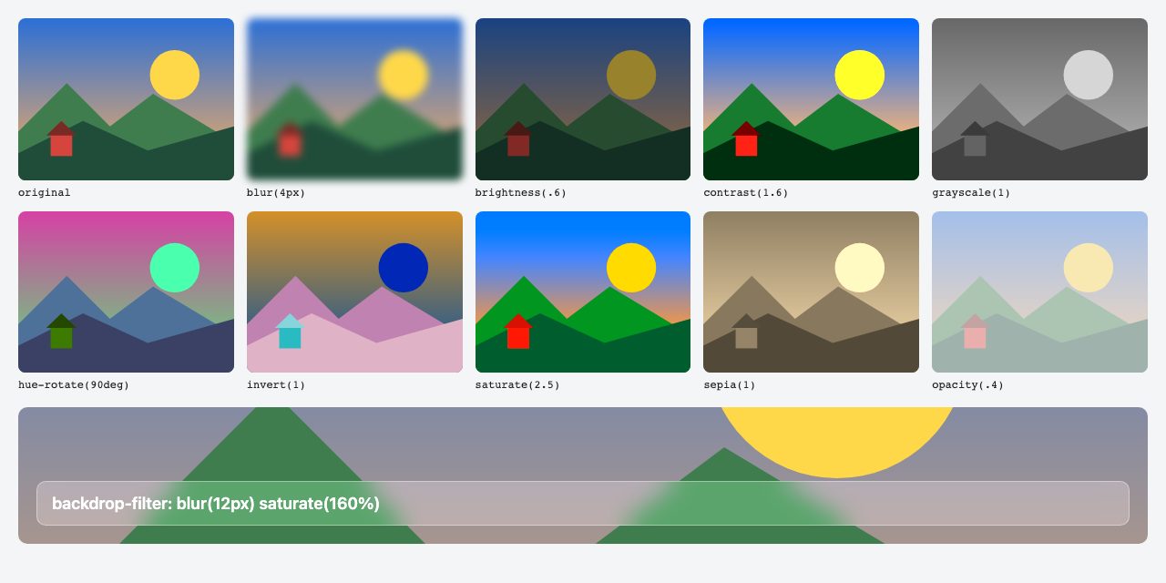
backdrop-filter panel along the bottom.The ten filter functions
| Function | Example | What it does |
|---|---|---|
blur() |
blur(4px) |
Gaussian blur; the length is the blur radius. Useful for placeholders and backgrounds behind text. |
brightness() |
brightness(.6) |
Multiplies brightness. Below 1 darkens, above 1 lightens. Handy for text overlays. |
contrast() |
contrast(1.6) |
Pushes tones apart (above 1) or toward gray (below 1). |
drop-shadow() |
drop-shadow(0 8px 10px #0006) |
A shadow that follows the visible shape, including transparent PNG, WebP and SVG edges. |
grayscale() |
grayscale(1) |
Removes color. 1 is fully gray. |
hue-rotate() |
hue-rotate(90deg) |
Rotates every hue around the color wheel. |
invert() |
invert(1) |
Inverts colors. Often used to flip a black icon to white in dark mode. |
opacity() |
opacity(.4) |
Transparency, like the opacity property but it can be chained in a filter list. |
saturate() |
saturate(2.5) |
Boosts (above 1) or mutes (below 1) color intensity. |
sepia() |
sepia(1) |
Warm brown vintage tone. |
Chain filters, and mind the order
Functions run in the order you write them, left to right, so the result can differ:
/* lift contrast first, then desaturate */
.photo-a { filter: contrast(1.4) grayscale(1); }

/* the shadow is created first, so grayscale also turns the shadow gray */
.photo-b { filter: drop-shadow(0 6px 8px rgb(200 0 0 / .6)) grayscale(1); }
That second case matters: according to MDN, filters listed after drop-shadow() are applied to the shadow too. Put drop-shadow() last if you want a colored shadow to stay colored.
Color on hover: a consistent image style
A classic use is a muted, uniform set of images that spring to full color on hover. Because filter is animatable, a plain transition is enough. Wrap the hover rule in @media (hover: hover) so touch devices do not get a sticky hover state, and respect prefers-reduced-motion:
.card img {
  filter: grayscale(1) contrast(1.05);
  transition: filter .3s ease;
}

@media (hover: hover) {
  .card:hover img { filter: none; }
}
.card:focus-within img { filter: none; }

@media (prefers-reduced-motion: reduce) {
  .card img { transition: none; }
}
MDN notes that when two filter lists have the same functions in the same order, each function is interpolated individually. If the lists differ in length, the shorter one is padded with neutral values. When you use none as the end state this works as you would expect, but mixing in url() filters makes the change jump instead of fading.
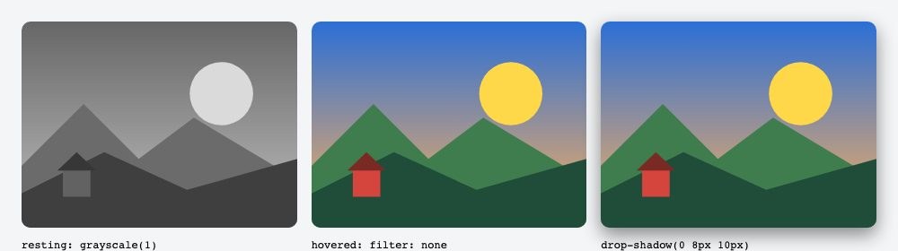
drop-shadow() treatment.Blur and darken an image behind text
The most common real use is a hero or card image that must stay readable under a caption. Chain blur() with brightness(), and clear the effect on hover:
.hero-card img {
  filter: blur(3px) brightness(.55);
  transition: filter .3s ease;
}
.hero-card:hover img,
.hero-card:focus-within img { filter: none; }
.hero-card figcaption { color: #fff; }
Blurred edges can leave a pale fringe at the element boundary, so put the image inside a wrapper with overflow: hidden and scale the image up slightly (transform: scale(1.05)) to hide it.
Animating filters on entry and on scroll
Filters also animate from a starting state without JavaScript. @starting-style gives an element a filter to transition from the first time it renders, and a scroll-driven animation ties the value to scroll position:
.card img {
  filter: none;
  transition: filter .5s ease;
  @starting-style { filter: blur(12px) grayscale(1); }
}

@media (prefers-reduced-motion: no-preference) {
  .reveal img {
    animation: sharpen linear both;
    animation-timeline: view();
    animation-range: entry 0% cover 40%;
  }
}
@keyframes sharpen {
  from { filter: blur(10px); }
  to   { filter: blur(0); }
}
Both rely on newer features, so treat them as progressive enhancement: where unsupported, the image simply appears in its final state.
For more hover treatments with markup you can copy, see our animated photo gallery and expanding gallery on hover snippets.
drop-shadow() versus box-shadow
box-shadow always draws a rectangle. drop-shadow() traces the actual pixels, so a transparent logo or cut-out product photo gets a shadow that matches its outline. Its syntax is like box-shadow but it does not accept inset or a spread value. For ordinary rectangular photos, box-shadow is cheaper to render, so save drop-shadow() for irregular shapes.
backdrop-filter: filtering what is behind an element
filter changes the element itself. backdrop-filter changes whatever is painted behind it, which is how frosted-glass panels are made:
.glass {
  background: rgb(255 255 255 / .25);
  backdrop-filter: blur(12px) saturate(160%);
  border: 1px solid rgb(255 255 255 / .4);
}
MDN marks backdrop-filter as Baseline 2024 (newly available since September 2024), so it works in current versions of all major browsers but can be missing on older devices. Safari needed a -webkit- prefix until version 18, which shipped it unprefixed, so you can drop the prefix now unless you must support older Safari. The element needs a transparent or semi-transparent background for the effect to show. If you need a safe fallback, make the background more opaque and add the glass only inside @supports (backdrop-filter: blur(1px)).
One trap: a parent with opacity below 1, a filter, a mask, clip-path or mix-blend-mode becomes a “backdrop root”, which limits how far up the page the child can see. If the blur seems to do nothing, check the ancestors.
Advanced effects with SVG filters
When ten functions are not enough, filter accepts url() pointing to an SVG <filter>, which unlocks duotone maps, displacement and noise:
Here is a working duotone: a feColorMatrix converts the image to gray, then feComponentTransfer maps black and white onto two colors (dark navy to warm pink). Put the SVG in the page, hidden from view:
<svg width="0" height="0" aria-hidden="true" focusable="false">
  <filter id="duotone" color-interpolation-filters="sRGB">
    <feColorMatrix type="matrix"
      values="0.33 0.33 0.33 0 0
              0.33 0.33 0.33 0 0
              0.33 0.33 0.33 0 0
              0    0    0    1 0"/>
    <feComponentTransfer>
      <feFuncR type="table" tableValues="0.08 1"/>
      <feFuncG type="table" tableValues="0.1 0.45"/>
      <feFuncB type="table" tableValues="0.3 0.6"/>
    </feComponentTransfer>
  </filter>
</svg>
img.duotone { filter: url(#duotone); }url(#duotone) references an inline filter by id; url("filters.svg#duotone") points to an external file instead. Inline is easier to maintain and avoids an extra request.
These are more complex to write and cannot be smoothly transitioned, so use them for static art direction. If your goal is tinting rather than correction, CSS blend modes are often simpler.
Accessibility and performance notes
- Contrast: blur and brightness change the background under text. Re-check text contrast against the filtered result, not the original photo.
- Do not rely on color alone: if a filter signals state (grayed-out means unavailable), add text or an attribute too, because
filteris not exposed to assistive technology. - Cost: large blurs on big, animated elements are expensive. Keep radii modest, avoid animating
blur()over full-screen areas, and test on a mid-range phone. - Side effects: any
filterother thannonecreates a new stacking context and backdrop root, so z-index and nestedbackdrop-filtercan behave differently. - Fixing images at the source: filters are a presentation layer. For permanent corrections, export an adjusted image and serve it responsively.
Where to go next
Filters pair well with transitions and transforms; our guide to CSS transitions and transforms covers the timing side, and CSS3 image styles shows frames, borders and shapes you can combine with the filters above. For a broader checklist, see 20 pro CSS tips.


Good suggestion. Will add it.
Hii this is absolutely great guidance about CSS filter. Those CSS filter properties will help me a lot thanks for sharing.
You save my lots of time. Thanks for this nice tutorial about image.