How to Add Icons to Any Element With CSS
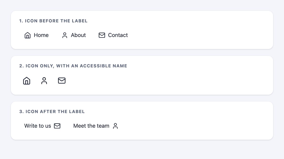
To add an icon to any element with CSS today, use a pseudo-element (::before or ::after) that is painted with mask and background-color: currentColor. The icon is a plain SVG, it inherits the text color, it follows hover and focus states for free, and you do not need an icon font, a unicode lookup table, or any change to the HTML.
This is the same idea as the old icon-font trick, where you set content: "\f015" and a font-family on a pseudo-element. The difference is what sits behind the pseudo-element. Below is the full technique, an accessible way to build icon-only links, and a short explanation of why icon fonts lost.
Why icon fonts fell out of favor
Icon fonts solved a real problem when they became popular: they scaled cleanly and took color from CSS. But they are text pretending to be graphics, and that causes trouble:
- Accessibility. Icons live in the Unicode private use area, so assistive technology can announce nothing, or a meaningless character. Generated content is also not part of the DOM, and MDN warns that it may not be announced reliably.
- Weight. You download every glyph in the font to show three of them.
- Rendering. If the font is slow or blocked, you see an empty box or a stray character instead of an icon.
- Limits. One color per glyph, and alignment depends on font metrics.
Font Awesome itself now documents SVG sprites and bare inline SVG as ways to use its icons, so the SVG route is not a workaround. It is the supported direction.
Pick the right method
| Method | Needs HTML change | Best for |
|---|---|---|
Inline <svg> |
Yes | Icons you can edit in the markup, animated or multi-color icons |
CSS mask on a pseudo-element |
No | Menus, CMS output, third-party markup, list bullets, any element you cannot edit |
content: url() with alt text |
No | Fixed-color decorative or informative icons |
| Icon font | Maybe | Legacy sites you are not ready to migrate |
If you control the HTML, inline SVG is usually the simplest. The mask method is for the case in the original tip: you can style an element but not change what it contains, for example a WordPress menu, a plugin’s output or a rich-text field.
Get an SVG icon
Any SVG will do. Open-source sets such as Lucide and Bootstrap Icons let you copy a single icon’s SVG, so you ship only what you use. For a mask, the colors inside the SVG do not matter: only the shape and its transparency are used, and the visible color comes from the element’s background.
Step 1: Store icons as custom properties
Put each icon in a custom property as a url(). A data URI keeps everything in one stylesheet and avoids an extra request. Characters such as #, < and > must be percent-encoded, and attributes use single quotes.
:root {
  --icon-home: url("data:image/svg+xml,%3Csvg xmlns='http://www.w3.org/2000/svg' viewBox='0 0 24 24' fill='none' stroke='black' stroke-width='2' stroke-linecap='round' stroke-linejoin='round'%3E%3Cpath d='m3 9 9-7 9 7v11a2 2 0 0 1-2 2H5a2 2 0 0 1-2-2z'/%3E%3Cpath d='M9 22V12h6v10'/%3E%3C/svg%3E");
  --icon-user: url("data:image/svg+xml,…");
  --icon-mail: url("data:image/svg+xml,…");
}
You can also point to a file, such as url("/icons/home.svg"). Per MDN, mask images are fetched with CORS rules, so a mask loaded from file:// is not accepted and renders as transparent black, which means no icon. Test on a local server, or use data URIs.
Step 2: Draw the icon with a mask
The pseudo-element becomes a small box filled with the current text color. The mask cuts that box into the icon’s shape.
.icon-link {
  display: inline-flex;
  align-items: center;
  gap: 0.5rem;
}

.icon-link::before {
  content: "";
  inline-size: 1.25em;
  block-size: 1.25em;
  flex: none;
  background-color: currentColor;
  mask: var(--icon) center / contain no-repeat;
}

.home    { --icon: var(--icon-home); }
.about   { --icon: var(--icon-user); }
.contact { --icon: var(--icon-mail); }
<ul>
<li><a class="icon-link home" href="/">Home</a></li>
<li><a class="icon-link about" href="/about">About</a></li>
<li><a class="icon-link contact" href="/contact">Contact</a></li>
</ul>Three details do the work:
content: ""is required. Without it the pseudo-element is not generated at all.- Sizing in
emkeeps the icon proportional to the link’s font size. currentColormeans acolorchange on hover or focus recolors the icon automatically, with no separate icon rule. That replaces the olda:hover::beforetip.
The unprefixed mask shorthand is Baseline widely available: MDN lists it as available across browsers since December 2023, so you no longer need -webkit-mask duplicates for current browsers.
Step 3: Move the icon to the end
For a trailing icon, use ::after with the same rules. Switch off the ::before one if the element also has the shared class.
.after::before { content: none; }
.after::after {
  content: "";
  inline-size: 1.25em;
  block-size: 1.25em;
  background-color: currentColor;
  mask: var(--icon) center / contain no-repeat;
}
Replace the label with an icon, accessibly
The old tip hid the link text with color: transparent and a clipped width. That is fragile, and it can leave the text findable in odd ways. Keep the label in the HTML in a visually hidden span instead, so screen readers and voice-control users still get a name.
<a class="icon-link icon-only home" href="/">
  <span class="sr-only">Home</span>
</a>
.icon-only { padding: 0.6rem; gap: 0; }
.icon-only::before { inline-size: 1.5em; block-size: 1.5em; }
.sr-only {
position: absolute;
inline-size: 1px;
block-size: 1px;
overflow: hidden;
clip-path: inset(50%);
white-space: nowrap;
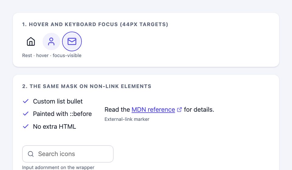
}Make the tap target comfortable: padding that brings the link to roughly 44 by 44 CSS pixels is a good goal on touch devices.
Focus and hover states
Because the icon uses currentColor, one rule covers both text and icon. Use :focus-visible so keyboard users get a clear ring without showing it on every mouse click. The snippet defines --brand once so you can change the accent in one place.
:root { --brand: #4f46e5; }

a:hover,
a:focus-visible {
  color: var(--brand);
  background: color-mix(in oklab, var(--brand) 8%, transparent);
}
a:focus-visible {
  outline: 2px solid var(--brand);
  outline-offset: 2px;
}
Icons on elements that are not links
Nothing in the technique depends on the element being an anchor. Share one mask rule and swap the icon variable. These three cover most cases: a custom list bullet, an external-link marker, and an input adornment drawn on the wrapper (a pseudo-element cannot go on an input itself).
.checklist li { display: flex; align-items: center; gap: 0.6rem; }
.checklist li::before {
  content: "";
  inline-size: 1.1em;
  block-size: 1.1em;
  flex: none;
  background-color: var(--brand);
  mask: var(--icon-check) center / contain no-repeat;
}

a[target="_blank"]::after {
  content: "";
  display: inline-block;
  inline-size: 0.9em;
  block-size: 0.9em;
  margin-inline-start: 0.25em;
  background-color: currentColor;
  mask: var(--icon-external) center / contain no-repeat;
}

.field { display: flex; align-items: center; gap: 0.5rem; }
.field::before {
  content: "";
  inline-size: 1.1em;
  block-size: 1.1em;
  background-color: currentColor;
  mask: var(--icon-search) center / contain no-repeat;
}
The screenshot above shows all three. Keep them decorative: the list text, the link text and the input’s label carry the meaning, and an external marker should be backed by real text such as “(opens in a new tab)” where that matters.
An alternative: content with alt text
If the icon never changes color, content can load the image directly and supply text for assistive technology after a slash:
.external::after {
  content: url("/icons/external.svg") / "(opens in a new tab)";
}
This is handy for small decorations like external-link markers. According to MDN’s compatibility data, the slash syntax needs Chrome 77, Safari 17.4 or Firefox 128, so older Firefox and Safari ignore the whole declaration. Add a plain fallback line before it if you must support them. Note that an image in content cannot be recolored, which is why the mask method is the better default.
Accessibility checklist
- Decorative icon next to a text label: nothing more to do. The mask draws it and the text names the link.
- Icon-only control: always keep a text name, as in the visually hidden span, or an
aria-label. - Icon that carries meaning (an error, a warning): do not rely on a generated image alone. Put the meaning in real text.
- Contrast: the icon follows
color, so check it against its background at the same 3:1 minimum used for graphical objects. - Forced colors mode (Windows High Contrast): the browser overrides
background-colorwith the page color, so a mask-painted icon fills with the canvas color and disappears. This is a known weakness of mask icons. Fix it as shown below. - Respect
prefers-reduced-motionif you animate the icon.
Fixing forced colors mode
Opt the pseudo-element out of the override and give it a system color. CanvasText matches normal text; use LinkText on links if you want them to match the link color.
@media (forced-colors: active) {
  .icon-link::before,
  .icon-link::after {
    forced-color-adjust: none;
    background-color: CanvasText;
  }
}
I tested this with Chromium’s forced colors emulation (Playwright forcedColors: 'active', the same switch as the DevTools Rendering tab). Without the rule, the computed icon color was white on a white canvas and every icon, bullet and marker vanished. With the rule, all of them rendered in black. Where forced colors support really matters, such as a high-contrast toolbar, inline SVG with fill: currentColor is the sturdier choice. Apply the same rule to any other class that draws a mask.
Where to go from here
Once your icons are masks, you can reuse them everywhere: buttons, list markers, form-field adornments. If you want ready-made patterns to adapt, these snippets show icons inside real interfaces: the navigation sidebar with icons and badges, the mobile app menu with icon tiles and the animated menu with a sliding indicator. For the menu layout around your icons, see Four Elements of Truly Mobile-Friendly Responsive Menus, and for hover transitions on icon links, Easy CSS Animation With Transition & Transforms.
A simple rule for choosing: use inline SVG when you own the markup, when the icon is animated or multi-color, or when forced colors support is critical. Use the mask when you cannot edit the HTML or want one rule to style many elements. If your site still ships an icon font, you do not have to migrate it all at once. Replace the icons in the most visible places, check the Network panel, and drop the font when its last glyph is gone.


Don’t use icon fonts, use svgs instead. This has been common knowledge for some time now.
If you use a lot of icons, using icon font can reduce http requests.
No Nick. The correct way to use a SVG icons system is to have all your icons defined as symbols in a single SVG file. So a single HTTP request is needed. These icons are then referenced (using the tag) into inline SVG elements in your markup.
If you use a lot of icons, you can generate an SVG sprite using the build tool of your choice that bundles them as symbols. You can then access said icons via .
I’ll admit that you will still need BoomSVGLoader or a similar solution to have it work with an external sprite and still have it cacheable, but the solution in itself is far superior to icon fonts which have a ton of accessibility and rendering issues.
SVG-sprite is only good for custom/client sites when you have the exact icons. For WordPress themes that we do at Themify, icon font is the best solution because users can pick any icon and manipulate the color/size, etc. It depends on the situation and purpose.
You can manipulate everything on an SVG with CSS/JavaScript: color, shape, visibility, You can have multiple colors without hacks and umsupported ligature features and you’re not leaving people with disabilities in the cold.
I advise you read up on SVG. Read Sara Soueidan’s blog or Chris Coyier’s book on SVG and you’ll quickly realise there’s no upside to fonts over SVG for icons.
What are SVGS? Why are they better than icons?
While this tutorial is aimed at cases where you need to modify existing markup (where injecting an SVG via CSS is not always possible or easily understood by everyone), I wanted to mention that Font Awesome 5 will be introducing an SVG framework for who like to use them, which will be as easily to implement as standard
itags. For those of you who are unsure what SVGs are and why there is debate over them, designer Ben Frain offers a balanced argument for why Icon Fonts are still viable, especially for the average web person, and is an excellent place to add your input on the debate: https://benfrain.com/seriously-use-icon-fonts/If you do have an SVG or SVG sprite you want to use in this way, you can use a pseudo element in much the same way by either setting the
contentproperty to the SVG url like this:or by setting a background declaration as shown in this codepen.