20 Pro CSS Tips to Level Up Your Stylesheets
The best CSS tips today are the ones that remove code instead of adding it. Cascade layers settle specificity fights, nesting and :has() replace JavaScript and class juggling, container queries make components responsive on their own, and clamp() and logical properties replace piles of media queries and left/right overrides. This guide collects 20 habits that make a stylesheet smaller, more predictable and easier to hand to someone else.
Every feature below is supported in current Chrome, Edge, Firefox and Safari. Where a feature is newer, the tip says so, and the support tables on MDN are linked at the end so you can check Baseline status for your own audience.
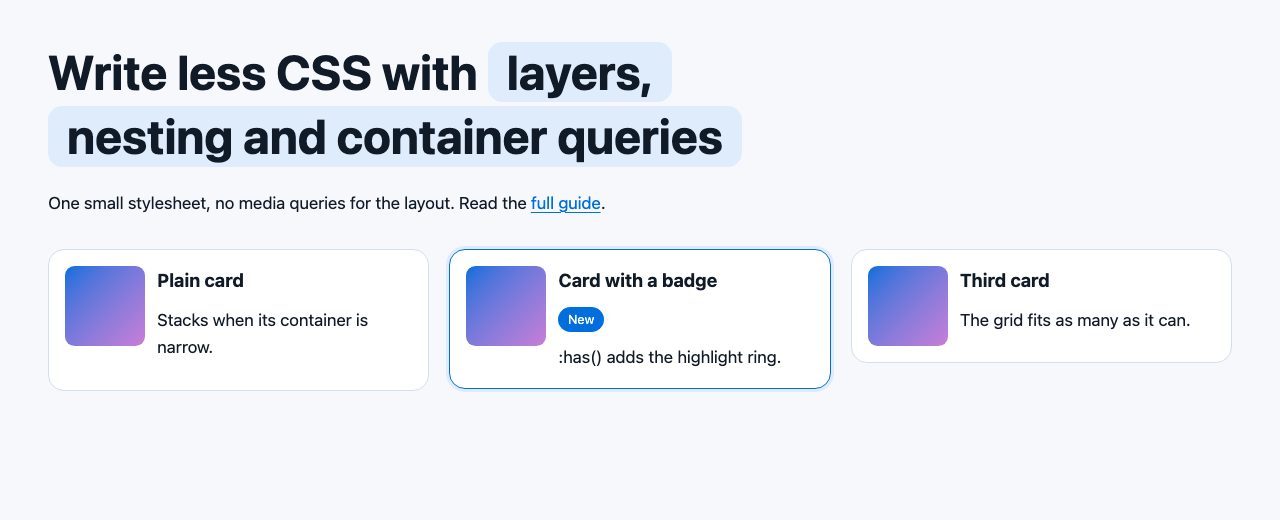
:has(), container queries, clamp() and aspect-ratio. No layout media queries.Set up a solid foundation
1. Start with a minimal reset
You no longer need a full normalizing library, because browsers now agree on most defaults. A handful of rules covers what is still annoying:
*, *::before, *::after { box-sizing: border-box; }
* { margin: 0; }
img, svg, video { display: block; max-width: 100%; height: auto; }
input, button, textarea, select { font: inherit; }
Setting box-sizing on everything is simpler than the old inherit-from-html trick. Third-party widgets that need content-box can opt out locally.
2. Put your CSS in cascade layers
Specificity wars happen because source order and selector weight both decide the winner. @layer adds a third, explicit rule: later layers beat earlier ones, regardless of specificity.
@layer reset, base, components, utilities;

@layer reset { * { margin: 0; } }
@layer components { .btn { padding: .6em 1.2em; } }
@layer utilities { .p-0 { padding: 0; } }
Now a utility class always beats a component, even if the component selector is more specific. Unlayered styles beat every layer, so you can also import a third-party stylesheet into a low layer with @import url(lib.css) layer(vendor); and never fight it again.
3. Keep specificity low with :where()
:where() works like :is() but contributes zero specificity. Use it for base styles you expect to be overridden:
:where(h1, h2, h3, h4) { line-height: 1.2; }4. Use logical properties
Properties such as margin-inline, padding-block and inset-inline-start follow the writing direction instead of the physical screen. One rule then works for left-to-right and right-to-left languages:
.card { padding-block: 1rem; padding-inline: 1.5rem; border-inline-start: 4px solid var(--brand); }5. Give the body a unitless line-height
The advice from the original version of this article still holds: set line-height: 1.5 on body with no unit, so every element computes its own line height from its own font size. Headings usually want less, around 1.1 to 1.25. Pair it with text-wrap: balance on headings to stop one-word last lines:
body { line-height: 1.5; }
h1, h2, h3 { line-height: 1.2; text-wrap: balance; }
Layout without hacks
6. Replace margin hacks with gap
Separators and gutters no longer need :last-child resets. gap works in both Flexbox and Grid and only adds space between items:
.nav { display: flex; gap: 1rem; }If you still want a divider between items, .nav li:not(:last-child) or li + li is fine. For a full flexbox walkthrough, see Master CSS Flexbox in 5 Simple Steps.
7. Build responsive grids without media queries
This single declaration creates as many columns as fit, never narrower than 16rem, and never overflows a small screen thanks to min():
.grid {
  display: grid;
  gap: 1.25rem;
  grid-template-columns: repeat(auto-fit, minmax(min(100%, 16rem), 1fr));
}
8. Center with place-items
Vertical centering is now one line on a grid container. Use min-height rather than height: 100%, so content that grows is never clipped:
.hero { display: grid; place-items: center; min-height: 100dvh; }The dvh unit tracks the visible viewport as mobile browser toolbars appear and disappear, which is the modern fix for the problem described in CSS Fix for iOS vh-unit Bug. More methods are in CSS Vertical Centering.
9. Space flowing content with a flow class
The “lobotomized owl” selector (* + *) is still a good idea, but applying it globally can bite. Scope it and keep specificity at zero:
:where(.flow) > :where(* + *) { margin-block-start: var(--space, 1.25rem); }Add class="flow" to any container and its children get consistent vertical rhythm. Override --space on a single section when it needs to breathe more.
10. Hold shapes with aspect-ratio
The padding-bottom percentage trick is obsolete. Declare the ratio directly:
.thumb { aspect-ratio: 16 / 9; object-fit: cover; width: 100%; }Also set width and height attributes on every <img>. Browsers derive the ratio from them and reserve the space before the file loads, which prevents layout shift.
Components that adapt themselves
11. Use container queries for components
Media queries ask how wide the viewport is. A card in a narrow sidebar and the same card in a wide main column need different layouts at the same viewport width. Container queries answer the real question:
.wrap { container-type: inline-size; }

.card { display: grid; gap: .75rem; }

@container (min-width: 22rem) {
  .card { grid-template-columns: 5rem 1fr; }
}
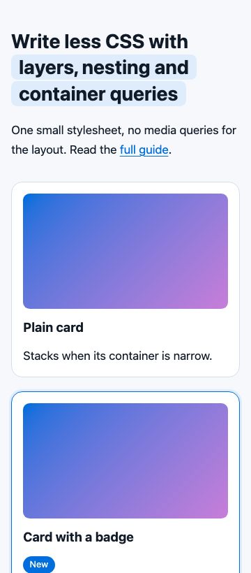
The element you query must be an ancestor with container-type set, not the card itself, because a container cannot be styled by its own size. The narrow screenshot below shows the same cards falling back to the stacked layout.
12. Nest your selectors
Native nesting gives you what Sass did, with no build step. Related rules live together, and the parent selector is written once:
.card {
  border: 1px solid var(--line);

  & h2 { font-size: 1.15rem; }
  &:hover { border-color: var(--brand); }

  @media (prefers-reduced-motion: no-preference) {
    transition: transform .2s;
  }
}
Media and container queries can be nested too, which keeps a component’s responsive behavior inside the component. Avoid nesting more than two or three levels, or you recreate the specificity problems you meant to escape.
13. Style parents with :has()
CSS can finally select an element based on what it contains. No class toggling, no JavaScript:
.card:has(.badge) { border-color: var(--brand); }
label:has(input:checked) { background: var(--brand-soft); }
form:has(:user-invalid) .hint { display: block; }
This is how the highlighted card in the screenshot works. It also lets you build CSS-only toggles and selectable cards; compare the CSS-only toggle switch styles.
14. Fluid type with clamp()
The old calc(1vw + 1vh) root font size ignored user preferences and could be unreadable on odd viewports. clamp(min, preferred, max) sets safe limits and keeps a rem component so browser zoom and font settings still work:
:root {
  --step-0: clamp(1rem, .95rem + .25vw, 1.125rem);
  --step-2: clamp(1.75rem, 1.2rem + 2.4vw, 3rem);
}
h1 { font-size: var(--step-2); }
Never put a viewport unit alone in a font size. The rem part is what lets users enlarge text, which matters for accessibility.
15. Pick the right unit
Use rem for global sizes and spacing, em for things that should scale with their own text (button padding, icon size), ch for line length and lh for spacing in line-heights:
.prose { max-width: 65ch; }
.btn { padding: .6em 1.2em; }
Leave the root font size alone. Resetting html to 15px or 62.5% overrides what the visitor chose in their browser.
Details that signal craft
16. Make wrapped highlights look right
When an inline element wraps onto two lines, its padding and background break awkwardly at the line end. box-decoration-break: clone gives every line fragment its own padding and rounded corners:
.hl {
  background: var(--brand-soft);
  padding: .05em .4em;
  border-radius: .3em;
  box-decoration-break: clone;
}
Keep the element display: inline. The old inline-block advice would stop the text wrapping at all. Check MDN’s compatibility table if you must support older Safari, which needs the -webkit- prefixed form.
17. Style default links with low specificity
Targeting links that have no class keeps your global link style from overriding buttons and cards, and :where() keeps it easy to beat:
a:where(:not([class])) {
  color: var(--brand);
  text-underline-offset: .2em;
  text-decoration-thickness: 1px;
}
a:where(:not([class])):hover { text-decoration-thickness: 3px; }
Keep the underline. It is the most reliable signal that text is a link, and the offset and thickness properties make it look refined.
18. Use SVG icons that inherit color
Inline SVG with fill="currentColor" picks up the text color, so hover, dark mode and disabled states cost nothing. For icon-only buttons the accessible name belongs in the HTML:
<button type="button" aria-label="Search">
  <svg width="20" height="20" viewBox="0 0 24 24" fill="currentColor" aria-hidden="true">…</svg>
</button>
That replaces the old .no-svg fallback, since SVG support is no longer in question. For button states and hover polish, see button hover effects.
19. Build a palette with custom properties and color-mix()
Custom properties are the foundation of theming. Add oklch() and color-mix() and a whole palette comes from one brand color:
:root {
  --brand: oklch(55% .19 255);
  --brand-soft: color-mix(in oklch, var(--brand) 14%, white);
  --brand-strong: color-mix(in oklch, var(--brand) 80%, black);
}
OKLCH is perceptually uniform, so steps in lightness look even, unlike HSL. Change --brand once and every derived shade follows.
20. Respect forms, focus and motion preferences
Three small blocks make a site feel finished. Keep form controls at 16px so iOS Safari does not zoom on focus, show focus rings for keyboard users only, and turn off non-essential animation when asked:
input, select, textarea { font-size: 1rem; }

:focus-visible { outline: 3px solid var(--brand); outline-offset: 2px; }

@media (prefers-reduced-motion: reduce) {
  *, *::before, *::after { animation-duration: .01ms !important; transition-duration: .01ms !important; scroll-behavior: auto !important; }
}
The old tip of hiding unmuted autoplay videos is no longer needed, because browsers block autoplay with sound by default. accent-color is a quick bonus: it tints native checkboxes, radios and range sliders with your brand color.
Where to go next
If selectors still feel fuzzy, read The Power of CSS Selectors and How to Use Them. Then adopt these tips one at a time: layers and nesting first, because they change how you organize everything else.
Thanks, this is a great list of CSS tips, i will definitely be using the :not(). Just wish all browsers support such useful selectors.
Help me!
I have the background web image ‘fixed’. It works on desktop but turns into ‘repeat’ on iOs. How do I solve it?
Thank you!
body {
background-image: url(“paper.gif”);
background-repeat: repeat-y;
}
/* options: background-repeat: repeat|repeat-x|repeat-y|no-repeat|initial|inherit; */
If you want a fast rendering site, be warned that using the asterisk selector a lot (like suggested above) can severely impact performance.
These are great tips! A few examples or even screen shots of useage would be super helpful, especially for anyone used to CSS needed to just get by vs. powerful CSS like this. A great article though, and really helpful for a newbie designer!
Loved the tip about styling broken images. Would be great if you could write a post about CSS transitions. Thanks!
I have been designing large responsive websites for many years and shrinking your text proportionally with the screen size is almost always a bad idea.
:root {
font-size: calc(1vw + 1vh + .5vmin);
}
(Don’t do this)
If you have huge headings on a desktop site, sure use a media-query or fluid typography to scale down a bit. But 6pt equivalent font size on a mobile is relay hard to read. In most cases you want the body copy of text on your mobile to be the same or LARGER on a mobile so that it is easer to read.
Great set of tips, tip #3, Flexbox has saved my life a couple of times but favorite had to have been about using rem and em units. Even today it still has confused the crap out of me.
Thank you so much for this great tips.??
Good read but I check out the Not: selector and it says is not well supported yet (13%)