How to Create Spotify Colorizer Duotone Effects With CSS Blend Modes
You can recreate Spotify’s duotone “Colorizer” look in plain CSS with three ingredients: a grayscale image, mix-blend-mode: multiply on top of a bright background colour, and a second colour layer set to lighten. No Photoshop export, no image processing on the server, and the same rule works on any photo a user uploads.
The problem Spotify solved is still common. When artists, authors or customers upload their own pictures, the result is a messy grid of unrelated colours. A duotone treatment pulls them into one brand palette. The blend modes involved have been Baseline widely available in every major browser since January 2020, so you no longer need fallbacks or @supports guards for the core technique.
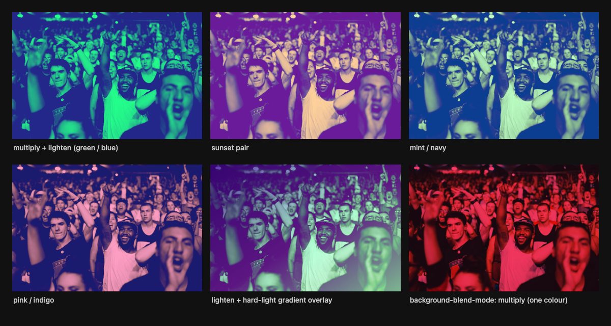
How a CSS duotone works
A duotone maps the darkest tones of a picture to one colour and the lightest to another. In Photoshop you stack a grayscale photo between two colour layers and set blend modes on them. CSS gives you the same stack:
- The wrapper carries the highlight colour as its
background-color. This is the bottom layer. - The image is converted to grayscale with
filterand blended withmultiply. Multiply keeps black as black and lets white show the wrapper colour, so the photo’s light areas turn into your highlight colour. - A pseudo-element sits on top, filled with the shadow colour and blended with
lighten. Lighten keeps the brighter value of each channel, so the black areas left by multiply become the shadow colour while the highlights stay put.
Multiply and lighten are two of the blend modes defined in the W3C Compositing and Blending spec, which also gives you screen, overlay, darken, color-dodge, color-burn, hard-light, soft-light, difference, exclusion, hue, saturation, color and luminosity. mix-blend-mode additionally accepts the compositing operators plus-darker and plus-lighter.
The markup
The effect needs a wrapper, because the top layer is a pseudo-element and img cannot have one. Any element works: div, span or figure.
<div class="duotone sunset">
  <img src="concert.jpg" alt="Fans cheering at a concert" width="900" height="600">
</div>
Keep the meaningful alt text on the image. The colour treatment is decoration and does not change what the picture communicates.
The CSS, with custom properties
The original technique repeated every colour in several selectors. Custom properties make each colourway a two-line variant:
.duotone {
  --highlight: #00ff36;
  --shadow: #23278a;

  position: relative;
  isolation: isolate;               /* keep the blend inside this box */
  background-color: var(--highlight);
  aspect-ratio: 3 / 2;
  overflow: hidden;
}

.duotone img {
  display: block;
  width: 100%;
  height: 100%;
  object-fit: cover;
  filter: grayscale(1) contrast(1.2);
  mix-blend-mode: multiply;
}

.duotone::after {
  content: "";
  position: absolute;
  inset: 0;
  background-color: var(--shadow);
  mix-blend-mode: lighten;
  transition: opacity 0.4s;
}

/* New colourways are just new values */
.duotone.sunset { --highlight: #ffd166; --shadow: #6a1b9a; }
.duotone.mint   { --highlight: #b9fbc0; --shadow: #0b3d91; }
.duotone.pink   { --highlight: #ff9ec4; --shadow: #1a1a6e; }
Why isolation: isolate matters
A blend mode blends an element with everything behind it in the same stacking context. If the wrapper does not form its own context, the multiply or lighten layer can pick up the page background or a parent’s colour and shift your palette. MDN’s examples use isolation: isolate for exactly this reason. It is cheap insurance, and the demo above needs it when cards sit on a dark page.
Choosing the contrast value
The contrast() filter decides how much of the tonal range reaches the two colours. A value around 1.2 is a safe default for unknown photos. Below 1 the image washes out and the effect can disappear on already faded pictures. Around 2 you lose detail and get a screen-printed look, which suits posters and album art. If your source photos are very dark, add brightness() in the same filter list.
Picking colour pairs that work
Because lighten compares channel by channel, a shadow colour with a channel brighter than the matching channel of your highlight colour will clip part of the highlights. Choose a highlight that is lighter overall than the shadow, and keep the two clearly different in hue. Saturated highlights over deep, dark shadows (yellow over purple, mint over navy) read best. If you want to see the effect of swapping the order, exchange multiply and lighten and use a dark wrapper colour.
Variations beyond multiply and lighten
Gradient overlays
The top layer does not have to be a flat colour. A gradient with hard-light adds depth, and a dark wrapper colour with lighten on the image gives a moody, glowing result (bottom middle in the screenshot):
.duotone.gradient {
  --highlight: #88169d;
}
.duotone.gradient img {
  mix-blend-mode: lighten;
}
.duotone.gradient::after {
  background: linear-gradient(to top left, #75d775, #321a5b);
  mix-blend-mode: hard-light;
}
A single colour tint with one element
When you only need one colour, you do not need a wrapper or a pseudo-element at all. background-blend-mode blends an element’s own background images with its background colour:
.tint {
  aspect-ratio: 3 / 2;
  background-color: #ff3b6b;
  background-image: url("concert.jpg");
  background-size: cover;
  background-blend-mode: multiply;
}
The two properties are easy to confuse. mix-blend-mode blends a whole element with what is behind it. background-blend-mode blends only that element’s own background layers with each other. Both are Baseline widely available. Use the single-element version for hero backgrounds, and the wrapper version for content images that need real img semantics.
Other quick swaps
- Replace
multiplywithdarkenif the result is too dark. - Use
colororoverlayon the pseudo-element for a plain colour wash that keeps the original brightness. - Animate the colours by registering the custom properties with
@propertyand transitioning them. Without registration, custom properties switch instantly instead of interpolating.
Hover, motion and accessibility
The demo fades the shadow layer on hover, which reveals more of the grayscale photo underneath. Keep that kind of motion optional:
@media (prefers-reduced-motion: reduce) {
  .duotone::after { transition: none; }
}
Two more things to check before you ship:
- Text over duotone images. Do not put text inside the blended wrapper. Blend modes would tint it too. Place captions and headings in a sibling element above the image, and test contrast against the lightest part of the picture, which is now your highlight colour.
- Performance. Blending forces the browser to composite extra layers. A grid of a few dozen images is fine, but avoid animating blend modes on full-screen elements, and prefer animating
opacityas the demo does.
Where to go next
Blend modes pair naturally with other image effects. Our simple CSS image filters tutorial covers the filter functions used for the grayscale step, and CSS3 image styles shows frames, shadows and shapes you can combine with a duotone. For hover interactions, see grayscale image hover, or drop a duotone into the thumbnail grid with hover effects and the animated photo gallery.
Spotify’s original campaign was designed by the agency Collins, and it showed how a strict, two-colour treatment can make thousands of unrelated pictures feel like one brand. The CSS version gives you the same consistency for any site where the content is not under your control.
Hey, I love your work. But as i have just started. I wan’t some thorough explanation to gallop it all. Can you please direct me where should i start some beginner level tutorials. So that i can do this easily ??
Hello!
Check out the CSS course on for a quick way to learn the CSs syntax. From there, just read the MDN guides for the mix-blend-mode property to understand how it works, and then this tutprial should feel very easy to you :) If youa re looking for more help in learning blend modes in general, check out this Photoshop tutorial to help you understand how each mode works with your color choices:
You can make wonderful things by using CSS. Great tutorial.
Great tutorial. I was wondering is there a way for using technique and have the colours fade from one colour to another just using CSS?
Hi Craig!
Today we are publishing a tutorial on CSS transition which will show you how to do that – the trick is to set the color change on the hover event (or whatever) the way I removed them in the example. If you want them to automatically change color or continually color shift, then you have to use animate and @keyframes which will be covered next week :D
How to prevent the Caption inside image without affecting the color? for now, The caption text is blended with image.
Hello!
My recommendation is to use figure to wrap the image and a pseudo element on the figure, then put the caption inside a figcaption wrapper.
Bonjour :) et merci pour ce tuto
J’arrive crer l’effet, mais rien ne se passe lorsque je dplace la souris sur l’image, pourtant j’ai rpter votre exemple, pouvez-vous m’aider svp?
Merci
Clia L.
Hello :) and thank you for this tutorial
I can create the effect, but nothing happens when I move the mouse over the image, yet I repeat your example, can you help me please?
Thank you
Clia L.
This is another great resource for us web designers. Thank you for sharing ;) Surely, I am going to incorporate this approach to my upcoming web design projects.