Layout
Clearing Floats in CSS: flow-root, Overflow and Flexbox
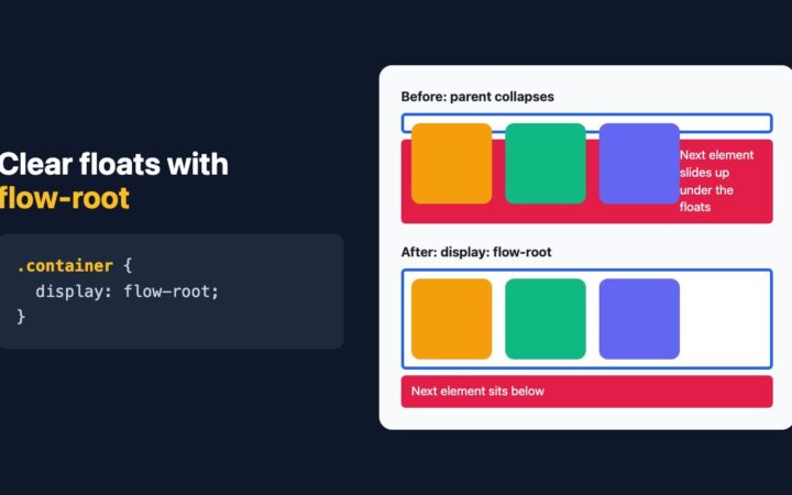
display: flow-root is the one-line, side-effect-free way to contain floats. See why overflow worked, where it fails, and when to use Flexbox…
Topic
Grid, Flexbox, container queries and responsive layouts that hold up on every screen.
display: flow-root is the one-line, side-effect-free way to contain floats. See why overflow worked, where it fails, and when to use Flexbox…
Skip the grid framework. Build a 12-column layout, a self-adjusting card grid and aligned cards with native CSS Grid, subgrid and container…
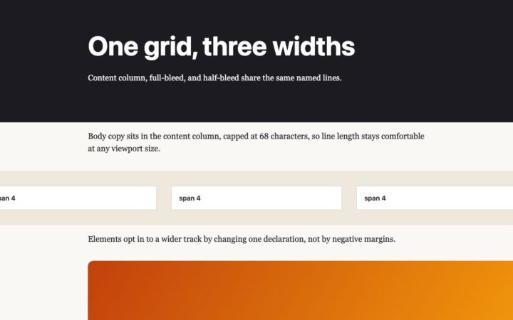
How to design grid and column layouts today: named lines for content widths, subgrid for aligned cards, and container queries for components…
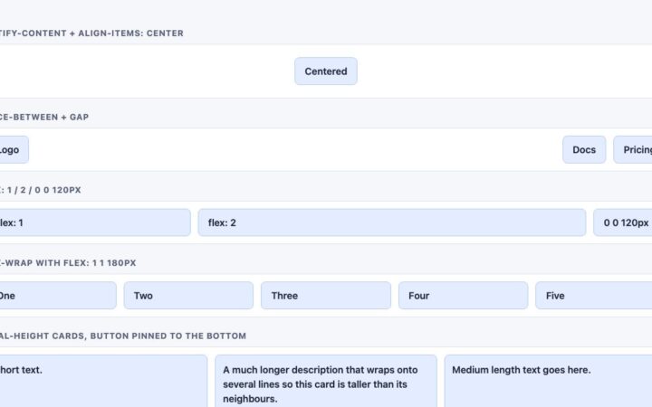
Flexbox comes down to five ideas: flow, alignment, gap, sizing and order. Learn each with tested code, and know when Grid or…
Rebuild the classic two-panel landing page with flexbox, :has() hover expansion and an animated native dialog, no jQuery or animation library needed.
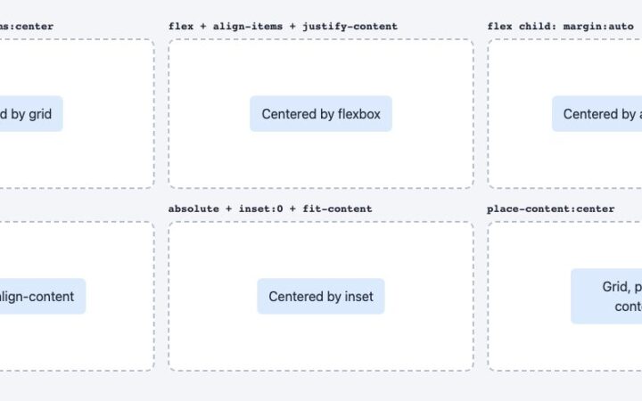
Vertical centering in CSS is a one-liner now. Compare grid, flexbox, auto margins, align-content and absolute positioning, and learn which to use…
Copy-ready Bootstrap components with live preview, MIT licensed.