Easy CSS Animation With Transitions and Transforms
A CSS transition animates a property from its old value to its new value when that value changes, and a transform moves, scales, rotates or skews the element while it does. Together they cover most UI motion: hover effects, toggles, menus and cards. Today you write them with the individual properties translate, rotate and scale, add @starting-style for elements that have just appeared, and wrap motion in a prefers-reduced-motion check.
This guide covers the whole model: how a transition works, which properties to animate, the transform properties and their origin, staggering with delays, click-driven state without jQuery, and entry animations.
Transitions, transforms and keyframes: who does what
These three features are often mixed up, so separate them first.
- Transforms (
transform,translate,rotate,scale) decide what an element looks like: where it sits, its angle and its size. - Transitions decide how the browser gets from one style to another when a value changes.
- Keyframe animations (
animationplus@keyframes) run on their own, can have many steps and can loop. They are covered in Easy CSS Animation Using @keyframes.
Use a transition when something changes between two states, such as hover, focus, checked or an added class. Use keyframes when the motion has more than two stops or needs no trigger.
How a transition works
A transition needs a change. The browser compares the computed value before and after, and if a transition is declared for that property, it interpolates between them. Declare the transition on the base rule, not only on :hover. Then the element animates both into and out of the hover state. Put it only on :hover and the element animates in but snaps back on mouse-out.
.link {
  color: #5b6577;
  transition: color 0.2s ease-out;
}
.link:hover {
  color: #1c2230;
}
The shorthand
The four longhands are transition-property, transition-duration, transition-timing-function and transition-delay. In the shorthand, the first time value is the duration and the second is the delay. A fifth, transition-behavior, is covered below.
.button {
  transition:
    background-color 0.2s ease-out,
    scale 0.2s ease-out,
    box-shadow 0.3s ease-out 0.05s;
}
Name your properties, avoid all
The old habit was transition: all 0.3s. It works, but it animates every property that ever changes, including ones you did not plan for, such as width, padding or an inherited font size. That can cause layout jank and surprising effects after a later edit. List the properties you mean to animate.
Stick to properties the browser can animate cheaply: opacity, translate, rotate, scale, transform and filter usually run on the compositor, while width, height, margin and top force layout on every frame. A property can only transition if it has a midpoint, so font-family cannot, and display needs special handling (see below).
Duration and easing
For small UI feedback, 150 to 300 ms feels responsive. Longer moves, such as a panel sliding across the screen, can take 300 to 500 ms. Anything beyond that usually feels slow. For easing, ease-out suits things entering or reacting to input because it starts fast. ease-in-out suits movement between two points on screen. linear is mostly for colour fades and spinners.
For a custom curve, use cubic-bezier(x1, y1, x2, y2). Values of y outside 0 to 1 produce overshoot, which gives a springy feel:
transition: translate 0.5s cubic-bezier(0.34, 1.56, 0.64, 1);The linear() easing function goes further by describing a curve as a list of points, which is how bounce and spring easings are expressed in plain CSS. Generators exist for it, so you rarely write the points by hand.
Transforms: use the individual properties
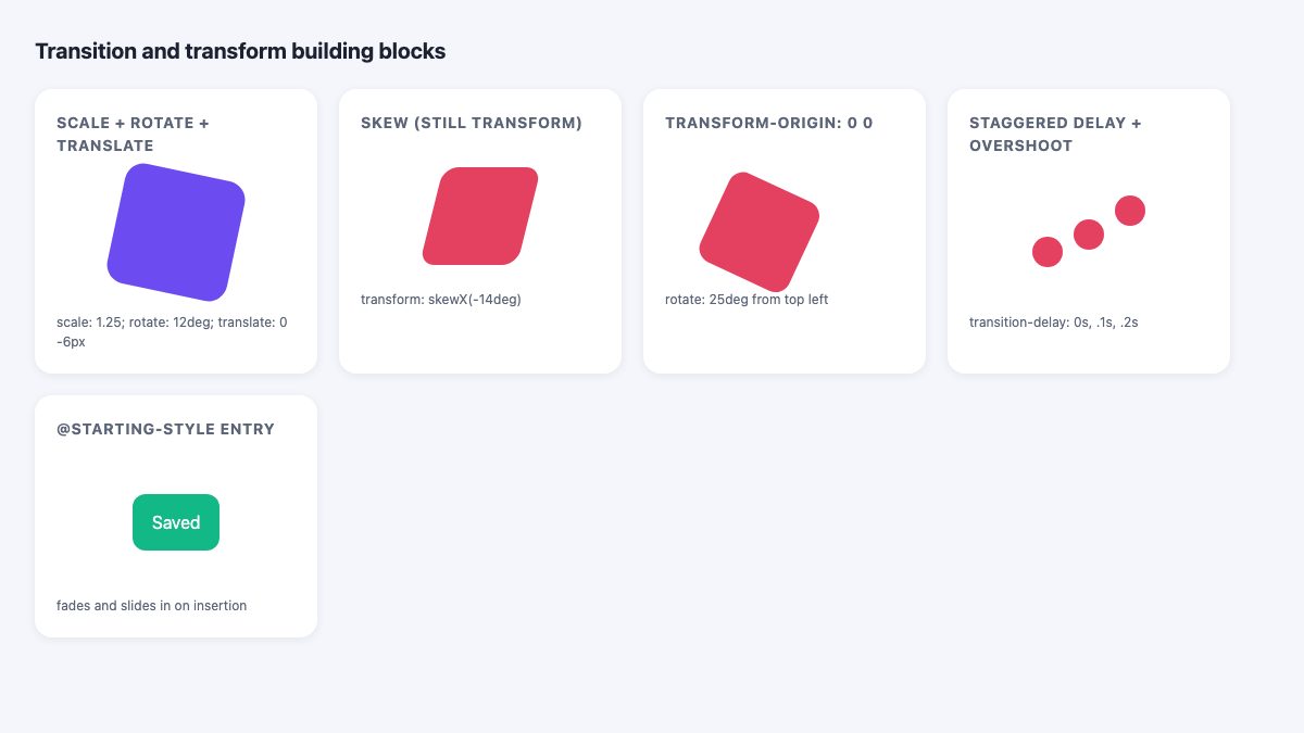
The classic way is transform: rotate(12deg) scale(1.25) translateY(-6px). It still works, but it has a trap: all functions live in one value, so changing one on hover means rewriting the others, and order changes the result. The individual properties translate, rotate and scale are Baseline widely available, and each can be set, changed and transitioned on its own.
.card {
  transition:
    scale 0.4s ease,
    rotate 0.4s ease,
    translate 0.4s ease;
}
.card:hover {
  scale: 1.25;
  rotate: 12deg;
  translate: 0 -6px;
}
Notice what is gone: no repeating of the other functions, and no need to remember their order. The browser applies translate, then rotate, then scale, then transform, so the translation happens in the parent’s coordinate space and is not tilted by the rotation.
Syntax cheat sheet
| Property | Example | What it does |
|---|---|---|
scale |
scale: 1.2 or scale: 1.5 0.8 |
Resizes; one value is uniform, two are X and Y. Unitless. |
rotate |
rotate: 90deg, rotate: -0.25turn |
Positive is clockwise. Values beyond 360deg spin more than once. |
translate |
translate: 20px 50px, translate: 50% |
Moves along X and Y. Percentages refer to the element’s own size. |
transform |
transform: skewX(-14deg) |
Skew has no individual property, so it stays here. |
3D works too: rotate: 1 0 0 45deg rotates around the X axis, and a third translate value moves along Z. Add perspective on the parent for depth.
Transform origin
Transforms pivot around the element’s center by default. transform-origin moves the pivot, and it applies to the individual properties as well. To swing something from its top-left corner:
.flap {
  transform-origin: top left; /* same as 0 0 */
  rotate: 25deg;
}
Remember that a transformed element carries its children with it. If a child should stay upright, give it the opposite value, or restructure so the transformed element is a sibling or a pseudo-element. Also note that transforms do not affect layout: neighbours do not move out of the way, and the original space is still reserved.
Staggered motion with delays
transition-delay lets properties or elements start at different times. Combined with :nth-child() or a custom property, it produces staggered reveals with very little code:
.row .dot {
  translate: 0 0;
  transition: translate 0.5s cubic-bezier(0.34, 1.56, 0.64, 1);
  transition-delay: calc(var(--i) * 0.1s);
}
.row:hover .dot {
  translate: 0 calc(var(--i) * -18px);
}
Set --i to 1, 2, 3 on each item, either in your markup or with one rule per :nth-child(). Keep total delays short, since anyone who hovers should see a response in well under half a second.
Triggering transitions without jQuery
CSS pseudo-classes cover many states: :hover, :focus-visible, :active, :checked, :target and :has(). For click-driven state that is not a form control, toggle a class with a few lines of vanilla JavaScript. This replaces the old $(".foo").click(...) jQuery handler:
const box = document.querySelector('.box');
box.addEventListener('click', () => {
  box.classList.toggle('is-active');
  box.setAttribute('aria-pressed', box.classList.contains('is-active'));
});
.box {
transition: translate 1.4s ease-in, rotate 1.4s ease-in;
}
.box.is-active {
translate: 300px 0;
rotate: 720deg;
}Use a real <button> for the clickable element so it is focusable and works with Enter and Space, and keep aria-pressed in sync if it is a toggle. For pure-CSS toggles, a hidden checkbox with :checked ~ .icon still works, and :has(:checked) now lets the parent react to its child without sibling tricks. For the popular hamburger icon, animate the three bars with rotate, translate and opacity on [aria-expanded="true"]. Our responsive navbar snippet shows a full menu built around that idea.
Animating elements as they appear: @starting-style
A transition needs a “before” value, and an element that has just been inserted into the page or revealed from display: none has no previous style. That is why fade-in effects used to need JavaScript or keyframes. @starting-style supplies the missing “from” values. MDN lists it as Baseline 2024, newly available across current browsers.
.toast {
  opacity: 1;
  translate: 0 0;
  transition: opacity 0.3s ease-out, translate 0.3s ease-out;

  @starting-style {
    opacity: 0;
    translate: 0 12px;
  }
}
The nested block must come after the base declarations, since it has the same specificity. When the toast is added to the DOM, it fades and slides in.
Exit animations and display
Exit is harder, because display: none is applied instantly and cuts the animation short. Add transition-behavior: allow-discrete, written in the shorthand as the keyword allow-discrete, so display flips at the end of the transition instead of the start. For popovers and dialogs, add overlay too, so the element stays in the top layer until it finishes:
[popover] {
  opacity: 0;
  translate: 0 12px;
  transition:
    opacity 0.3s,
    translate 0.3s,
    overlay 0.3s allow-discrete,
    display 0.3s allow-discrete;
}
[popover]:popover-open {
  opacity: 1;
  translate: 0 0;

  @starting-style {
    opacity: 0;
    translate: 0 12px;
  }
}
This pattern gives you an animated dialog or popover with no animation library and no transitionend listeners. Check your target browsers for allow-discrete if you must support older versions, and remember that without it the element still works, it just appears and disappears without animation.
Respect reduced motion
Large movement, spinning and parallax can cause discomfort for people with vestibular disorders. Operating systems expose a “reduce motion” setting, and CSS reads it with prefers-reduced-motion. You do not need to remove all feedback. Replace big movement with a gentle fade or colour change.
@media (prefers-reduced-motion: reduce) {
  .card {
    transition: background-color 0.2s;
  }
  .card:hover {
    scale: 1;
    rotate: 0deg;
    translate: none;
  }
}
A second option is to apply motion only when the user has not asked for less, using @media (prefers-reduced-motion: no-preference). That default-safe approach means nothing moves if the query is unsupported or unreadable.
Two other accessibility habits help. Trigger hover effects on :focus-visible too, so keyboard users get the same feedback, and never hide essential information in an effect that only appears on hover, because touch devices have no hover.
Common mistakes
- Transition declared only on
:hover. The way in animates, the way out snaps. Declare it on the base rule. - Different units between states. Moving from
height: autoto a fixed height will not animate in most cases. Animategrid-template-rowsfrom0frto1fr, or useinterpolate-sizewhere you can accept limited support. - Overusing
will-change. Add it only to the element that actually janks, since each hint reserves memory. - Mixing
transformwith the individual properties without a plan. They combine, but a rule that sets onlytransformon hover will not reset arotateset elsewhere. Pick one approach per element. - Animating layout properties on large lists. Prefer
translateandopacity.
Where to go next
Once you are comfortable with two-state transitions, move on to multi-step motion in @keyframes animation and, for colour work, animating background colors. For ready-made hover patterns you can copy, see the product card with hover zoom and the expanding image gallery snippets, or the animated dropdown navbar. The MDN guide to CSS transitions remains the best reference for every value.


This article made my day. A very help knowledge about css has learnt today. Thank you very much.
Excellent Post
I totally agree with all these ideas.
It is really helpful to people make their site more attractive.
Thank you for sharing your great knowledge with us.
Looking forward to your further tips on similar topics Thanks