CSS & HTML
20 Pro CSS Tips to Level Up Your Stylesheets
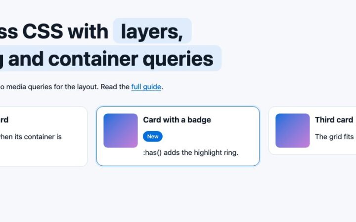
Twenty modern CSS habits that cut code and bugs: cascade layers, nesting, :has(), container queries, clamp() fluid type, logical properties and color-mix().
Twenty modern CSS habits that cut code and bugs: cascade layers, nesting, :has(), container queries, clamp() fluid type, logical properties and color-mix().
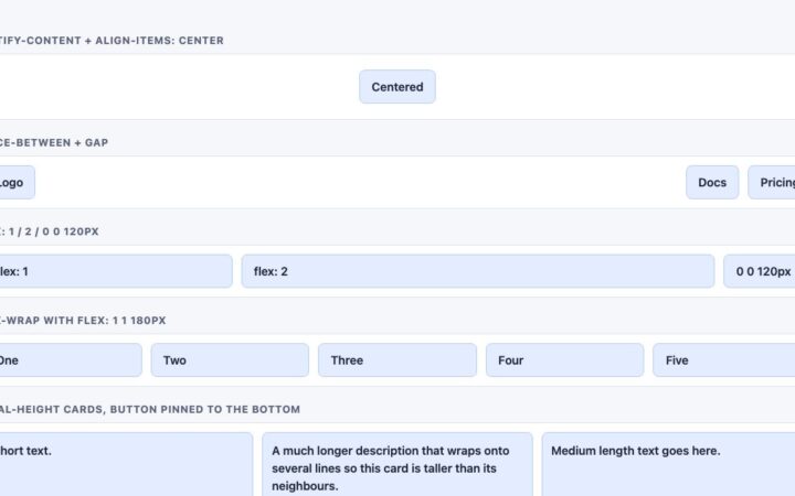
Flexbox comes down to five ideas: flow, alignment, gap, sizing and order. Learn each with tested code, and know when Grid or…
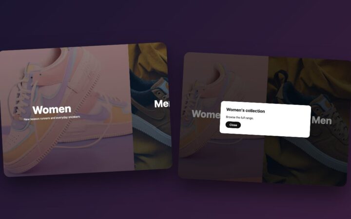
Rebuild the classic two-panel landing page with flexbox, :has() hover expansion and an animated native dialog, no jQuery or animation library needed.
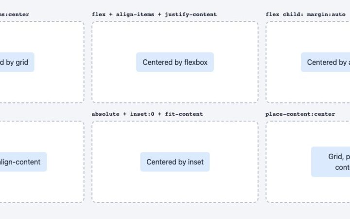
Vertical centering in CSS is a one-liner now. Compare grid, flexbox, auto margins, align-content and absolute positioning, and learn which to use…
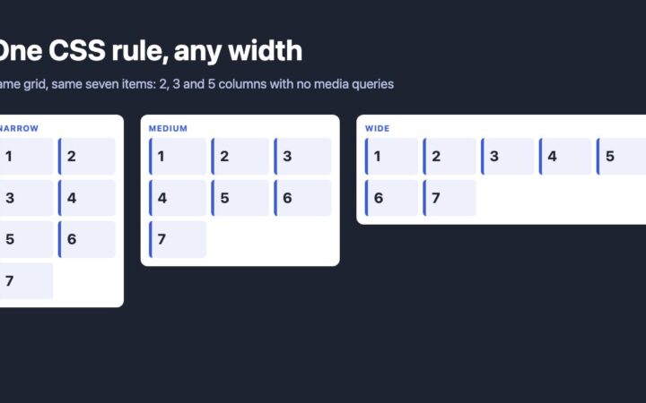
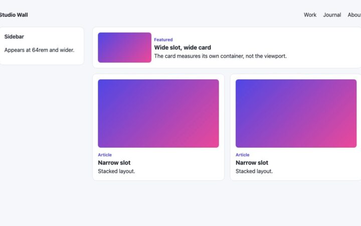
Replace float and nth-of-type column hacks with one CSS Grid rule, then use container queries and subgrid so columns respond to the…
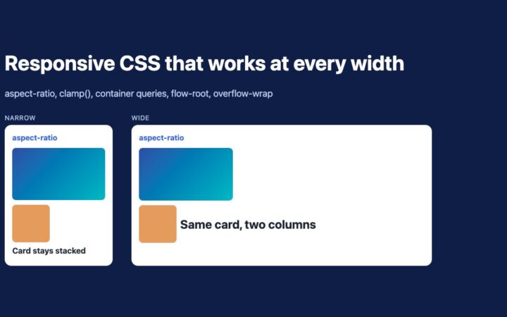
Replace padding hacks and IE fixes with aspect-ratio, clamp(), container queries, flow-root and overflow-wrap. Five tested techniques for responsive layouts.
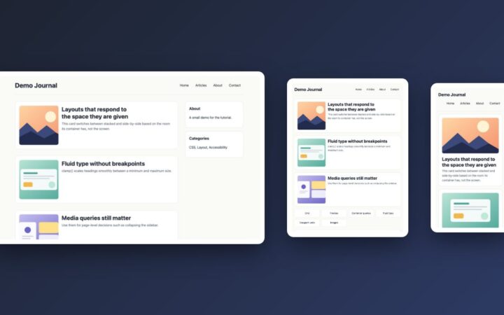
Build a fluid blog layout with CSS Grid, clamp(), range-syntax media queries and container queries, and learn when to use each one.
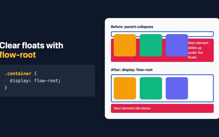
display: flow-root is the one-line, side-effect-free way to contain floats. See why overflow worked, where it fails, and when to use Flexbox…
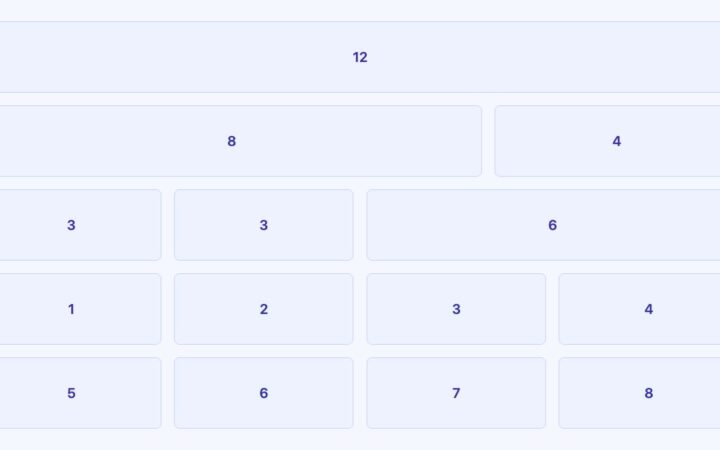
Skip the grid framework. Build a 12-column layout, a self-adjusting card grid and aligned cards with native CSS Grid, subgrid and container…
How to write CSS media queries today: range syntax, mobile-first rem breakpoints, container queries, dark mode and reduced motion, with a tested…
Slanted heroes, overlapping cards, text that wraps around circles and full-bleed bands: modern CSS techniques for layouts that escape the rectangle, with…
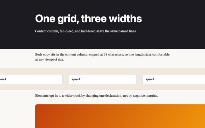
How to design grid and column layouts today: named lines for content widths, subgrid for aligned cards, and container queries for components…