5 Useful CSS Tricks for Responsive Design
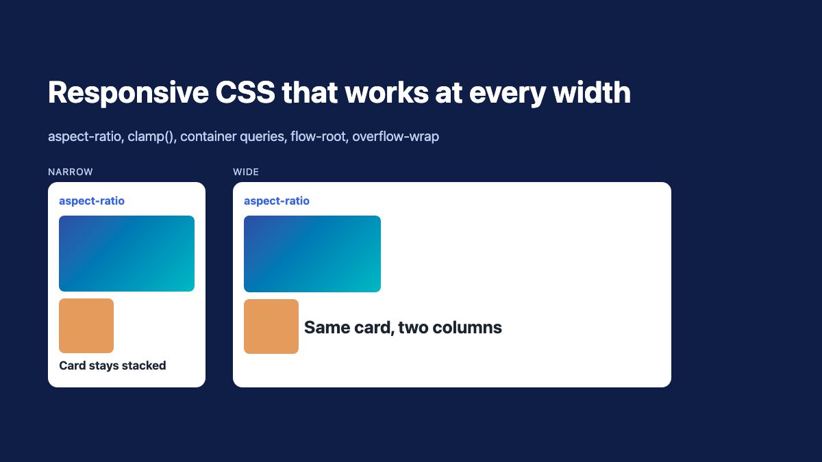
Five CSS features cover most responsive layout problems today. They are aspect-ratio, min(), max() and clamp(), container queries, display: flow-root and overflow-wrap: anywhere. Each one replaces a workaround from the early responsive era with a single, readable declaration.
The original version of this article relied on padding hacks, IE8 fixes and overflow: hidden. None of that is needed now. Every property below is Baseline, meaning it works in current Chrome, Edge, Firefox and Safari, except where noted. If you are new to the idea, start with Responsive Design in 3 Steps, then come back for the details that keep a layout balanced at every width.
1. Keep embeds and media in proportion with aspect-ratio
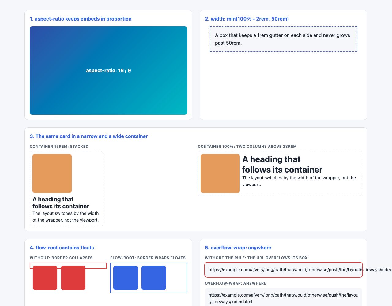
Responsive video used to need a wrapper element with padding-bottom: 56.25% and an absolutely positioned child, as covered in CSS: Elastic Videos. The aspect-ratio property makes the wrapper unnecessary. You give the element a width and a ratio, and the browser works out the height.
.video {
  width: 100%;
  aspect-ratio: 16 / 9;
}

iframe.video,
video.video {
  display: block;
  border: 0;
}
Put the class straight on the <iframe> or <video>. The ratio applies only when one dimension is automatic, so if you also set an explicit height, the ratio is ignored. aspect-ratio has been Baseline widely available since 2021.
Reserve space for images too
For images, put width and height attributes in the HTML. Browsers turn them into an aspect ratio before the file loads, which prevents layout shift. Then use the classic pair in your stylesheet:
img {
  max-width: 100%;
  height: auto;
}
This is still the right default. The old IE8 width: auto hack can go. For cropped thumbnails, combine aspect-ratio: 4 / 3 with object-fit: cover.
2. Size with min(), max() and clamp()
The old pattern was width: 800px; max-width: 90%. It works, but min() says the same thing in one value and lets you add safe gutters at the same time.
.container {
  width: min(100% - 2rem, 50rem);
  margin-inline: auto;
}
The container is at most 50rem wide, and on narrow screens it keeps a 1rem gutter on each side. No media query is involved. min-width still has its place, for example on a form field that should not shrink below a usable size:
input[type="text"],
input[type="email"] {
  width: 100%;
  min-width: 12rem;
}
Fluid type and spacing with clamp()
clamp(min, preferred, max) gives a value that scales between two limits. It is the modern answer to text that is too small on phones or too large on wide monitors.
h1 {
  font-size: clamp(1.75rem, 1.2rem + 2.5vw, 3rem);
}

section {
  padding-block: clamp(2rem, 6vw, 5rem);
}
Keep a rem term in the preferred value, as above. A pure vw value does not respond to the user’s browser zoom or font-size setting. For text, MDN’s clamp() accessibility note says the maximum should be a relative unit no less than twice the minimum, so text can scale to at least 200% when the page is zoomed. That maps to WCAG 1.4.4 Resize Text. clamp() has been Baseline widely available since 2020.
For choosing where layouts should change in the first place, see Setting Breakpoints in Responsive Design.
3. Use relative units, and size to the container
Relative values still beat fixed pixels, for the same reason as in 2012: spacing and type that scale together stay balanced. Use rem for global sizes, em for spacing that should follow a component’s own font size, and unitless line-height.
.button {
  font-size: 1rem;
  padding: 0.6em 1.2em;   /* grows with the button's text */
  border-radius: 0.4em;
}
The bigger change is that components can now respond to the space they are placed in, not just the viewport. A card in a narrow sidebar and the same card in a wide main column should not need different classes. Container queries solve this.
.card-wrap {
  container-type: inline-size;
}

.card {
  display: grid;
  gap: 0.75rem;
}

.card h3 {
  font-size: clamp(1.1rem, 0.8rem + 3cqi, 1.75rem);
}

@container (width > 28rem) {
  .card {
    grid-template-columns: 8rem 1fr;
  }
}
In the demo above, card 3 renders the same markup in a 15rem wrapper and a full-width wrapper: the narrow one stays stacked, the wide one switches to two columns. The element with container-type: inline-size becomes the reference. The @container rule switches the layout based on its width, and cqi is 1% of that container’s inline size. Size container queries have been Baseline since early 2023, so they are safe for production. One rule to remember: a container cannot style itself, only its descendants, so you need a wrapper.
This replaces the percentage-margin and percentage-padding tricks from the early days. For multi-column layouts that adapt without queries at all, see Responsive Column Layouts and combine them with grid-template-columns: repeat(auto-fit, minmax(min(100%, 16rem), 1fr)).
4. Contain floats with flow-root, and stop overflow at the source
Using overflow: hidden to clear floats, as described in CSS: Clearing Floats with Overflow, had a side effect: it clips anything that pokes outside the box, including shadows and focus rings. The purpose-built replacement is display: flow-root.
.media {
  display: flow-root;
}

.media img {
  float: left;
  margin-right: 1rem;
}
flow-root creates a new block formatting context, so the container grows to include its floated children and nothing is clipped. Floats are now mostly used for text wrapping around images; for layout, use flexbox or grid.
The flex and grid overflow trap
The modern version of “my layout overflows on mobile” is a flex or grid child that refuses to shrink because its automatic minimum size is its content width. Long code blocks and tables are common causes. The fix is one line:
.layout > * {
  min-width: 0;
}

pre,
.table-wrap {
  overflow-x: auto;
}
Let the wide element scroll inside its own box instead of stretching the whole page.
5. Wrap long strings with overflow-wrap: anywhere
Long URLs, email addresses and tokens break layouts. The old word-wrap: break-word from Word-Wrap: Force Text to Wrap is now an alias of overflow-wrap, which is the standard name. Use it on user-generated content:
.comment,
.card p {
  overflow-wrap: anywhere;
}
The difference between values matters inside flexible containers. With break-word, the browser still treats the whole unbroken word as the minimum content size, so a flex item can stay too wide. With anywhere, the possible break points count toward the minimum size, so the item can shrink. That makes anywhere the better default for cards and table cells.
Better line breaks for headings and paragraphs
Two newer properties improve the wrapping itself:
h1, h2, h3, blockquote {
  text-wrap: balance;
}

article p {
  text-wrap: pretty;
}
balance evens out line lengths in short blocks. Browsers limit it to a few lines (six in Chromium, ten in Firefox), which suits headings. pretty reduces orphans in body text at a small performance cost. balance is Baseline: Chrome 114, Firefox 121 and Safari 17.5 support it. pretty is not there yet everywhere. It works in Chromium (117) and Safari 26 but, at the time of writing, not in Firefox, so treat it as progressive enhancement. Browsers that do not understand a value simply ignore it and fall back to normal wrapping, so neither can break a layout. Check the text-wrap-style compatibility table before relying on it.
Test with container query units and a fallback
Container query units such as cqi only resolve against a container. If no ancestor has container-type, they fall back to the small viewport units, which can give surprising sizes. Give every component a wrapper, and add a plain rem declaration before the cqi one so the value is still sensible in a browser that drops the second line:
.card h3 {
  font-size: 1.25rem;                              /* fallback */
  font-size: clamp(1.1rem, 0.8rem + 3cqi, 1.75rem); /* container-aware */
}
To test, resize a wrapper rather than the window: set resize: horizontal; overflow: auto on .card-wrap in DevTools and drag its corner. The layout should flip at 28rem without any change to the viewport.
A runnable example for the flex trap
This is the smallest page that reproduces the overflow problem and the fix. Remove the min-width: 0 line and a long code line pushes the sidebar off screen; keep it and the code block scrolls inside its own column.
<div class="layout">
  <main>
    <pre><code>const url = "https://example.com/a/very/long/path/that/does/not/wrap/by/itself";</code></pre>
  </main>
  <aside>Sidebar</aside>
</div>

<style>
  .layout { display: flex; gap: 1rem; }
  main { flex: 1; min-width: 0; }   /* the fix */
  aside { flex: 0 0 12rem; }
  pre { overflow-x: auto; }
</style>
The reason is that a flex item defaults to min-width: auto, which means it cannot be narrower than its content. Setting it to 0 lets the item shrink, and overflow-x: auto on the code block gives the extra width somewhere to go.
Putting it together
A small base stylesheet using all five ideas gives you a layout that holds together from a 320px phone to a wide desktop:
*, *::before, *::after { box-sizing: border-box; }

img, video, iframe { max-width: 100%; height: auto; }
iframe { aspect-ratio: 16 / 9; width: 100%; border: 0; }

.container { width: min(100% - 2rem, 70rem); margin-inline: auto; }
h1 { font-size: clamp(1.75rem, 1.2rem + 2.5vw, 3rem); text-wrap: balance; }
p, li { overflow-wrap: anywhere; }
.media { display: flow-root; }
Test it by dragging the browser narrower and by zooming to 200%. If nothing scrolls sideways and the text stays readable, the layout is sound. For navigation, which is where most responsive layouts break first, see our responsive navbar snippet.
Quick reference
| Old trick | Use now |
|---|---|
| Padding-bottom video wrapper | aspect-ratio: 16 / 9 |
width: 800px; max-width: 90% |
width: min(100% - 2rem, 50rem) |
| Percentage margins and padding | rem, clamp(), container queries |
overflow: hidden to clear floats |
display: flow-root |
word-wrap: break-word |
overflow-wrap: anywhere |
The responsive image technique is fine for aesthetics but doesn’t take into account page performance, you wouldn’t want to load a full size image and then scale it down with CSS on a 3G connection or something similar as it would bog down page load time.
Your’re right, but there are a bunch of methods that try to sort it out. Take a look at this round up: https://css-tricks.com/on-responsive-images/
i kinda think of responsive design as a low level functionality of the site and serving scaled images as another layer, built on top of responsive design. Scaled images without responsive design doesn’t make much sense.
I should probably edit the heading to “Resizing Image” instead of responsive image.
Great post!
Im not to sure about the responsive images problem though that you mention.
This is what i use on my images. it keeps them from going wider than their initial size and when the screen size minimizes, they repond perfectly and shrink.
img {
height: auto;
max-height: 100%;
max-width: 100%;
width: auto;
}
(Tested on XP ie7, XP ie8, Win 7 ie8, ie9, and latest firefox, chrome, safari and opera)
I like the overflow: hidden trick – nice one!
Agreed Will! I use the same technique you posted here, and I’ve never had any problems. Not sure why you’d only want to target ie8 with ‘width: auto;’
Well done! I look forward to playing with these techniques!
I would call this “the ultimate responsive toolbox”! :-)
I already used your responsive video technique on blogs and it has been really useful!
And I didn’t know about the “overflow: hidden” technique, this is brilliant!
Thanks a lot!
You can make the font-size relative to the browser width/height. This is now available in Chrome Canary but it is very nice.
More information: https://css-tricks.com/viewport-sized-typography/
Great stuff here especially the Video trick you mentioned! Not many realize the importance of CSS that assist your users in getting a pleasant surfing experience. with the tricks mentioned above issues like resizing, panning, and scrolling are long gone! Thanks a lot and keep up the great work!
Excellent very essential css tricks, the example images you added makes the post very easy to know how it works.
This is a great article on responsive image techniques! Thanks for sharing!
Awesome! Thank you for hard work! Responsive and No Pasaran! :-)
I had surely forgotten about word-wrap. ¡Important! (especially with garish Georgia font on one of my client sites for seniors). Lots of long strings in a couple of my (client) sites. Installed yesterday. Thanks.
Thanks for grouping all these tricks in one post ;)
Duh, what hapen with my code:
screenSorry, you are indeed correct. There should be a \ 0 there as well
You did it again. This is a very useful post to all those new in responsive design making. I started my responsive theme design because of your posts. Clearly above the notch, you set the best benchmark in creating tutorials for newbies. Thanks!
word-wrap isn’t a thing any more.
.element { overflow-wrap: break-word; }From the css3-text-properties page, overflow-wrap:
@gene – that may be true but even the latest version of Chrome (19) does not support overflow-wrap, along with most legacy browsers.
Use word-wrap for Best Results (backward compatibility.)
Some great tips, thanks. I have a feeling some of these will be very useful if I ever get around to designing the responsive wordpress theme I have in mind. Bookmarked for future!
Really useful css tips. I always struggled getting a logo image to be fluid. I think i will get it working now, thanks for your tips.
What you are typing is just a media query. However, in the article @media screen was used as a css hack to target IE8
Very useful tips, thanks. max-width has proved very useful in the past, especially with a Content Management System website where the customer adds their own images.
Awesome article. For those interested in having responsive images or videos take a peek at the Responsive Grid framework we just released. It features a bunch of the things everyone is riffing on above.
This article goes into so much required detail to help in having a responsive design. Incorporating an example of a video was a very good idea. The print-screens and codes are very helpful in explaining the 5 tricks. As stated by other users here, grouping these 5 tricks is awesome, as it caters for all important issues in one article, not having to search bits and pieces from all around the web. I am not much into the coding part of designing themes, but this article has really encouraged me to continue learning about this and experiment in the future. Keep up the fantastic work as your site is really helpful and it deserves all the praise it can get.
Awesome work…hope to see more articles related to CSS…
Great Post! I’ve encountered some of those issues with CSS and iphones. Thanks!
Recently I have found this website. Greate idea!
Belanja rak surabaya, where place you find what you need for your minimarket
can anyone tell me why using -ive sign in CSS considered as bad SEO practices ?
i am using this number 4 trick but this is not helpful in updated version of google chrome above 21
Instead of using mobile plugin, I should re-design my site using responsive css design. Neverthough responsive css before ;) thanks for the tricks
Good CSS Tricks,It’s very helpful for me~
Thank you very much for this article, some neat tricks I didn’t yet know of. (such as the responsive image IE8 hack ;) )
Muchas Gracias
you’re tutorials are fantastic but I can’t help to wonder why no one really explains or shows a demo in using a css background image while using responsive design? At least I haven’t seen any. Basically I’m wondering if the img element was a css image rather than an html element, how would this work with responsive design? For designing purposes I use css backgrounds and wanted a quick insight on how this is done.
that was meant for Nick, not you Aydin. sorry.
Thanks, this is great information. Enhanching some responsive web projects with such simple css tricks, nice
very nice and advance blog, You blog provide useful tutorial about CSS. thanks for sharing this wonderful tutorial.
Regards,
website designing
these tricks are really helpfull and i am gonna use these tricks in my work. BTW thanks to webdesignerwall.com for this wonderfull post.
Perth website designer
Scott, about the link you posted => with a good reset CSS you don’t need to clear margins on a H2 and even write a post about it ;-)
Mark, Good idea thanks!
What the best way you advice to reset CSS ?
Detailed article, I learned new css, lun reading is done.
thank you much!
I was searching code for the embed re-sizing. I found it here. thanks dude :)
I had no idea about the word-wrap: break-word functionality!!! This saved me some grief, I kept having a bunch of headings that has links in them go off the page in mobile view which was becoming really frustrating and this saved me!
Woot woot for –
.break-word {
word-wrap: break-word;
}
Thanks for this wonderful write up :)
Great post ! Not often do you hear that something is supported in IE & not chrome. It’s too bad that there’s no pure CSS solution for this just yet that works in most browsers.
We’ve been in the field for about 3 years now and we cannot imaging webpages without CSS. CSS3 has lots and lots of great options and features to give wonderful look to your website.
Thanks for a great post.
nice website and thanks for supporting.i can follow this responsive code…
I am impressed with this writer’s content. This content is engaging, thought-provoking and motivational. There are many unique ideas shared in this article that I can relate to and understand….
I want to know more about the css tricks and the java script. For me to have a honor this opportunity, and makes me complete regarding this information,,For your help I am able to explore the important methods on how does css and java script will improve by applying on this design.
these stuff not enough because i want to know more about the css tricks For your help I am able to explore the important methods on how does css and java script will improve by applying on this design.
Good tips. I have a question about the responsive image IE8 hack. width: auto seems to work fine, EXCEPT NOT when the image is inside of a container, such as a div, with an already defined width. I can change the div width to auto and it will work, but it breaks the page layout. How to work around this? I have a layout with css/grids/divs and the div containers need to have defined widths. Any ideas? Thanks.
Great article. What I am curious about is, the main column on this website seems to have a fixed width, and it moves horizontally when resizing the window. How is this accomplished with a flexible grid?
How to center an item which is outside the post content.?
I just used your width:auto for IE issues and it worked perfectly. The images were being shrunk horizontally and now they appear normally. Very thankful for this as it would have taken me a long time to figure out. Appreciate your help.
I love the responsive css much more than having alternate, mobile themes. Having alternate themes or sites for mobile is a pain. Thanks for these tips.
Muchísimas gracias!!! gran tutorial y fácil de entender
Found it on here. Well thanks for ‘word-wrap: break-word;’. My mobile web will perfect. :)
Hello, just wanted to mention, I enjoyed this post. It was funny. Keep on posting!
I should quickly add:
The CSS also works on Ipad and PC screens but only if the image pixel width is smaller than the width of the sidebar.
If the image pixel width is bigger than the sidebar (bigger than 300px) the image blows out in full pixel size and drags the container with it, it seems.
Thanks a million for any help with this issue.
Since 2013, CSS has given us a few really cool properties to help with responsive design. One of them is object-fit, which will likely help you out – the real solution is to write @media queries to handle how your site looks and behaves at different screen sizes, which you can learn more about here. WordPress should also be handling your images in a responsive way, so your issue could be with the theme or widget you are using (try the “Image Widget” plugin which will handle your image responsively).
To add some custom CSS with object-fit, you add a class for the image like this:
.textwidget img{width: 100%; -webkit-object-fit: fill;}. Find out more about object-fit here..
LOVED IT. NEEDED MORE LIKE THIS. GRT DOING. PLZ SHARE MORE SUCH EASY AND USEFUL TRICKS ABOUT CSS.