Grid and Column Layouts with CSS Grid, Subgrid and Container Queries
A good grid and column design in 2027 is built with CSS Grid, not floats or a 960px framework: you define columns once on a parent, let items snap to named lines, and use subgrid so nested content aligns with the same tracks. Components then adapt to the space they are given with container queries instead of guessing from the viewport.
Grid thinking itself has not changed since the editorial sites and blogs of the 2000s. Print layout and the editorial blogs of that era all argued for the same thing: a consistent structure that makes pages feel ordered. What changed is that the browser now does the arithmetic. This guide shows the three techniques that matter, each with code you can paste.
What a grid is for
A grid is a set of agreed alignment lines. Headlines, images and captions that snap to the same lines read as one system, even when they are different sizes. That is why dense editorial pages stay readable, and why a personal blog with three well-chosen widths looks calmer than one with a dozen.
Before you write code, decide on three things:
- The widths you need. Most sites need only a reading column, a wide track for images and tables, and a full-bleed track for backgrounds.
- The gutter. One value, stored in a custom property, used for both column and row gaps.
- The column count for dense layouts. Twelve is popular because it divides into halves, thirds, quarters and sixths, but many sites do fine with automatic columns and no fixed count.
Named lines: one grid, three widths
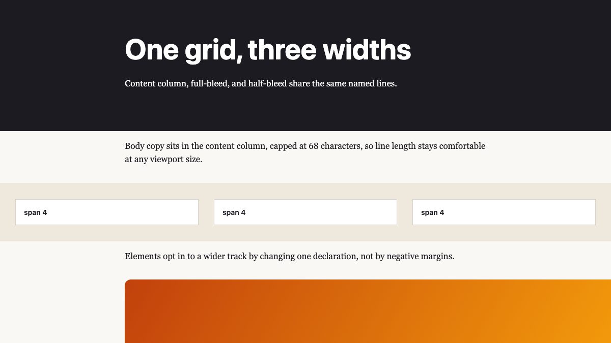
The most useful pattern for content sites replaces the old wrapper-div-plus-negative-margin trick. You create a single grid on the page, name its lines, and let each child choose how far to extend by changing one grid-column value. The MDN guide to named grid lines covers the syntax in depth.
.page {
  --gutter: clamp(1rem, 2.5vw, 2rem);
  display: grid;
  grid-template-columns:
    [full-start] minmax(var(--gutter), 1fr)
    [content-start] minmax(0, 68ch)
    [content-end] minmax(var(--gutter), 1fr) [full-end];
}

.page > * { grid-column: content; }          /* default: reading column */
.page > .wide { grid-column: full; }          /* edge to edge */
.page > .pull { grid-column: content-start / full-end; } /* half-bleed */
Naming a pair of lines content-start and content-end automatically creates an area called content, so grid-column: content works without extra declarations. The outer tracks flex with the viewport but never shrink below the gutter, which gives you side padding for free on small screens.
For a full-bleed element that needs its own inner layout, make it a grid with grid-template-columns: subgrid so its children can still land on the page’s named lines.
.hero {
  grid-column: full;
  display: grid;
  grid-template-columns: subgrid;  /* inherit full-start, content-start... */
  background: #1c1917;
  color: #fff;
}

.hero > * { grid-column: content; }  /* text stays on the reading column */
The background now runs edge to edge while the headline and paragraph still align with the body copy below.
Subgrid: align what lives inside cards
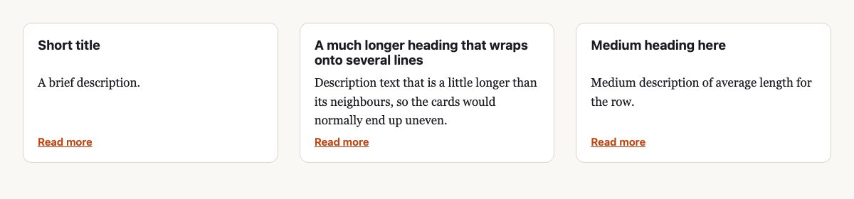
Cards with a heading, a paragraph and a link have always had one problem: each card sizes its own rows, so the headings and links drift out of line when the text lengths differ. Subgrid fixes this by letting a child adopt its parent’s row tracks.
.cards {
  display: grid;
  grid-template-columns: repeat(auto-fit, minmax(min(100%, 16rem), 1fr));
  gap: var(--gutter);
}

.card {
  display: grid;
  grid-row: span 3;                /* title, text, link */
  grid-template-rows: subgrid;     /* use the parent's row tracks */
  gap: 0.5rem;
}

.card a { align-self: end; }
Two details are worth remembering. The child must span the number of rows it needs, and the parent’s row-gap is inherited unless the child sets its own. The min(100%, 16rem) inside minmax() prevents horizontal overflow when the container is narrower than the minimum card width.
If you want to see more finished card and gallery grids, the Web Designer Wall snippet library has useful starting points such as the product card grid and the photo gallery layout.
Container queries: columns that respond to their slot
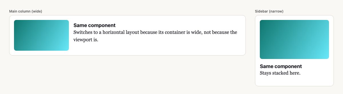
Media queries answer the question “how wide is the screen?” A component in a sidebar and the same component in a main column need different answers on the same screen. Container queries let the component ask about its own container.
.slot {
  container-type: inline-size;
  container-name: card;
}

.card { display: grid; gap: 1rem; }

@container card (min-width: 30rem) {
  .card { grid-template-columns: 12rem 1fr; align-items: center; }
}
The element you query must be an ancestor of the one you style, which is why the card sits inside a .slot wrapper. Using inline-size containment means the container’s width must not depend on its content, which is almost always true for grid or block children.
Two caveats. First, container-type: inline-size applies containment, so a container that relied on its children to set its width will collapse; give it a width from its parent, such as a grid track. Second, a container cannot query itself: the styles inside @container apply to descendants, so keep the wrapper and the component separate. Use container-type: size only when you also need height queries, because it requires you to size the container in both directions.
Container query units let sizes follow the slot as well. 1cqi is 1% of the container’s inline size, so type can scale with its slot rather than the screen:
.card h2 {
  font-size: clamp(1.125rem, 0.9rem + 2cqi, 1.75rem);
}

.card { padding: 4cqi; }
If no ancestor is a size container, these units fall back to viewport units, so the card still renders sensibly outside a slot.
Combine the two ideas: a page grid decides how wide each region is, and container queries let components inside those regions pick the right layout. You rarely need many breakpoints after that. If you are still working from older breakpoint habits, read Responsive Design with CSS3 Media Queries and Responsive Column Layouts for the background.
Browser support
All three features are Baseline widely available according to the web-features dataset behind MDN and web.dev. You can verify each row against caniuse for Grid, subgrid and container queries.
| Feature | Baseline | Supported since |
|---|---|---|
| CSS Grid | Widely available | Chrome 57, Firefox 52, Safari 10.1 |
| Subgrid | Widely available | Chrome 117, Firefox 71, Safari 16 |
| Size container queries | Widely available | Chrome 106, Firefox 110, Safari 16 |
Masonry-style layouts are a different story. The CSS feature for them, display: grid-lanes, is not Baseline. caniuse lists default support only in Safari 26.4 and later, with Chrome and Firefox behind flags. Treat it as progressive enhancement behind @supports and keep a normal grid as the fallback.
Accessibility and practical tips
- Keep DOM order meaningful. Grid lets you place items anywhere visually, but keyboard focus and screen readers follow source order. Do not reorder content in ways that make tabbing jump around.
- Cap line length. A reading column near 60 to 75 characters, set in
ch, is easier to read than a full-width paragraph. - Use
gap, not margins, for spacing between items, so you never get an extra margin at the edge. - Avoid fixed heights on grid items. Let content decide, and let subgrid align the results.
- Inspect with browser DevTools. Chrome, Firefox and Safari can overlay grid lines and show named lines, which is the fastest way to debug a layout.
If you still reach for one-dimensional layouts, flexbox remains the right tool for rows of items such as toolbars; our flexbox walkthrough covers it. A simple rule: use flexbox for content-driven flow along one axis, and grid when you need rows and columns to line up.
Where to see grids in the wild
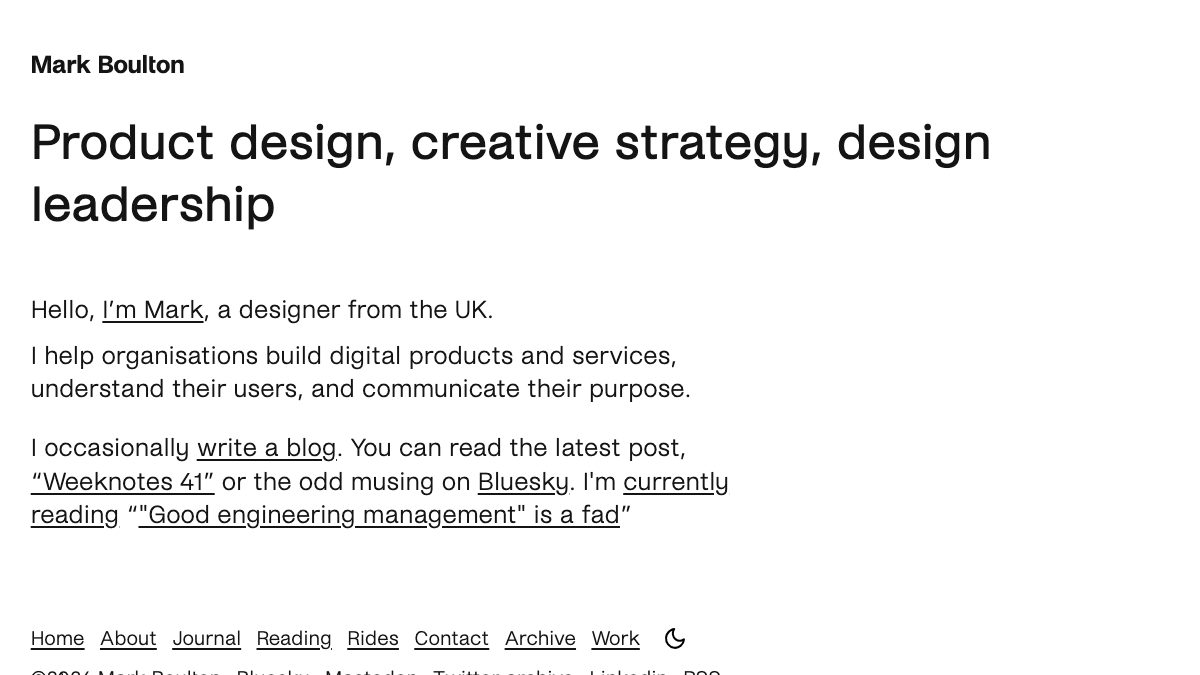
The original gallery on this page collected column-based sites: dense editorial fronts, blogs with a single reading column, and designs that break out of the box. You can still study all three on live sites. Mark Boulton’s own site, for example, pairs a large heading that spans most of the width with body text held to a narrow measure, which is the content and wide contrast from the named-line example above.
Open any news or magazine front page and switch on your browser’s grid overlay: you will usually find a few repeated column widths rather than a different layout per section. Those are the same ideas applied at larger scale.
For reference, bookmark MDN’s guides to subgrid and container queries.
I think newspapers only want to get as much text on one stie as they could.
This is going to be a big inspiration for a WordPress theme I’m brewing. Cheers!
Best list ever! Seems like you checked my bookmarks. just kiddin’ ;)
mmmmm, interesting, the old layout in a modern media,,,,mmmmm
Damn, Nick. How do you manage to do that? I’ve been looking for some inspirational multi-columnar layouts recently, and BAM, you’ve just posted a load. Nice one.
thanks for this grid collection.
the structure of the editorial site would be very helpfull for my next work ;-)
Thank you for this, I am always trying to compare grid and box structures for websites, gives a great overview.
Thanks!
A lot of sites use the grid for layout, but I dislike when they don’t hold the grid structure up into the header. The content body is nice and structured but the header falls apart and everything is just put where ever it will fit. Khoi over at subtraction.com does a really great job of keeping the grid structure through the header, and I believe it makes the site design. oh and BTW Jeff Croft redesigned his site a couple days ago.
Great Post.
Del.icio.us list! I always want to read something like this.
Very very nice. I’ve ween a post like this before. I’m starting to become a huge fan of grid layouts. It’s the way to go if you grow.
Great post and will be checking in regularly for ideas.
Thanks
A little off topic but how do you keep a track of all the different sites that you refer to in posts like this? Surely they are not something you just stumble across when you get an idea for an article – are they?
@Elton – In case you don’t know, I also run Best Web Gallery. So, a lot of bookmarks are collected from Best Web Gallery.
Nick
Sireh Dan Cengkeh have creative use of rotating picture script and change it with random quotes. cool
Columns are great, but so is whitespace. Too many columns or too little spacing between columns tends to confuse visitors rather than aiding in the flow of the page. Unless a page is animated, it should usually follow the same top-left to bottom-right layout used in print design.
For those who want to experiment in grid or column layouts, check out blueprintcss.
Great Post. Really good roundup of good uses of the grid. I like how you start conservative and then move to cases that break out of the grid in areas and use interesting backgrounds. Thanks.
Although I’m just starting to get the hang of implementing grids (I think), I have a good understanding of the power you gain from using them. I’ve seen many of the examples above before but will certainly check out the ones I’ve not seen. Some really interesting looking designs : )
Those are all very typical ways of applying a grid to a website. A grid can be (or at least should be) applied to any website or design. Columns can be filled with white space, and they be covered with excessive amounts of text (like you have shown above.) I don’t think this could have inspired anyone to think outside of the box and that’s a shame because grids are a really great way to start an excellent design.
Ahh, Grid designs give me the warm fuzzies. Learning how to structure designs around a grid was a pivotal experience in learning how to improve my designs. There’s a lot of lessons learned from grid alignment that transcend pure grid sites (and lets face it, the graphic designer part of all of us likes to break out from time to time!).
Thanks for taking all that time to compile example sites, it’s a great resource that I’m definitely bookmarking for the future.
Cheers
Hello! Thanks for the inspiration. I love the grids, and I’ve got lots more to learn about them.
Funny thing is. Me and my buddy started on this swedish xbox-community site back in 2006. We didnt think of grids when we got started with the design. The only thought was to have the desing kinda clean and organized. Now aftewards that i got around reading more on grid-design I’ve realized that the site actually very griddy indeed. Truly a happy kind of accident. :-)
check it out… http://www.xboxer.se.
Thanks for the feature, we don’t use grid layout as a form of trend, we use it as a form of information architecture. Very much so like NYTimes.com, Khoi Vinh I believe is the design director at NYTimes and would have much to say about the Web site.
Very neat stuff, everyone should be interested in. Thanks again
Useful article as always, I’m starting on a redesign for the website I run and need some magazine-y/grid inspiration!
thanks for showing me that not all grid based designs are in minimalistic/boring black-white colors and shapes
Great article…good examples of many different uses for these types of layouts. However, I was hoping you would mention and provide examples of GRAPHICS-INTENSE sites that utilize columns/grids as placeholders for organizing images (and corresponding content with added behavior). For example, sanslimbo.com uses a 4 column with header and footer grid to hold different images, each column styled with CSS , each with javascript controlling behavior of content.
Thank you for this great list about “Grid and Column Designs”.
I like this style extremly and some great websites to have in a list completly… thanks a lot.
Ralph
I like especially the “Subtraction” theme. Very good list thx alot.
I’m impressed by the way you gathered your info. The designs are great and it stirs up my creativity. Your article is very inspiring. Good work and thanks! :)
That helps a lot, I think I might use some of of these for idea’s!
really like the NY Times….I think they bring the traditional newspaper style to the web really well.
I’m not seeing a lot of ecommerce sites here that really stick to grid layouts. Does anyone have suggestions? I’m doing research.
Thanks
Very cool post. Grid design is a must when it comes to heavy content websites.
I really like the Substraction theme. Nice collection, thanks
Ungarbage is my fave from this list, some really nice work here. I love this site!
We are always looking for new ways to tackle column and grid design, thank you for sharing with us some of your findings.
Great tutorial, I’m a complete css novice but this was easy to follow and tweak to suit my needs. A quick question: should the -900% text ident interfere with positioning the menu on the page? I seem to have to rely on absolute positioning coordinates, for example to center the menu next to an image at the top of my page.
Thanks!
Best way to explain to a learner. It spelts out the minischule of details that has to be kept in consideration while designing Grids.
It makes you wonder how some people come up with the inspiration for these sites in the first place, let alone code some of them…
This is really helpful. There’s too many examples around to do with certain popular graphical styles, yet few people take the time to get the grid structure correct.
Thanking you once more.
This has made me think about re designing our site!
This site is interesting as well as informative. Enjoyed browsing through the site. Keep up the good work. Greetings..
most of those are pretty bad imo. also wtf is w/ the letter spacing in fields?
Great, Great, Great collection of Grid and Column designs. Definitely i shall follow your resources.
This has made me think about re designing our site!
Can you tell me how to control grid
Thx for the showcases of grid systems, it really helps me in future.
Great, Great, Great collection of Grid and Column designs. Definitely i shall follow your resources.
The designs showed here show what simple and tasteful design is all about. Another one to consider
Very nice collection of Grid and Column designs. We are planning a new blog, maybe we use such a style, too.
Simple clean layouts work for me…the clearer the better. Grids are perfect for this
Make a good impression – thanks for the work …
Very very great resource. Thank you fo r this great work Admin
I think this superb grid and colum design.
white iphone 4 available now. It is the best news today.
Recently i am looking fot the white iphone 4 conversion kit. If you have any recommendation, plz tell me. I will be very grateful!
Very useful tips for grid and column designs for a webpage. This is something what people want to learn and apply it in their web design and a great help to those who are new to web design field.
Los Angeles Web Design
Pokkadots.com is website dedicated to finding best and most affordable products you need for your baby – baby clothes, designer diaper bags, baby related bedding and furniture.
Recently i am looking fot the white iphone 4 conversion kit. If you have any recommendation, plz tell me. I will be very grateful!
Splendid work. Thank you so much for this post. Interesting content.
Colour effects are perfect and love the combination here..please keep sharing more from you man. I will show this to our expert team of Web Designer in London & yes thanks for that hard work.
Another questionnaire, the participants’ problem identification and structuring, idea generation, problem elaboration and clarification, such as creativity, problem solving insertion sezkin idea which one’s preferred styles are evaluated. While participants preferred the style of non-disclosure and intellectual development of ADHD, with ADHD, participants chose to produce ideas.
This is something what people want to learn and apply it in their web design and a great help to those who are new to web design field.i appreciate your beautiful article from my deep heart!
This is something what people want to learn and apply it in their web design…
Grid and Column Designs – Love it.Thanks for the share.
Thanks for sharing and keep up the good work. That is a great article.
I am not sure whether it is possible or not but It would be interesting to present source codes for effects on facebook pages.
An annoying trend, as of late, is the digression of intellectual debate turning into playground level insults. There are people out there who have not grasped the concept.
Interesting designs…we’ve just redesigned our website and it would have definitely helped being able to see the types and make a selection from those.
Interesting designs…we’ve just redesigned our website and it would have definitely helped
It’s interesting how designs are changing to reflect the new social phenomenon. Hard corporate design is giving way to a more casual almost friendly blog type style. The question is, does this have a measurable effect on the businesses concerned?
I never understand why newspaper websites have to be so packed with columns, boxes, and lines. It is so hard to focus to read on something.
They never understand the web. It is so destined to fail. I rather read then in feed reader due to the lousy packed design.
It’s interesting how designs are changing to reflect the new social phenomenon. Hard corporate design is giving way to a more casual almost friendly blog type style.