Responsive Column Layouts with CSS Grid and Container Queries
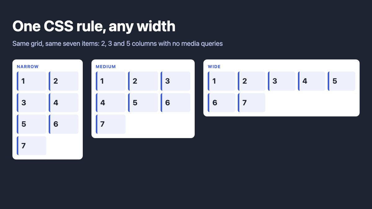
The modern way to build responsive columns is CSS Grid with repeat(auto-fit, minmax(…)). It makes the browser choose the column count from the space available, with no media queries, no .first or .last classes and no nth-of-type resets. When columns should follow a component’s width instead of the screen, add a container query.
The original version of this tutorial floated percentage-width boxes and used :nth-of-type(4n+1) to clear the left margin on every row, then rewrote those rules at three breakpoints. That worked in 2012. Today it is about forty lines of CSS you no longer need.
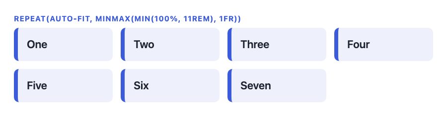
The one-rule responsive grid
This is the whole technique:
.grid {
  display: grid;
  grid-template-columns: repeat(auto-fit, minmax(min(100%, 11rem), 1fr));
  gap: 1rem;
}
Read it from the inside out:
minmax(11rem, 1fr)says each column is at least 11rem wide and may grow to share leftover space equally.repeat(auto-fit, …)creates as many such columns as fit in the container. Per MDN,auto-fitcollapses empty tracks to zero after items are placed, so a single row with only a few items stretches to fill the width.auto-fillkeeps the empty tracks, which leaves those items at their minimum width with blank space after them. The two keywords only differ when there are fewer items than fit in one row. A wrapped last row keeps the column width with either keyword, because the tracks are shared by every row.min(100%, 11rem)is a safety net. Without it, a container narrower than 11rem would overflow. With it, the column simply becomes one full-width track.gapreplaces the margin arithmetic. Spacing exists only between tracks, so there is nothing to reset on the first item of a row.
The markup stays flat:
<div class="grid">
  <article class="col">…</article>
  <article class="col">…</article>
  <article class="col">…</article>
</div>
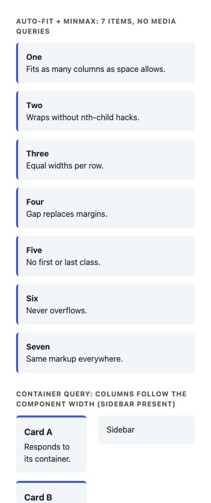
Resize the window and the grid moves from six columns to five, four, and eventually one, with every item equal in width. On a narrow phone the same rule gives a single column:
Fixed column counts when you want them
The old demo switched between four, three and two columns at specific widths. Auto-fit gives you fluid counts, which is usually better, but sometimes a design needs exactly four columns on wide screens. Use a custom property and one media query:
.grid {
  display: grid;
  grid-template-columns: repeat(var(--cols, 1), 1fr);
  gap: 1rem;
}
@media (width >= 40rem) { .grid { --cols: 2; } }
@media (width >= 64rem) { .grid { --cols: 4; } }
Range syntax such as width >= 40rem is part of Media Queries Level 4 and reads more clearly than min-width. Use rem rather than pixels, so the layout respects a reader’s default font size.
Columns that follow the component, not the viewport
Media queries measure the screen. A card list placed in a wide main area on one page and a narrow sidebar on another needs to measure its own space. That is what container queries are for. Mark the parent as a query container and write rules against it:
.main {
  container-type: inline-size;
  container-name: cards;
}
.cards {
  display: grid;
  gap: 1rem;
}
@container cards (width >= 30rem) {
  .cards { grid-template-columns: repeat(2, 1fr); }
}
@container cards (width >= 48rem) {
  .cards { grid-template-columns: repeat(3, 1fr); }
}
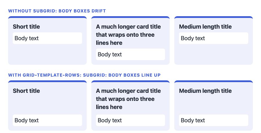
container-type: inline-size applies inline-size containment, so the container’s width can no longer depend on its children. The query target therefore has to be an ancestor of the element you style, which is why the rule sits on .main and the grid is inside it. Container query units such as cqi (1% of the container’s inline size) let type scale with the component too. In the screenshot below, the card titles use this rule, so they grow with the container:
.card h3 { font-size: calc(1rem + 1cqi); }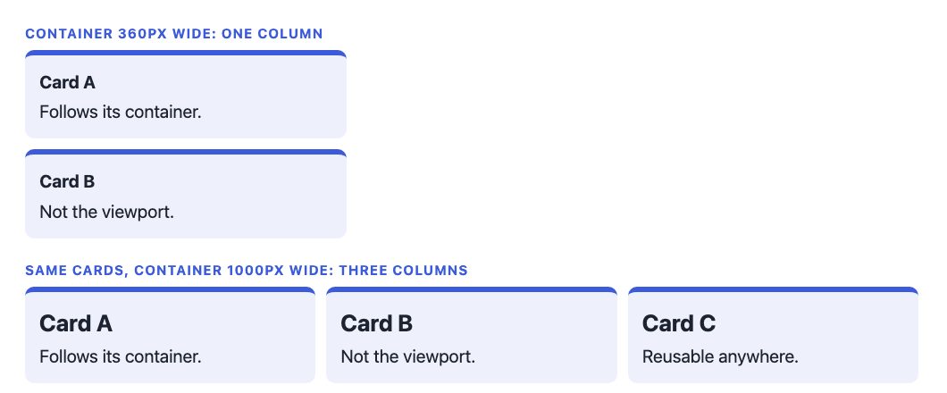
Container size queries are Baseline Widely available, and so are CSS Grid and flexbox, according to the Web Platform Status data, so you can ship them without a fallback.
Aligning content across cards with subgrid
Equal-width columns are only half the problem. If card titles wrap onto two lines in one card and one line in the next, the body text drifts out of line. Subgrid lets each card borrow row tracks from the parent:
.cards { display: grid; grid-template-columns: repeat(auto-fit, minmax(min(100%, 16rem), 1fr)); gap: 1rem; }
.card {
  display: grid;
  grid-row: span 2;
  grid-template-rows: subgrid;
  gap: 0;
}
Each card has two children, a heading and a body, and they now line up across the row, as the second row of the screenshot shows. Subgrid is Baseline Widely available.
Grid or flexbox for columns?
| Need | Use |
|---|---|
| Equal columns that wrap into rows | Grid with auto-fit |
| Items of different widths that wrap naturally, such as tags or buttons | Flexbox with flex-wrap |
| A single short row should not stretch to fill the width | Grid with auto-fill |
| Content aligned across cards | Grid with subgrid |
| One axis only, such as a toolbar | Flexbox |
Flexbox decides widths per item, so a half-empty last row stretches or misaligns. Grid decides widths per track, which is why it suits column layouts. When you want items to wrap and grow without a grid, Flexbox with gap and flex: 1 1 11rem is a fair alternative, but the last row will stretch its items, so choose it only when that is acceptable. For running text split into columns, as in a newspaper, use CSS multi-column layout with column-width: 18rem instead of grid. If flexbox is new to you, read Master CSS Flexbox in 5 Simple Steps.
Migrating a float grid
- Delete the
float, percentage widths,clearand every.first/.lastornth-of-typerule. - Set
display: gridon the parent and replace margins withgap. - Choose
auto-fitwith a minimum width, or a--colsvariable for fixed counts. - Remove the width overrides in media queries. Keep only the queries that change
--cols. - Replace viewport queries with container queries wherever the component is reused in different-width slots.
The old IE8 polyfills (selectivizr and respond.js) have no place here. Grid is supported by every current browser.
Common mistakes
- Using
auto-fitwith a tiny minimum. A 5rem minimum gives you a dozen cramped columns on a desktop. Pick the narrowest width at which your content still reads well. - Forgetting
min(100%, …). A plainminmax(16rem, 1fr)overflows any container narrower than 16rem, which happens in sidebars and on small phones. - Querying the element you style. A container cannot respond to a query about itself. Put
container-typeon the wrapper and style the children. - Mixing percentage widths into grid items. Let the tracks size the items. Set
widthon a grid item only when you have a specific reason.
Accessibility notes
- Grid changes visual order only if you tell it to. Avoid
orderand explicit placement that disagree with the DOM, because keyboard focus follows the source order. - Use a sensible minimum column width. A column narrower than a comfortable line length forces text to wrap awkwardly, and the content has to survive 200% zoom, where the grid will drop columns on its own.
- Do not set fixed heights on cards. Let text wrap when users enlarge it.
Where to go next
For breakpoint decisions in the layouts that still need them, see Responsive Design with CSS3 Media Queries. For more small responsive patterns, 5 Useful CSS Tricks for Responsive Design is a good companion. If you want ready-made grids to adapt, our product card grid and photo gallery snippets show the card patterns in Bootstrap 5.
How about css3-mediaqueries.js instead of respond.js? It should work well with selectivizr.js
Thanks for sharing. Responsive columns work very well in Themify Themes so it’s great to learn how it’s done.
Simply set a left margin on all columns and then reset it on the first element of every column (xn + 1); combine it with a clear: left.
Also, if you define media queries with a min-width and max-width, there’s no need to ‘reset’ any selectors using the !important rule (which should always only be a last resort).
Just my 2¢.
Nice article. Been messing around with various options myself for some time now.
A better backwards compatible solution with inline-block usage:
Setting a negative margin on the parent container is better supported than nth-child selector.
In my example I chose to not support mediaqueries for older IE’s, of course this could be easily added.
This is indeed very nice, but you still need nth-of-type() to clear the float for situation like this:
ps. It doesn’t work on FF.
Hi Nick,
What do you mean with “you still need nth-of-type() to clear”? You can change the vertical-align to top to let the items align like floated block elements would, except they remain in the row they’re in (a good thing!).
Which version of FF are you using? I’m using it as well and works fine here :\ I thought I checked all major browser for compatibility.
Example updated.
Tested it on Mac FF 16 & 17. Result is:
Very handy technique… Good idea to post it ;)
Thanks for this Article, nice technique.
IE8 sucks :|
Thanks for this helpful post on responsive layouts. I’m studying this now for my second WP Theme.
A plus for examples which can be visited with a banal click. I like how the blog confers the best suggestions on anything
Not an ideal solution because it requires left and right margin which causing the left and right empty space.
Phwoar. This appeals to my nerd sensibilities. Thanks for sharing. Shame as always about the problem of IE, but seems like an acceptable solution.
Great tutorial!
Would removing all gutters be as a simple as changing margin-left: 3.2% to 0% and adjusting col widths accordingly? Thanks
Pretty awesome, you can also use inline-block; for reflowing grids rather than floats.
The most obvious way a responsive design changes is in its layout.