Layout
CSS Media Queries: Responsive Layouts with Modern Syntax
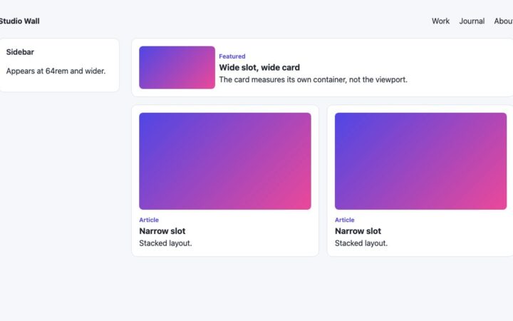
How to write CSS media queries today: range syntax, mobile-first rem breakpoints, container queries, dark mode and reduced motion, with a tested…
Topic
Grid, Flexbox, container queries and responsive layouts that hold up on every screen.
How to write CSS media queries today: range syntax, mobile-first rem breakpoints, container queries, dark mode and reduced motion, with a tested…
Use background-size: cover, svh heights, focal points and matched edge colours to build large website backgrounds that never show seams, crop badly…