Layout
CSS Fix for the Mobile Viewport Height (vh) Bug
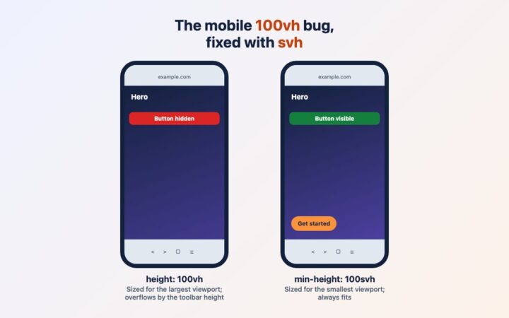
On phones, 100vh is taller than the visible screen because of the browser toolbar. Replace it with svh, dvh or lvh, add…
Topic
Grid, Flexbox, container queries and responsive layouts that hold up on every screen.
On phones, 100vh is taller than the visible screen because of the browser toolbar. Replace it with svh, dvh or lvh, add…
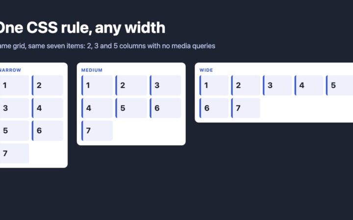
Replace float and nth-of-type column hacks with one CSS Grid rule, then use container queries and subgrid so columns respond to the…
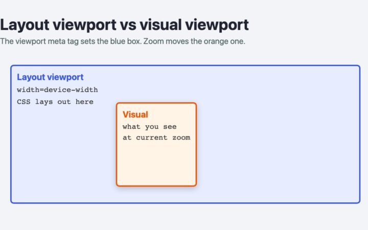
Learn what each viewport meta value does, how to fit a fixed-width page on phones, why you should never disable zoom, and…
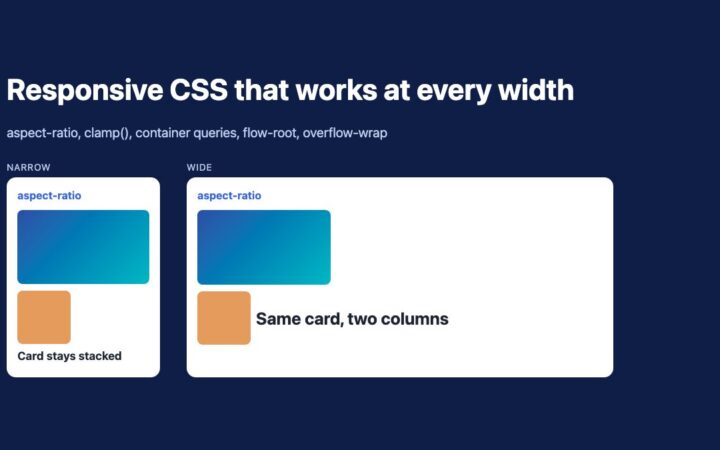
Replace padding hacks and IE fixes with aspect-ratio, clamp(), container queries, flow-root and overflow-wrap. Five tested techniques for responsive layouts.
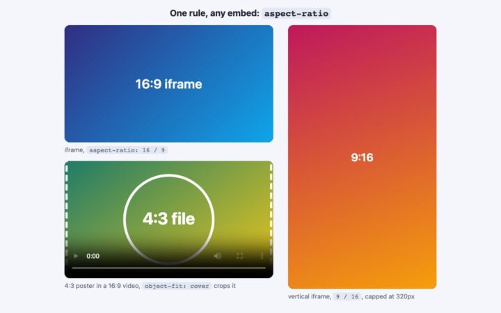
Make iframe videos elastic with a single line of CSS. Replace the old padding hack with aspect-ratio, and handle vertical video, native…
Build a fluid blog layout with CSS Grid, clamp(), range-syntax media queries and container queries, and learn when to use each one.