CSS Fix for the Mobile Viewport Height (vh) Bug
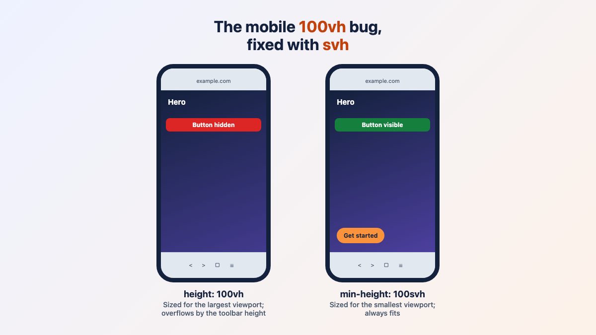
On a phone, height: 100vh is often taller than the part of the page you can actually see. The bottom of your hero, including its button, hides behind the browser toolbar until the visitor scrolls. The modern CSS fix is to stop using plain vh for full-screen sections and use svh, lvh or dvh instead.
For most layouts the answer is one line: min-height: 100svh, with 100vh declared before it as a fallback. The rest of this article explains why that works and when dvh is the better pick.
Why 100vh breaks on mobile browsers
Mobile browsers show an address bar and toolbars that slide away as you scroll. Browsers decided that layout should not jump every time that happens, so classic vh is defined against the largest viewport: the one you get when the toolbars are hidden. MDN notes that plain vh is equivalent to lvh. On first load the toolbars are visible, so a 100vh element overflows the visible area by the toolbar height.
In 2015 the same symptom appeared in iOS 7 and the fix was a pile of media queries that hard-coded pixel heights for each iPhone and iPad. That approach cannot work today: there are too many device sizes, and the toolbar height changes between browsers and OS versions. You need units that describe the browser state instead.
The three new viewport units
CSS Values and Units Level 4 adds three families of viewport-relative units, each in height, width, inline and block flavours (svh, svw, svi, svb, and so on).
svh, the small viewport- Toolbars expanded. Stable while scrolling. Best for heroes and full-screen sections that must never be clipped.
lvh, the large viewport- Toolbars retracted. Stable while scrolling. Best for backgrounds and decorative layers that may extend under the toolbar.
dvh, the dynamic viewport- Follows the toolbars as they move, so it changes while scrolling. Best for overlays, app shells, modals and drawers that should fill the visible screen exactly.
With svh the section fits when the toolbars are showing. When they retract you get a little extra space below, which is usually invisible against a background. With dvh the box always fits exactly, but MDN warns the value is not stable and resizing during scroll can hurt the UI and performance. That trade-off decides which one you use.
The fix: svh with a fallback
Declare the old unit first, then the new one. A browser that does not understand svh drops the second declaration and keeps the first.
.hero {
  min-height: 100vh;   /* fallback for browsers without small viewport units */
  min-height: 100svh;  /* fits the screen with toolbars showing */
  display: grid;
  grid-template-rows: auto 1fr auto;
  padding: 1.5rem;
}
Use min-height rather than height. If the content is taller than the screen, for instance in landscape or with a large text size, the section grows instead of clipping text.
Desktop browsers have no collapsing toolbar, so every unit computes to the same height there. The difference only appears on real phones, so test on a device or in your browser’s remote debugging, not only with responsive mode.
When to use dvh instead
Pick dvh when an element is fixed to the screen and must always match the visible area: a mobile menu overlay, a bottom sheet, a chat panel or an app-style layout where a footer bar stays at the bottom.
.menu-overlay {
  position: fixed;
  inset: 0;
  height: 100vh;
  height: 100dvh;
  overflow-y: auto;
}
Because these elements are taken out of the page flow, resizing them while the toolbar moves should not push the surrounding content around, although the overlay itself is still re-laid out. Avoid dvh on large sections with lots of content: every toolbar movement can trigger layout and make the page feel jittery. For those, stay with svh.
Sticky bottom bars
The most common real-world version of this bug is a call-to-action or footer bar pinned to the bottom of the screen. If it lives inside a 100vh container, the toolbar covers it on first load. Make the container min-height: 100svh when the bar is part of a page section, or use 100dvh on a fixed app shell so the bar always sits on the visible bottom edge. A position: fixed; bottom: 0 bar needs no viewport unit at all, because it is positioned against the visible viewport.
This is also why the bug is so persistent on iPhones: Safari on iOS sizes 100vh to the largest viewport, with the toolbars retracted, rather than to what you see on load. Open the page on a phone and scroll to watch the toolbars move; the diagram above shows the starting state.
Keep the hero from being too tall or too short
A full-screen hero on a tall tablet or a short landscape phone looks bad. Combine the unit with clamp() so the height has sensible limits.
.hero {
  min-height: clamp(28rem, 100svh, 60rem);
}
On a phone in landscape the 28rem floor keeps the heading and button from being squeezed, and the page simply scrolls. On a huge monitor the 60rem ceiling stops the hero from becoming a wall.
Virtual keyboards and interactive-widget
The on-screen keyboard is a separate case. By default it does not change the size of vh, svh, lvh or dvh: dvh tracks the browser toolbars, not the keyboard, as web.dev explains. The viewport meta tag has an interactive-widget key that changes how the keyboard behaves. Its values, per MDN, are:
resizes-visual(default): the keyboard shrinks the visual viewport only; your layout does not change.resizes-content: the layout viewport shrinks, so viewport units such asvhrecompute.overlays-content: neither viewport changes and the keyboard covers the page.
<meta name="viewport" content="width=device-width, initial-scale=1, interactive-widget=resizes-content">Use resizes-content for chat or form screens where an input is pinned to the bottom and must stay above the keyboard. Support is limited: the MDN compatibility data lists Chrome on Android from version 108 and Firefox on Android from version 133, but no support in Safari on iOS or macOS, where the key is ignored. Treat it as an enhancement, and keep the default for ordinary content pages.
Browser support
The small, large and dynamic viewport units are Baseline widely available. They became newly available across browsers in December 2022, with Safari 15.4, Firefox 101 and Chrome and Edge 108, and caniuse shows global support around 96 percent. Browsers that lack them ignore the second declaration and use your 100vh fallback.
Notches and safe areas
On phones with a notch or rounded corners, add viewport-fit=cover only if you want your design to extend under those areas, and then pad important content with env(safe-area-inset-*). MDN recommends using the inset variables with cover so nothing important is cut off.
.hero {
  padding-block: max(1.5rem, env(safe-area-inset-top)) max(1.5rem, env(safe-area-inset-bottom));
}
Do you still need a JavaScript fallback?
Not for new projects. The old workaround was to measure window.innerHeight and write it into a custom property such as --vh, then use calc(var(--vh) * 100). It needed a resize listener, flashed the wrong height before the script ran, and fought with the browser. Small, large and dynamic units replace it, and the 100vh line before them covers anything older.
Quick checklist
- Replace full-screen
height: 100vhon sections with thesvhpair from above. - Use
100dvhfor fixed overlays, drawers and app shells. - Use
lvhfor decorative backgrounds that may sit under the toolbar. - Wrap the value in
clamp()to avoid extremes. - Test on a real phone with the toolbar both visible and hidden.
Keep going
Full-height sections are usually part of a larger responsive layout. Our guides to useful CSS tricks for responsive design, vertical centering and setting breakpoints cover the next steps. For ready-made headers to drop your full-height hero into, see the hero header with search bar and the full screen navigation menu, a good candidate for 100dvh. If you are working on mobile menus too, read Mobile Navigation Design & Tutorial.
Thanks! This one is a nice and handy fix. Obviously, it will work on all iOS devices because it is CSS based… But if anyone relies more on JavaScript for this, will it pose any unseen disadvantages?
Thanx for sharing such a content. Bug is really a big problem. The most important part in it is any programmer can use this code.
I was just looking similar to this problem..thank you
Will it work on other IOS’s too? Say older IOS versions?
Thanks for this fix. We’ve been having issues with CSS in older Apple iPhone and iPad models e.g. iPad 2 when designing sites so we are always on the look out for articles like this.
On a iphone 5 on portrait mode I pass in this MQ :
@media only screen and (min-device-width: 320px) and (max-device-height: 568px) and (orientation : portrait) and (-webkit-device-pixel-ratio: 2) {
.fullheight {
height: 568px;
}
}
then override by :
@media only screen and (min-device-width : 320px) and (max-device-width : 480px) and (orientation : portrait) and (-webkit-min-device-pixel-ratio : 2) {
.fullheight {
height: 480px;
}
}
Thanks!
This one is a nice and handy fix. Obviously, it will work on all iOS devices.
thank you very much, I’m having this problem, I’ll use it to our website
The CSS fix for such a bug may come as a major relief for Apple owners who are still running their device on iOS 7. The new iPhone model will be optimized to iOS 9, which renders this bug invalid, since the solution will already be integrated into the operating system. However, older users often seem to be bogged down by the pace of innovation, since this bug can be persistent in older versions. The CSS fix will not only eliminate this bug for older devices, it is a simple and straightforward process that can be done by anyone by closely following the steps in the tutorial.
Great CSS fix to all device size (ios) and very easy to learn. Thanks a ton for sharing.
Thanks! This one is a nice and handy fix
Thanks for this. I’ve added iPhone 6/6s/7, iPhone 6 plus/6s plus/7 plus, and iPad Pro to mine: https://gist.github.com/uxjw/f5b833eaede49ad203bce6ed653d027e
Awesome, thanks for sharing your gist!
I’ve had a problem with the Ipad Pro mediaquery, the fixed height was overwriting the “100vh” for smaller desktop screens. I found a method to isolate the media query for the Ipad Pro. Anyone with the same problem should take a look. https://gist.github.com/zenolahaye/aed0ac3fc3c8c5dc934c79004a6d782c
Ive had a problem with the Ipad Pro mediaquery, the fixed height was overwriting the 100vh for smaller desktop screens. I found a method to isolate the media query for the Ipad Pro. Anyone with the same problem should take a look