CSS Vertical Centering: Grid, Flexbox and align-content
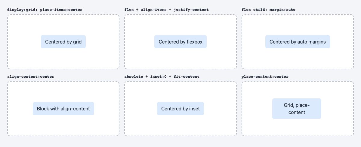
To center something vertically in CSS today, make its parent a grid container and add place-items: center. That one line centers a child on both axes, whatever its size, with no hard-coded heights, no transforms and no hacks. If you only need one element centered inside a flex row, margin: auto on the child does the same job.
The old tricks (table-cell, negative margins, line-height, top: 50% plus translateY(-50%)) were all workarounds for CSS having no real alignment system. It has one now. Below are the six methods that matter, when each is the right pick, and the traps that still catch people.
Quick answer: which method to use
| Situation | Use |
|---|---|
| Center one thing in a box | display: grid; place-items: center |
| Center in a row of items (navbar, button with icon) | Flexbox with align-items: center |
| One child among several flex items | margin: auto or margin-block: auto on that child |
| Several children centered together as a group | display: grid; place-content: center |
| Plain block with text, no layout mode needed | align-content: center |
| Overlay, badge or modal that leaves the flow | position: absolute; inset: 0; margin: auto with a fit-content size |
The shared setup
Every example uses the same markup: a container with a height, and one child. The height matters. A box that is exactly as tall as its content has no spare space, so there is nothing to center in.
<div class="box">
  <p>Centered text</p>
</div>
.box {
min-height: 12rem; /* or 100dvh for a full-screen section */
}
.box p {
margin: 0; /* default paragraph margins skew the result */
}Prefer min-height to height. When the text wraps on a narrow screen the box grows instead of overflowing. For full-screen sections, use 100dvh rather than 100vh; dvh tracks the mobile browser toolbar as it shows and hides. It is Baseline 2022 (Chrome 108, Safari 15.4, Firefox 101), so it is safe in current browsers; because the value changes as the toolbar moves, avoid it on elements that should not resize while the user scrolls.
1. Grid: place-items
.box {
  display: grid;
  place-items: center;
}
place-items is shorthand for align-items and justify-items. In a grid with one implicit cell, the child is centered on both axes. This is the shortest correct answer and works for any content: text, images, cards, forms.
If you have several children and want them stacked and centered together as a group, use place-content: center instead. It centers the grid tracks themselves, so the children stay packed together instead of spreading across the box.
2. Flexbox: align-items and justify-content
.box {
  display: flex;
  align-items: center;      /* cross axis: vertical in a row */
  justify-content: center;  /* main axis: horizontal in a row */
}
Flexbox is the right tool when the centered thing is part of a row or column of siblings, such as an icon next to a label, or nav links in a header. The mental model: justify-content works along the main axis, align-items across it. If you set flex-direction: column the two swap roles, which is the most common source of confusion. Our Master CSS Flexbox in 5 Simple Steps walks through that model in detail.
3. Auto margins in a flex container
.box { display: flex; }
.box p { margin: auto; }
In a flex or grid container, auto margins absorb all free space on their axis. Setting margin: auto on the child centers it both ways, and margin-inline-start: auto pushes it to the end, the classic way to float a logout button to the right of a navbar. It is also the cleanest option when you want to center a single item without touching how the other items align.
4. align-content on a normal block
.box {
  min-height: 12rem;
  align-content: center;
}
This is the newest option, and the one people miss. align-content now works on ordinary block containers, so you can center the contents without switching the box to flex or grid. Inline text still flows as usual. One side effect to know: any value other than normal makes the block establish an independent formatting context, so child margins won’t collapse out of the box, and the element also contains floats. It is Baseline 2024 (Chrome 123, Firefox 125, Safari 17.4), so check your audience’s browser floor before using it without a fallback. In block layout the positional values (start, center, end) are the useful ones; the distribution values (space-between, space-around, space-evenly, stretch) have no effect because the whole content is a single alignment subject.
5. Absolute positioning with inset
.box { position: relative; }
.box p {
  position: absolute;
  inset: 0;
  margin: auto;
  width: fit-content;
  height: fit-content;
}
Use this only when the element should leave the normal flow, such as a play button over a video, a badge on an image, or a custom dialog. The key is the explicit size. An absolutely positioned box with inset: 0 and margin: auto only centers if it has a width and height that are smaller than the container. fit-content gives it that size from its own content. Because the box leaves the flow, the parent will not grow to fit it, so do not use this for ordinary text blocks.
What not to use anymore
- top: 50% plus translateY(-50%). It still works, but it can blur text on non-integer pixel positions and needs two declarations plus positioning. Grid replaces it.
- display: table-cell with vertical-align: middle. A workaround from the IE era. It breaks margins and makes responsive layouts awkward.
- line-height equal to height. Only works for a single line of text and breaks the moment the text wraps.
- Negative margins from a known height. Requires fixed dimensions, which content rarely respects.
Gotchas that still bite
Centering can clip content you cannot scroll to
If centered content is taller than its container, centering pushes it past the top edge, where the user cannot scroll back to it. Use the safe keyword so the browser falls back to start alignment on overflow:
.box {
  display: grid;
  align-items: safe center;
  justify-items: center;
}
Short landscape screens overflow full-height heroes
A hero centered inside 100dvh looks right on desktop, but on a short landscape phone the content can be taller than the viewport. The min-height advice above is what saves you: add vertical padding and let the section grow past the screen instead of capping it.
Inline-block children use vertical-align
If you center an inline element such as an icon or inline-block badge within a line of text, grid and flex on the parent are not involved. Use vertical-align: middle on the element, or make the parent inline-flex with align-items: center.
Optical centering is not geometric centering
A button label or icon can look slightly low even when it is mathematically centered, because fonts reserve space for descenders. If a label looks off, adjust with a small padding offset rather than changing the centering method. For labels inside buttons, flexbox with align-items: center is the standard; see 20 Pro CSS Tips for more layout habits worth building.
Real-world patterns
Three places you will use this constantly:
- Full-screen hero or login screen:
min-height: 100dvh; display: grid; place-items: center;on the section. - Modal or dialog: the native
<dialog>element opened withshowModal()is centered by the browser. For a custom overlay, a fixed full-viewport wrapper withdisplay: grid; place-items: centerdoes it. - Icon plus text:
display: inline-flex; align-items: center; gap: .5rem.
If you want ready-made examples, our modal wizard snippet, success popup and responsive navbar all rely on these techniques.
Summary
Start with grid and place-items: center. Reach for flexbox when the item lives in a row with siblings, auto margins when one flex child needs to sit in the middle or be pushed to an edge, and align-content when you want to keep a plain block. Keep absolute positioning for overlays. Add min-height, not height, and the safe keyword when content might overflow.
Would
.item {
min-height: 33vh;
}
and
.item {
min-height: 33%;
}
be the same in this case?
well 33% is 33% from your div. 33vh is 33 of monitor height :)
I just want to clarify that vh = viewport height, with the viewport being the visible area of your browser that displays the webpage – it is not the monitor height and has no direct relation to screen resolution (ie a high resolution iPad will still have a smaller viewport than your desktop monitor with the same resolution). You can see vh in action simply by resizing your browser window. You can learn more about it here:
https://www.quirksmode.org/css/units-values/viewport.html
You will be surprised, but I have reached the same conclusions.
I suddenly feel less alone.
Merry Christmas.
No,
.item {
min-height: 33vh;
}
Uses viewpoints
While
.item{
min-height 33% ;
}
uses percentage
I totally agree with you.i’m happy that i am using the right option :-)
Thanks for all the replies to the vh vs % comment.
I asked that question years ago when I was a student, and thanks to all for answering.
In retrospect, just wanted to point out that today I am a web developer at one of the leading firms in my country and you guys sure have a little contribution in that! :-) Grateful.