
This is an example of a bootstrap web form with an error message, designed using HTML, and CSS. Bootstrap style sheets including the fonts are imported to the form with their URLs. The body of the form is given a font-family of 'Varela Round', sans-serif, a color of #434e65, and a width of 525px. The header section is given the color #e85e6c, text-align as center, margin as -20px -20px 0, and border radius as 5px 5px 0 0. The text-align for the header text is set as center and font-size as 36px. The close button on top is given a color of #fff and opacity of 0.5, which changes into 0.8 in a hover event. The try again button has the styles of color as #fff, border-radius as 4px, background as #eeb711, transition as all 0.4s, line-height as normal, border-radius as 30px, margin-top as 10px, padding as 6px 20px, and min-width as 150px. The button changes its color to #eda645 in a hover event.
Elegant Error Modal
4.3.1
This is an example of a bootstrap success confirmation web form, designed using HTML, and CSS. Bootstrap style sheets including the fonts are imported to the form with their URLs. The body font-family of 'Varela Round', sans-serif. The background color of the form is set to #636363 whereas the content section of the model has the styles of padding as 20px, and border-radius as 5px. The styles of the header are set to text-align as center, font-size as 26px, and margin as 30px 0 -15px. The icon box is given a background color of #82ce34, height and width of 95px, and a border-radius of 50% to make it circular shaped. The styles of the confirm button are set as color as #fff, border-radius as 4px, background as #82ce34, transition as all 0.4s, and line-height as normal, which then takes the background color of #6fb32b in a hover event.

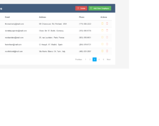
This is an example of a bootstrap user management data table, designed using CSS, HTML, and JavaScript. Bootstrap style sheets including the fonts, are imported to the form with their URLs. The body is given a styles set of color as #566787, background as #f5f5f5, font-family as 'Varela Round', sans-serif, and font-size as 13px. The title is given the styles padding-bottom as 15px, background as #299be4, color as #fff, padding as 16px 30px, margin as -20px -25px 10px, border-radius as 3px 3px 0 0, and font-size as 24px. The buttons in the header section have the styles of color as #566787, float as right, font-size as 13px, background as #fff, min-width as 50px, and border-radius as 2px which then take a background color of #f2f2f2, in a hover event. The icons are given the cursor style pointer to get the hand pointer effect. In a hover event, settings button and name section takes the color #2196F3 whereas the delete button takes the color #F44336. Tooltip style has been used to display a popup in a hover event on settings and delete icons whereas JavaScript functions are used to implement tooltip activation.

This is an example of a bootstrap delete confirmation web form, designed using HTML, and CSS. Bootstrap style sheets including the fonts, are imported to the form with their URLs. The body is given a font-family of 'Varela Round', sans-serif. The background color of the form is set to #636363 whereas the content section of the model has the styles of padding as 20px, border-radius as 5px, text-align as center, and font-size as 14px. The styles of the title are set to text-align as center, font-size as 26px, and margin as 30px 0 -10px. The buttons are given a styles set of color as #fff, border-radius as 4px, background as #60c7c1, transition as all 0.4s, line-height as normal, min-width as 120px, min-height as 40px, and border-radius as 3px. The cancel button is given a background color of #c1c1c1 and the confirm button is given a background color of #f15e5e. Both buttons change colors in a focus event, into #a8a8a8 and #ee3535 respectively.
This is an example of a bootstrap CRUD (Create, Read, Update, Delete) data table for a database with modal form, designed using HTML, CSS, and JavaScript. Bootstrap style sheets including the fonts are imported to the form with their URLs. The body is given a styles set of color as #566787, background as #f5f5f5, font-family as 'Varela Round', sans-serif, and font-size as 13px. The table title is given the styles of padding-bottom as 15px, background as #435d7d, color as #fff, padding as 16px 30px, margin as -20px -25px 10px, and border-radius as 3px 3px 0 0 whereas header two is given a margin of 5px 0 0, and font-size of 24px. The table has the styles of font-weight as bold and color as #566787. The background colors of edit and delete icons are set as #FFC107 and #F44336, respectively. The concept of Lists has been used with the LI component to display the details in an orderly manner. Once checked, the checkbox takes the color #03A9F4. Tooltip style has been used to display a popup in a hover event on edit and delete icons whereas JavaScript functions are used to implement tooltip activation and checkbox implementation.

This is an example of a simple modal box designed using HTML, CSS, and JavaScript. JavaScript functions have been used to implement the responsive features of the modal box. The font family is added as "Roboto", sans-serif, and the font-weight is set as normal. The background color of the body is set to #B0BEC5. The header of the model has the styles of padding as 20px 40px, background as #546E7A, and color as #ffffff whereas the modal body is given the styles of background as #ECEFF1, and padding as 60px 40px. The cursor is set as pointer to display the hand cursor. The modal box is given the animation styles of animation-duration: .4s, and animation-timing-function: cubic-bezier(0,0,.3,1.6). The modal trigger button has the style set of top and left as 50%, padding: 20px 40px, background: transparent, color: #ffffff, and border: 1px solid #ffffff.
Simple Modal Box Snippet
4.3.1