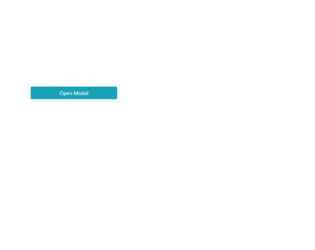
This is an example of a modal that expands a multi-step registration form on click, designed using CSS, HTML, JavaScript, and Bootstrap framework 4. The JavaScript methods have been used to indicate the progress of the steps using a color dot. The modal button is created as a primary type button. The concept of Lists has been used with UL and LI components. UL element has been used with the child elements of LI to display the child elements of the registration steps, in an orderly manner. The body of the form is given a background color as #eee. The input text fields are set to take the styles of font color as #495057, background-color as #fff, border-color as #80bdff, and box-shadow as 0 0 0 0rem rgba(0, 123, 255, .25), in a focus event. The buttons are given a box-shadow style of 0 0 0 0rem rgba(108, 117, 125, .5), to be displayed in a focus event.
Source: https://bbbootstrap.com/snippets/modal-dialog-multi-step-form-wizard-29726524

This is an example of a comment section in a modal format, designed using HTML, CSS, and Bootstrap framework 4. The Comment section is hidden within the modal and will be shown after pressing the button on the modal. The fonts and images are imported to the code with their URLs. The body of the form is given the styles of display as grid, place-items as center to place the modal in the center of the form, font-family as 'Manrope', sans-serif, and background as #000. The model button is created as a danger type button. The rating stars are created as radio buttons. The comment section is given a border value of 1px solid #ff0000. The send message button is given the styles of font color as #fff, and background-color as #ff000. In a hover event, the background color of the button changes to #f50202. The rating icons are created to take a fill effect of #ff0000, in hover and active events.
Source: https://bbbootstrap.com/snippets/bootstrap-modal-comment-section-rating-12857455

This is an example of bootstrap contact us web form with a gradient background, designed using HTML, and CSS. Bootstrap style sheets including the fonts and icons are imported to the form with their URLs. The body of the form is given the styles of font-family as "Varela Round", sans-serif, linear-gradient background color of linear-gradient(#ff9968, #ff5e63), and a color of #ff5e63 for browsers that don't support linear gradient colors. The header title is given the styles of text-align as center, font-size as 50px, and margin as 0 0 15px whereas the hint text quote has the styles of font-size as 15px, text-align as center, padding-bottom as 25px, and opacity as 0.8. The styles for the "send message" button is set as background: #a177ff, font-size: 16px, and min-height: 50px. In a hover event, the color of the button changes to #8048ff.
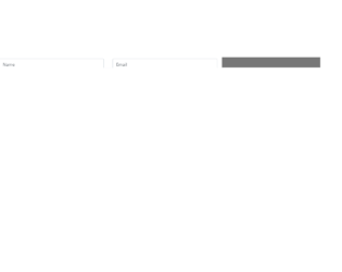
This is another template for a bootstrap subscribe newsletter web form inside modal, designed using HTML, CSS, and JavaScript. JavaScript functions have been used to implement displaying functions. Bootstrap style sheets including the fonts and icons are imported to the form with their URLs. The body of the form is given a font-family of 'Varela Round', sans-serif whereas the form is given the styles color as #999, width as 625px, and font-size as 15px. The header title is given the styles of color as #000, font-size as 30px, and font-weight as bold. The close button on top is given a font-size of 24px, and opacity of 0.5, which changes to 0.8 in a hover event. The subscribe button is given the styles of color as #fff, background as #f95858; transition as all 0.4s, line-height as normal, padding as 6px 20px, and min-width as 150px. In a hover event, the color of the button changes to #f72222.

This is a template for a bootstrap subscribe newsletter web form inside modal, designed using HTML, CSS, and JavaScript. JavaScript functions have been used to implement displaying functions. Bootstrap style sheets including the fonts and icons are imported to the form with their URLs. The body of the form is given a font-family of 'Varela Round', sans-serif whereas the form is given the styles color as #999, and font-size as 15px. The header title is given a style set of color as #000, text-align as center, font-size as 30px, margin as 0 0 25px, font-weight as bold, and text-transform as capitalize to make the first letter of each word capital. The close button on top is given a color of #c0c3c8, and an opacity of 0.5, which changes to 0.8 in a hover event. The color of the icon is set as #7265ea whereas the subscribe button has the styles of color as #fff, border-radius as 4px, background as #7265ea, and transition as all 0.4s. The background color of the icon changes to #4e3de4 in a hover event.