
This is an example of a bootstrap survey form which includes buttons and radio buttons, designed using HTML and CSS. The radio buttons in the same group are given the same name to avoid selecting multiple buttons at the same time. There are five types of radio buttons; Very Good, Good, Mediocre, Bad, and Very Bad which are assigned its color code. Very Good buttons are given a background and a border color of #2e7d32, Good are given a border and a background color of #64dd17, Mediocre are given a color of #ffea00, Bad are given the color of #ff9800 whereas Very Bad are given the background and border color of #d50000.
Bootstrap survey
4.3.1

Models are dialog box /popup that is displayed on top of the current page. This can be used to show any important message or any information. This snippet is an example of showing more information on the clicked object. It is a simple example of buttons to show the model. Here the buttons are having the image out planets and styled using CSS. A click on any button or image displays model with the information of planets. To open the model set the data-target to model to be opened. To create a Model you need to define the model class with a dialog containing, header, body, and footer if needed and id as a reference to a button click. A close button dismisses button can be seen at the bottom and at top of the model. You can use this snippet to display the information in dialogue in the form of Model. You can style the model accordingly.
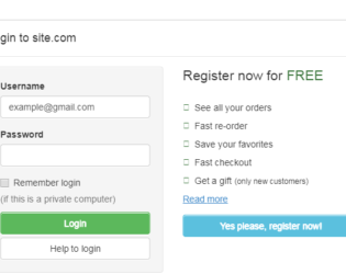
This is an example of adding Login Form in Modal. Bootstrap contains a Modal component, They are Modals are built with HTML, CSS, and JavaScript. They’re positioned over everything else in the document and remove scroll from the so that modal content scrolls instead. Clicking on the modal “backdrop” will automatically close the modal. Bootstrap only supports one modal window at a time. Nested modals aren’t supported as we believe them to be poor user experiences. Whenever possible, place your modal HTML in a top-level position to avoid potential interference from other elements. You’ll likely run into issues when nesting a .modal within another fixed element. ModelContent is divided into modelHeader, modal-body, and ModalFooter. ModalBody contains the form and registration details whereas the ModalHeader contains header details. Form and registration details are added in two columns in a row. This does not use the modal footer.
Login Form In Modal
3.2.0