
This is an example of another contact us form with floating labels, designed using HTML, CSS, and Bootstrap framework 4. The font style is imported to the code using its URL. The users are given the ability to access the contact form on clicking the modal button.The body of the form has the styles of background color as linear-gradient(0deg, #fff, 50%, RGB(210, 231, 252)), and font-family as 'Rubik', sans-serif. The font size of the title has been calculated using the calc(14px + (17 - 14) * ((100vw - 360px) / (1600 - 320))) formula. The background color of the modal button is set as #52B4DB. The input text fields are given a font-size of 15px, and the opacity is set as 0.5. The font-size of the labels gets changed to 8px in the focused mode, and the font color gets changed to #04A79C to create the floating effect on labels. In a focus event, the input text fields take the effects of border as 1px solid #04A79C, and box-shadow as 2px 2px rgba(233, 226, 226, 0.8). The cursor style for the modal is set as pointer to get the hand cursor effect in the hover event.
Source: https://bbbootstrap.com/snippets/contact-us-form-floating-labels-23481684

This is an example of a stylish newsletter subscription form, designed using HTML, CSS, JavaScript, and Bootstrap framework 4. The font and Bootstrap styles are imported to the code with their URLs. JavaScript methods have been used to display the subscription form when the page is refreshed. The body of the form is given a font family style of 'Open Sans', sans-serif. The title of the subscription card is displayed using the styles of font color as #000, text-align as center, font-family as 'Lato', sans-serif, font-weight as 900, font-size as 30px, and text-transform as uppercase to automatically convert the text to uppercase. The close button is given a background color of #c0c3c8, an opacity of 0.5, which gets changed to 0.8 on hover. The input text field is given a border color of #dbdbdb. The text field takes the styles of border-color as #49c5c1, and box-shadow as 0 0 8px rgba(73, 197, 193, 0.5), in a focus event. The 'Subscribe' button is given the styles of font-size as 14px, font-weight as bold, text-transform as uppercase, and background color as #49c5c1, which gets changed to #39b3af, on hover.
Source: https://www.tutorialrepublic.com/snippets/preview.php?topic=bootstrap&file=elegant-subscribe-newsletter-modal-form

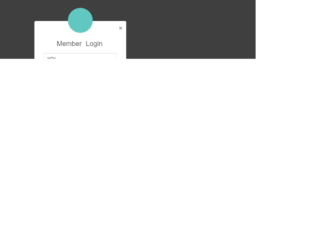
This is an example of a user login form which can be accessed through a modal, designed using CSS, HTML, and Bootstrap framework 4. The login form consists of the input text fields, the 'Login' button, and the user avatar image. The body of the form is given a font-family style as 'Varela Round', sans-serif. The form is given a background color of #636363 and a width of 350px. The title of the login card is displayed with text-align style as center, and font-size as 26px. The input text fields take a border color effect as #70c5c0, in the focus mode. The avatar image is given a background color as #60c7c1, box-shadow style as 0px 2px 2px rgba(0, 0, 0, 0.1), and the border-radius as 50% to get the circle shape. The 'Login' button is given a background color of #60c7c1, which gets changed to #45aba6, on hover.
Source:https://www.tutorialrepublic.com/snippets/preview.php?topic=bootstrap&file=elegant-modal-login-form-with-avatar-icon
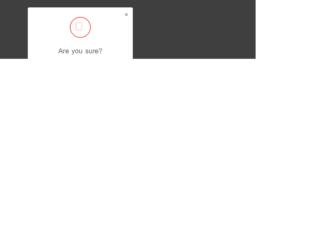
This is an example of a delete confirmation modal, designed using Html, CSS, and Bootstrap framework 4. The CSS and font styles are imported to the code with their URLs. The delete confirmation form is designed to be opened upon clicking on the modal link. The form is given a font-style of 'Varela Round', sans-serif. The body of the confirmation form is set as #636363. The title of the login form is displayed with a font-size of 26px. The cross icon is given a width and a height of 80px, a border style of 3px solid #f15e5e, and a border-radius of 50% to get the circle shape. The modal content is displayed with a font-size of 14px. The form consists of a 'Cancel' button and a 'Delete' button, which are given the background color of #c1c1c1, and #f15e5e, respectively. In a hover event, the 'Cancel' button turns its background color to #a8a8a8, whereas the 'Delete' button turns to #ee3535.
Source:https://www.tutorialrepublic.com/codelab.php?topic=bootstrap&file=delete-confirmation-modal
This is an example of an elegant login form, which can be accessed through a modal link. It is designed using Html, CSS, and Bootstrap framework 4. The CSS and font styles are imported to the code with the URLs. The body of the form is given a font-family style of 'Varela Round', sans-serif. The title of the login form is displayed with a font-size of 26px. The input text fields turn its border color to #70c5c0, on focus mode. The avatar is given a background color of #60c7c1, height and width as 95px, box-shadow as 0px 2px 2px rgba(0, 0, 0, 0.1), and border-radius as 50% to get the circle shape. The 'Login' button is created as a primary type button and given a background color of #60c7c1, which changes to #45aba6, in a hover event. The user name and password fields are validated by making them required fields.
Source:https://www.tutorialrepublic.com/snippets/preview.php?topic=bootstrap&file=elegant-modal-login-form-with-avatar-icon
Elegant Modal Login FOrm
4.3.1
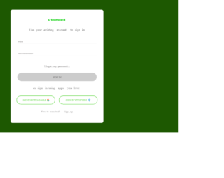
This is an example of a modal login form with social logins, designed using HTML, CSS, and Bootstrap framework 4. The form consists of a modal button that expands the sign-in form upon clicking on it. The font style is imported to the code with its URL. The body of the form is given the styles of background-color as RGB(58, 177, 2), and font-family as Poppins. Media quarries have been used to increase the responsiveness of the form. The title of the form is displayed using the styles of font-size as 20px, and font color as grey. The input text field labels are displayed with a font-size of 14px, and font color of RGB(143, 141, 141). The 'Sign in; button has the styles of font-family as Poppins, cursor as pointer to get the hand cursor effect on hover, font color as #fff, transition as all 0.4s ease, font-size as 18px, and width as 100%. The social media buttons have the styles of border-color as #65d849, font color as #65d849, and font-size as 12px.
Source: https://bbbootstrap.com/snippets/bootstrap-modal-login-form-social-logins-78503472