Layout
Responsive Column Layouts with CSS Grid and Container Queries
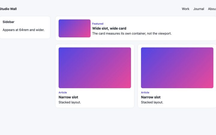
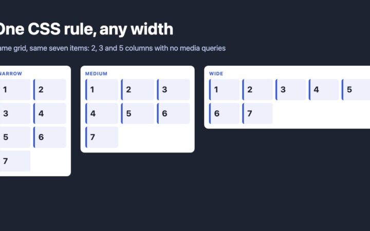
Replace float and nth-of-type column hacks with one CSS Grid rule, then use container queries and subgrid so columns respond to the…
Replace float and nth-of-type column hacks with one CSS Grid rule, then use container queries and subgrid so columns respond to the…
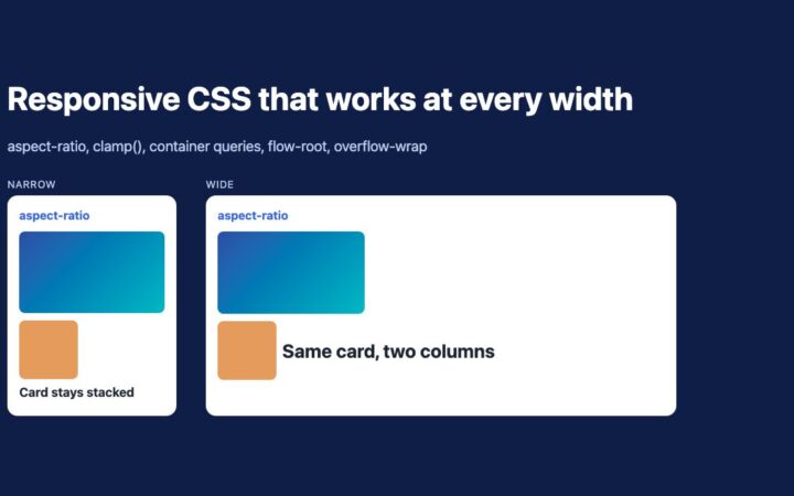
Replace padding hacks and IE fixes with aspect-ratio, clamp(), container queries, flow-root and overflow-wrap. Five tested techniques for responsive layouts.
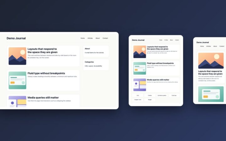
Build a fluid blog layout with CSS Grid, clamp(), range-syntax media queries and container queries, and learn when to use each one.
How to write CSS media queries today: range syntax, mobile-first rem breakpoints, container queries, dark mode and reduced motion, with a tested…
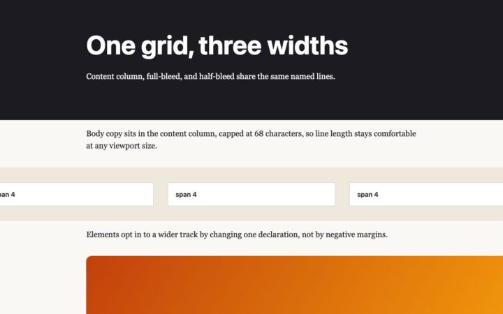
How to design grid and column layouts today: named lines for content widths, subgrid for aligned cards, and container queries for components…
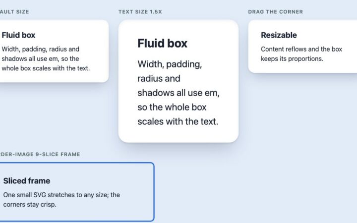
The classic all-expandable box rebuilt with modern CSS: em-based sizing, shadows, native resize and border-image frames, with no extra markup or sliced…