CSS Image Styles: Rounded, Glossy, Masked and Shaped Images
You can style an image with rounded corners, an inset ring, a glossy highlight, a pressed look, a fade or a custom shape using only CSS: border-radius, box-shadow on a wrapper pseudo-element, aspect-ratio, object-fit, mask-image, clip-path and filter. No jQuery, no extra spans injected by script, no background-image tricks, and the image stays fully responsive.
This is the modern version of an old problem. Back in 2012 browsers could not paint an inset box-shadow over an <img>, so we wrapped every image in a span with JavaScript and drew the effect on its :after. That idea is still the right one for inset effects. What changed is everything around it: the wrapper is plain HTML, the layout is handled by aspect-ratio, and shapes, fades and colour effects each have a dedicated property.
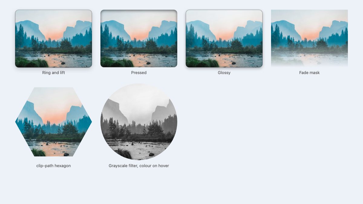
Why an inset shadow does not work on an img
An <img> is a replaced element: its pixels are painted on top of the element’s own background and inset shadow. An inset box-shadow is drawn inside the border box but underneath the content, so the photo simply covers it. Outer shadows and border-radius work fine; inner highlights do not.
The fix is to draw the inner effect in a layer that sits above the image. A semantic figure or a plain div around the image does the job, with a pseudo-element on top and pointer-events: none so clicks still reach the image.
Step 1: a responsive base for every image
Start with sizing, because every effect below depends on it. aspect-ratio reserves the box before the file loads (so the page does not jump) and object-fit: cover crops the photo to fill it without distortion.
:root {
  --radius: 0.75rem;
  --ring: oklch(0 0 0 / 0.35);
  --shine: oklch(1 0 0 / 0.45);
}

.pic { position: relative; }
.pic img {
  display: block;
  width: 100%;
  aspect-ratio: 4 / 3;
  object-fit: cover;
  border-radius: var(--radius);
}
Keep real width and height attributes in your HTML as well. Browsers use them to compute the ratio early, and CSS can still resize the image freely.
<figure class="pic ring">
  <div>
    <img src="lake.jpg" width="1200" height="801" alt="Mountain lake at sunrise">
  </div>
  <figcaption>Optional caption</figcaption>
</figure>
The inner div hugs the image only, so the overlay does not stretch over the caption. Give it position: relative in the CSS below.
Step 2: ring, lift, pressed and glossy overlays
All three styles share one pattern: a pseudo-element covering the wrapper, with the same radius as the image so the corners match. Using one --radius variable keeps the two in sync.
.pic > div { position: relative; }

/* Ring and lift: outer shadow on the image, inner ring on top */
.ring img {
  box-shadow: 0 1px 2px oklch(0 0 0 / 0.4), 0 6px 16px oklch(0 0 0 / 0.18);
}
.ring > div::after {
  content: "";
  position: absolute;
  inset: 0;
  border-radius: var(--radius);
  box-shadow: inset 0 0 0 1px var(--ring), inset 0 1px 0 var(--shine);
  pointer-events: none;
}

/* Pressed: darker inner shadow at the top, light edge below */
.pressed > div::after {
  content: "";
  position: absolute;
  inset: 0;
  border-radius: var(--radius);
  box-shadow: inset 0 3px 10px oklch(0 0 0 / 0.55), inset 0 -1px 0 oklch(1 0 0 / 0.5);
  pointer-events: none;
}

/* Glossy: a highlight on the top half */
.gloss > div::after {
  content: "";
  position: absolute;
  inset: 0;
  border-radius: var(--radius);
  background: linear-gradient(to bottom, oklch(1 0 0 / 0.5), oklch(1 0 0 / 0.05) 50%, transparent 50.1%);
  box-shadow: inset 0 0 0 1px oklch(0 0 0 / 0.4);
  pointer-events: none;
}
The original demo positioned its overlay with top: -1px; left: -1px; width: 100%; height: 100%. A single inset: 0 replaces all of that. Colours use oklch() with an alpha channel; rgb(0 0 0 / 0.35) would work identically here.
Because the ring is a translucent overlay rather than a border, it never changes the image size. Change one variable to retheme every card, including a dark mode: override --ring and --shine inside a prefers-color-scheme: dark block.
Step 3: fades and shapes with mask-image and clip-path
Effects that used to need Photoshop-made PNGs are now one declaration.
/* Fade the bottom edge into the page */
.fade img {
  border-radius: 0;
  mask-image: linear-gradient(to bottom, #000 55%, transparent);
}

/* Hexagon */
.hex img {
  border-radius: 0;
  aspect-ratio: 1;
  clip-path: polygon(25% 5%, 75% 5%, 100% 50%, 75% 95%, 25% 95%, 0 50%);
}
Use mask-image when you want soft, alpha-based edges; it accepts gradients, SVGs and PNGs. Use clip-path when you want hard geometric edges. Both are Baseline Widely available (unprefixed mask-image since December 2023). The difference matters for shadows: clip-path clips everything, including a box-shadow on the same element, so put the shadow on a parent with filter: drop-shadow() if you need one.
Avoid clip-path for the circular avatar case. border-radius: 50% on a square image does the same job and keeps shadows and focus rings intact.
Step 4: colour effects with filter
filter handles grayscale, sepia, blur, contrast and more, applied live to the image. Combine it with a transition for a hover reveal.
.circle img {
  aspect-ratio: 1;
  border-radius: 50%;
  filter: grayscale(1) contrast(1.1);
  transition: filter 0.3s;
}
.circle:hover img { filter: none; }

@media (prefers-reduced-motion: reduce) {
  .circle img { transition: none; }
}
Hover alone excludes keyboard and touch users. If the colour matters, also trigger it on :focus-within or simply keep the image in colour. For a deeper look at this property, see our 9 simple CSS image filters.
Polaroid frame in four lines
A framed print effect needs no overlay at all: padding and a white background on the wrapper, plus a tilt with the individual rotate property.
.polaroid > div {
  background: #fff;
  padding: 0.6rem 0.6rem 2.2rem;
  box-shadow: 0 8px 20px oklch(0 0 0 / 0.25);
  rotate: -2deg;
}
.polaroid img { aspect-ratio: 1; border-radius: 2px; }
What replaced the jQuery wrapper
The original tutorial used jQuery to wrap every image and copy its class onto the span. You no longer need script for this. Write the wrapper in your templates, or, in WordPress, let the Image block output its figure and target .wp-block-image with your CSS. If you must wrap existing markup, a few lines of vanilla JavaScript suffice:
document.querySelectorAll('.prose img').forEach((img) => {
  const wrap = document.createElement('div');
  wrap.className = 'pic-wrap';
  img.replaceWith(wrap);
  wrap.append(img);
});
Server-side or template-side wrapping is better: there is no flash of unstyled images and nothing breaks if scripts fail.
Accessibility and browser notes
- Overlays are decorative. Keep meaningful
alttext on the image and never put text inside a pseudo-element. - Do not rely on a pressed or glossy look to signal that something is clickable. Use a visible
:focus-visibleoutline on links that contain images. - Any effect that adds contrast (a ring, a lift) helps images sitting on similar-coloured backgrounds, but check contrast in dark mode too.
- Every property used here (
aspect-ratio,object-fit,mask-image,clip-path,filter,inset,oklch(), individual transform properties) is supported in current evergreen browsers. Check the Baseline badge on MDN for the one you rely on most.
Where to go next
Once your images look right, put them to work in layouts. Our thumbnail grid with hover effects and photo gallery with modal lightbox snippets are good starting points. If you want the earlier ideas behind this article, read CSS3 Image Styles, and for tighter control of the surrounding layout see 5 useful CSS tricks for responsive design.
Nice job Nick! This method is way better than part 1, only problem is no IE7/IE8 support.
But IE7/IE8 do not support border-radius and CSS3 (at least if yo don’t use behavior), so the result is a normal square image.
Oh my…why in the hell there’s always these people with the “but in IE” mumble rumble?!? This is a CSS3 tutorial for Christ’s sake! If this isn’t enough, you can read at very bottom of the article that “it works with any browser that supports Javascript and CSS3”.
Why does anyone even care if a person who has chosen to stick with IE can’t enjoy a more aesthetically pleasing site? It’s not as if there is some barrier preventing them from installing a real web browser. If web browsers cost money, and there was hardship involved, I would understand. But there all free.
I agree with Luis, enough with this IE mumble rumble!
PIE wouldn’t work because IE7 or lower doesn’t support :after element.
I’m curious as to why you wouldn’t just apply the .image-wrap:after styles to the .image-wrap itself. I’m probably missing something trivial, but thought I’d ask.
My initial tests seem to indicate that if you don’t use .image-wrap:after and apply all of those styles to the .image-wrap itself, excluding, content, height, width, position, top, and left, that you get the same results.
I’ll have to do more cross-browser testing, but This would significantly reduce the overall markup and CSS necessary for this approach.
@Art,
You need to apply the styles to the :after pseudo-element so that they appear “on top” of the IMG. If you apply the styles directly to .image-wrap, the IMG would obscure the styles.
Thanks Tim. That makes complete sense now, and I can see that those styles that needed to appear above the image (box shadow) weren’t getting applied in my .image-wrap only attempts.
A very nice solution!
Very nice, love the glossy one and opens up the doors for lots of creative shines and shimmers over pics. Will save a lot of time tampering with the pics in PS. :)
Great fix Nick, I didn’t really like the background image fix either. This is way better.
Nice post Nick.. good old jQuery to the rescue again.
It seems the “browser wars” will never end
This is good. This is getting fun now that more and more of this fancy stuff is supported by IE. It makes selling to the bosses a lot easier.
and makes it fun again to be doing the dev
Nice trick and demo, we can do magic arts with CSS3. haha
Nice work, cheers for the article. For those going on about IE7/8 etc, who gives a poop, it’s called browser degradation. If you want/must cater to user IE7/8 users you’re better off not using CSS3 at all if pixel perfect cross browser compatibility is essential.
Cutout style using box-shadow effect is really awesome. All these awesome things doesn’t work on IE.
Nice post, I had this issue before. Thanks
Excellent job, can’t image css can do this
Excellent post. I love to play with CSS and HTML
my name is ayub admed khosa is warking
That is great how you combined both relative and absolute positioning within the two image-wrap classes. They are the same yet different working together like a well-oiled machine. Kudos!
Most browsers let you apply CSS3 directly to the image element now, so no need for the span.
Excellent efforts! Thank you for sharing the information. Its been great to know about and appreciate your work.
intersting tip, as usual. and useful ! but for such a little effect, so much css code still to write, isn’t it ? anyway, thanks !
Thanks for the write-up! I really like these styles, but I was curious if I could still do the circle layout or the Morphing & Glowing like you had in your previous tutorial with this new version.
Yeah, I really liked some of your older overlay “frames” which still aren’t possible with code alone.
But could definitely be done with a combination of image re-sizing/stretching OR repeating chunks.
Thanks for sharing! Just as a sidenote: there’s a minor typo in the code. It’s supposed to say
-webkit-box-shadow, not-wekbit-etc.. Also some white-spaces get swallowed by the editor (?), like<imgsrc="and.image-wrapimg.Cheers!
Image styles are so easy to learn. Very good tips and it is more useful for me.
What’s up, I desire to subscribe for this blog to get hottest updates, thus where can i do it please help out.
Hi,
Do this also work on mobile browsers?
Hey Guys!!! this is very pretty article., this article is very helpful for us and now we came to know via this post how make image style in CSS. thank you very much for sharing us.
I’ve always faced this problem and ultimately got around with this post.
Thanks for this awesome tip. =)
Desktop Wallpaper, HD Wallpaper, Wallpaper Background
Desktop Wallpaper
You might enjoy some of these CSS3 code samples:
Great tips. Keep up with your fantastic work!
This article is very helpful for us and now we came to know via this post how make image style in CSS. thank you very much for sharing us.
I’m having trouble aligning said image, if I align the image the :after stays where the image previously was
How do you manage this?
Also really interesting, you can use CSS3 PIE to be compatible with IE! Thanks for the tutorial!
Sorry, finally I can’t find the way to implement this code with CSS3 PIE. Someone found a way to make it work in IE?
I can see this getting used a lot soon. I can’t wait to experiment. Cheers.
’m having trouble aligning said image, if I align the image the :after stays where the image previously was
Thank you for this – and Iwas very hopeful that it would work – but clearly I am missing something! And I wonder if you could help?
I have added the jQuery and this is correctly producing
And I have these classes in the CSS
.feather .image-wrap {
position: relative;
-webkit-border-radius: 30em;
-moz-border-radius: 30em;
border-radius: 30em;
opacity: 0.25;
}
.feather .image-wrap:after {
position: absolute;
content: ‘ ‘;
width: 100%;
height: 100%;
top: 0;
left: 0;
background: -webkit-gradient(radial, 50% 50%, 50, 50% 50%, 70, from(rgba(255,255,255,0)), to(rgba(255,255,255,1)));
background: -moz-radial-gradient(50% 50%, circle, rgba(255,255,255,0) 50px, rgba(255,255,255,1) 70px);
}
I am looking for “feathered” edge to the image; and once I have got this working I would like to try and do it for a rectangular shape – any thoughts most welcome and thank you
Paul
Interesting approach. Border radius of an image on website design can be tricky especially when trying to create various effects. I like your solution here. The embossed edges are a fresh take on image design and layout for graphic design in websites.