Four Elements of Mobile-Friendly Responsive Menus
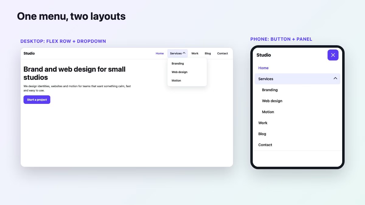
A mobile-friendly responsive menu is a real <nav> with a button that opens it, targets big enough to tap, visible focus, and a layout that collapses with CSS instead of a script that measures the window. You can build all of it today with plain HTML, CSS and a short script of about thirty lines. No jQuery, no menu plugin, no icon font.
The original version of this tutorial rested on four elements: a toggle, the menu, a breakpoint, and the behavior. Those four still hold. What changed is how each one is built. This guide rebuilds them with the platform features that replaced the old tricks, and adds the one thing the old version barely covered: keyboard and screen reader users.
The four elements, rebuilt
| Element | Then | Now |
|---|---|---|
| Toggle | Clickable div or li with three bar divs |
A real <button> with aria-expanded and aria-controls |
| Menu | ul with ids and classes, positioned with floats or absolute offsets |
A labelled <nav> containing a ul, with flexbox on wide screens |
| Breakpoint | Device-width media queries plus a jQuery resize handler | One min-width media query in em, and a matchMedia listener only to reset state |
| Behavior | slideToggle() and class juggling |
CSS transitions driven by an attribute, <details> for submenus, <dialog> for drawers |
Start with the markup
Write the mobile structure first and let the desktop layout be the enhancement. The toggle sits before the navigation in the DOM, so keyboard users reach the button first and the menu right after it.
<header class="site-header">
  <a class="logo" href="/">Studio</a>

  <button class="menu-toggle" type="button"
          aria-expanded="false" aria-controls="site-nav" aria-label="Menu">
    <span class="bars" aria-hidden="true"><span></span><span></span><span></span></span>
  </button>

  <nav class="nav" id="site-nav" aria-label="Main">
    <ul>
      <li><a href="/" aria-current="page">Home</a></li>
      <li>
        <details>
          <summary>Services</summary>
          <ul>
            <li><a href="/branding">Branding</a></li>
            <li><a href="/web">Web design</a></li>
          </ul>
        </details>
      </li>
      <li><a href="/work">Work</a></li>
      <li><a href="/contact">Contact</a></li>
    </ul>
  </nav>
</header>
A few choices here are worth explaining.
- The viewport meta tag is still required. Without
<meta name="viewport" content="width=device-width, initial-scale=1">phones render the page at desktop width and your media query never fires. - The three bars are decorative. The button gets its name from
aria-label, and the bars are hidden from assistive technology. The old demo used three divs; spans are fine, and so is an inline SVG. aria-expandedcarries the state. It tells a screen reader whether the menu is open, and the same attribute drives your CSS, so the visual state and the announced state can never drift apart.- Use
<details>for submenus. Open and close, the keyboard behavior and the expanded state are built in. The W3C’s own disclosure navigation example favors plain disclosure buttons overrole="menu", because the menu role promises application-style arrow-key behavior that site navigation does not need.
The base styles the snippets rely on
Every later snippet assumes these rules. Without position: relative on the header, the mobile panel, which is positioned with inset: 100% 0 auto 0, has nothing to attach to and lands at the bottom of the page. The custom properties give you one place to change colors.
:root {
  --bg: #fff; --ink: #14161f; --line: #e3e5ec;
  --accent: #5b3df5; --accent-ink: #fff;
  --hover: color-mix(in oklch, var(--accent) 10%, white);
}
* { box-sizing: border-box; }
body { margin: 0; font: 1rem/1.5 system-ui, sans-serif; color: var(--ink); background: var(--bg); }

.site-header {
  position: relative;          /* anchors the mobile panel */
  display: flex; align-items: center; justify-content: space-between;
  gap: 1rem; padding: .5rem 1rem;
  border-bottom: 1px solid var(--line);
}
.logo { font-weight: 800; font-size: 1.25rem; color: var(--ink); text-decoration: none; }

.nav ul { list-style: none; margin: 0; padding: 0; }

/* Every link and summary is a full-row, 48px-tall target */
.nav a, .nav summary {
  display: flex; align-items: center;
  min-height: 3rem; padding: 0 1rem;
  color: var(--ink); font-weight: 600;
  text-decoration: none; cursor: pointer; border-radius: .5rem;
}
.nav a:hover, .nav summary:hover { background: var(--hover); }
.nav [aria-current="page"] { color: var(--accent); }

/* Submenu summary: hide the default marker, draw a chevron that flips when open */
.nav summary { list-style: none; justify-content: space-between; gap: .5rem; }
.nav summary::-webkit-details-marker { display: none; }
.nav summary::after {
  content: ""; width: .55rem; height: .55rem;
  border: solid currentColor; border-width: 0 2px 2px 0;
  transform: rotate(45deg); transition: transform .2s;
}
.nav details[open] > summary::after { transform: rotate(-135deg); }
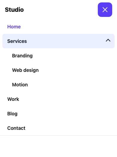
The explicit text-decoration: none matters because browsers underline links by default. The chevron is drawn with borders, so no icon font is needed. Put these base rules, the toggle rules, the two media queries and the script from the next sections together and you have the complete demo shown in the screenshots.
Make the toggle easy to find and easy to hit
The hamburger is still the icon mobile users recognize, but an icon alone is a weak label, so give the button an accessible name and consider a visible “Menu” word next to it on larger phones. Size matters just as much. WCAG 2.2 success criterion 2.5.8 sets a minimum target of 24 by 24 CSS pixels at level AA, while Apple’s Human Interface Guidelines suggest 44 points and Google’s Material guidance 48 dp. Aim for those larger numbers on touch layouts.
.menu-toggle {
  display: none;               /* hidden on wide screens */
  place-items: center;
  width: 3rem;                 /* 48px at default font size */
  height: 3rem;
  border: 0;
  border-radius: .75rem;
  background: var(--accent);
  color: var(--accent-ink);
  cursor: pointer;
}

.bars { display: grid; gap: 5px; width: 1.4rem; }
.bars span { height: 2px; background: currentColor; border-radius: 2px; transition: transform .25s, opacity .2s; }

/* Hamburger to X, driven by the same attribute screen readers read */
.menu-toggle[aria-expanded="true"] .bars span:nth-child(1) { transform: translateY(7px) rotate(45deg); }
.menu-toggle[aria-expanded="true"] .bars span:nth-child(2) { opacity: 0; }
.menu-toggle[aria-expanded="true"] .bars span:nth-child(3) { transform: translateY(-7px) rotate(-45deg); }

.menu-toggle:focus-visible,
.nav a:focus-visible,
.nav summary:focus-visible { outline: 3px solid var(--accent); outline-offset: 2px; }
Notice :focus-visible. The old article added a :focus rule because touch screens have no hover. Today you style the pointer feedback with :hover and :active, and keep a strong focus ring for keyboard users that does not flash on every tap. Every link and summary gets min-height: 3rem in the base styles above, so the whole row is the tap target, not only the text.
Collapse with CSS, not with a resize handler
Design the wide layout inside a min-width query and the narrow layout as the default. Use em in the query so the breakpoint respects the reader’s font size setting, since a user who enlarges text will get the compact menu sooner, which is what they need.
@media (min-width: 48em) {
  .nav > ul { display: flex; gap: .25rem; }
  .nav details { position: relative; }
  .nav details > ul {
    position: absolute; top: 100%; left: 0; min-width: 14rem;
    padding: .5rem; background: var(--bg);
    border: 1px solid var(--line); border-radius: .75rem;
    box-shadow: 0 12px 30px rgb(20 22 31 / .12); z-index: 5;
  }
}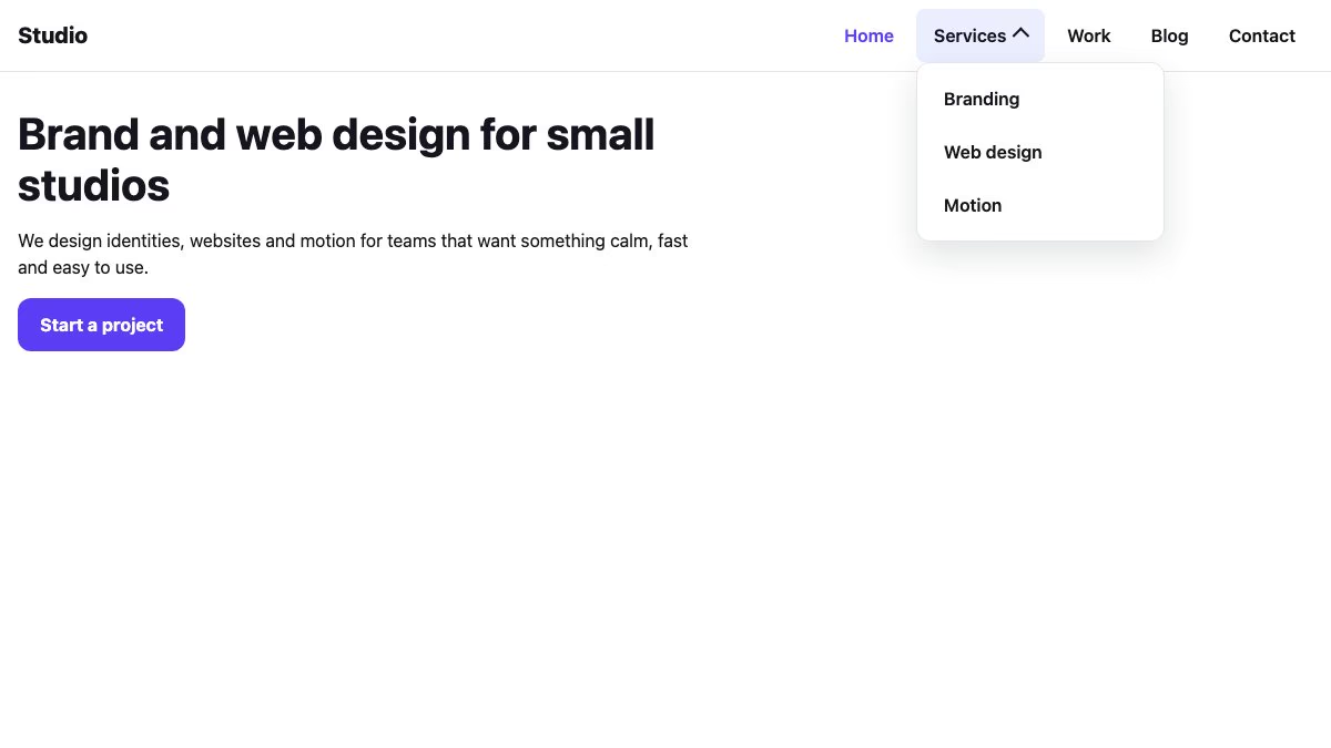
On narrow screens the same <details> elements need no positioning at all. The submenu simply opens in the flow and pushes the links below it down, which is the accordion behavior the original tutorial built by hand with slideToggle().
Animate the panel without JavaScript
The old menu used jQuery to animate height, because CSS could not transition to auto. A well-supported alternative is to transition a grid row from 0fr to 1fr. The panel animates to its natural height, whatever the number of links.
@media (max-width: 47.99em) {
  .menu-toggle { display: grid; }

  .nav {
    position: absolute; inset: 100% 0 auto 0; z-index: 10;
    display: grid; grid-template-rows: 0fr;
    visibility: hidden;
    background: var(--bg); border-bottom: 1px solid var(--line);
    transition: grid-template-rows .3s ease, visibility 0s .3s;
  }
  .nav > ul { overflow: hidden; min-height: 0; padding-inline: .5rem; }

  .menu-toggle[aria-expanded="true"] + .nav {
    grid-template-rows: 1fr;
    visibility: visible;
    transition: grid-template-rows .3s ease, visibility 0s;
  }
  .nav details > ul { padding-left: 1rem; }
}

@media (prefers-reduced-motion: reduce) {
  * { transition-duration: 0s !important; }
}
The visibility line is not decoration. A collapsed panel with a zero-height row would still contain focusable links, and a keyboard user would tab into invisible items. Delaying visibility: hidden until the close transition ends keeps the animation smooth and removes the links from the tab order once the menu is shut. The prefers-reduced-motion block respects people who turn animation off at the operating system level: the panel then opens and closes instantly, with no other change.
Support. Everything in this section, including <details>, grid-template-rows transitions, matchMedia and :focus-visible, works in all current major browsers. In a browser that did not animate grid rows, the panel would still open and close, only without the slide.
If you prefer the sidebar-pushes-content effect from the older tutorial, it is still possible with transform, but an overlay is simpler: it does not reflow the page and it avoids the layout shifts that a pushed container causes.
The JavaScript you still need
CSS handles the layout and animation. Script is only responsible for flipping the attribute, closing on Escape, and resetting state when the window grows past the breakpoint. The last handler closes the menu after a link to an in-page anchor such as #pricing; without it the panel stays open over the section the visitor just chose. Links to other pages need nothing because the page reloads.
const toggle = document.querySelector('.menu-toggle');
const nav = document.getElementById('site-nav');
const desktop = matchMedia('(min-width: 48em)');

function setOpen(open) {
  toggle.setAttribute('aria-expanded', String(open));
}

toggle.addEventListener('click', () => {
  setOpen(toggle.getAttribute('aria-expanded') !== 'true');
});

document.addEventListener('keydown', (e) => {
  if (e.key !== 'Escape') return;

  const openSub = nav.querySelector('details[open]');
  if (openSub && desktop.matches) {          // desktop dropdown
    openSub.open = false;
    openSub.querySelector('summary').focus();
    return;
  }
  if (toggle.getAttribute('aria-expanded') === 'true') {
    setOpen(false);
    toggle.focus();                              // hand focus back
  }
});

// Close any open dropdown when the user clicks elsewhere (desktop)
document.addEventListener('click', (e) => {
  if (desktop.matches && !e.target.closest('details')) {
    nav.querySelectorAll('details[open]').forEach((d) => (d.open = false));
  }
});

// Growing the window past the breakpoint resets the mobile state
desktop.addEventListener('change', () => setOpen(false));

// Close the mobile menu after an in-page anchor link is followed
nav.addEventListener('click', (e) => {
  if (e.target.closest('a[href^="#"]')) setOpen(false);
});
The matchMedia listener replaces the old resizeFix function. It fires only when the breakpoint is crossed instead of on every resize event, and it uses the same query as your CSS, so the two can never disagree. I ran this exact code in Chromium at phone and desktop widths: the toggle flips aria-expanded, Escape closes the menu and returns focus to the button, and the closed panel reports visibility: hidden.
Off-canvas drawers with the dialog element
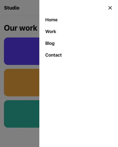
Off-canvas menus were the star of the original article, and they are still a good pattern for large menus. The hard parts used to be trapping focus, blocking the page behind the drawer and handling Escape, and developers solved them with libraries. A modal <dialog> does all three. According to MDN, <dialog> is Baseline widely available, and a dialog opened with showModal() makes the rest of the page inert, moves focus inside, and closes on Escape.
<button class="open-menu" type="button" aria-label="Open menu" aria-controls="drawer">
  <svg width="24" height="24" viewBox="0 0 24 24" aria-hidden="true" focusable="false"><path d="M4 7h16M4 12h16M4 17h16" stroke="currentColor" stroke-width="2" stroke-linecap="round" fill="none"/></svg>
</button>

<dialog class="drawer" id="drawer" aria-label="Main menu" closedby="any">
  <button class="close-menu" type="button" aria-label="Close menu">
    <svg width="24" height="24" viewBox="0 0 24 24" aria-hidden="true" focusable="false"><path d="M6 6l12 12M18 6L6 18" stroke="currentColor" stroke-width="2" stroke-linecap="round" fill="none"/></svg>
  </button>
  <nav aria-label="Main">
    <ul>
      <li><a href="/" aria-current="page">Home</a></li>
      <li><a href="/work">Work</a></li>
      <li><a href="/contact">Contact</a></li>
    </ul>
  </nav>
</dialog>
.drawer {
margin: 0 0 0 auto; /* pin to the right edge */
height: 100dvh; max-height: none;
width: min(20rem, 85vw);
padding: .5rem; border: 0;
background: var(--bg); color: var(--ink);
translate: 100% 0; /* off-screen by default */
transition: translate .3s ease,
overlay .3s allow-discrete,
display .3s allow-discrete;
}
.drawer[open] { translate: 0 0; }
@starting-style { .drawer[open] { translate: 100% 0; } }
.drawer::backdrop {
background: rgb(0 0 0 / 0);
transition: background-color .3s, overlay .3s allow-discrete, display .3s allow-discrete;
}
.drawer[open]::backdrop { background: rgb(0 0 0 / .5); }
@starting-style { .drawer[open]::backdrop { background: rgb(0 0 0 / 0); } }
/* Same 3rem buttons as the first demo; the drawer links reuse the 3rem rows */
.open-menu, .close-menu {
display: grid; place-items: center; width: 3rem; height: 3rem;
border: 0; border-radius: .75rem; cursor: pointer;
background: var(--accent); color: var(--accent-ink);
}
.close-menu { margin-left: auto; background: transparent; color: var(--ink); }
.drawer ul { list-style: none; margin: 0; padding: 0; }
.drawer a { display: flex; align-items: center; min-height: 3rem; padding: 0 1rem; color: var(--ink); text-decoration: none; font-weight: 600; }
@media (prefers-reduced-motion: reduce) {
.drawer, .drawer::backdrop { transition-duration: 0s; }
}const drawer = document.getElementById('drawer');
document.querySelector('.open-menu').addEventListener('click', () => drawer.showModal());
drawer.querySelector('.close-menu').addEventListener('click', () => drawer.close());
drawer.addEventListener('click', (e) => { if (e.target.closest('a')) drawer.close(); });The @starting-style rules and the allow-discrete transitions let the drawer slide in and out even though the browser toggles its display and top-layer state. Without them the dialog would appear and disappear instantly. Closing the dialog returns focus to the button that opened it, and in my test Escape did exactly that. The closedby="any" attribute adds light dismiss, so a tap on the dimmed backdrop closes the drawer.
Support and fallbacks. Treat the animation as an enhancement. According to MDN, <dialog> is Baseline widely available and @starting-style is Baseline newly available (since August 2024), but transition-behavior: allow-discrete, the overlay property and the closedby attribute are not yet Baseline. A browser without them still opens and closes the drawer correctly; it just does so instantly, with no slide. Browsers without closedby ignore it, so a backdrop tap will not close the drawer there; Escape and your visible close button still do. Keep that button regardless, and if you need backdrop dismissal everywhere, add a click handler that closes the dialog when e.target === drawer.
The snippets select the open state with .drawer[open] rather than the newer :open pseudo-class on purpose. :open is Baseline only since 2026, and in a browser that does not understand it the whole rule is dropped, so the drawer would stay translated off-screen and look broken even though it is technically open. The attribute selector works everywhere and costs nothing. Under prefers-reduced-motion the drawer’s transition duration is set to zero, so it also appears instantly.
Use the plain disclosure menu for a short navigation under the header, and the dialog drawer when the menu is long, has several levels, or needs to feel like an app panel.
A checklist before you ship
- The toggle is a
<button>with an accessible name,aria-expandedandaria-controls. - Every link, summary and toggle is 44 to 48 CSS pixels tall on touch layouts (the Apple and Google guideline sizes). WCAG 2.2 AA requires only 24, so treat that as the floor, not the goal.
- Focus is always visible with
:focus-visible, and Escape closes the menu and returns focus to its trigger. - Collapsed menus are removed from the tab order with
visibility,hiddenorinert, not just clipped. - Animation is short, uses
transform,translateor grid rows, and is switched off underprefers-reduced-motion. - The current page is marked with
aria-current="page". - You tested with a keyboard alone, with a screen reader, and on a real phone with large text enabled.
Ready-made menus to start from
If you would rather begin with finished markup, these snippets from our library show the same ideas in Bootstrap 5, and they are good for studying how the pieces fit together:
- Responsive navbar with an offcanvas menu
- Responsive navbar with dropdown and CTA
- Mobile navigation drawer with submenu
- Full-screen overlay menu
- Accordion sidebar menu
For earlier takes on the same problem, see our mobile navigation design tutorial and the notes on CSS transitions and transforms that underpin the animations here.


Crucial aspect missing here: keyboard accessibility. If a non-mouse, non-touch user can’t open the menu…
I do not remember seeing a non-mouse, non-touch user menu for a long time, valid point, do you have an example of a menu that is CSS mobile responsive and non-touch, etc?
Nice article. thank you. but about the demo, I don’t think pushing body contents down is a good idea, this behavior usually ends up in a laggy experience in most of the mobile devices
What about IE when using “display: flex;” ? Can you provide any solution for this, especially the 2nd menu example, too?
Beside that great article.
Awesome article, thank you!
On Windows 10, viewed in Chrome, there appear to be toggling issues.
– the hamburger doesn’t always change to and X and vice versa.
– the – / + sign on some resolutions for the sub-menu is misplaced mid screen for a smaller resolution it appears.
these issues are fixed on a refresh, but re-manifest themselves on use.