Easy CSS Animation Using @keyframes
CSS @keyframes lets you define the steps of an animation in your stylesheet, then play it with the animation property. Unlike a transition, which only runs between two states when something changes, a keyframe animation can start on its own, loop, reverse, pause and pass through as many intermediate states as you like. Today you can build most of it with transform and opacity, keep it accessible with prefers-reduced-motion, and even tie it to scrolling instead of time.
This guide covers the full workflow: writing keyframes, each animation-* property, the rules for fast animations, scroll-driven timelines, and reduced-motion handling. If you are new to motion in CSS, start with Easy CSS Animation With Transition & Transforms first, because keyframes reuse the same ideas.
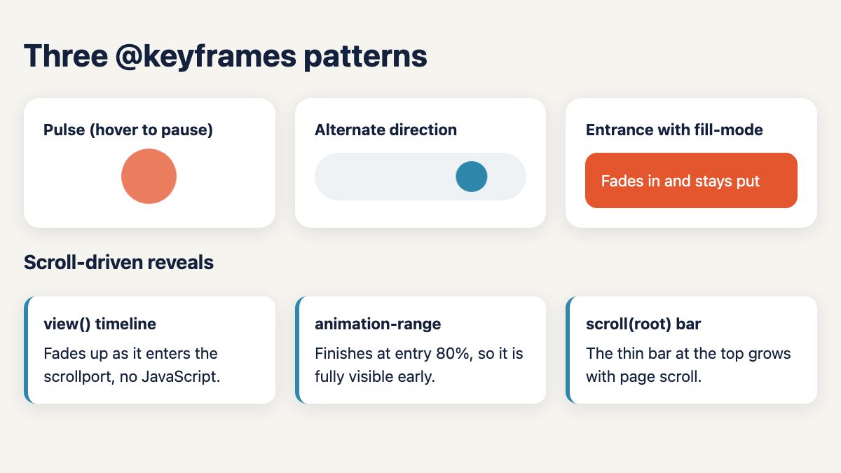
The two parts of every keyframe animation
An animation always needs two pieces: a @keyframes rule that names the steps, and an element that references that name through animation.
@keyframes pulse {
  0%, 100% { transform: scale(1);    opacity: 1; }
  50%      { transform: scale(1.35); opacity: .55; }
}

.dot {
  animation: pulse 1.6s ease-in-out infinite;
}
Percentages mark positions on the timeline. Use from and to as aliases for 0% and 100% when you only have two steps, and list several selectors (0%, 100%) to reuse the same declarations. If you omit the first or last step, the browser fills it in from the element’s current styles, so a single to block is often enough.
The animation properties, in plain terms
The shorthand is convenient, but each part is also a longhand property. They are easier to read when you know what each one controls.
| Property | What it does | Typical value |
|---|---|---|
animation-name |
Which @keyframes rule to play |
pulse |
animation-duration |
Length of one cycle | 1.6s |
animation-timing-function |
Easing between keyframes (applied per step, not across the whole animation) | ease-in-out, linear, cubic-bezier() |
animation-delay |
Wait before starting; negative values start partway through | .2s |
animation-iteration-count |
How many cycles | 3 or infinite |
animation-direction |
Order the keyframes play | normal, reverse, alternate, alternate-reverse |
animation-fill-mode |
Whether styles apply before and after the run | none, backwards, forwards, both |
animation-play-state |
Pause or resume | running, paused |
Order in the shorthand is mostly free, because the browser tells the values apart by type: animation: pulse 1.6s infinite and animation: infinite 1.6s pulse behave the same. Two exceptions matter. When you give two time values, the first is the duration and the second is the delay. And if a keyframes name matches an animation keyword such as none, infinite or forwards, the shorthand reads it as the keyword, so pick a different name or set animation-name as a longhand.
Easing: steps() and linear()
Besides ease-in-out and cubic-bezier(), two easing functions are worth knowing. steps() jumps between values instead of gliding, which suits sprite sheets and a typewriter caret. linear() joins several points with straight lines, so a long list of stops can approximate a bounce or spring, which a single cubic curve cannot. Both work in animation-timing-function and in transitions, and MDN lists linear() as Baseline widely available.
.caret { animation: blink 1s steps(2, jump-none) infinite; }
.drop  { animation: fall .9s linear(0, .6 25%, 1 40%, .8 55%, 1 70%, .95 85%, 1) both; }
Several animations on one element
Separate animations with commas, and every longhand takes a matching comma-separated list. Each animation should change different properties, otherwise the last one listed wins.
.badge {
  animation:
    fade-up .6s ease-out both,
    pulse 1.6s ease-in-out .6s infinite;
}
Direction: alternate instead of duplicating keyframes
animation-direction does not change where things move, only the order of the steps. With alternate, one rule plays forward and then backward, which gives you a smooth back-and-forth loop without writing the return trip.
.ball {
  animation: slide 2.4s ease-in-out infinite alternate;
}
@keyframes slide {
  to { transform: translateX(9rem); }
}
Fill mode: stop the snap back
By default the keyframe styles exist only while the animation runs. When it ends, the element jumps back to its normal styles. forwards keeps the last keyframe, backwards applies the first keyframe during a delay, and both does both. For an entrance animation, both is usually what you want: the element is hidden during the delay and stays visible afterward.
.panel {
  animation: fade-up .8s ease-out .2s both;
}
@keyframes fade-up {
  from { opacity: 0; translate: 0 1.5rem; }
}
The standalone translate, rotate and scale properties used above are handy in keyframes because they do not overwrite each other the way a single transform value does.
Play state: pause on hover
Pausing a looping animation under the pointer is a cheap usability win, especially for anything people might want to read or click.
.dot:hover,
.dot:focus-visible {
  animation-play-state: paused;
}
Set the longhand rather than re-declaring the whole shorthand, otherwise you can accidentally reset the animation instead of pausing it.
Animate transform and opacity
Browsers can animate transform, opacity and the individual transform properties without recalculating layout, which keeps motion smooth. Animating width, height, top or margin forces layout work on every frame. The old “Mars Landing” style of moving things by changing margins is exactly what to avoid; use translate instead.
When you want to animate a custom property, such as a gradient angle or a colour, register it with @property so the browser knows its type and can interpolate it. For a worked colour example, see Animating Background Colors.
@property --angle {
  syntax: "<angle>";
  inherits: false;
  initial-value: 0deg;
}
.spinner {
  background: conic-gradient(from var(--angle), #e4572e, #2e86ab, #e4572e);
  animation: spin 3s linear infinite;
}
@keyframes spin { to { --angle: 360deg; } }
Scroll-driven animations with animation-timeline
Normally an animation’s progress follows the clock. With animation-timeline you can bind it to scroll position instead, still using ordinary @keyframes and no JavaScript. Two functions cover most cases:
scroll()ties progress to how far a scroll container has scrolled, perfect for a reading-progress bar.view()ties progress to an element’s visibility in the scrollport, perfect for reveal effects. Pair it withanimation-rangeto say which part of the journey to use, for exampleentry 0% entry 80%.
.bar {
  position: fixed;
  inset: 0 0 auto 0;
  height: .35rem;
  background: #e4572e;
  transform-origin: left;
  transform: scaleX(0);
}

@supports (animation-timeline: scroll()) {
  .bar {
    animation: grow linear both;
    animation-timeline: scroll(root);
  }
  .reveal {
    animation: fade-up linear both;
    animation-timeline: view();
    animation-range: entry 0% entry 80%;
  }
  @keyframes grow { to { transform: scaleX(1); } }
}
Use linear easing for scroll-linked animations, because the scroll position already provides the pacing, and do not set a duration. Support differs by engine: Chromium browsers have shipped scroll-driven animations since version 115, Safari since version 26, and Firefox is rolling the feature out in newer builds. MDN does not mark animation-timeline as Baseline, so wrap it in @supports as above and check the compatibility table before relying on it. Without support, the progress bar stays at scaleX(0), so no bar appears, and the .reveal panels show normally with no animation. Design it as an enhancement. If you want the older approach for comparison, How to Zoom Hero Images on Scroll used JavaScript scroll listeners; the timeline version is shorter and runs off the main thread in browsers that support it.
Respect reduced motion
Looping and large movements can cause discomfort for people with vestibular disorders, and everyone benefits from calmer interfaces. The prefers-reduced-motion media query reads the operating system setting. Remove or tone down non-essential motion:
@media (prefers-reduced-motion: reduce) {
  .dot,
  .ball,
  .panel {
    animation: none;
  }
}
Reduced-motion blocks should cover every animation you add, including scroll-driven ones. Add .bar and .reveal to the selector list above if you want them calm too; the demo for this article does.
A caution about animation: none: it also removes any state the animation communicates, such as a spinner that tells people something is loading. For essential loaders, keep a non-moving cue (a static icon plus a “Loading” label) or a much slower, smaller motion such as a gentle opacity pulse, instead of removing feedback entirely.
Alternatively write the animation inside @media (prefers-reduced-motion: no-preference) so motion is opt-in. Either way, make sure content ends up visible: if an element starts at opacity: 0 in its normal styles and the animation is removed, it will stay invisible. Put hidden starting states inside the keyframes (as the fade-up above does) rather than on the element.
Also avoid flashing content, give looping animations a way to stop when they run for more than a few seconds, and never let an animation carry meaning that is not available another way.
Entry animations and @starting-style
To animate an element as it first appears, or as it changes from display: none, you do not always need keyframes. The @starting-style rule sets the values a transition starts from when an element is first rendered, and MDN marks it Baseline newly available. Use keyframes with both fill mode for effects that must run anywhere, and @starting-style for simple enter transitions on popovers, dialogs and inserted elements.
Choosing between transition and keyframes
- Use a transition for a simple change between two states, such as hover or focus.
- Use keyframes when it must run on load, repeat, pass through three or more states, or run independently of user input.
- Use animation-timeline when progress should follow scrolling.
For ready-made patterns, our snippet library has CSS loaders and a loading button, radio buttons with a hop animation and thumbnail hover effects you can study and adapt.
Tools for building and debugging
- Browser DevTools: the Animations panel in Chrome and Edge, and the Animations inspector in Firefox, let you slow playback, replay and scrub through keyframes.
- cubic-bezier.com: a visual editor for custom easing curves.
- Animate.css: a library of pre-made animations applied with class names, useful for prototyping.
Quick checklist
- Name the keyframes for what they do, not how they look.
- Animate
transform,opacityor registered custom properties. - Choose a fill mode so the element does not snap back.
- Pause or stop long-running loops, and honour
prefers-reduced-motion. - Wrap scroll-driven animation in
@supportsand treat it as an enhancement.


Nice writing with example. Anyone will give you 5?. I liked it and listed to my collections.
I absolutely ove ykur website.. Great colors & theme. Diid youu
devekop tis webb ssite yourself? Pleqse reply bacck ass I’m wanting too cdeate myy vety own siite
and waant too know where you goot thyis fdom oor just wht
thhe thyeme iss called. Cheers!
Perhaps you have changed your overall theme, but none of the code is visible against the dark background, unless the user selects it.