Animating Background Colors With Modern CSS
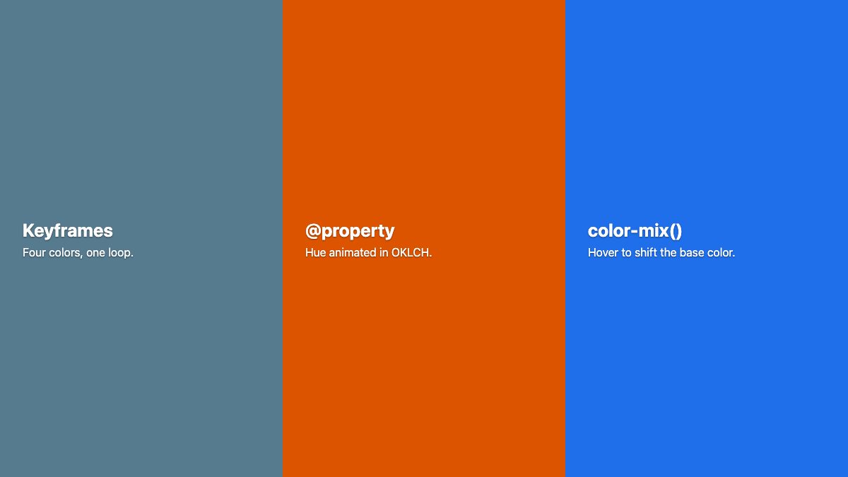
You can animate a background color with plain CSS: put a background-color in a @keyframes rule for a looping color cycle, or use a transition for a change triggered by hover, focus or a class. No jQuery, no jQuery UI and no plugin are needed. For smoother, more controllable color changes, register a custom property with @property and animate that instead.
This is the modern replacement for the old jQuery animatedBG script that cycled through a list of colors on a timer. Below you will build three versions: a keyframe color loop, a continuously shifting hue, and a hover state mixed with color-mix(). All of them respect prefers-reduced-motion.
Why the old jQuery approach is obsolete
The original technique required jQuery and jQuery UI, because jQuery alone cannot animate colors. A script ran on a timer and wrote inline styles every few milliseconds. That meant JavaScript on the main thread, a flash of unstyled color if the script failed, and no way to honor a user’s motion preferences without extra code.
Browsers now interpolate colors natively. The animation is declared in CSS, works before any script loads, and can be switched off with a single media query.
1. Cycle through colors with @keyframes
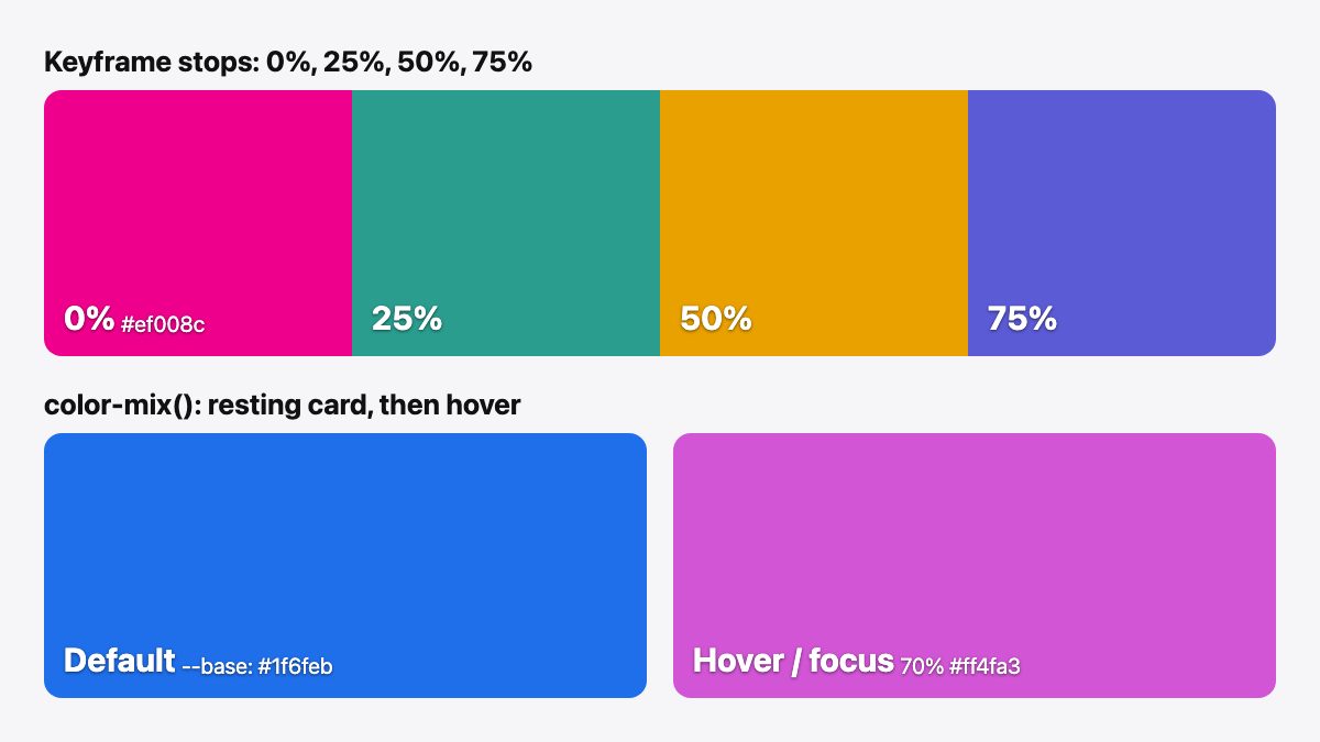
This is the direct equivalent of the old script. Define each color as a keyframe stop and loop the animation forever. The element’s normal background-color acts as the fallback and the starting color. The duration reads from a --speed custom property, so one class can be reused at different speeds.
.animated-bg {
  background-color: #ef008c;
  color: #fff;
  animation: bg-cycle var(--speed, 12s) ease-in-out infinite;
}

@keyframes bg-cycle {
  0%, 100% { background-color: #ef008c; }
  25%      { background-color: #2a9d8f; }
  50%      { background-color: #e9a100; }
  75%      { background-color: #5b5bd6; }
}

@media (prefers-reduced-motion: reduce) {
  .animated-bg { animation: none; }
}
Repeat the first color at 0% and 100% so the loop has no visible jump. Change the number of stops to add or remove colors, and set --speed to change the pace. For a deeper look at how keyframes work, see Easy CSS Animation Using @keyframes.
Keep text contrast in mind. White text on the yellow stop above is weak, so pick colors that all work with your text color, or test each stop against a contrast checker.
2. Animate a hue with @property
Keyframes between stops are fine, but sometimes you want the color to sweep smoothly through the whole wheel. Browsers cannot animate a number inside oklch() unless they know it is a number. That is what @property is for: it registers a custom property with a type, so the browser can interpolate it.
@property --hue {
  syntax: "<number>";
  inherits: false;
  initial-value: 0;
}

.hue-shift {
  background: oklch(62% 0.19 250); /* fallback */
  background: oklch(62% 0.19 var(--hue));
  animation: hue-spin 16s linear infinite;
}

@keyframes hue-spin {
  to { --hue: 360; }
}

@media (prefers-reduced-motion: reduce) {
  .hue-shift { animation: none; }
}
Per MDN, syntax and inherits are both required, and initial-value is required for any syntax other than "*". Without a registered type, the browser treats the custom property as a string and flips it at the midpoint instead of animating.
Using OKLCH keeps lightness and chroma constant while the hue rotates, so the color keeps a similar perceived brightness as it moves around the wheel. HSL does not guarantee that, and yellows and greens look much brighter than blues.
@property has been Baseline since July 2024, so it works in current versions of all major browsers. In a browser without it, --hue is an unregistered variable with no value, so the second background declaration is invalid at computed-value time and the element would be transparent. That is why the plain oklch(62% 0.19 250) line comes first: the cascade falls back to that static color. With reduced motion on, the animation stops and the hue stays at its registered initial value of 0.
3. Hover and focus states with transition and color-mix()
Not every background animation loops. Most are state changes: hover, focus, active, selected. Use transition on background-color, and derive the new color from a base color with color-mix() so you do not have to hand-pick a second hex value.
.card {
  --base: #1f6feb;
  background-color: var(--base);
  transition: background-color 0.4s ease;
}

.card:hover,
.card:focus-visible {
  background-color: color-mix(in oklch, var(--base), #ff4fa3 70%);
}
color-mix() has worked in all major browsers since May 2023 (check the MDN page for current status). When you do not name a color space it uses Oklab, but naming one is clearer. MDN recommends Oklab or Oklch for perceptually even results and warns that srgb tends to produce darker or grayer mixes.
Change only --base to theme the component. A variant such as .card.danger { --base: #d1242f; } gets its own hover color automatically. If you are new to transitions, Easy CSS Animation With Transition & Transforms covers the basics.
Colors in your own palette
Wherever you used a hex value above, you can use a design token instead. Store colors as custom properties on :root, and reference them in the keyframes:
:root {
  --c1: #ef008c; --c2: #2a9d8f; --c3: #e9a100; --c4: #5b5bd6;
}

@keyframes bg-cycle {
  0%, 100% { background-color: var(--c1); }
  25%      { background-color: var(--c2); }
  50%      { background-color: var(--c3); }
  75%      { background-color: var(--c4); }
}
Keyframes can read custom properties, so one palette can drive the whole page, and a dark mode override only needs to redefine four variables.
Reuse one class with different palettes and speeds
The old demos shipped separate classes for each look. With custom properties the same class can take any palette and any speed. Variants only override variables:
.animated-bg.calm   { --speed: 24s; --c1: #264653; --c2: #2a9d8f; --c3: #457b9d; --c4: #1d3557; }
.animated-bg.lively { --speed: 6s;  --c1: #ef008c; --c2: #ff7a00; --c3: #ffd000; --c4: #5b5bd6; }
Use this with the token-based keyframes above. Always keep the base background-color in the shared rule as the fallback. Slower cycles also tend to be easier on the eye and on contrast, so give text-heavy sections the calm variant.
When you still need JavaScript
If the colors come from data, such as a user’s chosen brand colors or an API, build the animation with the Web Animations API instead of a timer:
const el = document.querySelector('.animated-bg');
if (el && !matchMedia('(prefers-reduced-motion: reduce)').matches) {
  const colors = ['#ef008c', '#2a9d8f', '#e9a100', '#5b5bd6'];
  el.animate(
    colors.concat(colors[0]).map((backgroundColor) => ({ backgroundColor })),
    { duration: 12000, iterations: Infinity, easing: 'ease-in-out' }
  );
}
The browser still does the interpolation. JavaScript only supplies the list. The static CSS background-color remains the fallback.
Choosing the right technique
Use keyframes when you have a fixed list of brand colors and want a calm looping backdrop, such as a hero section. Use a registered @property when you want a continuous sweep or need to animate part of a gradient, like a stop position or an angle. Use transition with color-mix() for interface states, because it reverses smoothly when the user moves the pointer away mid-animation, while a keyframe animation would restart or jump.
Whichever you choose, put the static color in the base rule first. If anything fails to load or a browser lacks support, the page still shows a sensible, readable background.
Accessibility and performance notes
- Respect reduced motion. Large, constantly changing backgrounds can be distracting or uncomfortable. Disable looping animations inside
prefers-reduced-motion: reduce, as shown above. - Avoid flashing. Keep cycles slow. the WCAG three flashes guideline warns against content that flashes more than three times per second, and a 10 to 20 second loop is far from that.
- Check contrast at every stop. Text must stay readable throughout the animation, not just at the first color.
- Know the cost. Animating
background-colortriggers repaint, but not layout. For a few large sections that is fine. Avoid animating dozens of elements at once. - Do not rely on color alone. Hover color changes should be paired with a focus style for keyboard users, which is why the example includes
:focus-visible.
Ready-made examples
Want to see this applied in a real layout? Our registration form with an animated background and hero header with a fading background carousel snippets are good starting points. For a broader overview of CSS tricks worth knowing, read 20 Pro CSS Tips.


i bet this could happen without js—add a body:hover .animated_bg { color & transition }. so long as the cursor is interacting somewhere on the page, that div would get the action!
Nice script!
But I got one question. Why didn’t you solve this with CSS3 animations instead of JavaScript?
The demo looks great. Will give it a try soon.
Ohh this is awesome. Such a simple script for a cool effect, I’m going to have to give this a try on one of my projects!
This is a great post, and I love the effect you are creating. I wonder whether you could take that a stage on and have an illustration which only moves in part to change colour – maybe one for my graphic designers! Thanks for sharing.
Hi there, Thanks for this animating background color script. You have shared really a nice thing! Appreciated!
Could you please do one on how you animated the different elements on themify and how to implement that across various themes?
The more details the better as I’m just beginning!
Thanks!
It can be created with CSS3 animations only…
jquery, jquery UI and animated_bg.js? I kindly refuse this solution, and offer this alternative using CSS transitions and animations alone: http://jsfiddle.net/timv88/j5w5V/
The downside of my fiddle (which is missing a -moz- and -o- prefix for older browsers) is that it won’t work in < IE9 (see https://caniuse.com/css-animation). Is this a reason to include 3 javascript downloads? In my opnion, unless the changing background colour is a core business/design requirement the additional JS should be avoided at all costs.
You can however include the JS files conditionally for < IE9 with `` – but even then you should consider performance implications.
Thanks and thanks and thanks! When I first saw that on Themify it was so cool that I felt ashamed even to just ask.
Now you have the giveaway but I feel so sorry that my redesigned blog has no room for it. I’ll keep it on a shortlist for a future project :D
Hi,
What a truly great thing for backgrounds. It makes you think of some of the most famous fim effects of the 1960’s. Tarantino has been playing with this in some of his films…
Would you please consider guiding me on how to implement this in WordPress?
Thanks.
Man, you’re a lifesaver! I’m always looking for a way to spice up my sites, and a great background is often the best way to do it. Thanks for the script. Its a good idea that I don’t have to think of, and not only that, its one I don’t have to progam.
Blessings.
Wow! great information on animation background.Now I can also use it.Even i don’t have to write a script on my own for it.You have made things simpler.No doubt.great efforts!I think css3 animations could have used.
I like it a lot. I think I’ll implement it on our site :)
we can do that by using only css3 :D
I’m surprised by the content quality of this blog, won one more follower!