
This is an example of a full-width accordion slider, designed using HTML, CSS, JavaScript, and Bootstrap framework 4. JavaScript functions have been used to implement the accordion functions. The fonts and background images are imported to the code with their URLs. The font family style for the form is given as 'Open Sans', sans-serif. The accordion is given four items, which are given different background colors as darken(rgba(240,81,81,0.65), 20%), darken(rgba(33,124,193,0.80), 23%), rgba(238,183,6,0.6), and darken(rgba(0,172,139,0.7), 10%). The accordion items are given the styles of position as absolute, display as block, width as 100%, height as 100%, a border style as 2px solid #FFF, and cursor style as pointer to get the hand cursor effect. The items change their width to 110px, in a hover event. The banner title has the styles of text-transform as uppercase to automatically convert the text to uppercase, and font color as #FFF. The accordion items change the value of their Left positions when they are selected to adjust according to the frame.
Source: https://codepen.io/EzeRangel/pen/yvsjC
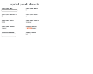
This is an example of a web form with input types and pseudo-elements, designed using HTML, CSS, and Bootstrap framework 4. The concept of Lists has been used with UL and LI components. UL element has been used with the child elements of LI to display the icons and elements in an orderly manner. There are eight types of inputs and elements displayed on the form, which are text¸ radio, checkbox, range, color, button, text area, and Select. The wrapper class is given the styles of max-width as 600px, margin as 2rem auto 1rem. The header of the form is given a text-align style as center. The list items are displayed in a grid, and the number of columns for the grid is defined as 2. The grid-gap is set as 1rem, with the font-style for the list items is set as 16px/1.4 Arial, sans-serif. An outline style of 1px solid #DDD is set for the list item box, with a padding value as .5rem.
Source: https://codepen.io/yoksel/pen/eYNmRNe
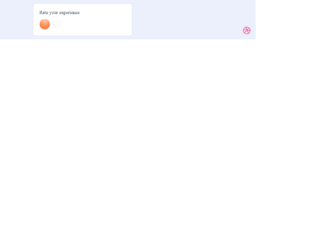
This is an example of a rating slider with smiley animations, designed using HTML, CSS, JavaScript and Bootstrap framework 4. The icons are imported to the code with their URLs. The concept of Lists has been used with UL and LI components. UL element has been used with the child elements of LI to display the icons in an orderly manner. The slider is given five types of reactions which are awful, bad, okay, good, and grat. JavaScript functions have been used to implement the reaction animations on smileys by giving different styles to a different section of smileys such as mouth and eyes. The body of the form is given a style set of min-height as 100vh, display as flex, font-family as 'Inter UI', 'Inter', Arial, justify-content as center, align-items as center, and background as #ECEFFC. The text is given the styles of font-weight as 500, and font-size as 18px. The colors are predefined and assigned according to the reaction smileys.
Source: https://codepen.io/aaroniker/pen/oNgPXav
Rating Slider
4.1.1
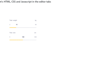
This is a sample template of a web form with a slider with a fill and configurable tick marks, designed using HTML, CSS, JavaScript, and Bootstrap framework 4. The icons and fonts are imported to the code with their URLs. JavaScript functions have been used to implement the slider functionalities. The colors and sizes are predefined. The slider container is given a max-width as 440px, border-radius as 40px, and box-shadow as 0px 8px 40px rgba(128, 128, 128, 0.15). The slider headers are given the styles of font-family as "Poppins", sans-serif, font-size as 18px, font-weight as 300, and color as #71738b. The slider value container is given the styles of font-family as "Hind Madurai", sans-serif, font-size as 18px, and color as #71738b. The slider value is given a font color of #34385a. The slider handle size is defined as 14px, whereas the slider progress is shown in #ffd049 color. The cursor style for the slider is set as pointer to get the hand cursor effect.
Source: https://codepen.io/viestursm/pen/BayEjaN
This is an example of a bootstrap web form with an image carousel, designed using CSS, bootstrap framework 4 and HTML. The images, fonts and bootstrap styles are imported to the code with their URLs, whereas the carousel feature had been implemented in CSS itself. The concept of Lists has been used with UL and LI components. UL element has been used with the child elements of LI to display the details in an orderly manner. The body of the form is given a background color of #000, whereas the color of the title is set as #7CFC00. Carousel items are given a style set of border-color as transparent, border-radius as 3px, box-shadow as 0 0 20px 0 #7CFC00, cursor as pointer to get the hand cursor effect, a transform effect as scale(1.5), transition-delay as 0, transition effect as all .34s linear, and z-index as 2. The height and the margin for the carousel are set as 392px, and 12px, respectively.
Source: https://codepen.io/cliero/pen/rNaJxVq

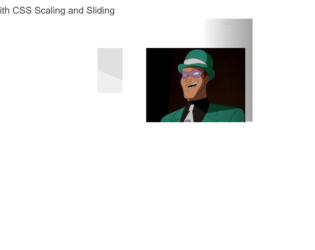
This is an example of a bootstrap web form with a swiper slider, designed using JavaScript, CSS, bootstrap framework 4 and HTML. The images and bootstrap styles are imported to the code with their URLs, whereas the swiper feature had been implemented using JavaScript. The swiper is given the styles of background-size as cover, background-position as 50%, min-height as 80vh, display as flex, align-items as center, justify-content as center, and flex-direction as column. The pagination dots are given the styles of background-color as transparent, border as 2px solid #fff, border-radius as 50% to get the circle shape, width as 12px, height as 12px, and opacity as 1. When the dots are active, they take the background-color #fff. The swiper buttons are given the background color as rgba(0,0,0,.25). The loop value is set as true in JavaScript to run the swiper in a loop.
Source: https://codepen.io/shivam1192/pen/BayYQoP
Swiper
4.3.1