This code is used to design a responsive navigation bar where it dynamically changes according to the screen size. If the screen width is greater than 700px, the “nav-bar” class will be displayed and “small-navbar” will be hidden and vice versa. The style “display” is used with the value “none” to hide the visibility and the value “block” to make it visible. To identify the screen size, the media screen attribute has been used by specifying a min-width. The input element has been used with its type checkbox to display the clickable div; its clicked events have been handled by applying the styles when checked and remove the styles when unchecked.
Source: https://codepen.io/jewel998/pen/exVpQK?&page=1
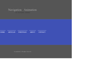
Whether it is "traditional top bar" navigation or sticky navigation at the bottom or sides, we can have animations for the menu when selected. These animations can be blended with all types of navigation bars. We are looking at the series of collections of animations used for the menu items in a navigation bar. This is the third example in this series; the code uses the combination of HTML and CSS to create the animation. It is a simple navigation bar with a menu like any other blog. Check out the menu when you trigger the hovering event, this will create a left border along with the text of the menu. The font and other styling properties are perfect matches for any format website. These animations give a special effect to navigation bars. You can use this kind of animations for your personal website.

This is an excellent example of animations used in the navigation bar. This effect is due to the simple combination of the HTML and CSS styles. This is a simple navigation bar with menu added to it. Once you trigger the hovering event on any menu, you would see the top border moving down while the left border appears along the left side of the text. This is achieved by setting the height and width property of borders before and after the hovering event. This can be used in a traditional top bar or any sticky navigation bar located at the bottom or sides of the website. You can use this snippet with any website, as the font and the properties used, can be a perfect blend with any website. You can have multiple animations by changing the border properties and see to yourself for the ideal animation effect for your webpage.
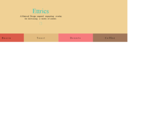
This is a creative style menu option where the columns are expanded to display the menu items. The Navigation bar itself is displayed with the menus at the bottom of the page. This can be used in your web pages instead of the navigation bar. This is best suited for less number of menu items. Each page is opened when clicked on the menu which is expanded using javascript. The color combinations and visual plays an important role than the menu and design. The animation effect is an effort of CSS and javascript for its simple and clean code. The design is responsive and takes a different view altogether in mobile devices. Use this for your personal websites where menu items are less in number. The CSS needs to be perfect for such kind of web page. Make sure your page has color matching to this template while using this on your site.
Material Design is an excellent template to represent the personal blogs consisting very fewer menu items. The design of the page is excellent with the menu represented at the bottom of the web page. This is totally responsive and can be viewed with any devices. Clicking on each menu item gives a description of the menu item. This design can be used to show mega menus too where the items in one category are listed in particular items. The webpage design is suited better for one-page navigation and can be used with any website by blending it with websites. For the smooth display of the pages of each menu, item javascript is used. Also, it shows a closing button at the right top of your webpage.

This is an example of Canvas navigation where the navigation template is vertical hamburger style which is located to the left of the plate. This is responsive in nature and can be best satiated for event website templates or music website templates. The template has a background animation effect you will get once clicked on the menu. The navigation menu items can be tweaked for your requirement and fit this on your website. It requires javascript to perform the animation of toggling of the menu when clicked on the menu. The animation and CSS style is a perfect match for this snippet. You can add this for event website templates or music website templates with your own flavor of website. With the right template and color, you can blend it with any website.