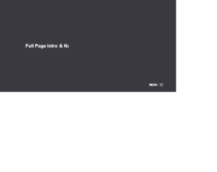
This is an example of a full page into and navigation menu. This uses the creative style of designing navigations for the web site. The menu is at the bottom and uses the hamburger navigation menu. On clicking the menu icon the navigation menu is displayed from the top of the page, covering the complete page. In order to dismiss the menu, you can click on the cross button on the right of the page. This style fits for photography website template. The navigation menu bar can be used to show the mega menu items like on the e-commerce website. You need to have a javascript running to display the menu items and their effects. The CSS is the best to match for the website. You can use this as an example for the creative website and tweak as per your requirements and menu links.

This is an example of a one-page navigation menu template. This can be used for floating style website as it reserves a particular space on the left sidebar. The design is such that it does not contain boundary on the homepage but for the subpages, you would see the boundaries. The menu options are just a blend to the rest of the web page as this design is possible due to the icons used for the website. The visual effects are purely due to CSS styling. These menu options can be used for creating web pages or personal blogs as the menu items are less in number. Check out the colors set for each paragraph, which gives a look of a new page. You can use this snippet for your one-page design layouts.

This is a classic example of the responsive navigation bar with no javascript needed. It uses clean HTML5 markup. This navigation bar is aligned to left but can be aligned to center or right. In mobile devices, the navigation bar is set on the top with the logo displayed whereas on the website it’s displayed on the left of the device. Toggling behavior can be seen by clicking on the toggle button. The dropdown is already set for some menu. The icon for each menu is set. CSS file defines responsive behavior using a media query. Navbar on the screen of width above than 767px will be displayed as block align to left, whereas for the screens below 767px the navigation bar will be displayed on the top of the page. Use this navigation bar for mobile applications to navigate to your custom links.
This is a classic example of the navigation bar, with scrollbar effect to the dropdown navigated links. This could be used for the educational or business website. This uses bootstrap and jquery. HTML is quite simple with the tag defining the dropdown and sub menu. It shows the example of a scroll bar effect where the submenus are scrolling without the scroll bar displayed vertically. Also, there is an example where no sub-menus are mentioned under the menu. The scrolling effect is given by javascript, using hover functionality. Javascript takes care of the height and items in sub-menus. It decides the speed of scrolling according to the list in the sub menu. More the list faster is the scrolling. CSS defined the style for each class used in the snippet. Use this snippet to create the desired navbar for your website.

This is an example of vertical responsive sidebar navigation, which can be used for mobiles or other devices. This is fully responsive and space saving sidebar navigation for any project. It is decorated button with primary and large settings. It button behavior is set with toggling property. The navigation is set to be a sidebar using sidebar-nav class this gives the navigation bar an ability to be placed at one side of the site. The navbar can have its brand name set by side-bar class. CSS file defines the effects and style for this navbar. Check out the properties set for each class and the wrapper which wrappers the navbar. The mouse hover effect is set in CSS with its color changing effect. The javascript adds the effect of toggling the navbar. This navbar is perfect for its responsive behavior. Use this and tweak it to your requirement.