
This is an example of a simple bootstrap card image gallery, designed using HTML, and CSS. Bootstrap class card-columns has been added to display images in columns. The images have been added to the form with their URLs imported. The images are divided into 4 sections depending on their different sizes, with the first section containing 2 columns, the second one containing 3 columns, the third one with 4 columns, and the fourth one with 5, making altogether 14 columns of images. The body of the form is given a padding of 2em. The card image is given a border-radius of 0em. Images in the first section are given a min-width of 576px, whereas the ones in the second are given 768px and the third and fourth, 992px, and 1200px, respectively.
Source: https://codepen.io/AldoF/pen/LvQaVW
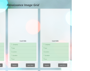
This is another example of a simple bootstrap tile layout with a photo grid, designed using HTML, and CSS. Bootstrap styles are imported to the code with its URL. The Li element of lists has been used to display the card details in a list. The background image has been added to the form with the given link. The body is given a style set of font-family as 'Montserrat', font-style as Italic, background-attachment as fixed, background-position as center, and padding as 20px whereas the header is given the styles of text-align as center, padding as 20px, and font-size as 20px. The card title is given the styles of font-weight as bold, and text-align as center. The left panel is given a style set of position: relative, left: 5%, background-color: #555, color: white, font-size: 16px, padding: 12px 20px, border-radius: 5px, and cursor as pointer to display the hand cursor. The right panel is given the styles of position: absolute, right: 10%, background-color: #555, color: white, font-size: 16px, padding: 12px 20px, border-radius: 5px, and cursor: pointer. The modal view of the learn more button is given a color of linear-gradient(white,#7FDBFF).
Source: https://codepen.io/soumyashaw/pen/maOzLO
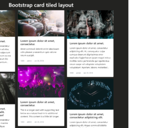
This is an example of a simple bootstrap tile layout designed using HTML, and CSS. Images for the tiles have been imported to the form with its URL added. The cards are given the bootstrap type card. The body of the form is given a background color of #232321 whereas the header of the form is given the styles of color as #fff and padding as 10px 0. The tiles are given a style set of box-shadow as 0 4px 8px 0 rgba(0, 0, 0, 0.2), transition as 0.3s, and border as none. In a hover event, the tiles take a box shadow effect with the style set as box-shadow: 0 8px 16px 0 rgba(0, 0, 0, 0.4). The color and text-decoration styles are set as initial and a text-muted helper class is also added with its margin set as 0 10px.
Source: https://codepen.io/MattRuddick/pen/xaZXgE

This is another example of a cards layout with images designed using HTML, and CSS. Images have been imported to the form with its URL added. The cards are given the bootstrap type card. The body is given a background color of #eeeded whereas the cards are given a style set of box-shadow as 0 1px 3px rgba(0,0,0,0.12), 0 1px 2px rgba(0,0,0,0.24), transition as all 0.2s ease-in-out, box-sizing as border-box, margin-top as 10px, margin-bottom as 10px, and background-color as #FFF. A box-shadow of 0 5px 5px rgba(0,0,0,0.19), 0 6px 6px rgba(0,0,0,0.23) is given to the cards in a hover event. Card header is given a margin-bottom of 5px whereas card image is given a width of 100%. The cards take a box shadow effect in a hover event.
Source: https://codepen.io/jakedx6/pen/Veqbez

This is an example of a responsive card layout designed using HTML, CSS, and JavaScript. The cards are given an expanding animation to response in a hover event and display hidden text. JavaScript functions are used to animate the push-bar in hover and clicked events with a style of 'transform': 'rotate(180deg)'. The bootstrap style sheet is imported to the code as well as the font style "font-family: 'Anton', sans-serif". The background image has been added with the given link. The cards are given the bootstrap type card. The body of the form is given the styles of background-color: transparent, background-size: cover, max-height: 300rem, and border: 15px solid transparent !important whereas the cursor is set as pointer to display the hand cursor. The push-button is given a border-radius: 50% to make it a circle. The cards are given an animation of all 0.6s ease whereas the details box appears with a style of transform: translateY(20px).
Source: https://codepen.io/Bahaa-Addin/pen/mmYMKp

This is an example for a card view with advanced effects and animation with the use of HTML, CSS and JavaScript. CSS style ‘overflow-y’ is set as scroll to apply scrolling to the whole page. JavaScript function has been used to implement the onclick function display only a half of the icon. On a click event of the element, a class will be added to the styles. In order to display only half of the element, CSS style top has been set to -215 making it placed above the top margin. Two JavaScript functions ‘mouseenter’ and ‘mouseleave’ have been added and given a transformation value of 1800 to zoom in and out the card tiles on mouse hover. The border bottom left radius has been set to the value of 5px and the border bottom right radius has been set to the value of 5 to curve only the bottom part of the element.
credits - https://codepen.io/Bahaa-Addin/pen/mmYMKp