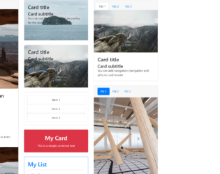
This is an example of displaying different types of card types with the use of HTML only. The bootstrap inbuilt class style has been used by setting the class name in the element. Each card consists of an image, title and a description in different formats and orders. The img HTML element has been used to set the image to the thumbnail. To distribute the data in rows and columns within a card, the bootstrap inbuilt class ‘row’ and class ’col’ are used. The class name ‘card’ has been used to apply the card styles to the HTML so that they don’t have to be manually entered. The links are set with the HTML element of href.
credits - https://codepen.io/SitePoint/pen/mXqdda
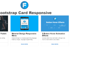
This is an example for a responsive card thumbnail that can be designed HTML and CSS. Each card has the image, title and a description followed by a read more button. The img HTML element has been used to set the image to the thumbnail. The styles that are applied to the entire page are height as 100%, width as 100%, background as #FFF, font family as 'Roboto', sans-serif, and font weight as 400. The font weight is the style that is used to set the bold value of the font. Media queries in the CSS file have been used to make the card thumbnails responsive with the values of min width as 450px, min width as 760px, and min width as 900px. resulting this example to be responsive for three screen resolutions.
credits - https://codepen.io/wisnust10/pen/BKjNNR
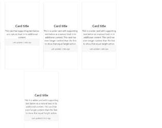
This is an example of displaying the data in a card format with the use of HTML and CSS. Each card will have the image on the top, title followed by the description. The card styles that are applied to this example have a style of padding left as auto, padding right as auto, min height as 500px, margin top as 15px, box shadow as 0 2px 5px 0 rgba(0, 0, 0, 0.16), 0 2px 10px 0 rgba(0, 0, 0, 0.12) and transition as .25s box-shadow. To implement the box shadow effect on the mouse hover for each card, the hover event in the CSS style class has been used by updating the box shadow class to the value of 0 5px 11px 0 rgba(0, 0, 0, 0.18), 0 4px 15px 0 rgba(0, 0, 0, 0.15). The same styles have been used for the focus event as well.
credits - https://codepen.io/reklamarsiv/pen/vgPLLv
Simple Bootstrap Cards
4.3.1

Models are dialog box /popup that is displayed on top of the current page. This can be used to show any important message or any information. This snippet is an example of showing more information on the clicked object. It is a simple example of buttons to show the model. Here the buttons are having the image out planets and styled using CSS. A click on any button or image displays model with the information of planets. To open the model set the data-target to model to be opened. To create a Model you need to define the model class with a dialog containing, header, body, and footer if needed and id as a reference to a button click. A close button dismisses button can be seen at the bottom and at top of the model. You can use this snippet to display the information in dialogue in the form of Model. You can style the model accordingly.