
This is an example of a web form with a responsive avatar card layout, designed using HTML, JavaScript, and CSS. The images have been added to the form with their image URLs imported. JavaScript functions have been used to implement the responsive animations on the avatar cards. The body of the form is given a background color of #08202B and the overflow-x property is set as hidden clip the content. Two navigational links: Directors and Contact have been given the styles of font-family as 'GTAmericaExpanded', sans-serif, font-size as 2.4rem, color as #fff, font-weight as 900, line-height as 1.2em text-transform as uppercase to automatically convert the text to uppercase, and cursor as pointer to display the hand cursor. The avatar module has the styles of width: 100%, position: absolute, top: 50%, left: 50%, and transform: translate(-50%,-50%) whereas avatar name is given the styles of width: 100%, font-family: 'GTAmericaExpanded',sans-serif, font-size: 1.2rem, color: #fff, font-weight: 800, text-align: center, transform: translateY(-50%), and transition: all 0.2s.
Avatars on cards
4.3.1
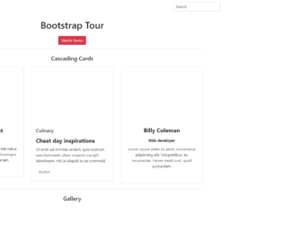
This is a template of a bootstrap tour of a web form with a navigational bar, buttons, cascading cards with social media links, and a card image gallery, designed using HTML, CSS, and JavaScript. The collapsible navigation bar is added with a dropdown list and a search bar. The bootstrap tour function is implemented using JavaScript functions. The show and hide methods of the JavaScript popover function have been used to hide and show the popup box. The images have been added to the form with their image URLs imported and the Li element of lists has been used to display the items in a list. The gallery is given an initial style set of column count as 3 (webkit-column-count: 3, moz-column-count: 3), column width as 33% (webkit-column-width: 33%, moz-column-width: 33%), transition as all 350ms ease, and animation as 1(webkit-transform: scale(1), ms-transform: scale(1)).

This is a template of a signup form layout, designed with CSS, HTML, and JavaScript. The toggle class of JavaScript has been used to toggle between adding and removing one or more class names. The logo has been added to the form with its image URL imported. The signup card has the styles of border as 1px solid #dadce0 and border-radius as .5rem whereas the logo has the styles of width: 75px, height: auto, margin-bottom: 1rem. The slogan is given the styles of color: #3c4043, font-weight: 500, and font-size: .875rem. The signup button is given the styles of border-width: 1px, font-weight: 500, font-size: .785rem, border-radius: .25rem and border-color: #dadce0 where it changes the style to background-color: #f6f9fe, and border-color: #d2e3fc in a hover event and background-color to #e4eefd, and border-color to #d2e3fc in a clicked event. The border color of the input fields also changes to #4285f4 in a clicked event.
Form on a card
4.3.1
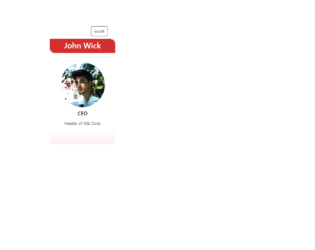
This is an example of a web form with a rotating card with description, designed using HTML, CSS, and JavaScript. Links to social media pages are also added to the bottom of the card. The Li element of lists has been used to display the social media icons in a list. JavaScript has been used to implement the flip function of the card with transform and box-shadow styles added. The images have been added to the code with their URLs. The body of the form is given a background color of rgb(255, 255, 255). The flip of the card has the styles of width: 100%, height: 350px, transform-style: preserve-3d, and transition: all 0.4s ease. CSS styles are added to the card section-wise as front, back, text area, top, top. header avatar, name, back.header, card link button, and the card links. A box-shadow effect of 0px 1px 10px -2px rgba(0,0,0,0.43) added to the card in a hover event.
Rotating card
4.3.1

This is an example of a simple bootstrap card image gallery, designed using HTML, and CSS. Bootstrap styles are imported to the code. The bootstrap class card is used to implement the cards, class card-columns to display the cards in a column view, and class card-img-top to display the cards on top of the text. The images have been added to the form with their URLs imported. A card is divided into three parts as Card Body, Card Title and Card Text. The background color for the background is set as orange. Default bootstrap styles have been used almost in the whole code and a text-muted helper class is also added to the cards.
Source: https://codepen.io/alex7andria/pen/PgdrZq
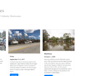
This is an example of a simple bootstrap card layout with links to its Wikipedia content, designed using HTML, and CSS. Bootstrap class card-deck has been added to display images in a deck. The images and the background image have been added to the form with their URLs imported. The background is given a background-size of 100%. The title has the styles of background-color: white, padding: 30px 40px 30px 20px, background: rgba(256, 256, 256, 0.5), display: inline-block, and font-family: Orbitron. The images are given a min-width of 576px, and the image title is given a font-size of 4rem and the subtitle a 2rem. Learn more buttons are embedded with the links to the Wikipedia content to externally redirect.
Source: https://codepen.io/mvthsmiller/pen/bxKxpM
Bootstrap card template
4.3.1