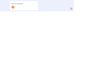
This is an example of a rating slider with smiley animations, designed using HTML, CSS, JavaScript and Bootstrap framework 4. The icons are imported to the code with their URLs. The concept of Lists has been used with UL and LI components. UL element has been used with the child elements of LI to display the icons in an orderly manner. The slider is given five types of reactions which are awful, bad, okay, good, and grat. JavaScript functions have been used to implement the reaction animations on smileys by giving different styles to a different section of smileys such as mouth and eyes. The body of the form is given a style set of min-height as 100vh, display as flex, font-family as 'Inter UI', 'Inter', Arial, justify-content as center, align-items as center, and background as #ECEFFC. The text is given the styles of font-weight as 500, and font-size as 18px. The colors are predefined and assigned according to the reaction smileys.
Source: https://codepen.io/aaroniker/pen/oNgPXav
Rating Slider
4.1.1
Callvertise is a pay per call marketplace that connects Affiliate publishers with call advertisers. We do Pay Per Call and performance marketing better than anyone in the business, and if you want to attract interested customers, we can bring them to you. Pay-per-call is an important part of your digital advertising, Use our marketplace to buy and sell pay per call advertising. If you are interested in buying and selling calls we have a portal www.callvertise.com here you can able to buy and sell call in the whole world. We Provide Lots of categories where you can buy and sell your calls with best offers and very affordable price.
Pay Per Call Network
4.1.1
Comments are closed

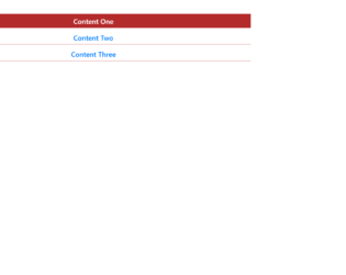
This is a plain yet elegant example of an Accordion with the items arranged in the ordered list. You can use this to show a large amount of information or data in an ordered manner. This can be seen in the pages where the content is broken in paragraphs, links, and images. You can create this using plain HTML with bootstrap and CSS styles. You can click on one of the panels and you would see the collapsible feature working on this accordion. This snippet uses the “Collapsible panel” one of the feature of bootstrap. You need to define the “panel-group” which is divided default-panel each having header, footer, and body. Check out the classes data-toggle assigned as “collapse”. This gives the collapsing functionality to the body of according once clicked on the header. The CSS styles the accordion along with the panel.

This is an example of Nested Accordion with verticle steps inside each accordion. Here the panel is created inside the panel to create a nested view. To create this nested view we have a super accordion defined as panel-group and then the panels containing the header and body for each accordion. Now each of these panel-body defines a new panel which would create a new group of the accordion. The data-toggle is set to collapse to give a collapsible behavior to each accordion. The innermost body contains some listed information; You would rarely see, but this could be useful in website for educational to display large content or on the sites which deals with different variety yet categories under one particular menu. You can use this on your website.

This is an example of the simple default collapsible feature and material design accordion using bootstrap. Though the HTML design is the same, the behavior changes due to the bootstrap material design accordion class. Click on the simple collapsible feature to see the content. This feature displays the collapsible behavior by click on it once again. Check out the material design bootstrap accordion behavior, once you click on any of the accordions there is a smooth transition from previous open accordion to the opening of click accordion. This transition is due to bootstrap designs. The styling for both the designs is different for both examples. Check out the javascript which adds and removes the active class for the clicked accordions. Use this snippet’s for your websites especially for menus or list items. Tweak the styling to blend it with your website.
This is an elegant looking accordion, with HTML and CSS style. The HTML is simple with the container having panel-group with the heading, title body defined for accordion. The data-toggle and accordion-toggle define the behavior of the accordion once clicked on it. The collapse class indicates it has a collapsible behavior for each panel. The .in is added to the first panel for the collapsible class which indicates the data to be shown by default. The first panel is shown by default and is in the expandable state. An accordion is used to show the extra information or paragraph with images and links. You can use this styled accordion on your page. The styling and color combination would give and stylish look to your website.