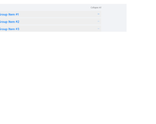
This is an excellent example of the accordion with “expand all and collapse all” button. The HTML is simple with the bootstrap accordion with the panel and data-toggling behavior defined. The CSS defined the styles for each tag, check out the “:: after” selector tag, which selects the panel-default and panel-heading and add the given styles after they are selected. Notice the change in the expandable button which is at the right of accordion, once clicked it rotates 180deg, this styling is done using CSS for aria-expended. This indicates the state of the collapsible element. This aria-expanded can be used with menus or list or any other collapsible items. The expand all and collapsible all button work using javascript. Check out the functions which open up all the accordion when clicked on "expand all" and "close all" when clicked on close all accordion. Use this to your website with large content and paragraphs.

Generally, accordions are used with collapsible and toggling behavior. But this example shows you the combination of color schemes such as primary, success, danger, etc. The snippet is using the container for the responsive behavior of this design, the panel-group class is used which includes the panel-heading, panel-title, panel-body. You could also include the panel-footer if needed. The panel-default describes the color scheme for the accordion. Panel container different classes for color such as panel-primary, panel-success, etc. This is defined for each panel in panel-group. Each panel defines the buttons for previous and next accordion to open. Button click functions are taken care of by the javascript file. The CCS just defines the top-margin for the accordion, color scheme and fonts is taken care using the tags used in HTML. You can use these types of the accordion to display some new or important announcements on webpages.
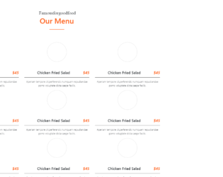
This snippet displays the stylish restaurant menus on the page. This can be easily integrated with your web page. It uses the latest features of Bootstrap 4 and jquery 3.2.The font for this style is carefully selected to match the template and enhances to make it stylish. In a container which is gives a behavior of responsiveness, we have a “section-title” which is aligned in the center. Next we have set of “single_menu_list” defined in the “menu_style1”. These set or template defines the “menu_list”, a set of image and menu header and description of each menu. These are placed equally into divided column of the row. The image border is reduced to zero during mouse hover which gives an image an elegant feature. You can use this snippet and tweak for your page to display your menu views similarly on menu card given in restaurants.
Bootstrap - 4 menu style
4.1.1
This is a classic example of the navigation bar, with scrollbar effect to the dropdown navigated links. This could be used for the educational or business website. This uses bootstrap and jquery. HTML is quite simple with the tag defining the dropdown and sub menu. It shows the example of a scroll bar effect where the submenus are scrolling without the scroll bar displayed vertically. Also, there is an example where no sub-menus are mentioned under the menu. The scrolling effect is given by javascript, using hover functionality. Javascript takes care of the height and items in sub-menus. It decides the speed of scrolling according to the list in the sub menu. More the list faster is the scrolling. CSS defined the style for each class used in the snippet. Use this snippet to create the desired navbar for your website.
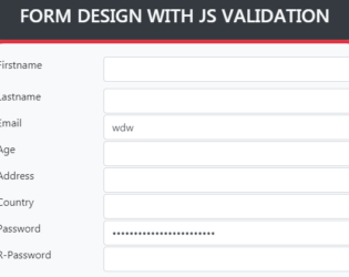
This is an example of a form design with javascript validations. This form can be used during the registration of players or with sports. The bg-dark class is used for the background of the container and complete body. This sets the dark grey background color. Form when submitted verifies with the validate method. FormGroup elements are used to create the form with fields like first and last name, email, age, address, country, password, interests. The interests are marked with the custom radio button. A CSS style sheet is defined for a row, button, and form groups. The script has a validate function which validates the input of each input tag. It sends an alert message if the input values are incorrect.
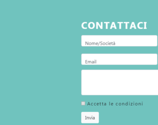
This is an example of a Contact Form with Google maps. The google maps and forms are placed in the container. The divisions are equally done to display the map as large as the given form. Contact details contain name details, contact details like email and telephone number and message. The map is displayed in iFrame and the location is set to Colosseum. Once you click on the map it opens you the google map page. FormGroup tag is used to add the FormControls. Font awesome icons are used to represent the contact details. The divisions are well organized and labels are input tags are well styles. The form has validations and checks it before submitting the form. Icons of social sites like Facebook and linked in are placed. These types of forms can be used for e-commerce websites and organization offering services.
Forms with Google Map
4.1.1