
This is an example of a rating slider with smiley animations, designed using HTML, CSS, JavaScript and Bootstrap framework 4. The icons are imported to the code with their URLs. The concept of Lists has been used with UL and LI components. UL element has been used with the child elements of LI to display the icons in an orderly manner. The slider is given five types of reactions which are awful, bad, okay, good, and grat. JavaScript functions have been used to implement the reaction animations on smileys by giving different styles to a different section of smileys such as mouth and eyes. The body of the form is given a style set of min-height as 100vh, display as flex, font-family as 'Inter UI', 'Inter', Arial, justify-content as center, align-items as center, and background as #ECEFFC. The text is given the styles of font-weight as 500, and font-size as 18px. The colors are predefined and assigned according to the reaction smileys.
Source: https://codepen.io/aaroniker/pen/oNgPXav
Rating Slider
4.1.1

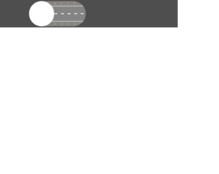
This is an example of a web form with date picker with click and drag options, designed using HTML, CSS, JavaScript, and Bootstrap framework 4. The icons are imported to the code with their URLs. JavaScript functions have been used to implement the click and drag functions of the calendar. The background color of the form is given as #eee. The calendar is given a style set of font-size as 3vw, display as grid, grid-template-columns as repeat(7, 1fr), grid-gap as 0.25em 0, margin as auto; padding as 1em, background as #FFF, box-shadow as 0 1em 2em hsla(0, 0%, 0%, .25), and border-radius as .5em. A selected date takes the background color of #00AEF2. If a date range is selected, the dates between the start date and end date take the opacity value of 0.5. The grid-column-start point is given as 4, to start the first child of the calendar from the fourth column.
Source: https://codepen.io/team/keyframers/pen/qBEKMbo

This is a web form with an animated CSS loader designed using pure CSS, and Bootstrap framework 4. The colors and sizes of the loader are predefined as $p: 6.25em, $r: 1.5em, $b: 20*$r, $d: 2*($b - $r), $c: /#490a3d, /*#bd1550,*/ #e97f02/*, $n: length($c), $q: 20%, and $t: 1s. The background of the form is given the styles of background color as #333, and filter as drop-shadow(2px 2px 5px rgba(#000, .5)). The body of the form is given the styles of display as grid, place-content as center, height as 100vh, and animation as fsx 4*$t steps(1) infinite. The loader switches its background color between #490a3d, and #e97f02. It is given an animation of fbg 2*$n*$t steps(1) -3*$t infinite, mov $t infinite alternate, and exp $t ease-in infinite alternate. When the mov becomes 100%, it is given a transform of translatey($r) rotate(.5turn).
Source: https://codepen.io/thebabydino/pen/YzPoZyj
CSS Loader
4.3.1
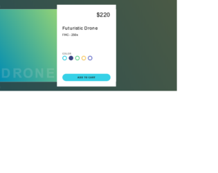
Bootstrap Product Card
4.3.1
This is an airplane mode toggle switch with animations, designed using HTML, CSS, JavaScript, and Bootstrap framework 4. JavaScript functions have been used to implement the animations on the toggle switch. The toggle button is designed to display animations when switched to the fly mode. The icons and images are imported to the code with their URLs. The colors are predefined as --color-background-off: #4e4e4e, --color-off: #494949, --shadow-off: 0 1.2rem 1.5rem #4d4d4d, --color-background-on: #2f86d5, --color-on: #1AB1FD, and --shadow-on: 0 1.2rem 1.5rem #2c82cc. The body of the form is given the styles of align-items as center, and background as var(--color-background-off). The width and height for the switch are defined as 31.1rem, and 13.8rem, while the border-radius is set as 10rem. The cursor style for the switch is set as pointer to get the hand cursor effect. The background color of the form is set to #848484 when the switch is in airport mode. The background color changes to #78c7fe when the button is switched to sky mode.
Source: https://codepen.io/KiarashZ/pen/dyPLpaP

This is an example of an animated photo gallery with hover effects, designed using HTML, CSS, and Bootstrap framework 4. The images are imported to the form with their URLs, whereas the media queries are used to increase the responsiveness of the form. The body of the form is given the styles of background as #222, font-family as "Fira Sans", sans-serif, and padding-right as 2rem. The image gallery is given a max-width of 1300px. The image wrapper is given the styles of justify-content as flex-end, background as #222, border-right as 2px solid #333, and position as relative. The image name is given the styles of text-transform as uppercase to automatically convert the text to uppercase, font-size as 40px, letter-spacing as 2px, and color as transparent. The first strip of images is given an animation of 60s move-it ease alternate infinite 5s, with a transforming effect of translateY(2%), whereas the second one is given 58s move-it-2 ease alternate infinite 5s with transform as translateY(-50%). The third one has an animation of 70s move-it ease alternate infinite 6s, with transform as translateY(2%), while the fourth one is given 65s move-it-2 ease alternate infinite 5.5s, with transform as translateY(-50%). The animation-play-state of the images become paused, in a hover event.
Source: https://codepen.io/oliviale/pen/RwNOPvx
Animated Photo Gallery
4.3.1
15. https://webdesignerwall.com/create-snippet?snippet_id=7914
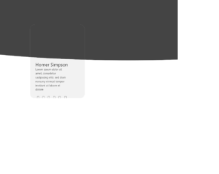
This is an example of an image card layout form with hover effects, designed using HTML, CSS, and Bootstrap framework 4. The icons and images are imported to the form with their URLs. The font style for the form is given as 'Segoe UI', sans-serif. The background of the form is given two colors; #444, and #f2f2f2. The gray shaped area is given the styles of top as -200px, left as -450px, width as 3000px, and height as 530px. The white shaped area is given the styles of top as 135px, left as calc(50vw - 150px), height as calc(350px + 4vw), and width as 300px. The content section has the styles of display as inline-block, margin-top as calc(50% + 4vw), width as 80%, height as 40%, padding as 0 10%, text-align as left, and color as #444. The name title is given the styles of color as #222, font-size as 25px, and font-weight as normal. The description is given a font-size of 15px. The icons are given a cursor style as pointer to get the hand cursor effect and change their color into #222, in a hover event.
Source: https://codepen.io/Pedru/pen/XWJGpqz
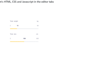
This is a sample template of a web form with a slider with a fill and configurable tick marks, designed using HTML, CSS, JavaScript, and Bootstrap framework 4. The icons and fonts are imported to the code with their URLs. JavaScript functions have been used to implement the slider functionalities. The colors and sizes are predefined. The slider container is given a max-width as 440px, border-radius as 40px, and box-shadow as 0px 8px 40px rgba(128, 128, 128, 0.15). The slider headers are given the styles of font-family as "Poppins", sans-serif, font-size as 18px, font-weight as 300, and color as #71738b. The slider value container is given the styles of font-family as "Hind Madurai", sans-serif, font-size as 18px, and color as #71738b. The slider value is given a font color of #34385a. The slider handle size is defined as 14px, whereas the slider progress is shown in #ffd049 color. The cursor style for the slider is set as pointer to get the hand cursor effect.
Source: https://codepen.io/viestursm/pen/BayEjaN