Hand-Drawn Design in Photoshop: Turn a Sketch into Artwork
To turn a hand drawing into a design element in Photoshop, you need the lines to stop being a picture of a drawing on paper and start behaving like ink on a transparent layer. There are three ways to get there: a blend mode (fast, not truly transparent), a selection built from the drawing’s tones (clean, reusable), and the Blend If sliders (no selection at all). This guide covers all three, then shows the same ideas in plain CSS so your sketches work on the web too.
The pictures in this article are my own illustrations of each result, built as HTML and SVG demos. They are not Photoshop screenshots, and the two panel diagrams are labelled as schematics. Menu names and shortcuts follow Adobe’s help for the current Photoshop desktop app; Adobe moves menu items between releases, so if a path differs in your version, search Adobe’s help for the command name.
The techniques come from a time when scanning a pencil drawing was the only way to get a realistic texture. They still are the best way to keep it: a real pencil line has pressure, grain and small imperfections that a vector brush has to fake.

Start with a good source drawing
Everything downstream is easier if the capture is clean. A few habits that pay off:
- Draw dark and bold. Use a soft pencil or fineliner on plain white paper. Faint pencil gives you a faint, grainy result that has to be fought later.
- Scan at 300 dpi or higher if the artwork will be printed or shown on high-density screens. A flatbed scanner gives even light. If you use a phone, shoot in daylight, straight on, with no shadow of your hand.
- Draw digitally if you prefer. With a tablet or stylus you can sketch straight onto a transparent layer with a textured brush, and you can skip the extraction steps. The rest of the article (gradients, compositing, the web) still applies.
- No tablet and no paper? Make the artwork as vector shapes, bring it in as a Smart Object, then roughen it: erase parts with a grainy brush on a layer mask and soften a few edges. Use a mask rather than the eraser so the work stays reversible.
Clean up the scan first
Open the scan and use a Levels or Curves adjustment layer to push the paper to pure white and the lines toward black. Drag the white point slider left until the paper stops showing grey, and the black point slider right until the lines are solid but still have their texture. Doing this as an adjustment layer means you can come back and tune it after you see the result in context.
Method 1: Multiply, the quickest route
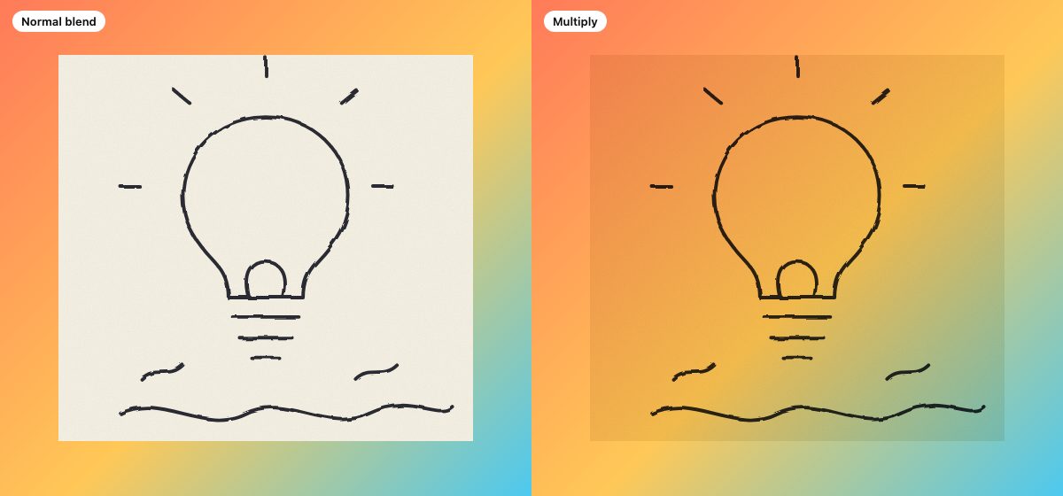
Put the scan on its own layer above your background and set the layer’s blend mode to Multiply. Multiply darkens: white has no effect, so the paper disappears and the lines darken whatever sits underneath. It works well for pencil over a flat colour, a texture or a photo.
The limitation is that nothing is actually transparent. The layer still contains a paper-coloured rectangle, and the effect only exists while the blend mode is live. If you export just that layer as a PNG, the paper comes with it.
For white lines, invert and use Screen
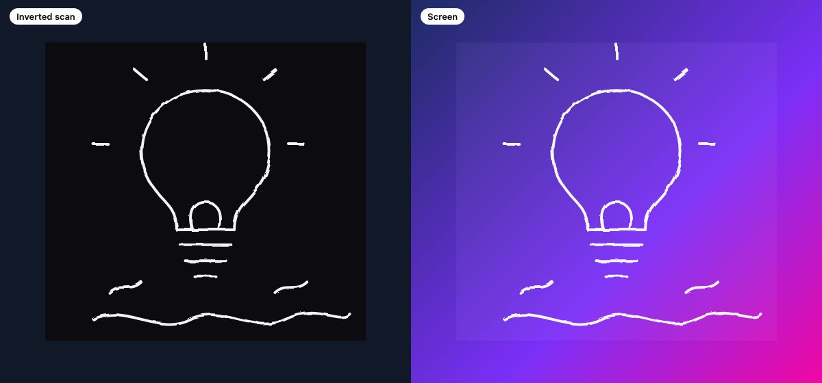
For light strokes on a dark design, invert the drawing with Image > Adjustments > Invert (Ctrl+I on Windows, Cmd+I on Mac) and set the layer to Screen. Screen is the mirror of Multiply: black has no effect, and everything lighter brightens the backdrop. The same drawing now reads as chalk on a blackboard.
Method 2: Turn the drawing into a selection
When you want a coloured gradient, a pattern or a texture to show only inside the lines, you need the lines as a selection. This is the same idea as the old alpha-channel technique, with a shorter path.
- Make sure the scan is cleaned up as described above.
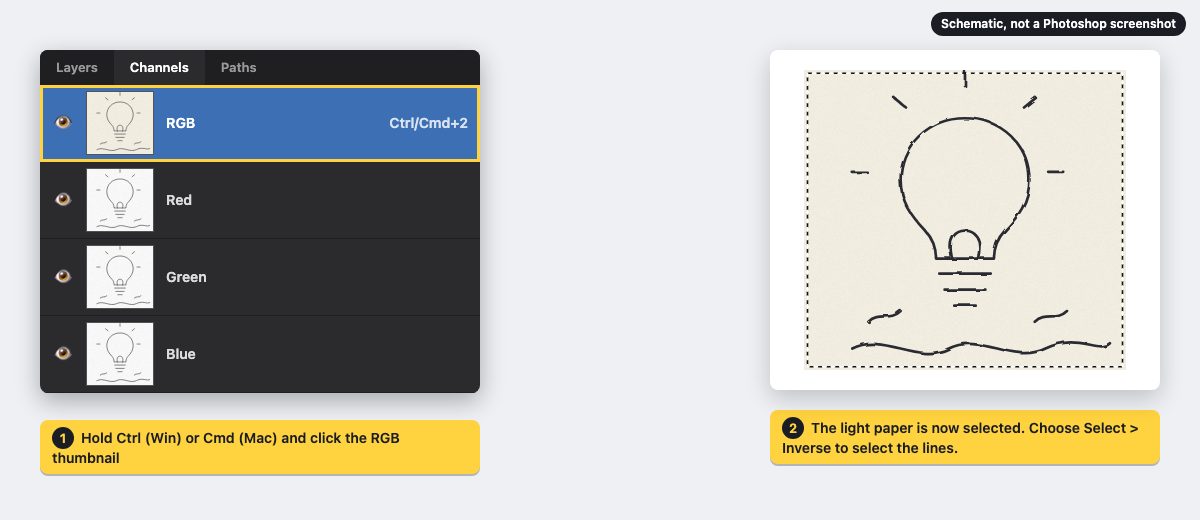
- Hold Ctrl (Windows) or Cmd (Mac) and click the RGB channel thumbnail in the Channels panel. This loads the image’s light areas as a selection, so the paper is selected and the lines are not.
- Invert the selection with Select > Inverse (Shift+Ctrl+I or Shift+Cmd+I). Now the lines are selected, and the soft, grainy edges become partial selection values.
- Alternatively, skip steps 2 and 3 and use Select > Color Range with the Select menu set to Shadows. It gets you to the same place with a preview and a Fuzziness slider that lets you decide how much of the faint grain to include.
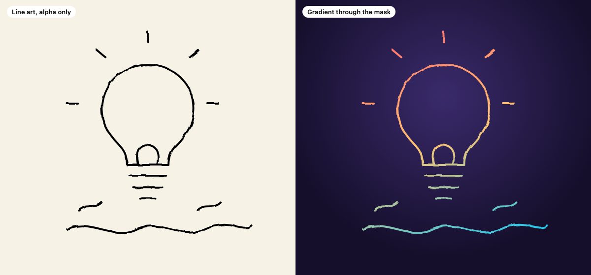
- With the selection active, choose Layer > New Fill Layer > Gradient (or Solid Color or Pattern). Photoshop turns the live selection into the fill layer’s mask, so the colour appears only along the lines.
Because the result is a fill layer with a mask, it is fully editable: double-click the layer to change the gradient angle and colours any time. If you prefer saving the selection for later, use Select > Save Selection to store it as an alpha channel, and bring it back with Select > Load Selection. The shortcut for a saved channel is the same Ctrl/Cmd-click on its thumbnail.
If you keep a lot of Photoshop shortcuts in your hands, our Photoshop secret shortcuts list is a good companion.
Method 3: Blend If, no selection needed
Double-click the scan layer to open Layer Style and look at the Blend If sliders at the bottom. On the This Layer bar, drag the white slider left: the lightest pixels in the layer, the paper, drop out and the underlying layers show through. Hold Alt (Windows) or Option (Mac) while dragging to split the slider in two, which feathers the transition so thin pencil lines do not get chewed up.
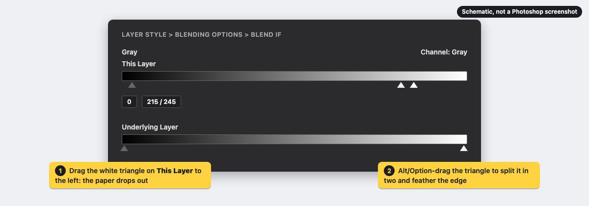
This is non-destructive and works on a Smart Object, so you can re-tune it against a different background. The trade-off compared with the selection method is that you get the lines only as a visual effect: the layer itself still has the paper in it. You can’t pour a gradient through the result, but you can combine Blend If with a Color Overlay layer style when you only need a single colour.
Which method should you pick?
| Method | Transparent? | Recolour? |
|---|---|---|
| Multiply or Screen | No | Limited |
| Selection to fill layer | Yes, as a mask | Gradient, pattern, solid |
| Blend If | No, visual only | One colour via style |
Use Multiply or Screen for fast mock-ups, a selection-based fill layer for final artwork and coloured lines, and Blend If for non-destructive tweaks against a single background.
Convert the scan to SVG for vector artwork
If you want crisp, scalable lines instead of a bitmap, trace the cleaned-up scan. In Illustrator, place the image, open Window > Image Trace, and choose a black-and-white or sketch preset. Raise the Threshold until the lines are solid, keep Noise high enough to ignore paper grain, then use Object > Image Trace > Expand to get editable paths and save or export as SVG. Bold, dark lines trace best; if a pencil drawing comes out lumpy, go back to the Levels step first. The grain is lost in the trace, so use it for logos, icons and web graphics rather than textured artwork.
Drawing apps such as Procreate or Fresco let you skip the scan: export the sketch as a PNG with a transparent background, or trace it as above for SVG. Either file is exactly what the CSS mask below needs as sketch-lines.svg.
Use the drawing in a finished design
The classic way to use hand-drawn lines is as an overlay on a photo, such as scribbled arrows, halos or doodles around a portrait. The structure of the layers matters more than any single trick:
- Cut out the subject. Use Select > Subject or the Object Selection tool, then add a layer mask and refine the edge on the mask, not on the pixels.
- Build the background. A soft radial or mesh-style gradient behind the subject gives the lines something to glow against.
- Place the drawing above the subject. Use your Method 2 fill layer or a Multiply or Screen layer, and scale it with Free Transform on a Smart Object so you can resize it again without softening the lines.
- Vary the colour. Put a gradient across the lines so the warm colours sit near the light source and cool ones recede.
- Repeat in the background. A second, larger copy of the drawing at low opacity behind the subject adds depth and details without competing with the main artwork.
For more on layering effects like this, see Mastering Illustrator effects and the older, still useful Photo Strip Photoshop tutorial. If you need a paper or grunge backdrop to draw over, free texture stock photos is a good starting list.
Do the same in CSS
You don’t have to flatten a drawing into a banner. Both the blend-mode and the selection ideas exist in CSS, and they let a design system change the colours without re-exporting artwork.
Multiply with mix-blend-mode
Export the scan as a JPEG or WebP and blend it with the background behind it:
.sketch-wrap {
  isolation: isolate; /* blend only inside this wrapper */
  background: linear-gradient(135deg, #ff7a59, #ffc857 55%, #4cc9f0);
}

.sketch-wrap img {
  mix-blend-mode: multiply; /* paper vanishes, lines stay */
}
mix-blend-mode is Baseline widely available, and has been since January 2020. The isolation: isolate line is the one people forget: without it the image also blends with the page behind the wrapper, and the result changes depending on where the component is placed. Swap in screen with an inverted image for light lines on dark.
Gradient through the lines with mask-image
If you exported the extracted lines as a transparent PNG, or traced them to SVG as described above, the CSS equivalent of “fill the selection” is a mask. The element’s own background shows only where the mask image is opaque:
.ink {
  aspect-ratio: 600 / 560;
  background: linear-gradient(160deg, #ff5f6d, #ffc371 50%, #00c6ff);
  mask: url("sketch-lines.svg") center / contain no-repeat;
}
Only the alpha channel of the mask image matters, not its colour, so a black line on transparent works. Unprefixed mask-image is Baseline widely available (across browsers since December 2023), so you no longer need -webkit-mask for current browsers. Put the gradient colours in custom properties and the same artwork fits a light theme, a dark theme or a seasonal campaign:
.ink {
  --ink-a: #ff5f6d;
  --ink-b: #00c6ff;
  background: linear-gradient(160deg, var(--ink-a), var(--ink-b));
  mask: url("sketch-lines.svg") center / contain no-repeat;
}

@media (prefers-color-scheme: dark) {
  .ink {
    --ink-a: #ffc371;
    --ink-b: #7bdcff;
  }
}
The drawing itself is never re-exported; only two colour values change with the theme.
Keep it accessible and light
- If the drawing is decorative, give the
imgan emptyalt=""; if it carries meaning, describe it. A masked element has no alt text at all, so put the meaning in nearby text or anaria-labelwithrole="img". - Check contrast for any text over the artwork, in both light and dark themes.
- Prefer SVG for simple line work and AVIF or WebP for grainy scans. Set
widthandheighton the image so it does not shift the layout while loading. - Do not animate large blended or masked areas on scroll without testing: blending forces extra compositing work on low-end phones.
For another take on blend modes in a real interface, see how Spotify-style colorizer effects are built with CSS blend modes, and our hero search box with an image background for a layout where a sketch overlay could sit on the hero.
Common problems
- A grey haze over the whole layer after Multiply. The paper is not pure white. Add a Levels adjustment, clipped to the scan layer, and move the white point left.
- Lines look jagged or crunchy after extraction. The selection threshold is too harsh. Use a gentler Fuzziness in Color Range, or work from a higher-resolution scan and resize down afterward.
- Edges show a pale halo on a dark background. Residual paper tone is in the semi-transparent edge pixels. Tighten the Levels step or use Screen with an inverted drawing instead.
- The CSS result differs from Photoshop. Photoshop and browsers can blend differently, for example when the document uses a colour profile other than sRGB. Keep the Photoshop document in sRGB for web work and compare the export in a browser.
Frequently asked questions
Is Multiply or an alpha mask better?
Multiply is quicker and keeps the paper grain visible. A mask or fill layer is better when you need to recolour the lines or hand off a transparent file. Many designers use Multiply to explore and a mask to finish.
Can I keep the pencil texture in a gradient fill?
Yes. Because the selection comes from the drawing’s tones, the grain becomes variations in the mask’s opacity, and the fill inherits it. A cleaner scan gives smoother lines; a rougher scan gives more texture.
Do I need Photoshop for this?
No. Any editor with layer blend modes and masks can follow the same logic, and the CSS sections need nothing but a browser. Photoshop’s advantage is the selection tools and the non-destructive fill layers.
Thanks for a very effective and easy-to-follow tutorial. It’s very considerate of you to include an option for people who don’t have a tablet – I do own one and I know how tough it can be to follow many tutorials online without it.
Awsome tutorial! how do you get such a great idea?
Thanks to share!
And i think hand drawn designs could work out very well in web design :)
great tutorial. i’m always in awe of people with really strong photoshop skills.
i’ve been using the pen tablet technique for some time in order to get the school-style handwritten words on my site. it works well and is reasonably fast to implement.
you can check it out here -> http://www.scoutingforgames.com
Normally I’ll do the same, just scan the hand-drawing, a lot more easier.. or I’m saying this just because I don’t have any tablets tools to use..Lol :(
I have a wacom intuos A4 and i must say thats a great tablet! i dont be a master of drawing but for some little things it is perfekt!
Of course, good tutorial, i like your stuff!
I’ve used this technic many times… an other way to do something like that, is to draw it on paper and take a photograph by digitalcamera. In most cases the result is good enough for web or something like wallpapers.
Hey,
Cool tutorial yet again, I like the lineart effect on the swirls from the scan.
Keep up the good work
Hi there,
Loving your tutorials and have such gratitude to you. But I’d like t ask if you can make a tutorial on how to cut out pics from Photoshop, I mean like what you did to the model. I always have a hard time doing it and maybe you have some tips & tricks to it.
Thanks again for your lovely site.
This is one among the best designs which I have seen in the past few months. Good work. Carry on … friend.
Here’s an interesting one – has that kind of illustrator trace feel
http://www.aequalsaght.org
Great stuff! I just have one question, though. For the gradient part with the alpha channels tutorial, you say to first Copy (Cmd+C) the drawing. Do you mean to ctrl + click the layer thumb and copy the selection of drawing’s outline, or to copy the drawing after pressing ctrl + a (or something else)? I’m just trying to figure out exactly what I’m copying at this step.
Thanks again for all of the tips! I love getting the chance to learn new Photoshop skills!
so if I scan in drawings should I open them straight into photoshop or do i need to trace them in illustrator first…or does it matter?
p.s. love your site.
I really love you Photoshop-art! Thank you so much for share it wiht us!
greetings from Berlin (Germany)
Laura
aaaah nice..
every since you posted the 2008 design trends I’ve been looking for tut’s about “hand”drawn designing.. So thnx for the simple little tutorial.
Maybe my site will get updated soon now =P
I messed up my webiste link in the last one, (the one that makes your name a link) and that is what this comment is for but once again amazing stuff i’m gonna try this out tomorrow cuz it’s 3:46 AM here and I need to wake up for work tomorrow
I love it!
I am a non tablet user as well so this is going to benefit me substantially!
1st post here on this site and must say… just the layout of your site is what is bringing me back… it is so visually attractive and the flow is very well thought out..
cheers!
Wow, great tut.
I dont actually own a tablet or scanner,
guess what im buying tomorrow?
Its simple, yet totally mindblowing!
I’ll have to try that sometime soon.
Can someone recommend me some books that teaches that process? draw,scan, create in photoshop
Thanks
Ole
Do a lot of designers use tablets? I’ve heard a number of designers say that they prefer using a mouse.
I never even really gave thought to scanning an image in. I’ll have to give it a try and see how it comes out.
Thanks for this post.
I see that you’re using hand drawing image as the background of this post, looks nice and very creative, thank you for sharing this useful tips.
Cheers,
Sam
I am excited with the webdesignerwall. I learned lot of creativity and ideas. I am working as a webdesigner. This is really helpful for my present and future..
Thanks alot……..
Thanks a lot. it so good for me to use in my work.
You mentioned that you can create a hand drawn design from scratch in Photoshop from scratch? I know it’s not your preferred method, but how would one go about doing so? Is there a certain brush that can be used? Please enlighten.
Noce work however it could have been more eye catching and professional looking if a little emphasis was put on the use of harmonic colors.
Excellent work, another very useful tutorial,looks very well. thanks
Thanks for the post. Get the idea behind (Don’t Have a Tablet?), but am missing what the associated image is doing.
very nice work! very useful tips, as always!
u all degion very super . send all degion pleace and model send here
I wanna say: you are really a Master.
Interesting effect. I’ll have to try that out some time.
Love this tutorial, I’m going to an art college currently and they really don’t encourage this enough!
It has been rumored a lot more of our fine arts students are being hired over the design students. This easily could be why!
Very Nice, good to see a great PhotoShop tutorial!
I can’t express your art with words .
I can only say God Bless You .
sorry, aber einfach eine scharfe schnepfe nehmen und etwas gekritzel drüber?
That is gorgeous. I’m definately going to be trying this out. I’ve been reading (and seeing) a lot of the illustrative style lately and its just amazing.
and btw
This one is for a photo contest. Please vote and support!!! Help me get cash for school!! Please
I haven’t seen this type of website before, really different and artistic. I liked it.
love your website. excellent art, tutorials, everything!
i want to make a website to display some of my work, and i’d also like to help others with their graphics, a bit like you, but i have no idea how i can construct a website. i have a host, but i don’t know how to put my stuff on and how to put a layout and all that. if you could help me that would be great.
thanks a bunch :)
This is the greatest Ive seen on the web
Asel Derin Ay Kimdir?
Kanliay Kimdir?
Dm® Kimdir?
İstikballisesi.NeT
Kanliay.İnfo
Dm®
unique tutorial.thats the reason why im coming back:)i learn a lot in here
This is the greatest Ive seen on the web.
First, thank you very much for the information. I’m just a beginner but having a load of fun!
Second, your website is absolutely BEAUTIFUL!
Thank you for your information, I’ll be coming here often!
~Mon~
This is a good website …helps me alots and giving ideas for my assignment
Muy bueno el efecto! me encanta tu blog!!!!!
thanx more 100 times, can u give me same like some ideas
thanx
alwan
good work, but what the basic tutorial for me, someone who didnt know photoshop?what the first step i should do?
Iam not profecional buy I would like to make a nice imagines to decorate face books and my lenguage is spanich and is to hard to explein to you thanks..
That was really helpful, surprisingly, I limited channels to one color, why? I don’t know why till now. Thank you!
Nice little post – not being a truly skilled manual illustrator (i received the training but lack the patience), I’ve been especially fond of the quick sketch methods for a while now to incorporate with more lofty designs. It doesn’t work in all situations, but I’ve gotten some great results that I’m happy with – and the elements make for great additions to everything from wallpaper to little human touches on major corporate websites. Glad to see some stuff being written about this.
wow
very nice how-to!
I think that using Illustrator live trace can smooth hand made work
Can this be done in Illustrator? THIS IS AMAZING I LOVE IT!!!
Envy, im not the best at hand work.
Conrad Gorny
Freelance Graphic Designer
http://www.conradgorny.com
Hey man your site is looking good da…
keep creating more sites….
check my site => http://www.leopix.com
i’m a blogger and webdesigner
that is soo coool!! i’m not even kidding.. :]
WHY ARE YOU USING MY PICTURE FOR YOUR WEBSITE
the picture of me is still in your website why?
the least you can do is ask me
[email protected]
ill be back later
to EMILY LIZ
I think what you should do is to send an email to the web master asking about your issues instead of posting comment here, because the comment is usually not going to be read in time.
Nice tutorial, thank you! I can see using this one a lot.
To Emily Liz: It seems your photographer sold this photo of you as “royalty free”. That means when a designer buys the image, they do not have to seek permission to use it. If you did not agree with your photographer for this, ask the photographer to remove your images from their sales listings, otherwise, you could find yourself on any ad for anything at all.
ver good i like this baye from Kosova One Bigg Kiss For you
what a beautifully designed website. Great tutorials as well. I have my own photo retouching service, and it is nice to keep up to date with what`s out there on the www`s
i used to be beautiful til i got terminally ill i was a dancer like a little fairy long very curly blonde hair my eyes one is skye blue other is sea green can u create an elfin type look that i can use as my photo with wings and little pointy ears i used to be called a dancing fairy. i design every craft textile i would love to see wat i looked like to you cartoony my description im tiny 1 blue 1green eye long black eyelashes button nose medium mouth i had golden light very long to my waist blonde hair 5ft2″ 6st i love trees to dance and have wings like a fairy dances by a tree. i am going to get better i positive drs can be wrong im born with muscle wasting disease unfortunatly i passed on to my baby michael who has passed but at least i had the privilage of holding him loving him he wouldve suffered so much pain maybe is reason why i no he was beautiful always have that memory thats why i will proove drs wrong if gi ven the chance i dance 1 last time i cant beleave science says i cant do what i can but 4 my little boy i fight an proove them wrong. thankyou so much your webpage made me feel lovely thankyou 4 that is an inspiration i wont forget my nickname is cally but get called little eva. ive been told many time my clothes desighns r stunning but were do u start many thanx little eva xxxxxxxxxxxxxxxxxx
its so amazing to have this website for all the designers who used photoshops & illustrator… “very very very nice tricks” i love it.
Hi,
Our new website design is based on this tutorial. We’ve handdrawn some fish and edited them in Photoshop…
So thanks for sharing!
Thank you for your time and work in putting your tutorials together. I come here often and have learned quite a bit thanks to you! Cheers!
I think your work is amazing- and it’s class getting an insight into how you do it -i am just starting out -trying out – and am even more inspired now -thanks.
it’s not working for me :(
everything’s fine until I have to fill the lines and make them gradient …
I do everything right, I select the “Alpha 1” … and then? the page is still black and the lines are still white :(( …and if I try to fill with a gradient it fills the entire page but the lines are still white..
I will consider to use one of it for our new sites
I think the background /header of this website looks much more better than your examples in this tutorial.
I would like to know if I have a tablet with a pen tool can you please let me know step by step how to draw this?
Thanks
Priti Jain
636 207 1806
The designs showed here show what simple and tasteful design is all about. Another one to consider
A brush head that is drawing some of this.
what a lesson, thanks! :) keep up the good work!
great work i must say keep up the good work
IT’s really ultimate design and tips for photoshop,helpful for web designers.i think photoshop is good for graphics design and graphics is good for websites….thanks
Hello!! Great tutorial BUT in CS3 doesn’t work =/ Thank you anyway
I really appreciate your professional approach.
Your article very interesting, I have introduced a lot of friends look at this article, the content of the articles there will be a lot of attractive people to appreciate, I have to thank you for such an article.
White iphone 4 Conversion Kit is now the hottest iphone 4 piece that you should get!
News about Apple’s much-delayed white iPhone 4 continues to fly fast and furious, with a new claim from Boy Genius Report suggesting that the model has been canceled entirely instead of merely delayed until next spring as the company announced yesterday.
Hello!! Great tutorial BUT in CS3 doesn’t work =/ Thank you anyway
I really appreciate the Good Looking has a Designer and I very like that initiative
I’m also commenting to let you know of the excellent discovery my wife’s girl undergone going through your web site. She learned a wide variety of pieces, which include what it’s like to have an amazing giving mindset to get other people smoothly thoroughly grasp a number of very confusing things. You really did more than our expectations. I appreciate you for rendering the important, safe, explanatory not to mention unique tips about this topic to Mary.
damn the pandoras box of designers is open .,…he he i love this example … eventually is far good of your real work but it a good start for me as a beginner
Vielen Dank für dieses Blog-es ist toll! Ich mag diese Art von Menschen, die Wissen mit anderen zu teilen.