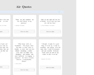
This is an example of a quote cards grid layout with the content displayed in an accordion, designed using HTML, CSS, JavaScript, and Bootstrap framework 4. The quotes are imported to the code with the URL, whereas the JavaScript functions have been used to implement the accordion expand feature. The body of the form is given the styles of background as #e6e6e6, padding as 50px 0, font-family as 'Noto Serif', serif. The quote cards can be displayed either in card layout or row layout. The quote grid is given the styles of max-width as 1000px, margin as 0 auto, font-family as 'Noto Serif', serif, theme-color-primary as #383838, and color as #414141. The quote caption has the styles of color as #414141, font-size as 40px, and font-weight as bold. The quote cards take the styles of border-radius as 10px, margin as 10px, and box-shadow as 0 4px 8px 0 rgba(0, 0, 0, 0.1), 0 6px 20px 0 rgba(0, 0, 0, 0.09), in the card layout. The accordion of the card is given the styles of position as relative, display as block, background as #f7f7f7, border-radius as .25em, cursor style as pointer to get the hand cursor effect, margin-bottom as .125em, padding as .75rem 1em, z-index as 20, border as 1px solid #cccccc, text-align as center, and font-size as 13px, which takes the background color of #ccc, in a hover event.
Source: https://codepen.io/zinggrid/pen/ZVJZEM
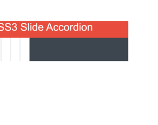
This is another example of a web form with an accordion feature, designed using CSS, HTML, and Bootstrap framework 4. The fonts and icons are imported to the code with their URLs. The concept of Lists has been used with UL and LI components. UL element has been used with the child elements of LI to display the child elements of the accordion in an orderly manner. The body of the form is given the styles of font-family as 'Lato', sans-serif, and background as #e74c3c, whereas the title of the form is given the styles of color as #fff, text-align as center, margin-top as 2em, font-weight as 200, and font-size as 80px. The wrapper section of the accordion is given a background color of #3D464E. The cursor style for the accordion child elements is set as pointer to get the hand cursor effect. The child elements are given the styles of border-right as 1px solid #3D464E, float as left, overflow as hidden to hide the details in normal state, height as 177px, width as 72px, transition as all 0.5s ease, and background as #fff. In a hover event, the items take a width of 350px to expand the details.
Source: https://codepen.io/larrygeams/pen/DyiBb
CSS Accordion
4.3.1
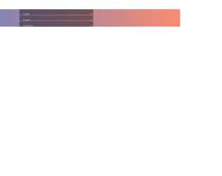
This is an example of a web form with an accordion feature, designed using HTML, CSS, React JavaScript, and Bootstrap framework 4. React JavaScript functions have been used to implement the accordion functions, whereas the fonts are imported to the code with its URL. The body of the form is given a style set of font-family as 'quicksand', font-weight as lighter, and a linear gradient background as rgba(92,129,202,1). The accordion is given the styles of box-shadow as 0px 13px 23px -13px rgba(0,0,0,0.5), width as 420px, background-color as transparent, margin as auto, and margin-top as 50px. The title has a style set of height and width as 30px, and 400px, background-color as rgba(0,0,0, .4), color as #ffddcc, text-transform as uppercase to automatically convert the text to uppercase, letter-spacing as 1px, line-height as 2, transition as all .2s ease-in, and cursor style as pointer to get the hand cursor effect in a hover event. In a hover event, the background color of the accordion turns to rgba(0,0,0, .5), whereas in the active mode, it turns to rgba(0, 0, 0, .55).
Source: https://codepen.io/matthewvincent/pen/EKKeyX
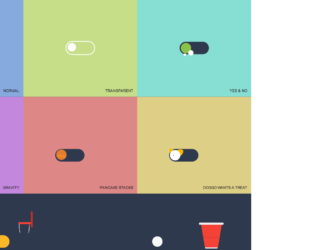
This is an example of a toggle buttons layout with animations, designed using HTML, CSS, and Bootstrap framework 4. The icons and CSS styles are imported to the code with their URLs, whereas media queries have been used to increase the responsiveness of the form. The form consists of eight toggle button containers named Normal, Transparent, Yes & No, Gravity, Pancake Stacks, Doggo Wants a Treat, Kobe Bryant Tribute, and Beer Pong. The body of the form is given a background color of #2e394d. The toggle button containers are given eight different background colors which are #dec387, #de8797, #87aade, #c5de87, #87ded2, #c487de, #de8787, and #decf87. The title of the toggle button container is given the styles of font as 500 14px 'Rubik', sans-serif, letter-spacing as .5px, text-transform as uppercase, and text-shadow as 0 1px 1px rgba(0,0,0,0.4). The toggle buttons are given the styles of width as 7em, background as #2e394d, height as 3em, border-radius as 50px, transition as all .3s ease, transform-origin as 20% center, and cursor as pointer to get the hand cursor effect in a hover event. The toggle buttons are given different animations to be generated in a checked event.
Source: https://codepen.io/oliviale/pen/xxboXzo
Toggle Buttons Layout
4.3.1
This is an example of a bootstrap timeline layout designed using HTML, CSS, and Bootstrap layout 4. External links are imported to the code with their URLs. The concept of Lists has been used with UL and LI components. UL element has been used with the child elements of LI to display the icons and timeline items in an orderly manner. The body of the form is given a style set of display as flex, justify-content as center, align-items as center, min-height as 100vh, and background color #1a1e23. The timeline is given a style set of display as grid to arrange the timeline in a grid layout, gap as 40px, max-width as 600px, font-size as 0.75rem, line-height as 1, font color as white, clip-path as inset(0 0 100% 0), animation as expand 5s forwards linear. The timeline list item is given a font color of #3498db, whereas the timeline line has a background color as white.
Source: https://codepen.io/alphardex/pen/bGdNxea
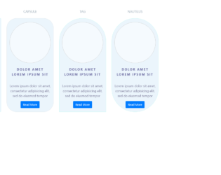
This is an example of a Neuomorphic style card layout, designed using HTML, CSS, and Bootstrap framework 4. The images and icons have been imported to the code with their URLs. The body of the form is given the styles of background-color as #ebf5fc, and font-family as 'Rajdhani', sans-serif. The box container is given the styles of padding-top as 20px, padding-bottom as 20px, border-radius as 6px, background as #ebf5fc, box-shadow as inset 8px 8px 15px #D9E3EC, border as 1px solid #c3f9f3, and an animation of rotate-center 4s linear infinite both, which changes its box-shadow value to inset -2px -2px 5px white, inset 3px 3px 5px rgba(0, 0, 0, 0.1), in a hover event. The icon set box has the styles of border as 1px solid #cac8c8, and border-radius as 50% to get the circle shape. The card heading has the styles of text-align as center, text-transform as uppercase to convert the text to uppercase, padding-top and bottom as 20px, letter-spacing as 3px; font-weight as bold, color as #6b6aa0, and font-size as 18px. The subheading is given a font color of #635f82, whereas the heading name is given the color #99a9b5.
Source: https://codepen.io/uiswarup/pen/poJoRaV
Neuomorphic Section
4.3.1