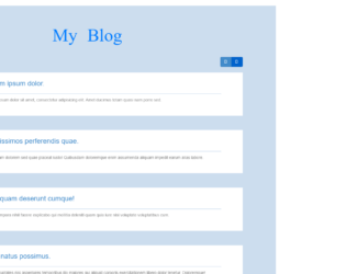
This is a template of a simple flat blog layout designed using CSS, HTML, and JavaScript. JavaScript click(function() had been used to implement the switch between two layouts. Bootstrap styles and fonts have been imported into the form by adding their URLs. Background images are also added into the code with the URL. The font family of the form is set as "Pacifico". Variables are used to define values to avoid using values again and again in different places, such as $size: 150px, and $bg:#CDE. The body is given a style set of padding:0 100px 100px, and background-color: $bg !important. The header has the styles of text-align: center, padding: 50px, font-size: 62px, font-family: "Pacifico", @include text-shadow (0 2px 2px darken ($bg,40%)). The article section is given the styles of position:relative, padding-left:$size+30,padding-right: $size/2,height: $size,margin-bottom:30px,background-color:#FFF,@includeborder-radius($size),andcursor: pointer. In a hover event, the image button takes a transformation of transform(rotate(5deg).
Source: https://codepen.io/renaudtertrais/pen/xJFny
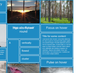
This is another example of a CSS card layout with animations, designed using CSS and HTML. The cards are given focus animations, flipping animations and pulse animations in a hover events. The images are added into the form with their URLs. The font family for the body is set as 'Open Sans', sans-serif. The color palette for the form is set as $black = #000, $red = #e74c3c, $green = #26a65b, $grey = #6c7a89, $purple= #8e44ad, $blue = #1e8bc3, $white= #ecf0f1 and $darkred = #cf000f. The flipping panel is given a style of backface-visibility as hidden to hide the backface of the panel, a transform-style of preserve-3d, a transition of .25s, and a transform style of transform rotateY(180deg). The pulse animated panel is given a style set of transform-style as preserve-3d, perspective of 1000, transition of transform .25s ease 0s and a hover transformation style of transform scale(1.02).
Source: https://codepen.io/jh3y/full/mPgyqw/