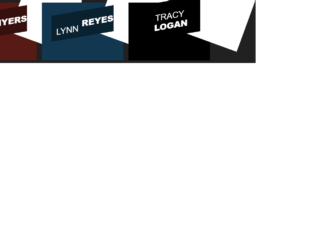
This is an example of an image hover with a title slide effect, designed using CSS, HTML, and Bootstrap framework 4. The form consists of three images, which are imported to the code with their URLs. The font style is also imported to the code using its URL. The images are given the styles of font-family as 'Raleway', Arial, sans-serif, position as relative, margin as 10px, min-width as 220px, max-width as 310px, max-height as 220px, background as #000000, font color as #ffffff, text-align as center, box-shadow as 0 0 5px rgba(0, 0, 0, 0.15). The header titles are given a font-weight of 400, and a test-transform style as uppercase to automatically convert all the letters to uppercase. The three titles are given three different background colors as #0a212f, #36100c, and #583804. The images change their opacity to 1, and takes a transform effect of scale(1.1) on hover, whereas the title takes transform effect of skew(-10deg) rotate(-10deg) translate(-150%, -50%), to implement the sliding effect.
Source: https://mdbootstrap.com/snippets/jquery/charkiewicz/831872#js-tab-view

This is an example of a collection of sticky notes with hover effects, designed using CSS, HTML, and Bootstrap framework 4. The body of the form is given the styles of font-family as Arial,sans-serif, font-size as100%, margin as 3em, background as #666, and color as #fff. The title of the sticky notes has been displayed using the styles of font-size as140%, font-weight as bold, and padding-bottom as10px, whereas the subtitle is displayed using a font-size of 180%. The concept of Lists has been used with UL and LI components. UL element has been used with the child elements of LI to display the child elements of the sticky notes, in an orderly manner. The sticky notes are given a box-shadow style of 5px 5px 7px rgba(33,33,33,.7). The notes are given three different background colors as #f6ff7a, #f26b6b, and #6bbcf2. The notes take a rotate animation of different values on hover, to create the scale-up animation.
Source: https://mdbootstrap.com/snippets/jquery/jakubowczarek/893358#css-tab-view
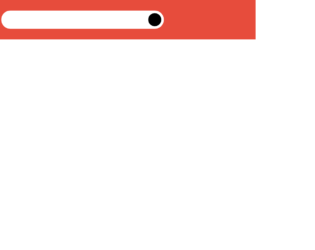
This is an example of a search bar with hover effects, designed using CSS, HTML, and Bootstrap framework 4. The body of the form is given a background color of #e74c3c, and the height and the width are set as 100%. The search input is given a style set of font color as white, margin-top as 5px, line-height as 40px, and transition value as width 0.4s linear. The caret color of the search input is set as red. In a hover event. The search icon is given a style set of height and width as 50px, float as right, display as flex, justify-content as center, align-items as center, border-radius as 50% to get the circle shape, font color as white, and background-color as black. The search icon changes its background color to red and the font color to #fff.
Source: https://bbbootstrap.com/snippets/awesome-search-bar-hover-17080978
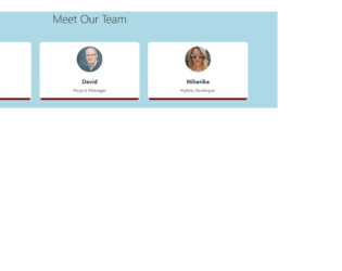
This is an example of a meet our team section with image hover effect, designed using CSS, HTML, and Bootstrap framework 4. The form consists of 3 team member profiles. The team member images are imported to the code using their URLs. The body of the form is given a background color as #ADD8E6. The title of the form is displayed using the styles of font color as #000, margin as 40px 0 60px 0, and font-weight as 300. The profile cards are given a border-bottom of 7px #8B0000 solid. The border-radius of the profile images are set as 50% to get the circle shape. The name of the team member is displayed using a font-size of 20px, and a font-weight of 700. The front and back sides of the cards are given styles separately. In a hover event, the front side card takes a bottom style as -200px, to reveal the backside card, whereas the border-color also gets changed to #FF0000.
Source: https://bbbootstrap.com/snippets/meet-our-team-section-image-hover-effect-65308030
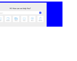
This is an example of a need help template with a search bar and hover effects, designed using CSS, HTML styles, and Bootstrap framework 4. The icon images have been imported to the code using their URLs. The background color of the form is set as blue, whereas the background color of the template is set as #eee. The background color of the search bar is set as #fff, while the border-radius is set as 5px. The search input of the search bar is displayed with the styles of caret-color as #536bf6, font-size as 19px, font-weight as 300, color as black, and transition as width 0.4s linear. The background of the search icon is set as #536bf6. On hover, the background color of the search icon turns to #fff. The inner cards are given a style set of word-wrap as break-word to allow breaking and wrapping long words onto the next line, background-color as #fff, border as 1px solid rgba(0, 0, 0, .125), border-radius as .25rem, cursor style as pointer to get the hand cursor effect on hover, and transition as all 2s. The inner cards take a transforming effect of scale(1.1), in a hover event to scale up the icon.
Source: https://bbbootstrap.com/snippets/bootstrap-need-help-support-template-search-97309157

This is an example of a set of social media cards with hover effects, designed using CSS, HTML, and Bootstrap framework 4. The form consists of three cards. The font style is imported to the code with its URL. The body of the form is given a background color as #fff, and font-family as 'Josefin Sans', sans-serif. The name of the card is displayed using a font style of 'Josefin Sans', sans-serif. The information card is given a style set of background color as #F0FFFF, padding as 60px 10px, margin as 30px 0px, box-shadow as 0 4px 8px 0 rgba(0, 0, 0, 0.2), 0 6px 20px 0 rgba(0, 0, 0, 0.19), and margin-bottom as 25px. The cards take the background color of #000000, on hover, whereas the card name and text turn its font color to #FFF. The 'Learn More' link is displayed using a font color of #00BFFF, which also turn the font color to #FFF, on hover.
Source: https://bbbootstrap.com/snippets/social-cards-font-awesome-icons-80190200