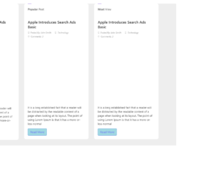
This is an example of a blog page layout with hover effects, designed using HTML, CSS, and Bootstrap framework 4. The concept of Lists has been used with UL and LI components. UL element has been used with the child elements of LI to display the information, in an orderly manner. The font style and the image have been imported to the code with their URLs. The body of the form is given a background color of #eee. The form consists of three blog post cards. Each card is given the styles of transform as scale(1), opacity as 1, and transition as transform .4s ease, opacity .4s ease. In a hover event, a card takes the styles of transform as scale(1.02), opacity as .7, and a background filter as gray. The title of the card is displayed with the styles of font-size as 20px, font color as #242424, and line-height as 26px, whereas the card information displayed with the styles of font-style as italic, font color as #959595, and font-size as 12px.
Source: https://www.bootdey.com/snippets/view/bs4-blog-post-with-image-hover#html
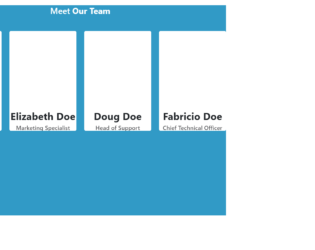
This is an example of a meet our team layout with hover effects, designed using HTML, CSS, and Bootstrap framework 4. The profile images and font styles are imported to the code with their URLs. The form is given a height of 800px, and background color as #319ac6. The form title is displayed using a font color of #fff. The user profile cards are given a box-shadow style of 0 4px 0 #2b86a. The profile cards are given a wrap which appears on top of the user card, in a hover event. The wrap is given a transition value of all .3s ease. The user name on the wrap is displayed with a font-size of 24px, whereas the designation is displayed with a font-size of 14px, and font color of #555659. Each wrap is also given a set of social media icons with a width and height of 40px, and a box-shadow of 0 3px 0 rgba(0, 0, 0, .1). The icons are given background colors of #3262b9, #3dd7e5, #e23535, and #069, which turn to #2d57a5, #27d2e2, #de2020, and #005580 respectively, in a hover event. The user image turns its opacity to 0, on hover.
Source: https://www.bootdey.com/snippets/view/meet-our-team-with-hover-effect#css
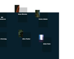
This is an example of a web layout with movable profile avatars and hover effects, designed using CSS, HTML, JavaScript, and Bootstrap framework 4. The avatars are given an animation to move along with the mouse cursor movement, on hover. The profile images are imported to the code with their URLs. JavaScript methods have been used to implement the movable animation and the resize effect on the avatars. The body of the form is given a background color as #08202B. The navbar is given a style set of font-family as 'GTAmericaExpanded', sans-serif, font-size as 2.4rem, font color as #fff, font-weight as 900, text-transform as uppercase to automatically convert the text to uppercase, cursor style as pointer to get the hand cursor effect on hover, and line-height as 1.2em. The avatar name is given the styles of font-size as 1.2rem, font color as #fff, font-weight as 800, and transform as translateY(-50%). The name changes its font-size to 1.7rem, on hover. The avatar photo container is given a width and a height of 50%, and 60% respectively, which gets changed to 65% and 75% in a hover event.
Source: https://mdbootstrap.com/snippets/jquery/tomekmakowski/854141#js-tab-view
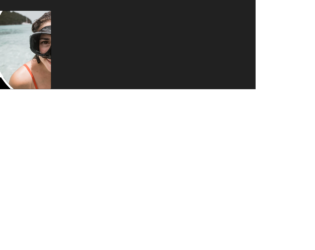
This is an example of another profile card with caption and hover effects, designed using CSS, Html, and Bootstrap framework 4. The profile image and font style is imported to the form with their URLs. The body of the form is given a background color of #212121. The profile card is given a style set of background-color as #ffffff, height as 300px, width as 500px, transition-duration as 2s, and border-radius as 5px. The profile image is given a border style of 8px solid white, border-radius of 240px, and a transition duration value of 1.5s. In a hover event, the profile image takes a margin-left style of 200px, to create the hover effect. The profile name is displayed using a font-family style of 'Roboto', sans-serif, and a font-weight of 200, whereas the profile designation is displayed using the style set of font-family as 'Franklin Gothic Medium', 'Arial Narrow', Arial, sans-serif, background-color as black, font color as white, font-size as 25px, height as 50px, and width as 400px.
Source: https://mdbootstrap.com/snippets/jquery/charkiewicz/925996#js-tab-view
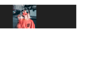
This is an example of a profile card with hover effects, designed using CSS, HTML, and Bootstrap framework 4. The profile image and font styles are imported to the code with their URLs. The body of the form is given the styles of background-color as #212121, and font-family as 'Roboto', sans-serif. The profile picture is given the styles of width as 100px, height as 100px, border-radius as 50px to get the circle shape, and border as 2px solid white. The title of the profile is displayed using the styles of font color as white, font-size as 1.3rem, and font-weight as 400, whereas the subtitle is given the styles of color as #c45c00, font-size as 0.9rem, and font-weight as 500. The profile card is given the styles of height and width of 300px, and a grayscale filter of grayscale(70%) blur(8px). In a hover event, the profile card takes a transform effect of scale(1.3).
Source: https://mdbootstrap.com/snippets/jquery/charkiewicz/940342#js-tab-view
This is an example of a page menu with a corner effect, designed using HTML, CSS, JavaScript, and Bootstrap framework 4. The font style is imported to the code with its URL. The form is given a background color of #212121. The menu list is given the styles of font-family as 'Raleway', Arial, sans-serif, text-align as center, text-transform as uppercase to automatically convert the text to uppercase, font-weight as 500, and letter-spacing as 1px. The menu items are displayed using a font color of rgba(255, 255, 255, 0.5). The menu items take a border-right and a border-top effect of 3px solid #9b59b6 to create the corner effect, in the active mode as well as the hover mode. The opacity of the menu items also gets changed to 1 on hover. JavaScript methods have been used to implement the corner effect only on individual items at a time.
Source: https://mdbootstrap.com/snippets/jquery/charkiewicz/870091#js-tab-view
Menu with corner border
4.3.1