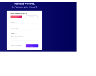
This is an example of another signup form with Buy/ Sell tab selection, designed using HTML, CSS, and Bootstrap framework 4. The font style is imported to the code with its URL. The body of the form is given the styles of background as linear-gradient(to right, rgba(23, 23, 124, 1) 0%, rgba(0, 0, 90, 1) 100%), and font-family as 'Roboto', sans-serif. The title of the form is given a font color of #CBCCFF, and a font-size of 29px, whereas the subtitle is given a font color as #A7A9FF, and a font-size as 28px. The Buy/ Sell tabs are radio type buttons which are given border color of #D15D84, font color of #ffc5d5, and a background color of linear-gradient(to right, rgba(242, 82, 106, 1) 43%, rgba(218, 18, 107, 1) 100%). The input fields are given a border- bottom style of 1.5px solid #E6EBEE. The signin button has the styles of border as 1px solid #7931DB, a linear gradient background color and a border-radius of 3px.
Source:https://bbbootstrap.com/snippets/bootstrap-buy-sell-signup-form-radio-buttons-82387175
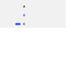
This is an example of a web form with radio buttons with hopping animations, designed using HTML, CSS, and Bootstrap framework 4. The body of the form is given a style set of background color as #f1f1f1, font color as #171717, display as flex, font as 1em Ubuntu, sans-serif, height as 100vh, line-height as 1.5, and padding as 1.5em 0. The animation timing, duration, and colors are predefined as $wormDur: 0.4s, $radioDur: 0.2s, $timing1: cubic-bezier(0.45,0.05,0.55,0.95), $timing2: cubic-bezier(0.5,0,0.5,2), and $shadowColor: rgba(0,0,0,0.2). The label of the radio button is given the styles of $shadowColor as rgba(0,0,0,0.2), cursor style as pointer to get the hand cursor effect in a hover event, font-weight as bold, text-shadow as 0 0.1em 0.1em $shadowColor, transition as color $radioDur $timing1, and margin-bottom as 1.5em. The radio button and the labels take the color of #2762f3 in the active mode. Media queries have been used to increase the responsiveness of the form.
Source: https://codepen.io/jkantner/pen/rNaPadg

This is an example of a download interaction button with animations, designed using HTML, CSS, JavaScript, and Bootstrap framework 4. The icons are imported to the code with their URLs, whereas the JavaScript functions have been used to implement the downloading animation. The body is given the styles of background as #E8EBF3, height as 100vh, font as 400 16px 'Poppins', sans-serif, display as flex, flex-direction as column, justify-content as center, and align-items as center. The download icon box is given a border-radius of 3px, and a box shadow of 0 10px 30px rgba(#000000, 0.2). The download button is given height and width of 55px, background color of #1F242D, cursor as pointer to get the hand cursor effect on a hover event, and a transition value of width .2s ease-in .4s, height .2s ease-in .4s, background .2s ease-in .4s. The arrow in the download button is given a background color of #FFFFFF, height of 15px, and width of 2px. The progress container is given the color of linear-gradient(to right top, #00A7FC, #0070ED).
Source: https://codepen.io/milanraring/pen/jOEOmbv

This is an example of a toggle buttons card layout with animations, designed using CSS, HTML, and Bootstrap framework 4. The icons and CSS styles are imported to the code with their URLs, whereas media queries have been used to increase the responsiveness of the form. The form has eight toggle button container cards named as Normal, Transparent, Yes & No, Gravity, Pancake Stacks, Doggo Wants a Treat, Kobe Bryant Tribute, and Beer Pong. The body of the form is given a background color of #2e394d, whereas the toggle button containers are given eight different background colors. The colors are #dec387, #de8797, #87aade, #c5de87, #87ded2, #c487de, #de8787, and #decf87. The title of the toggle button container is given the styles of font as 500 14px 'Rubik', sans-serif, letter-spacing as .5px, text-transform as uppercase, and text-shadow as 0 1px 1px rgba(0,0,0,0.4). The toggle buttons are given the styles of width as 7em, background as #2e394d, height as 3em, display as inline-block, border-radius as 50px, margin as 40px, transition as all .3s ease, transform-origin as 20% center, and cursor as pointer to get the hand cursor effect on a hover event. The toggle buttons take different animations such as rotating, hooping, and rolling over when the buttons are checked as active.
Source: https://codepen.io/oliviale/pen/xxboXzo
Toggle Buttons
4.3.1
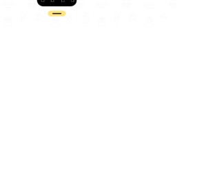
This is an example of a simple toggle button, designed using HTML, CSS, JavaScript, and Bootstrap framework 4. The menu icon is imported to the code with its URL. The JavaScript functions have been used to implement the expand feature of the toggle button. The body of the form is given a background color of #ffffff. The plus icon is given the styles of width as 100px, cursor as pointer to get the hand cursor effect on a hover event, transition as all .3s ease 0s, height as 100px, background color as #ffe581, border-radius as 50% to get the circle shape, display as flex, and position as relative. The line in the plus icon has the styles of width as 6px, height as 50px, background as #000, and border-radius as 10px. The line takes a transform effect of rotate(90deg) when it’s checked to form the links menu. The menu links are given the styles of color as #fff, font-size as 30px, visibility as hidden to be hidden when inactive, transition as .3s ease 0s and transform as scale(.5).
Source: https://codepen.io/knyttneve/pen/rGLxbP
Toggle Button
4.3.1
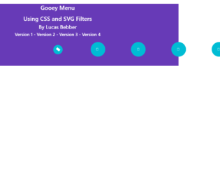
This is an example of a menu bar with gooey style animations, designed using HTML, CSS, and Bootstrap framework 4. The CSS style sheet is imported to the code with its URL. The body of the form is given the styles of background as #673ab7, color as white, and text-align as center. The menu icon is given the styles of background as #673ab7, border-radius as 100%;, width and height as 80px, margin-left as -40px, font color as white, text-align as center, line-height as 80px,
transform as translate3d(0,0,0), and transition as transform ease-out 200ms. The child elements of the menu are also given the styles of background as #673ab7, which turns to white in a hover event. The buttons are given a cursor style as pointer to get the hand cursor effect in a hover event, whereas the menu button is given a gooey filter, which is imported to the code with its URL. The menu button takes the style of transform as scale(1.2,1.2) translate3d(0,0,0), in a hover event.
Source: https://codepen.io/lbebber/pen/pvwZJp
Gooey Style Menu Layout
4.3.1