
This is another example of a login form with social media logins, designed using HTML, CSS, and Bootstrap framework 4. The font styles and social media icons have been imported to the code with their URLs. The body of the form is given a background color of #e5e5e5. The concept of Lists has been used with UL and LI components. UL element has been used with the child elements of LI to display the list of logins, in an orderly manner. The input text fields are given a font-size of 16px, whereas the font-size of the login buttons is set to 250%. The four social media buttons are created as primary type buttons and given the background colors of #da573b for Google, #1daee3 for Twitter, #4c699e for Facebook, and #4875B4 for LinkedIn. The buttons take the background colors of #be5238, #3997ba, #47618d, and #466b99, respectively in a hover event.
Source: https://www.bootdey.com/snippets/view/Social-network-login-with-buttons#html

This is an example of a login form layout, designed using CSS, HTML, and Bootstrap framework 4. The font style has been imported to the code with its URL. The media quarries have been used to increase the responsiveness of the form. The form consists of the social media buttons, input text fields, and the 'Login' button. The title of the form is given a text-align style as center, and a line-height of 300%. The social media buttons are given an opacity value of 0.9, which turns to 1, on a hover event. The background color of the Facebook, Twitter, and Google+ buttons are set as #3b5998, #00aced, and #c32f10, respectively. The 'Submit' button is created as a primary type button in HTML. The 'Or' clause in between the social media buttons and the input fields is displayed with a font-size of 1.5em, and font color of #aaa.
Source: https://www.bootdey.com/snippets/view/Responsive-login-with-social-buttons#css
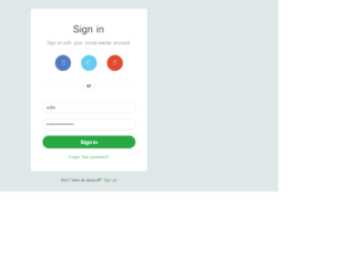
This is another stylish Sign-in form with circle shape social media buttons, designed using CSS, Html, and Bootstrap framework 4. The social media icons, font, CSS, and Bootstrap styles are imported to the code with their URLs. The body of the form is given the styles of font color as #434343, background color as #dfe7e9, and font-family style as 'Varela Round', sans-serif. The input text fields are given a font-size of 16px, and a border color of #5cb85c, to be activated on hover. The sign-in form is given a width of 400px, background color as #fff, and a box-shadow style as 0px 2px 2px rgba(0, 0, 0, 0.3). The title of the form is displayed with a font-size of 34px. The 'Sign in' button is created as a success type button and given the styles of border color as border-color: #5cb85c, font-size as 18px, font-weight as bold, and text-align as center. The 'Sign in' button changes its background color to #5cb85c, and the opacity value to 0.8, in a hover event. The social media buttons are given a border-radius as 50% to get the circle shape, and given three different background colors as #507cc0, #64ccf1, and #df4930. The buttons change their opacity to 0.8 on hover.
Source: https://www.tutorialrepublic.com/snippets/preview.php?topic=bootstrap&file=sign-in-form-with-circular-social-buttons

This is an example of a Signup form with rounded social media buttons, designed using CSS, Html, and Bootstrap framework 4. The form consists of the signup card, social media buttons, input text fields, 'Signup' button, and a 'Login' link. The font, CSS, and Bootstrap styles are imported to the code with their URLs. The body of the form is given the styles of background color as #dfe7e9, and font-family as 'Roboto', sans-serif. The signup container is given a width of 480px, background color of #fff, and a box-shadow style of 0px 2px 2px rgba(0, 0, 0, 0.3) The input text is displayed with a font-size of 16px, whereas the input fields take a border color of #5cb85c, in a focus event. The input text fields are validated by making them required fields. The header of the signup form is displayed with a font-size of 34px. The 'Signup' button is created as a success type button and given a background color as #5cb85c. The social media buttons are created as primary, info, and danger type buttons and given the background colors of #507cc0, #64ccf1, and #df4930. The buttons change their opacity value to 0.8, in a hover event.
Source: https://www.tutorialrepublic.com/snippets/preview.php?topic=bootstrap&file=sign-up-form-with-rounded-social-buttons
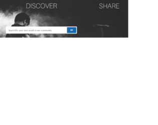
This is an example of a search box on header with image in background, designed using CSS, HTML styles and Bootstrap framework 4. The background image is imported to the code with its URL. The form is given the styles of padding as 40px, margin-bottom as 22px, font color as #fff, text-shadow as 0 1px 2px rgba(0, 0, 0, 0.25), background-color as #2e9df7, and box-shadow as 0 15px 15px -15px rgba(0, 0, 0, 0.25). The input text of the search bar is given the styles of font-family as "lucida grande", "Lucida Sans Unicode", tahoma, sans-serif, color as #333, font-size as 15px, padding as 3px;width as 250px, background as #fff, and border as 1px solid #999. The background color of the 'Go' button is set as #1268b3. The font-size for the button is set as 13px, and a text-transform style is given as uppercase to automatically convert the text to uppercase.
Source: https://bbbootstrap.com/snippets/search-box-header-image-background-70660533
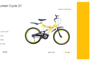
This is an example of a product page template with a buy now button, designed using CSS, HTML, and Bootstrap framework 4. The product image is imported to the code with its URL. The body of the form is given a background color as #ffc107, and a font-family style as Arial, Helvetica, sans-serif. The background color of the information container is set as #fff. The concept of Lists has been used with UL and LI components. UL element has been used with the child elements of LI to display the product details in an orderly manner. The product details are given a line-height as 50px, and font color as #000. The 'Description' and 'Review' sections are given a font-weight style as Bold. The 'Buy Now' button is given a border color as 2px solid yellow, font color as #000, font-size as 12px, and font-weight as bold, and turns its background color to yellow in a hover event. Media quarries have been used to increase the responsiveness of the form.
Source:https://bbbootstrap.com/snippets/bootstrap-product-page-template-buy-now-button-77561293