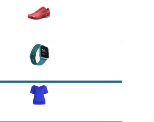
This is an example of an e-commerce product list with hover effects, designed using HTML, CSS, and Bootstrap framework 4. The product images are imported to the code with their URLs. The body of the form is given a background color of #B3E5FC. The product card is given a border-radius of 6px, and background color of #fff. The product details are displayed using a font-size of 13px, and a color of #cbcbcb. The cost of the product is displayed using the styles of font color as #fb3531, font-weight as bold, and font-size as 20px. The cost of the three products is displayed using three different font colors. The rating stars are displayed using the color of #FBC02D. The cursor style for the products is set as pointer to get the hand cursor effect on hover. The text on the 'Add to Cart' button is displayed using a text style as uppercase to automatically convert the text to uppercase. The image container is given an animation of fade_in_show 0.5s to create the animation on hover.
Source: https://bbbootstrap.com/snippets/bootstrap-ecommerce-product-list-two-product-images-onhover-effect-20402795

This is an example of a set of cards which takes an expanding animation, in a hover event. It is designed using CSS, HTML, and Bootstrap framework 4. The card images are imported to the code with their URLs. The body of the form is given a background color of #FFFACD. The title is given a style set of font-weight as 100, text-align as center to bring the text the center of the form, font-size as 40px, font-family as "Times New Roman", Times, serif. The card list title is displayed using a font-size of 20px, and an opacity of 0.8. The card list is given a display style as block, opacity as 1, transition style as 0.25s ease-in-out opacity, 0.25s ease-in-out filter, and the pointer style as cursor to get the hand cursor effect in a hover event. In a hover event, the three cards in the card list, take transform and rotate effects to create the expanding effect, individually. The rest of the cards take a filter of grayscale(100%), and opacity of 0.25, while the cursor is placed over one card set, making the selected card list highlighted and the others blurred.
Source: https://bbbootstrap.com/snippets/shop-brand-hover-animation-21837534
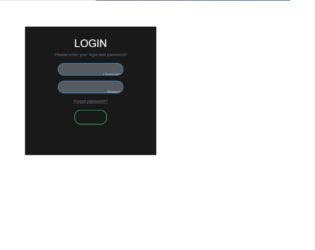
This is an example of an animated login form, designed using CSS, HTML, and Bootstrap framework 4. The concept of Lists has been used with UL and LI components. UL element has been used with the child elements of LI to display the social media icons, in an orderly manner. The body of the form is given a font style of sans-serif, and background color of linear-gradient(to right, #b92b27, #1565c0). The login card is given the styles of width as 500px, padding as 40px, position as absolute, background color as #191919, text-align as center to centralize the text, transition as 0.25s, and margin-top as 100px. The title of the card is given a style set of font color as white, text-transform as uppercase to automatically transform the text to uppercase, and font-weight as 500. The input text fields are given the styles of text-align as center, border as 2px solid #3498db, width as 250px, font color as white, and border-radius as 24px. In a focus event, the width of the text fields changes to 300px, and the border-color to #2ecc71. The 'Login' button changes its background color to #2ecc71, in a hover event.
Source: https://bbbootstrap.com/snippets/animated-login-form-95290954
Animated Login Form
4.3.1
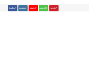
This is an example of a set of social media buttons with a 3D flipping animation, designed using HTML, CSS, and Bootstrap framework 4. Media quarries are used to increase the responsiveness of the form. The form consists of five buttons named as Facebook, Instagram, YouTube, Whatsapp, and Pinterest. The buttons are given different background colors as #3b5998, #3f729b, #ff0000, #4dc247, and #cb2027. The body of the form is given a background color as #f7f6f6. The text on the buttons is given a font-size of 20px, and a font-weight style as bold. Each card is given a transform style as rotateY(180deg) to be active on hover, which rotates the buttons by 180 degrees and creates the flipping animation. The CSS styles have been given to both the front and back sides of the buttons, separately. The buttons are given a border value as 1px solid #eee, box-shadow style as 5px 6px 6px 2px #e9ecef, and the cursor style as pointer to get the hand cursor effect in a hover event.
Source: https://bbbootstrap.com/snippets/bootstrap-social-media-icons-3d-flips-78890278

This is an example of a multi-step form wizard with an animated progress bar, designed using CSS, HTML, JavaScript, and Bootstrap framework 4. The icons are imported to the code with their URLs. JavaScript methods have been used to implement the progressing function of the progress bar. The input text fields are given a font color as grey. The heading of the form is displayed using a text-transform style as uppercase to automatically convert the text to uppercase and font color as #673AB7. The input text fields are given a style set of border as 1px solid #ccc, margin-bottom as 25px, margin-top as 2px, width as 100%, box-sizing as border-box, font-family as Montserrat, font color as #2C3E50, background-color as #ECEFF1, font-size as 16px, and letter-spacing as 1px. In a focus event, the text fields take a border style of 1px solid #673AB7. The 'Next' button is given a background color of background: #673AB7, font-weight as bold to highlight the text, font-color as white, and the cursor style as pointer to get the hand cursor in hover. The background color of the button turns to #311B92, in a hover event.
Source:https://bbbootstrap.com/snippets/multi-step-form-wizard-animated-progressbar-53000683
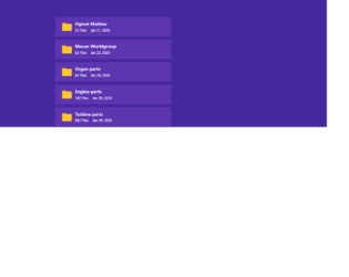
This is an example of a folder list with a checkbox and transform effect, designed using HTML, CSS, and Bootstrap framework 4. The folder icons are imported to the code by the URLs. The body of the form is given a background color as #4527A0. The list items are given a style set of margin-top as 10px, background color as #5E35B1, cursor style as pointer to get the hand cursor effect in hover, and transition as all 0.3s ease-in-out. The list items take a transform effect of scaleX(1.1) in a hover event, to change the scale of the folder items. The opacity of the checkbox is set as 0, which changes to 1 in a hover event. The checkbox is given a border style of 1px solid #10a3f9, border-radius as 3px, and background color as white, which changes to border as solid #007bff, border width as 0 2px 2px 0, and takes a transform effect of rotate(45deg), in a checked event.
Source:https://bbbootstrap.com/snippets/bootstrap-folder-list-checkbox-and-transform-effect-16091735