
This is an example of a bootstrap profile card layout, designed using HTML, CSS, JavaScript and bootstrap framework 4. The images and fonts are imported to the code with their URLs. JavaScript functions have been used to implement the following function. The body of the form is given the styles of background as #202020, and font-family as 'Krub', sans-serif. The card is given a style set of width as 250px, height as 400px, border-radius as 10px, box-shadow as 0 10px 25px 5px rgba(0, 0, 0, 0.2),and background as #151515. The top part of the card is given the styles of background as crimson, and animation as dsTop 1.5s. The profile pic is given a border-radius of 50% to get the circular shape, box-shadow as 0 0 0 5px #151515, and an animation as mvTop 1.5s. The name title is given an animation fadeIn 2s ease-in, which takes a text-decoration as underline, and color as crimson, in a hover event. The bottom content is also given the styles of text-transform as uppercase, and color as crimson.
Source: https://codepen.io/jforv/pen/yLyMRXQ
Profile Card
4.3.1

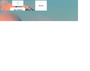
This is an example of a bootstrap interactive user profile card layout, designed using HTML, CSS, JavaScript and bootstrap framework 4. The images and icons are imported to the code with their URLs. CSS @keyframes is used to implement the animations in CSS, whereas JavaScript draggable() function is used to implement the drag feature. The profile card is given a border-radius as 8px, and a box shadow as 0px 2px 6px rgba(0, 0, 0, 0.2), 0px 2px 6px rgba(0, 0, 0, 0.4), and also it is given a blur filter blur(8px), with the background color set as rgba(255, 255, 255, .60). The profile card is given a cursor style as grabbing, to be able to be dragged across the form. The profile picture is given a border-radius as 100px, and a filter as sepia (.25). The name title has the styles of color as rgba(38, 50, 56, 1), font-family as 'Roboto Condensed', sans-serif, font-size as 36px, font-weight as 700, whereas the designation is given a font-size as 16px, and font-weight as 400.
Source: https://codepen.io/lukas-pawlaczyk/pen/KKwoQdG
Interactive profile card
4.3.1
This is an example of a bootstrap web form with profile cards with CSS scrolling option, designed using JavaScript, CSS, bootstrap framework 4 and HTML. The images and bootstrap styles are imported to the code with their URLs, whereas the ability to scroll the profile cards with the mouse wheel is implemented in JavaScript. The background of the form is given a style set of background as #111, font-family as "Comfortaa", sans-serif, and min-height as 100vh. The width and height for the card image are set as 17em, and 400px, respectively. The card image is also given the styles of margin as 40px 20px, min-width as 17em, scroll-snap-align as center, background as #f8f8f8, height as 400px, and border-radius as 20px. The font color for the title is set as #ccc, with the font style set to 900 100px/1 Muli. A text-transform style as uppercase is given to automatically convert the text to uppercase. The cursor style for image card is set as pointer to get the hand cursor effect in a hover event, as well as a box-shadow style of 0 0 30px rgba(255, 255, 255, 0.2).
Source: https://codepen.io/reguia/pen/rNadwEJ
This is an example of a bootstrap animated profile card layout with hover effects, designed using HTML, CSS, and bootstrap framework 4. The images and icons are imported to the code with their URLs. Media queries have been used to increase the responsiveness of the form. The body of the form is given width as 100vw, height as 100vh, filter as blur (30px), and transform as scale(1.1). The profile card is designed using the CSS grid. The profile section is given the styles of transform-style as preserve-3d, transition as all 1s ease-in-out, and transition-delay as 0.1s. The profile image has the styles of border-radius as 50% to get the circular shape and cursor as pointer to get the hand cursor effect. In a hover event, the image takes a transform effect of rotateY(180deg) to display the backside icons. The font-family for content is given as 'Oswald', sans-serif. The bottom and right sections are given a text-transform style as uppercase to automatically convert the text to uppercase, whereas the icons on the right section turn their color to hsl(0, 0%, 20%), in a hover event.
Source: https://codepen.io/CrackAll/pen/abzjQwv
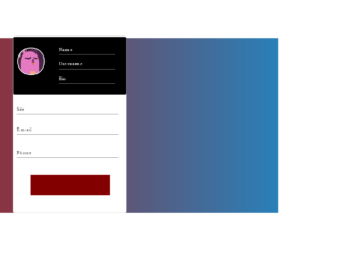
This is an example of a bootstrap animated profile card layout with hover effects, designed using HTML, CSS, and bootstrap framework 4. The images, CSS styles, and fonts are imported to the code with their URLs. The body of the form is given a linear gradient background color of linear-gradient (to right,#ac1816,#2980b9), and a font- family style as Montserrat. The profile card is given a width and a height of 30%, and 600px, border-radius as 5px, and background color as 600px. The profile picture is given a border style of 3px white solid. The content input section is given a background color of #535c68. The submit button is given a style set of width as 70%, and height as 70px, background color as RGB(131, 0, 0), transition effect as 0.7s, font-color as white, and font-size as 20px and cursor style as pointer to get the hand cursor effect. The button changes its background color to red, in a hover event.
Source: https://codepen.io/AranhaTM/pen/VwYGaOv
Animated profile card
4.3.1

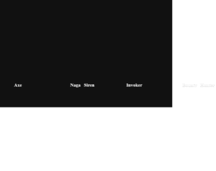
This is an example of a bootstrap grid layout used to display thumbnail details with hover effects, designed using CSS, HTML, and Bootstrap framework 4. The background images of the cards are imported to the code with their URLs. The number of grid items per row is defined as 3, and the gap between each item is set as 1, in CSS. The colors are predefined as primary-color: #333, secondary-color: #fff, and font-color: #fff. For the browser that does not support the grid layout, the background color is set as #00d2ff. The font family for the form is given as 'Roboto', sans-serif. The title of the form is given a style set of color as white, font-size as 30px, text-transform as uppercase to automatically convert the text to uppercase, and font-weight as 700, whereas the subtitle of the form is given the styles of font-size as 18px, and font-weight as 300. In a hover effect, the first card takes a transform effect of transformSkewScale (-45deg, 1), and a transition effect of (all 400ms cubic-bezier(0.175, 0.885, 0.32, 1.275)), whereas the second and third ones take transformSkewScale(45deg, 1), and transformSkewScale(45deg, 0) effects, respectively.
Source: https://codepen.io/nikhil8krishnan/pen/jbdXdr
THUMBNAIL HOVER EFFECTS
4.3.1