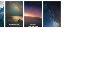
This is an example of an image card layout form with hover effects, designed using HTML, CSS, and Bootstrap framework 4. Media queries have been used to increase the responsiveness of the form, whereas the fonts and images are imported to the code with their URLs. The font sizes are predefined as --font-sans: 'Rubik', sans-serif, and --font-serif: 'Cardo', serif. The image cards are placed in a grid layout. The page content is given the styles of display as grid, grid-gap as 1rem, padding as 1rem, max-width as 1024px, and font-family as var(--font-sans). The title of the card has the styles of font-size as 1.3rem, font-weight as bold, and line-height as 1.2. The card description has the styles of font-family as var(--font-serif), font-size as 1.125rem, font-style as italic, and line-height as 1.35, whereas the button is given the styles of cursor as pointer to get the hand cursor effect, margin-top as 1.5rem, padding as 0.75rem 1.5rem, font-size as 0.65rem, and text-transform as uppercase to convert the text to uppercase. The button takes the background color of lighten(black, 5%), in a hover event and outline of 1px dashed yellow, in a focus event. The image cards take a transforming effect of translateY(-50%), in a hover event.
Source: https://codepen.io/hexagoncircle/pen/XWbWKwL
Card Hover Interactions
4.3.1
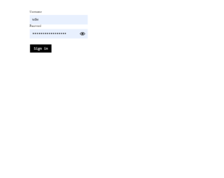
This is an example of a password input form with a light beam animation, designed using CSS, HTML, JavaScript, and Bootstrap framework 4. JavaScript functions have been used to implement the animation in a clicked event on the eyeball icon. The colors are predefined as --bgColor: white, --inputColor: black, --outlineColor: dodgerblue, and --beamColor: yellow. The body is given a background color as var(--bgColor), whereas the form is given a transform value as translate3d(0,0,0). The sign-in button has the styles of font-size as 1.5rem, font-family as monospace, and color as var(--inputColor), which takes an outline style of 3px solid var(--outlineColor), in a focus event. The user name and password are given a font color as black. The cursor style for the button and eyeball is set as pointer to get the hand cursor effect. The eyeball is given the size of 1.25rem, and a transform style of translateY(-50%). In a focus event on the eyeball, the background color of the form turns to black, revealing the password value and a light beam is displayed in a polygon(100% 50%, 100% 50%, 0 0, 0 100%) path, with the beam color as yellow.
Source: https://codepen.io/hexagoncircle/pen/zYxzQqa
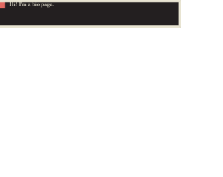
This is an example of a page header with page transitions, designed using HTML, CSS, JavaScript, and Bootstrap framework 4. The images are imported to the code with their URLs. The concept of Lists has been used with UL and LI components. UL element has been used with the child elements of LI to display the details in an orderly manner. The colors and values are predefined as --purple-brown: #231f20, --egg-shell: #e8e4d2, --dark-peach: #e26961, --border-width: .75rem, and --dots-gap: 10px. The body of the form is given the styles of font-family as Trocchi, Georgia, serif, line-height as 1.5, and color as var(--egg-shell). The background is given the styles of min-height as 100vh, padding as 25vh 0 1.5rem, and transition as background 0s 1s, color .6s. Bio, Projects, and Find Me sections are given different background colors as var(--purple-brown), var(--egg-shell), and var(--dark-peach). The dots are given an animation of movebg .2s linear infinite.
Source: https://codepen.io/pehaa/pen/wvBLpNK
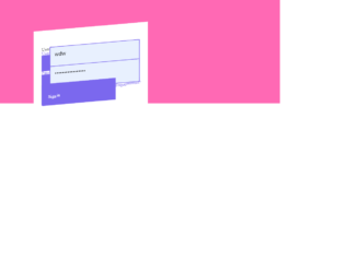
This is an example of a login form with hover animations, designed using CSS, HTML, and bootstrap framework 4. The fonts and icons are imported to the code with their URLs. The values and font sizes are predefined as color-primary: mediumslateblue, color-secondary: black, color-tertiary: hotpink, base-border-radius: 0.25rem, ease: cubic-bezier(0.075, 0.82, 0.165, 1), duration: 350ms, font-family: 'Roboto', sans-serif, and font-size: 1.25rem. The laels are given the styles of font-size as calc(var(--font-size) / 1.65), font-weight as 700, text-transform as uppercase to automatically convert the text to uppercase, and letter-spacing as 0.065rem. The body of the form is given a style set of padding as var(space-m), font-size as var(font-size), font-family as var(font-family), line-height as 1.2, and background-color as var(color-tertiary). The header of the form is given the styles of font-weight as 700, and font-size as calc(var(--font-size) * 1.5). The form is given a transform value of skewY(-5deg) translateY(10%) scale(0.94). In a hover event, the form takes a transform of scale(1.0001) to get the folded animation.
Source: https://codepen.io/hexagoncircle/pen/XWJGQqy
Folded Paper Login Form
4.3.1

This is an example of a web form with feedback reactions icons, designed using HTML, CSS, JavaScript, and Bootstrap framework 4. The icons are imported to the code with their URLs. The concept of Lists has been used with UL and LI components. UL element has been used with the child elements of LI to display the icons in an orderly manner. JavaScript functions are used to implement the active status of the feedback icons. The colors of the feedback icons are predefined as normal: #ECEAF3, normal-shadow: #D9D8E3, normal-mouth: #9795A4, normal-eye: #595861, active: #F8DA69, active-shadow: #F4B555, active-mouth: #F05136, active-eye: #313036, active-tear: #76b5e7, and active-shadow-angry: #e94f1d. The cursor style is set as pointer to get the hand cursor effect on the icons. There are five feedback icons named as angry, sad, ok, and two happy icons. Each icon is divided into four sections as eye left, eye right, and mouth. Reaction animations are created by giving different styles to eyes and mouth sections.
Source: https://codepen.io/aaroniker/pen/mdyYBPP
Feedback Reactions
4.3.1
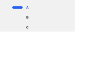
This is an example of a web form with radio buttons with hopping animations, designed using HTML, CSS, and Bootstrap framework 4. Media queries have been used to increase the responsiveness of the form. The body of the form is given a style set of background as #f1f1f1, color as #171717, display as flex, font as 1em Ubuntu, sans-serif, height as 100vh, line-height as 1.5, and padding as 1.5em 0. The animation timing, duration, and colors are predefined as $wormDur: 0.4s, $radioDur: 0.2s, $timing1: cubic-bezier(0.45,0.05,0.55,0.95), $timing2: cubic-bezier(0.5,0,0.5,2), and $shadowColor: rgba(0,0,0,0.2). The label of the radio button has the styles of $shadowColor as rgba(0,0,0,0.2), cursor as pointer to get the hand cursor effect, font-weight as bold, text-shadow as 0 0.1em 0.1em $shadowColor, transition as color $radioDur $timing1, and margin-bottom as 1.5em. Once checked, the radio button and the labels take the color #2762f3.
Source: https://codepen.io/jkantner/pen/rNaPadg