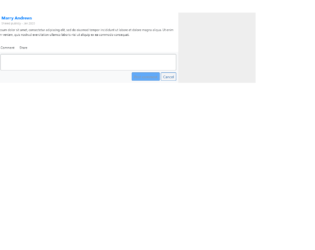
This is an example of a Like, Comment, and Share section, designed using HTML, CSS, and Bootstrap framework 4. The profile images are imported to the code with the URL, and defined as rounded-circle in HTML. The body of the form is given a background color as #eee. The dateline is given a font-size as 11px, whereas the font-size of the comment text is defined as 12px. The Like, Comment and Share texts are also given a font-size as 12px. The name title is given a background color as #007bff. The cursor style for the form is set as pointer to get the hand cursor effect in a hover event. The Like, Comment and Share text turns to blue color, in a hover event. Two primary type buttons are also included in the form to post the comment and cancel the comment.
Source: https://bbbootstrap.com/snippets/bootstrap-like-comment-share-section-comment-box-63008805
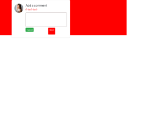
This is another example of a comment section with rating stars, designed using HTML, CSS, and Bootstrap framework 4. The profile image and font styles are imported to the code with the URLs. The rating stars are created as radio buttons. The body of the form is given the styles of display as grid, place-items as center to place the card in the center, font-family as 'Manrope', sans-serif, and background as red. The comment card is given a width as 450px, and a border-radius as 6px. The text area is given a border as 1px solid #ad9f9f. The send button is given a background color as #ff0000, which changes to #f50202, in a hover event. The rating buttons are given a cursor style as pointer to get the hand cursor effect in a hover event. The rating icons take a fill effect of #ff0000, in hover and active events.
Source: https://bbbootstrap.com/snippets/bootstrap-comment-section-form-ratings-98792632
This is an example of a comment section in a modal format, designed using HTML, CSS, and Bootstrap framework 4. The Comment section is hidden within the modal and will be shown after pressing the button on the modal. The fonts and images are imported to the code with their URLs. The body of the form is given the styles of display as grid, place-items as center to place the modal in the center of the form, font-family as 'Manrope', sans-serif, and background as #000. The model button is created as a danger type button. The rating stars are created as radio buttons. The comment section is given a border value of 1px solid #ff0000. The send message button is given the styles of font color as #fff, and background-color as #ff000. In a hover event, the background color of the button changes to #f50202. The rating icons are created to take a fill effect of #ff0000, in hover and active events.
Source: https://bbbootstrap.com/snippets/bootstrap-modal-comment-section-rating-12857455
This is an example of a rating bar with hover effects, designed using HTML, CSS, JavaScript, and Bootstrap framework 4. Media quarries have been used to increase the responsiveness of the form, and the JavaScript functions have been used to implement the rating function. The body of the form is given a background color of #000000. The background color of the rating bar is set as #fbedd9, which changes to #EDB867, in a hover event or while rating. The current rating is also indicated by the #EDB867 fill color effect. The rating bar is given the styles of display as block, width as 12px, padding as 5px 0, height as 28px, and float as left. The current rating value is indicated with the styles of font-size as 20px, line-height as 2, float as left, padding as 0 20px 0 20px, and font-weight as 400.
Source: https://bbbootstrap.com/snippets/bar-rating-1-10-97482935
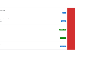
This is another example of a user timeline with profile image, designed using HTML, CSS, and Bootstrap framework 4. The font styles and images are imported to the code with their URLs. The body of the form is given the styles of background-color as #D32F2F, and font-family as 'Calibri', sans-serif. The profile image is given a border-radius of 100%. Some labels are given a background color of #1976d2, whereas some are given the default color of success. The label is given the styles of padding as 3px 10px, line-height as 13px, color as #ffffff, font-weight as 400, border-radius as 4px, and font-size as 75. The user card is given a box-shadow of 0px 5px 20px rgba(0, 0, 0, 0.05). The user section is given a cursor style as pointer to get the hand cursor effect in a hover event whereas the background of the card also changes to rgba(0, 0, 0, 0.02), in a hover event.
Source: https://bbbootstrap.com/snippets/bootstrap-user-timeline-profile-image-47156152
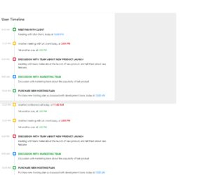
This is an example of a scrollable timeline with time, designed using CSS, HTML, and Bootstrap framework 4. The form is given a background color as #eee. The timeline card is given the styles of position as relative, display as flex, flex-direction as column, background-color as #fff, border as 1px solid rgba(26, 54, 126, 0.125), and border-radius as .25rem.The timeline is given a height of 100%, a width of 4px, and a background color as #e9ecef. The timeline title has the styles of font-size as .8rem, text-transform as uppercase to convert the first letter of each word to uppercase, margin as 0 0 .5rem, and font-weight as bold. The content section of the timeline is given a font-size as .7619rem, and font color as #adb5bd. A scrollbar is given to scroll through the timeline. The dates are indicated with a set of primary, success, warning, and danger badges, which are defined in the HTML.
Source: https://bbbootstrap.com/snippets/scrollable-user-timeline-time-12654784
This is an example of a user timeline web form, designed using HTML, CSS, and Bootstrap framework 4. The avatar images are imported to the code with their URLs. The body of the form is given a background color of #f9f9fa. The image circle is given a border radius as 500px. Some of the icons are given a background color of #f4c414 linear-gradient(45deg, #f4c414, #f45414), and a font color of #fff. The timeline is displayed using the background color of rgba(160, 175, 185, .15). The timeline card is given the styles of background as #fff, border-radius as .25rem, box-shadow as 0 1px 3px rgba(0, 0, 0, .05), and as margin-bottom: 1.5rem. The avatar is given a border radius of 500px, font-weight of 700, and box-shadow as 0 5px 10px 0 rgba(50, 50, 50, .15). The links and profile circles are given an underline effect to take place in a hover event. Media quarries are used to increase the responsiveness of the form.
Source: https://bbbootstrap.com/snippets/user-timeline-avatar-92172382
This is an example of a login form with Facebook and Google sign-in links, designed using CSS, HTML, JavaScript, and Bootstrap framework 4. The icons, background image, and the card image are imported to the code with their URLs. JavaScript functions are used to implement the click functions of the input text fields. The form container has the styles of width as 450px, height as 550px, background-color as white, top as 50px, left as 35%, box-shadow a 0 0 20px black, and border-radius as 8px. The card image is given a width of 50px, and a height of 150px. The text of the form is given the styles of font-size as 25px, font-family as 'Roboto Slab', serif, text-alignment as center, and position as relative. The font-size of the input text fields are set to 20px, with the margin-bottom style set as 15px. In a hover event, the background color of the input fields turns to gainsboro, whereas in a focus event, the fields take a box shadow effect of 0 0 10px green. The cursor style for the login button is set as pointer to get the hand cursor effect. The Facebook and Google sign-in buttons also take their respective colors as their background color, in a hover event.
Source: https://bbbootstrap.com/snippets/login-form-facebook-and-google-link-26654961
This is an example of a testimonial carousel slider, designed using CSS, HTML, JavaScript, and Bootstrap framework 4. The testimonial images are imported to the code with their URLs. Media quarries have been used to increase the responsiveness of the form, whereas JavaScript functions are used to implement the carousel slider functions. The number of cards per slide is defined as 4 in JavaScript functions. The body of the form is given a background color of #4A148C. The testimonial card is given the styles of position as relative, display as flex, width as 600px, flex-direction as column, background-color as #fff, background-clip as border-box, border as 1px solid #d2d2dc, border-radius as 11px, and box-shadow as 0px 0px 5px 0px RGB(161, 163, 164). The card title has the styles of font-size as 19px, and font-weight as 200. The card content section has the styles of font-size as 0.875rem, margin-bottom as .5rem, and line-height as 1.5rem.
Source: https://bbbootstrap.com/snippets/testimonial-carousel-slider-autoplay-24183189
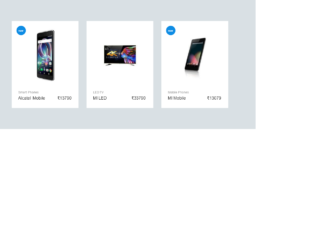
This is an example of a product carousel for an e-commerce shopping cart, designed using CSS, HTML, JavaScript, and Bootstrap framework 4. The product images, CSS styles, and font styles are imported to the code with their URLs. JavaScript functions are used to implement the carousel function of the slider. Media quarries have been used to increase the responsiveness of the form. The body of the form is given the styles of font-family as 'Rubik', sans-serif, font-size as 14px, font-weight as 400, background as #eee, and color as #000000. The subtitle of the form is given the styles of font-size as 14px, line-height as 1.7, font-weight as 400, color as #828282, and text-shadow as rgba(0, 0, 0, .01) 0 0 1px. The product prices have the styles of font-size as 16px, and font-weight as 500. The product name and link are given a font-size as 16px, and font color as #000000, which takes a font color of #0e8ce4.
Source: https://webdesignerwall.com/create-snippet?snippet_id=8956
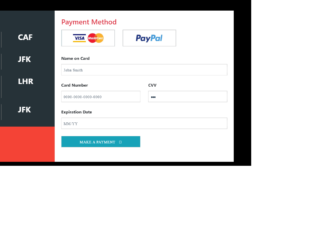
This is an example of a payment form with an input mask, designed using CSS, HTML, JavaScript, and Bootstrap framework 4. The payment options images are imported to the code with their URLs. JavaScript functions have been used to implement the date format, number format, and the radio button active status in the input fields. The body of the form is given a background color of #000000. The left side card is given a background color of #263238, and height as 100%. The font-size of the bill value is set as 30px. The bill dates are displayed in a #BDBDBD font color. The payment method radio buttons are given a height of 64, width of 204, border value of 2px solid light grey, and cursor style as pointer to get the hand cursor effect. The radio buttons take a box-shadow effect of 0px 0px 0px 1px rgba(0, 0, 0, 0.2) in a hover event and a box-shadow effect of 0px 0px 0px 1px rgba(0, 0, 0, 0.4), in a focus event.
Source: https://bbbootstrap.com/snippets/payment-form-input-mask-20478269
This is an example of a demo requesting form with validation, designed using CSS, HTML, JavaScript, and Bootstrap framework 4. The background image is imported to the code with its URL. JavaScript functions have been used to implement the validation by switching the border colors of the input text fields between red and green, according to the true-false conditions. The information card is given the styles of padding as 30px 40px, margin-top and bottom as 60px, and box-shadow as 0 6px 12px 0 rgba(0, 0, 0, 0.2). The blue text section is given a font color as #00BCD4. The font-size of the input text fields are set as 18px, and the font-weight is set as 300. In a focus event, the text fields take the border color of #00BCD4. The cursor style for the button is set as pointer to get the hand cursor effect and a text-transform style is set as uppercase to automatically convert the text to uppercase.
Source: https://bbbootstrap.com/snippets/request-demo-form-validation-12274818