This is an example of a collapsible Like, Comment, and Share section, designed using HTML, CSS, and Bootstrap framework 4. The image is imported to the code with the URL. The data-target attribute with the data-toggle="collapse" method has been used in HTML to implement the collapsible function of the form. The body of the form is given a background color as #eee. The form is designed to reveal a comment section if the comment link is clicked, or reveal the list of social media icons if the share link is clicked. The date section is given a font-size as 11px, whereas the comment text is given a font-size of 12p. The font color of the user names is set as #007bff. The font color of the Like, Comment and Share links turn to blue, in a hover event. The cursor style for the links is set as pointer to get the hand cursor effect in a hover event. The social media icons are given background colors accordingly.
Source: https://bbbootstrap.com/snippets/bootstrap-collapsible-like-comment-and-share-section-43201372
This is an example of a collapsible accordion, designed using CSS, HTML, and Bootstrap framework 4. The form is designed to reveal the hidden text in a panel, on a button click. The form consists of six panels. An accordion button with the data-target attribute has been used to implement the collapsible feature of the accordion by using the data-toggle="collapse". The expanded panel is given a background color as #4385f5, and line-height as 24px. The non-expanded panel has the styles of color as #999999, background-color as #fff, display as block, padding as 12px 20px. The content section of the expanded panel is given a text size of 14px, whereas the expanded panel title is given a font-size as 16px. When expanded, the color of the text gets changed to #fff. The content section of the expanded panel is also given the styles of font-family as 'FontAwesome, width, and height as 21px, display as block, border-radius as 50% and text-align as center.
Source: https://bbbootstrap.com/snippets/awesome-accordian-collapse-blue-93531626
This is an example of a Signup form with an auto carousel testimonials feature, designed using HTML, CSS, and Bootstrap framework 4. The concept of Lists has been used with UL and LI components. UL element has been used with the child elements of LI to display the carousel indicators in an orderly manner. The body of the form is given the styles of color as #000, height as 100%, and background-color as #EEEEEE. The testimonial card is given the styles of border-bottom-left-radius and border-top-left-radius as 20px, background-color as #512DA8, height as 100%, color as #fff, padding-left and right as 13%. The input fields of the signup form, have the styles of border as 1px solid light grey, border-radius as 10px, margin-bottom as 25px, margin-top as 2px, width as 100%, box-sizing as border-box, color as #2C3E50, and font-size as 14px. The signup button is given a background color of #512DA8, which changes to #311B92 in a hover event.
Source: https://bbbootstrap.com/snippets/sign-up-form-auto-carousel-testimonials-62466161
This is an example of a testimonial carousel with previous and next preview, designed using HTML, CSS, JavaScript, and Bootstrap framework 4. The CSS styles and user images are imported to the code with their URLs. JavaScript functions have been used to implement the carousel features whereas media quarries have been used to increase the responsiveness of the form. The body of the form is given the styles of font color as #000, height as 100%, and background-image as linear-gradient(180deg, #1E88E5, #fff). The testimonial card is given a box shadow as 0px 4px 8px 0px #BDBDBD. The owl dots are given a background color of #1E88E5, which changes to #0D47A1, in a hover event. The testimonial cards take a transform effect of scale(0.8), with the transition duration of 0.3s, and change the opacity value to 0.6, in the event of sliding.
Source: https://bbbootstrap.com/snippets/testimonial-carousel-slider-previous-and-next-preview-50691522
This is an example of a testimonial box with hover effects, designed using HTML, CSS, and Bootstrap framework 4. The images are imported to the code with their URLs and media quarries have been used to increase the responsiveness of the form. The body of the form is given the styles of height and width as 100%, font-family as 'Cormorant', serif, and background as #262626. The testimonial card is given the styles of box-shadow as 0px 5px 16px rgba(223, 241, 223, 0.5), transition as 0.8s, background as #333, box-sizing as border-box, and border-radius as 7px. The content of the card the styles of font-size as 20px, line-height as 33px, and color as #fff. The testimonial profile name is given a font color as #fff, and a font-weight as 500. In a hover event, the testimonial card takes a layer effect of linear-gradient(#03a9f4, #e91ee3) and gets filled with the layer color, a box-shadow effect of -5px 50px 100px rgba(223, 241, 223, 0.5), whereas the font-weight of the profile title and content section gets changed to 600.
Source: https://bbbootstrap.com/snippets/testimonial-box-hover-effect-50508276
This is an example of another testimonial web form with hover effects, designed using HTML, CSS, and Bootstrap framework 4. The profile images are imported to the code with their URLs and with a width and height given as 40, in HTML. Media quarries have been used to increase the responsiveness of the form. The body of the form is given the styles of min-height as 100vh, background-color as #eee, background-size as cover, font-family as 'Cormorant', serif, color as RGB(112, 123, 240), and a linear gradient background as (140deg, #fff, 50%, #74a0ff). The font color of the testimonial card is set as RGB(146, 154, 236), whereas the border value is defined as 1px solid. The font-size of the card content is given as 17px and the font-weight as bold. The testimonial card takes a transform effect of scale to 0.9 and changes its size to create the hover effect.
Source: https://bbbootstrap.com/snippets/testimonial-hover-animation-and-social-media-icons-36925129
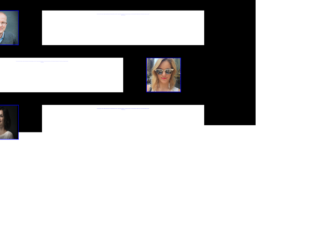
This is an example of a user testimonials form with image and background animation, designed using HTML, CSS, and Bootstrap framework 4. The images are imported to the code with their URLs. The form is given opening animations while media quarries have been used to increase the responsiveness of the form. The body of the form is given the styles of background-color as black, animation-duration as 1s, animation-fill-mode as forwards, animation-delay as 2s, and font-family as 'Abel', sans-serif. When the form is opened, the background color of the form changes to #29b6f6. The image is given the styles of width and height as 10vw, border as 2px solid blue, transform as rotateY(180deg), animation-duration as 1s, animation-fill-mode as forwards, and animation-delay as 1s. The image takes a transform effect of rotateY(360deg) to create the rotate animation. The author of the quote is given a font style of font-family as 'Dancing Script', cursive. The width and font-size of the text also change from o to 45vw, and 1.2vw, respectively, to create the animation.
Source: https://bbbootstrap.com/snippets/animated-users-testimonial-34216508
This is another example of testimonials for with auto carousel feature, designed using HTML, CSS, and Bootstrap framework 4. The testimonial images are imported to the code with their URLs. The concept of Lists has been used with UL and LI components. UL element has been used with the child elements of LI to display the carousel indicators in an orderly manner. The body of the form is given the styles of color as #000, height as 100%, and background as linear-gradient(#01579B, #03A9F4). The testimonial cards are given the styles of color as #fff, background-color as #536DFE, position as relative, margin-left as 70px, border-radius as 10px, and min-height as 312px. The width and height for the indicators are set as 10px, and the cursor style is set as pointer to get the hand cursor effect. The profile card is given a background color of #FFD54F, and font color as #000, whereas the profile pic is given height and a width of 120px.
Source: https://bbbootstrap.com/snippets/auto-carousel-testimonial-profile-left-edge-37357943
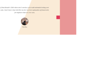
This is another example of a testimonials form with an auto carousel option, designed using HTML, CSS, and Bootstrap framework 4. The images are imported to the code using their URLs and the media quarries have been used to increase the responsiveness of the form. The body of the form is given the styles of min-height as 100vh, display as flex, align-items as center, background-color as RGB(233, 150, 150), and font-family as 'Open Sans'. The testimonial caption is given a style set of padding as 5rem 8rem, font color as rgba(78, 77, 77, 0.856), text-align as center to place the text in the center, font-size as 1.2rem, font-style as italic, font-weight as bold, and line-height as 2rem. The profile image is given a border-radius of 5rem. The image caption is given a font-size as 0.6rem. The autoplay for the carousel is turned on by default.
Source: https://bbbootstrap.com/snippets/bootstrap-testimonials-auto-carousel-slider-image-and-content-11109914
This is an example of a testimonial web form with hover effects, designed using CSS, HTML, and Bootstrap framework 4. The profile images are imported to the code with their URLs and given width and height as 40, in HTML. Media quarries are used to increase the responsiveness of the form. The body of the form is given the styles of min-height as 100vh, background-color as #eee, background-size as cover, font-family as 'Cormorant', serif, color as RGB(112, 123, 240), and a linear gradient background as linear-gradient(140deg, #fff, 50%, #74a0ff). The font-size of the card content is defined as 17px and the font-weight as bold. The font color of the testimonial card is set as RGB(146, 154, 236), and a border value is also given as 1px solid. In a hover event, the testimonial card changes its scale to 0.9 and take a transform effect to imply the hover effect.
Source: https://bbbootstrap.com/snippets/testimonial-hover-animation-and-social-media-icons-36925129
This is an example of another tooltip with an image and content, designed using CSS, HTML, and Bootstrap framework 4. The tooltip image is imported to the code with its URL. The body of the form is given a background color of #E0E0E0, whereas the card header is given a color as #9575CD and a font color as #fff. The tooltip item is given the styles of background as rgba(0, 0, 0, 0.1), cursor as pointer to get the hand cursor effect on a hover event, display as inline-block, font-weight as 500, and padding as 0 10px. The tooltip content is given a style set of width as 360px, font-size as 14px, line height as 30px, box shadow as -5px -5px 15px rgba(48, 54, 61, 0.2), and background color as : #2b2b2b. The tooltip content takes a border color of #2a3035, in the active mode. In a hover event, the tooltip takes transform effect of translate3d(0, 0, 0) rotate3d(0, 0, 0, 0deg). The tooltip text is given a font-size as 14px, and font color as #fff.
Source: https://bbbootstrap.com/snippets/tooltip-image-and-content-36745684
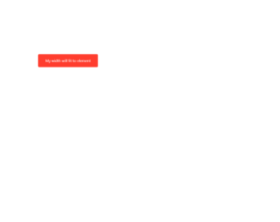
This is an example of a simple tooltip effect, designed using CSS, HTML, and Bootstrap framework 4. The tooltip styles are imported to the code with its URL. The tooltip form is given the padding styles of padding as 13rem, and margin-left as 300px. The tooltip button is given the style of display as inline-block, and min-width as 100px. The text of the button is aligned as center. The background color of the button is set as #ff3d2e, whereas the font color of the button is set as #fff. The font-size of the button is given as 1rem, whereas the margin-top style is given as 1.5rem. The button has a border-radius of 5px, and it is also given a transition style as background 0.1s linear. The tooltip gets activated and displays its message, in a hover event over the button.
Source: https://bbbootstrap.com/snippets/simple-tooltips-onhover-74402564