- Latest
- Featured
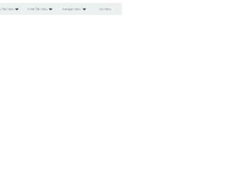
This is a classic example of the navigation bar, with scrollbar effect to the dropdown navigated links. This could be used for the educational or business website. This uses bootstrap and jquery. HTML is quite simple with the tag defining the dropdown and sub menu. It shows the example of a scroll bar effect where the submenus are scrolling without the scroll bar displayed vertically. Also, there is an example where no sub-menus are mentioned under the menu. The scrolling effect is given by javascript, using hover functionality. Javascript takes care of the height and items in sub-menus. It decides the speed of scrolling according to the list in the sub menu. More the list faster is the scrolling. CSS defined the style for each class used in the snippet. Use this snippet to create the desired navbar for your website.

This is an example of vertical responsive sidebar navigation, which can be used for mobiles or other devices. This is fully responsive and space saving sidebar navigation for any project. It is decorated button with primary and large settings. It button behavior is set with toggling property. The navigation is set to be a sidebar using sidebar-nav class this gives the navigation bar an ability to be placed at one side of the site. The navbar can have its brand name set by side-bar class. CSS file defines the effects and style for this navbar. Check out the properties set for each class and the wrapper which wrappers the navbar. The mouse hover effect is set in CSS with its color changing effect. The javascript adds the effect of toggling the navbar. This navbar is perfect for its responsive behavior. Use this and tweak it to your requirement.
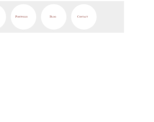
This is a stylish, elegant, and eye-catching navigation bar with the perfect match for fonts and color. This is a must use for sites like personal blogs. This uses the font awesome icons, to display details in each circle. The tag uses the main-navigation class which defines the navigation bar, which is followed by container. The span is styled with the circle, the shape is the eye catcher for this navigation bar. Try pointing the mouse on the link, and you would see the rolling effect of these circles. This effect is defined in CSS using “rotate(360 deg)”. The CSS also defines the media queries, for the screen with a maximum width. Check out other properties defined for this navigation bar. Use this navbar with your page and site, this is an eye-rolling navigation bar with fun to watch the links rollings.
Source: "https://codepen.io/TomHergenreter/pen/qHkfb"
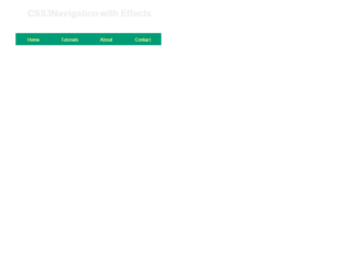
This is an example of a clean navigation bar for an educational site. The font and the style are a perfect match for the sites like tutorials. The navigation bar displays four links which can be linked to the pages like“Home”, “Tutorials”, “About”, and “Contact”. You can add more links to accommodate the pages of your site. You can have a nested link displayed using the numbered list for any given link. Using the and list tags, various topics can be categories. Mouse hover on the “Tutorials” and “Design” link and you would see the list of topics under “Design” displaying with effect. With the classes like “drop bottom” and “dropRight”, we can decide the direction of the list to be displayed. CSS adds effects like background-color, visibility, padding and most important for mouse hovering event. Use this navigation bar style for your website with your topics and links.
Source: "https://codepen.io/rssatnam/pen/niBsD"

This is a stylish example of Navbar for social networking sites or web portal. It uses styles and scripts in the header part of the page. The navbar has an elegent color with other items like “followup”, “Collaborations”, “Media” with dropdown option to collect “Facebook” and Instagram. Navbar is placed in the body of HTML which acts as a container. Nav is decorated with classes like mb-4 for setting the margins of the bottom side and navbar-expand which gives the ability to expand and set the desired color in the navbar. Using navbar-brand the brand name of the company is set, you can go ahead and place a logo of a company. Median displays a drop-down: check out the nav-item dropdown class used to create links. This bar has a CSS style which sets the styles for classes. Tweak this code to add it in your webpage of social networking sites.

This is the classic example of Navbar for a personal web portal. It uses styles and scripts in the header part of the page. The navbar has an elegant color with other items like “Books”, “Movies”, “Songs”, “Dropdown” with an option to “search” in the portal. Navbar is placed in the body of HTML which acts as a container. The navigation bar is decorated with classes like "mb-4" to set the margin at the bottom and navbar-expand gives the ability to expand. Using navbar-brand the brand name of the company is set, you can go ahead and place a logo of a company. The dropdown has a drop down to check out the dropdown classes used to create links. This bar has a CSS style which sets the styles for classes. Tweak this code to add it in your webpage of an e-commerce website.

This is the classic example of Navbar for a web portal, once the user is logged in. It uses styles and scripts in the header part of the page. Navbar is placed in the body of HTML which acts as a container. Nav is decorated with classes like mb-4 and navbar-expand, gives the ability to expand and set the desired color in the navbar. Using navbar-brand the brand name of the company is set, you can go ahead and place a logo of a company. The navbar has an elegant color with other items like “Contact”, “Settings”, “Profile”. These use font awesome is done to represent the icon for the links. Profile Link has a drop-down for “My Account” and “Log Out”. Check out the dropdown classes used to create links. This bar has a CSS style which sets the styles for classes. Tweak this code to add it in your webpage.
NavBar with Bootstrap 4
4.3.1

This is the classic example of Navbar for an e-commerce web portal. It uses styles and scripts in the header part of the page. The navbar has an elegent color with other items like “Home”, “features”, “Pricing”, “Dropdown” with an option to “search” in the portal. Navbar is placed in the body of HTML which acts as a container. Nav is decorated with classes like mb-4 and navbar-expand, gives the ability to expand and set the desired color in the navbar. Using navbar-brand the brand name of the company is set, you can go ahead and place a logo of a company. The dropdown has a drop down to check out the dropdown classes used to create links. This bar has a CSS style which sets the styles for classes. Tweak this code to add it in your webpage of an ecommerce website.