- Latest
- Featured

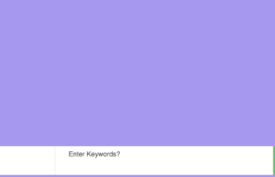
Colorful HTML/CSS search form for ecommerce, fashion and other similar websites.

A beautiful and bright multiple search option hotel search that can be used for hotel and directory websites as well as many other search engines.
A creative multiple choices search form for all kind of websites and projects.
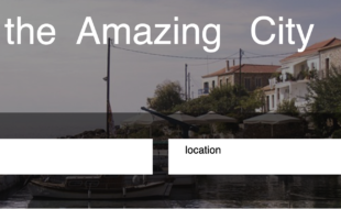
A cool locations search form that could be used for travel, hotel, directory or other similar websites and web projects.

A cool registration form based on a pure HTML & CSS without any library dependance. This can be used to build any website or web project you can imagine.
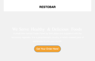
A minimal email template based on a clean HTML and CSS. In its example is is made for a restaurant business but by replacing images you will be able to use it for any business of yours that is not related to food and dining.

A simple HTML contact form for websites and other online projects. This doesn't require Bootstrap or any dependency and works well with just HTML and CSS.
Simple HTML Contact Form
4.1.1