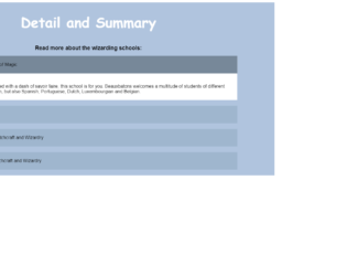
This is a simple snippet using HTML tags. Though it looks like an accordion it is much more. It is a plain HTML details tag which specifies the additional details that the user can use and hide on demand. Unlink accordion, it is not collapsible unless it is clicked. This snippet can be used on any website to show the small amount of information for a particular section. Take a look at CSS, each tag is styled. The hovering function is used for the summary, once you hover the mouse on summary the styling is set for the borders of summary tag, along with the colours set for the details and summary in open state. The styling would enhance these simple tags and gives it look as collapsible or accordion. This can be used in your website easily to enhance your paragraphs.
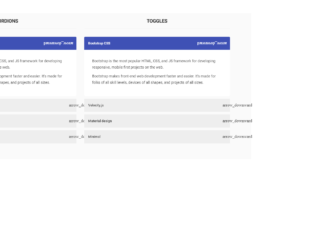
This snippet shows examples of Accordion and toggles using Velocity.js. Velocity.js is an animation engine for the UI, which works with or without JQuery. It is fast it features colour animation, transforms, loops, easings, SVG support, and scrolling. It can be used instead of Jquery and CSS. Here, the snippet deals with bootstrap 3 combined with Velocity.js v1.2. You can see the Accordion and Toggle behaviour created using bootstrap classes. The HTML is similar for both the example, take a look at the CSS and JQuery. Jquery uses the Velocity for creating the animation effect for fading the panels once clicked to see the accordion and toggling behaviour. The animations are smoothly done. This would be used in websites with large content. You can use this code with your personal tweak to blend with your page.
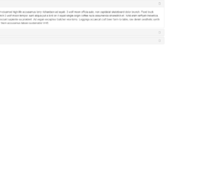
This is a beautiful yet simple accordion created using Bootstrap 4. Your browser must support ES 6 in order to display this properly. You can see the accordion has a white background around the text. If you closely look at the code you can see, HTML code is simple and repetitive while CSS is very minimal. The biggest challenge is to write JavaScript code properly. One of the most noticeable code segment is the use of async and await.
This accordion can be used on any website as a vertical navigation bar. You can expand the accordion by only by clicking the texts such as React. Accordion won’t be expanded if you click outside of the text within an accordion item. With slight modification to javascript, you can customize the accordion to behave in quite different ways.
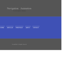
Whether it is "traditional top bar" navigation or sticky navigation at the bottom or sides, we can have animations for the menu when selected. These animations can be blended with all types of navigation bars. We are looking at the series of collections of animations used for the menu items in a navigation bar. This is the third example in this series; the code uses the combination of HTML and CSS to create the animation. It is a simple navigation bar with a menu like any other blog. Check out the menu when you trigger the hovering event, this will create a left border along with the text of the menu. The font and other styling properties are perfect matches for any format website. These animations give a special effect to navigation bars. You can use this kind of animations for your personal website.
This is an excellent example of animations used in the navigation bar. This effect is due to the simple combination of the HTML and CSS styles. This is a simple navigation bar with menu added to it. Once you trigger the hovering event on any menu, you would see the top border moving down while the left border appears along the left side of the text. This is achieved by setting the height and width property of borders before and after the hovering event. This can be used in a traditional top bar or any sticky navigation bar located at the bottom or sides of the website. You can use this snippet with any website, as the font and the properties used, can be a perfect blend with any website. You can have multiple animations by changing the border properties and see to yourself for the ideal animation effect for your webpage.
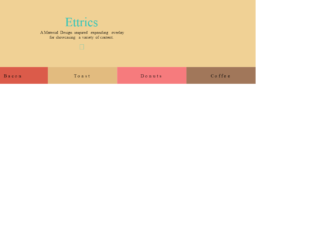
This is a creative style menu option where the columns are expanded to display the menu items. The Navigation bar itself is displayed with the menus at the bottom of the page. This can be used in your web pages instead of the navigation bar. This is best suited for less number of menu items. Each page is opened when clicked on the menu which is expanded using javascript. The color combinations and visual plays an important role than the menu and design. The animation effect is an effort of CSS and javascript for its simple and clean code. The design is responsive and takes a different view altogether in mobile devices. Use this for your personal websites where menu items are less in number. The CSS needs to be perfect for such kind of web page. Make sure your page has color matching to this template while using this on your site.
Material Design is an excellent template to represent the personal blogs consisting very fewer menu items. The design of the page is excellent with the menu represented at the bottom of the web page. This is totally responsive and can be viewed with any devices. Clicking on each menu item gives a description of the menu item. This design can be used to show mega menus too where the items in one category are listed in particular items. The webpage design is suited better for one-page navigation and can be used with any website by blending it with websites. For the smooth display of the pages of each menu, item javascript is used. Also, it shows a closing button at the right top of your webpage.
This is an example of Canvas navigation where the navigation template is vertical hamburger style which is located to the left of the plate. This is responsive in nature and can be best satiated for event website templates or music website templates. The template has a background animation effect you will get once clicked on the menu. The navigation menu items can be tweaked for your requirement and fit this on your website. It requires javascript to perform the animation of toggling of the menu when clicked on the menu. The animation and CSS style is a perfect match for this snippet. You can add this for event website templates or music website templates with your own flavor of website. With the right template and color, you can blend it with any website.
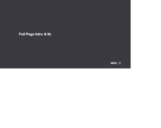
This is an example of a full page into and navigation menu. This uses the creative style of designing navigations for the web site. The menu is at the bottom and uses the hamburger navigation menu. On clicking the menu icon the navigation menu is displayed from the top of the page, covering the complete page. In order to dismiss the menu, you can click on the cross button on the right of the page. This style fits for photography website template. The navigation menu bar can be used to show the mega menu items like on the e-commerce website. You need to have a javascript running to display the menu items and their effects. The CSS is the best to match for the website. You can use this as an example for the creative website and tweak as per your requirements and menu links.
This is an example of a one-page navigation menu template. This can be used for floating style website as it reserves a particular space on the left sidebar. The design is such that it does not contain boundary on the homepage but for the subpages, you would see the boundaries. The menu options are just a blend to the rest of the web page as this design is possible due to the icons used for the website. The visual effects are purely due to CSS styling. These menu options can be used for creating web pages or personal blogs as the menu items are less in number. Check out the colors set for each paragraph, which gives a look of a new page. You can use this snippet for your one-page design layouts.