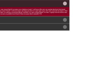
This is a plain yet elegant example of an Accordion with the items arranged in the ordered list. You can use this to show a large amount of information or data in an ordered manner. This can be seen in the pages where the content is broken in paragraphs, links, and images. You can create this using plain HTML with bootstrap and CSS styles. You can click on one of the panels and you would see the collapsible feature working on this accordion. This snippet uses the “Collapsible panel” one of the feature of bootstrap. You need to define the “panel-group” which is divided default-panel each having header, footer, and body. Check out the classes data-toggle assigned as “collapse”. This gives the collapsing functionality to the body of according once clicked on the header. The CSS styles the accordion along with the panel.
This is an example of Nested Accordion with verticle steps inside each accordion. Here the panel is created inside the panel to create a nested view. To create this nested view we have a super accordion defined as panel-group and then the panels containing the header and body for each accordion. Now each of these panel-body defines a new panel which would create a new group of the accordion. The data-toggle is set to collapse to give a collapsible behavior to each accordion. The innermost body contains some listed information; You would rarely see, but this could be useful in website for educational to display large content or on the sites which deals with different variety yet categories under one particular menu. You can use this on your website.
This has a beautiful simple accordion example. Unlike other examples where panel-group was used, this uses the card with each card acting as an accordion. This contains the card header and card body. Take a look at the class used for header and body they define the collapsible feature. By default the first card is expanded, where are others are made false. The card-body is just defining the matter which would be displayed in the accordion. The accordion container is used to hold these set of cards, whose titles are visible but only one pane is visible at a time. The CSS styling has added extra look and transitions for this Accordion. This snippet is responsive and changes to the look to fit the screen size. You can easily use this sample to add a stylish look to your page.
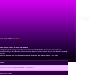
This is the best example of the accordion used for FAQ. This snippet can be directly used in the web page or application viewed on any device. The HTML page uses a container-fluid which gives a responsive behavior. The header contains the brand name, sign in and registration button. If you see the header while loading the page, you would see the animation effect assigned to the element of the header. The main body contains the accordion mentioning the FAQ. The jQuery accordion is set to a div giving an accordion behavior. Do include the animation.css to have the animations effect set on the div. Animations like flipInY, FlipInX are created using animation.css. The CSS styling is the right fit for this snippet. You can use this snippet for SPA websites.
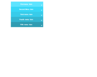
This is an example of a responsive display of menu items. This can be used for small devices as it displays the prominent color change once selected. There is a toggle button displaying the active state of each list item. This looks like an accordion but it is just the ordered list with the styling for each list. Once the menu item is clicked the javascript is used to open the item and close the rest of the items. This can be used when the list items are small in number. Transitioning of the opening of the menu items and closing is done smoothly; this is done using the CSS styles, also not the rotation of the icon to the left. You can use this type of menu item list to enhance the style of your website.
An example of the Accordion with the dropdown on mouse hover. HTML is a simple and plain page with the headers and paragraphs used in div. The styling is perfectly matching the HTML content. The behavior of accordion is given by the jquery, take a look at jquery script where the accordion is set to a specific div at mouse hover event. The properties like active, auto-height, navigation and collapsible behavior are added at mouse hover event. The CSS styling takes care of the accordion with”:: before” and “:: after” selectors. This is an excellent example of large content. You can use this in your page for the FAQ’s or large content to be displayed with a slight animation effect. Use this snippet for a simple yet elegant look for your web page.
This is best suited for a site on smaller devices. The accordion is seen in smaller screens, whereas the tabs are seen in larger screens. HTML is simple with the ordered list set in the tags. The CSS styling is set for each tag which gives a tab and accordion view as per the screens used to view the page. This behavior is given due to the CSS styling and javascript. The javascript takes care of activating and deactivating the tabs once click. It also gives an accordion kind of look by adding the active class when needed. The script is carefully written to enhance the responsive behavior in smaller screens. Display for smaller screens is taken by CSS file using @media screens. Each and every file has a responsibility well divided to make this snippet function. You can use this snippet for mobile applications.
Models are dialog box /popup that is displayed on top of the current page. This can be used to show any important message or any information. This snippet is an example of showing more information on the clicked object. It is a simple example of buttons to show the model. Here the buttons are having the image out planets and styled using CSS. A click on any button or image displays model with the information of planets. To open the model set the data-target to model to be opened. To create a Model you need to define the model class with a dialog containing, header, body, and footer if needed and id as a reference to a button click. A close button dismisses button can be seen at the bottom and at top of the model. You can use this snippet to display the information in dialogue in the form of Model. You can style the model accordingly.
This is an example of the simple default collapsible feature and material design accordion using bootstrap. Though the HTML design is the same, the behavior changes due to the bootstrap material design accordion class. Click on the simple collapsible feature to see the content. This feature displays the collapsible behavior by click on it once again. Check out the material design bootstrap accordion behavior, once you click on any of the accordions there is a smooth transition from previous open accordion to the opening of click accordion. This transition is due to bootstrap designs. The styling for both the designs is different for both examples. Check out the javascript which adds and removes the active class for the clicked accordions. Use this snippet’s for your websites especially for menus or list items. Tweak the styling to blend it with your website.
This is an elegant looking accordion, with HTML and CSS style. The HTML is simple with the container having panel-group with the heading, title body defined for accordion. The data-toggle and accordion-toggle define the behavior of the accordion once clicked on it. The collapse class indicates it has a collapsible behavior for each panel. The .in is added to the first panel for the collapsible class which indicates the data to be shown by default. The first panel is shown by default and is in the expandable state. An accordion is used to show the extra information or paragraph with images and links. You can use this styled accordion on your page. The styling and color combination would give and stylish look to your website.
This is an excellent example of the accordion with “expand all and collapse all” button. The HTML is simple with the bootstrap accordion with the panel and data-toggling behavior defined. The CSS defined the styles for each tag, check out the “:: after” selector tag, which selects the panel-default and panel-heading and add the given styles after they are selected. Notice the change in the expandable button which is at the right of accordion, once clicked it rotates 180deg, this styling is done using CSS for aria-expended. This indicates the state of the collapsible element. This aria-expanded can be used with menus or list or any other collapsible items. The expand all and collapsible all button work using javascript. Check out the functions which open up all the accordion when clicked on "expand all" and "close all" when clicked on close all accordion. Use this to your website with large content and paragraphs.
Generally, accordions are used with collapsible and toggling behavior. But this example shows you the combination of color schemes such as primary, success, danger, etc. The snippet is using the container for the responsive behavior of this design, the panel-group class is used which includes the panel-heading, panel-title, panel-body. You could also include the panel-footer if needed. The panel-default describes the color scheme for the accordion. Panel container different classes for color such as panel-primary, panel-success, etc. This is defined for each panel in panel-group. Each panel defines the buttons for previous and next accordion to open. Button click functions are taken care of by the javascript file. The CCS just defines the top-margin for the accordion, color scheme and fonts is taken care using the tags used in HTML. You can use these types of the accordion to display some new or important announcements on webpages.