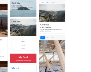
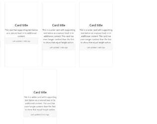
This is an example of displaying different types of card types with the use of HTML only. The bootstrap inbuilt class style has been used by setting the class name in the element. Each card consists of an image, title and a description in different formats and orders. The img HTML element has been used to set the image to the thumbnail. To distribute the data in rows and columns within a card, the bootstrap inbuilt class ‘row’ and class ’col’ are used. The class name ‘card’ has been used to apply the card styles to the HTML so that they don’t have to be manually entered. The links are set with the HTML element of href.
credits - https://codepen.io/SitePoint/pen/mXqdda
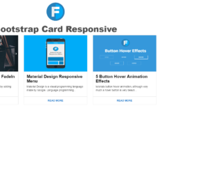
This is an example for a responsive card thumbnail that can be designed HTML and CSS. Each card has the image, title and a description followed by a read more button. The img HTML element has been used to set the image to the thumbnail. The styles that are applied to the entire page are height as 100%, width as 100%, background as #FFF, font family as 'Roboto', sans-serif, and font weight as 400. The font weight is the style that is used to set the bold value of the font. Media queries in the CSS file have been used to make the card thumbnails responsive with the values of min width as 450px, min width as 760px, and min width as 900px. resulting this example to be responsive for three screen resolutions.
credits - https://codepen.io/wisnust10/pen/BKjNNR
This is an example of displaying the data in a card format with the use of HTML and CSS. Each card will have the image on the top, title followed by the description. The card styles that are applied to this example have a style of padding left as auto, padding right as auto, min height as 500px, margin top as 15px, box shadow as 0 2px 5px 0 rgba(0, 0, 0, 0.16), 0 2px 10px 0 rgba(0, 0, 0, 0.12) and transition as .25s box-shadow. To implement the box shadow effect on the mouse hover for each card, the hover event in the CSS style class has been used by updating the box shadow class to the value of 0 5px 11px 0 rgba(0, 0, 0, 0.18), 0 4px 15px 0 rgba(0, 0, 0, 0.15). The same styles have been used for the focus event as well.
credits - https://codepen.io/reklamarsiv/pen/vgPLLv
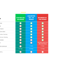
This is a simple example of displaying the details such as prices and more information in the table format with the use of HTML and CSS. The background of the page has been set to an image with adding the URL of the image. The other styles that are applied for the background are; background size as 100% 100%, background attachment as fixed and the padding as 100px 0. The CSS class text transform has been used with the value of uppercase to automatically convert the text to upper case. The font size of the header is 35px, font weight is 700, font family is 'Lato', sans-serif, font color is #fff, and the text align is center. In order to add the circle shapes, the border radius has been set as 45px along with the other styles as color as #1ab921, background as #fff, padding as 5px, border as 2px solid and box shadow as 0px 0px 11px -5px #000.
credits - https://bootsnipp.com/snippets/z71yy
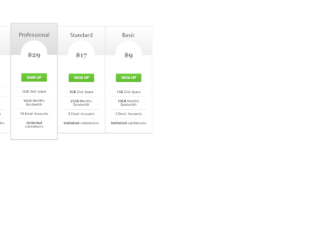
This is an example of table pricing with the use of the HTML and CSS. The background of the complete page has been set to the value of #303030. The cdn bootstrap CSS links have been imported to the HTML page with the use of the keyword import so the inbuilt styles can be used in the example without re implementing them. Each box of the table has the styles of z-index of 2, top as -13px, border width as 3px, padding as 30px 20px, border radius as 5px, and the border shadow as 20px 0 10px -10px rgba(0, 0, 0, .15), -20px 0 10px -10px rgba(0, 0, 0, .15). In order to add a shade of two colors to the heading section, the CSS style of background image has been used with the value of linear-gradient (#eee, #ddd).
credits - https://bootsnipp.com/snippets/2e6b5
This is an example of displaying a simple table and a shopping cart details in a table format with the use of HTML, CSS and JavaScript. The table elements have been used in HTML to display the details in the table format. The background color of the page has been set to the value of #fff. The important keyword (!important) has been used so if any existing value for the background will be overridden with this value. The headings have the styles of font size as 25px, margin top as 20px, margin bottom as 10px, font weight as 300 and font color as #3c4858. The buttons in the shopping cart have the styles of padding as 12px 30px !important, margin as 5px 1px, font size as 12px !important. The box shadow class has been used with the value of 0 2px 2px 0 hsla(0,0%,60%,.14), 0 3px 1px -2px hsla(0,0%,60%,.2), 0 1px 5px 0 hsla(0,0%,60%,.12) to get the box shadow effect.
credits - https://bootsnipp.com/snippets/P2eO9
This is an example of displaying the data in a responsive table format with the use of HTML and CSS. The bootstrap CSS style link has been imported to the HTML page with the use of the keyword and . By adding the CSS links of the bootstrap, the grid view of the bootstrap which is already implemented can be used by just setting the class name in the element. In this way, the data could be organized in a table format. The tables have been made responsive with the use of media queries and setting the values of min width as 768px and max width as 992px. The rows have the style of margin top as 0.2em, margin bottom as 0.2em and border as 0.1em solid rgb(163, 163, 163) whereas the border has the thickness of 0.1em with the color of rgb(163, 163, 163).
credits - https://bootsnipp.com/snippets/xV39
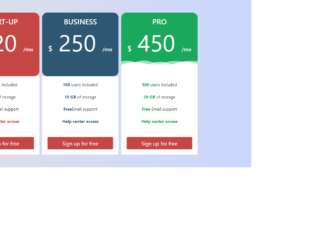
This is an example of displaying the details in a table format with the use of HTML and CSS. The bootstrap CSS links have been imported to the HTML page. Bootstrap grid views is used to organize the code. Color codes #C64545, #2D5772 and #1AA85C are used respectively get the colors red, blue and green. In order to display the effects of transform, the CSS class ‘transform’ has been used with the value of transform 0.5s for the transition event. To add the zoom-in effect to the display box, scale class is used with the value (1.05) so its size will be increased with a ratio of 1.05. This style is implemented on the hover event in CSS class so this will be dynamically added to the element on the mouse hover.
credits - https://bootsnipp.com/snippets/5M12R
This is an example for displaying the data in a table format with the use of HTML and CSS. The entire page has the styles of position as relative, height as 100%, background as rgba(0,0,0,.3), font family as 'Roboto', sans-serif, font weight as 300, font size as 17 and font color as #777. Implementation of the curve effect on the border of the quiz window has been accomplished by setting the border radius as 4px. The other styles which are applied for the quiz window are; position as absolute, left as 0, right as 0, top as 50px, margin as auto, width as 600px, background as #fff and overflow as hidden. By setting the overflow as hidden, the scroll bars will not be displayed. The title of the table has the font size as 18px, width as 40%, min width as 160px, font weight as normal and padding top as 3px.
credits - https://codepen.io/sdhnik/pen/JdVaow
This is a simple example of displaying the details in a table format that has a fixed table header; with the use of HTML, CSS and JavaScript. The table elements in HTML have been used to display the data in a table format. The table header has the background value of rgba(255,255,255,0.3) and the table has the styles of width as 100% and table layout as fixed. The table header text is automatically converted to upper case with the use of the class ‘text transform’ with the value of uppercase in CSS styles. The styles of the table header are set to padding as 20px 15px, text align as left, font weight as 500, font size as 12, and font color as #fff. The background color of the entire page has been implemented with a shade of two colors by setting the background class as linear-gradient (left, #25c481, #25b7c4).
credits - https://codepen.io/nikhil8krishnan/pen/WvYPvv
This is an example of displaying the details in a table format with the use of HTML and CSS. The table elements in HTML have been used to organize the data in a table format. The width for the responsive value has been declared as a variable in CSS so the same variable can be re used in several places in the CSS file. The intention of making the view responsive has been accomplished by the implementation of the media queries with the value of min width as 480px. The table has the styles of margin as 1em 0 and the min width as 300px. The table header cells have the styles of display as none and the table data have the value of display as block. The table row have the border styles of border top as 1px solid #ddd and border bottom as 1px solid #ddd.
credits - https://codepen.io/geoffyuen/pen/FCBEg
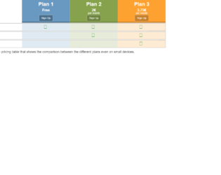
This is a simple example of displaying the details such as prices and more information in a responsive table format with the use of HTML and CSS. The container has been implemented with the styles of margin right as auto, margin left as auto, padding left as 15px and padding right as 15px. The title of the page is designed with the use of margin as 0 and text align as center. Media queries in CSS have been used with the values of min width as 768px and min width as 992px in order to make the table responsive. The styles will be dynamically changed on the given elements based on the screen size of the user. The price column has the styles of list style as none, padding as 0, margin as 10px 1px, position as relative, display as block and float as left.
credits - https://codepen.io/thingo/pen/LkwHu