Modern Website Footer and Sitemap Design
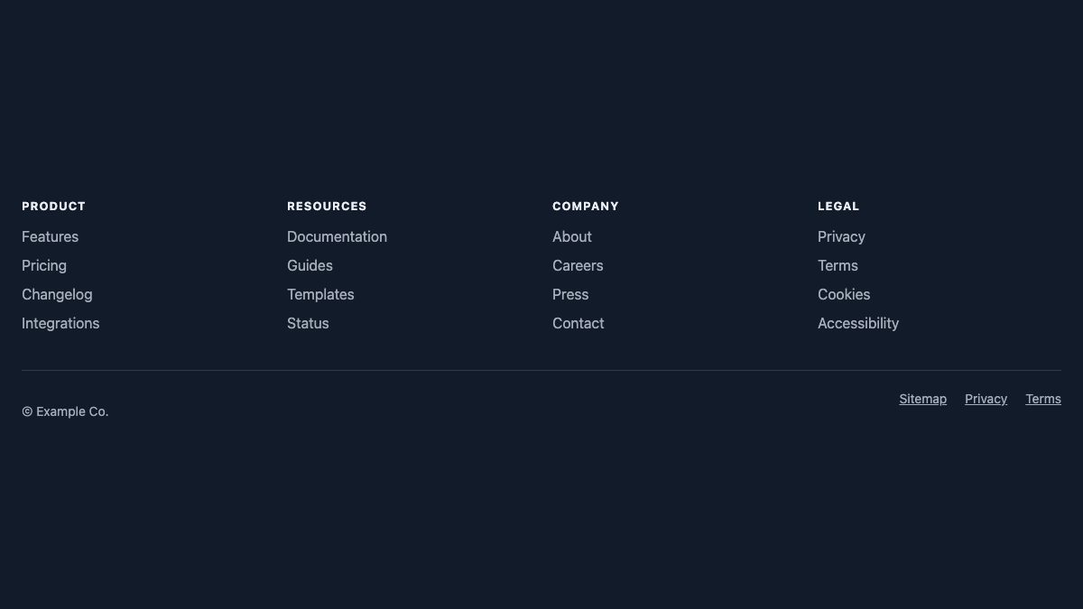
The modern footer is a sitemap: a few labelled columns of links at the bottom of every page, plus a “Sitemap” link for the full list. The standalone sitemap page that visitors once relied on is mostly gone, because a well-built footer gives people the same map without an extra click. This guide shows what good footers do today, with real examples, and gives you a tested CSS Grid footer that collapses into an accordion on phones.
One distinction first. An HTML sitemap page is for people. The XML sitemap (sitemap.xml) is for search engines and is a separate file. A footer helps visitors, and it also gives crawlers a consistent set of internal links from every page, but it does not replace the XML file.
What a footer sitemap is for
- Last-chance navigation. People who scroll to the bottom are usually looking for something the header did not offer: support, pricing, contact, careers.
- A shorter header. When the footer carries the long tail, the header can stay focused on the three to six things most visitors need.
- Orientation on big sites. A compact list of every top-level section shows the shape of the whole site at a glance.
- Trust and compliance. Privacy, cookies, accessibility statements and legal links are expected in the same predictable place.
Four footers worth studying
These are the footers of four live sites, as captured in October 2026 at a 1280px viewport. Sites redesign their footers, so treat the descriptions as a snapshot of each approach. Each solves a different problem.
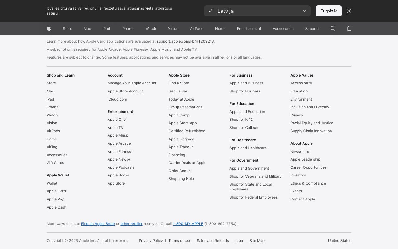
Apple: sectioned columns for a huge site
Apple’s footer is a dense five-column map, with small sub-headings (Apple Wallet, Entertainment, For Education) stacked inside each column, and a “Site Map” link in the legal bar for the complete list. The takeaway is that a large site can still use one footer if it groups links under clear headings and keeps the link labels short.
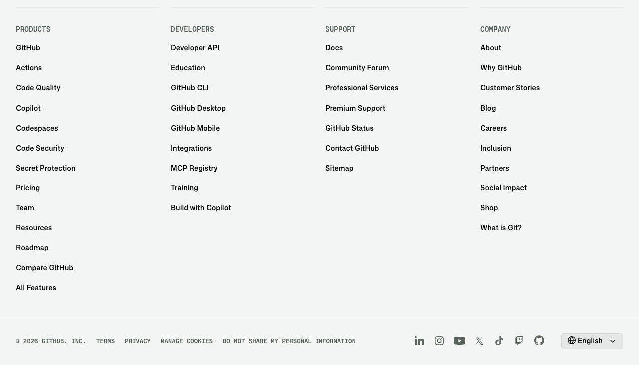
GitHub: four columns and a quiet base bar
GitHub uses four evenly spaced columns (Products, Developers, Support, Company) under small uppercase headings, with a separate bottom bar for legal links, social icons and a language picker. The “Sitemap” link sits in the Support column. Even spacing and one type style make the footer easy to scan.
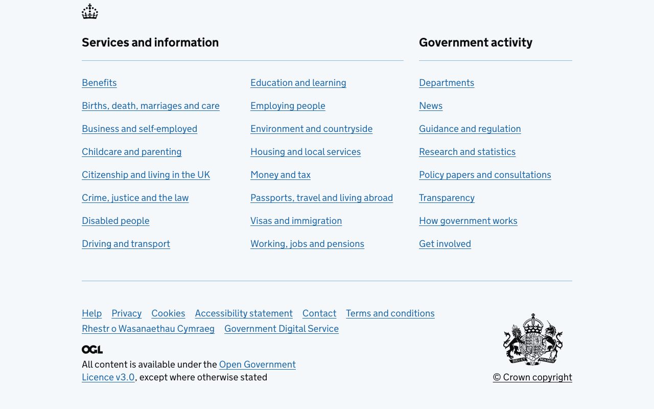
GOV.UK: plain, accessible, content-first
GOV.UK’s footer lists its two main content areas, “Services and information” and “Government activity”, as headed link lists, then a thin row of support links: Help, Privacy, Cookies, Accessibility statement, Contact. There is no decoration. Links are underlined and high-contrast, which is a good reference if accessibility matters more than style. The same pattern is documented in the GOV.UK Design System footer component.
Mozilla: a short sitemap with a brand statement
Mozilla keeps the link columns short (Company, Support, Developers), puts social links and the language selector on the right, and ends with a huge wordmark. It shows that you do not need twenty links to have a useful footer, and that the footer is a good place for a brand moment.

Patterns that hold up
- Group links under real headings. Three to six columns of three to eight links each. Name groups by what visitors want, not by your org chart.
- Keep the order consistent on every page and every template.
- Separate the legal bar. Copyright, privacy, terms, cookie settings and the “Sitemap” link go in a distinct bottom row.
- Link to a full sitemap on large sites. The footer promotes; the sitemap page lists everything.
- Do not duplicate the header. Repeat only what visitors still need at the bottom.
- Plan the small-screen version. Four columns of links become a long wall of text on a phone.
Build it: a responsive footer with CSS Grid
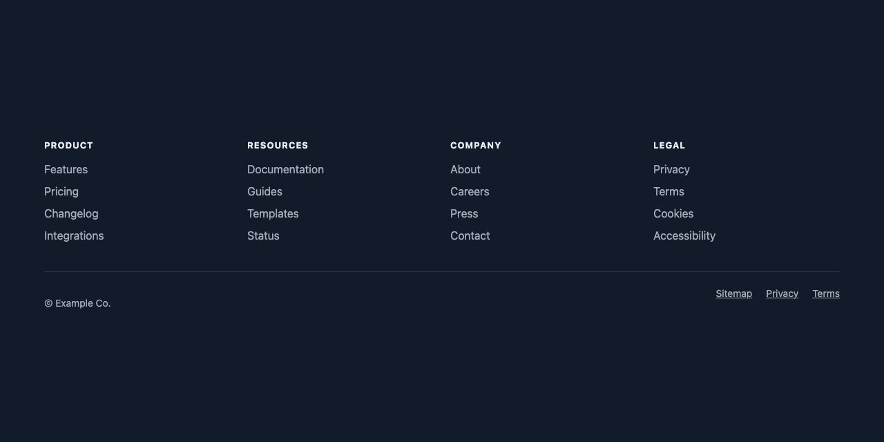
The demo below uses a real <footer>, a labelled <nav>, a grid that sets its own column count, and <details open> groups that are open by default and collapse on phones.
1. Semantic markup
A <footer> that is not nested inside <article>, <section> and similar elements is exposed to assistive technology as the page’s contentinfo landmark, which lets screen reader users jump straight to it (MDN). Give the <nav> an aria-label so it is not confused with the main navigation.
<footer class="site-footer">
<div class="footer-inner">
<nav class="footer-nav" aria-label="Footer">
<details open>
<summary><h2>Product</h2></summary>
<ul>
<li><a href="/features">Features</a></li>
<li><a href="/pricing">Pricing</a></li>
</ul>
</details>
<!-- Resources, Company, Legal … -->
</nav>
<div class="footer-base">
<p>© Example Co.</p>
<ul><li><a href="/sitemap">Sitemap</a></li> …</ul>
</div>
</div>
</footer>2. A grid that chooses its own columns
repeat(auto-fit, minmax(11rem, 1fr)) fits as many 11rem-minimum columns as the container allows and shares the leftover space, so you need no breakpoints for the column count. Colours are OKLCH custom properties, so a theme or dark mode only needs to change the tokens.
:root {
  --bg: oklch(22% .03 260);
  --fg: oklch(95% .01 260);
  --muted: oklch(75% .02 260);
  --line: oklch(35% .03 260);
  --accent: oklch(80% .13 200);
}

.footer-nav {
  display: grid;
  grid-template-columns: repeat(auto-fit, minmax(11rem, 1fr));
  gap: 2rem 1.5rem;
}

.footer-nav ul { list-style: none; margin: 0; padding: 0; display: grid; gap: .5rem; }
.footer-nav a { color: var(--muted); text-decoration: none; }
.footer-nav a:hover { color: var(--fg); text-decoration: underline; }
.footer-nav a:focus-visible { outline: 2px solid var(--accent); outline-offset: 3px; }
If you later need link rows to line up across columns of different lengths, subgrid lets nested lists share the parent’s rows. It is supported in all current major browsers.
3. Accordion on phones, open on desktop
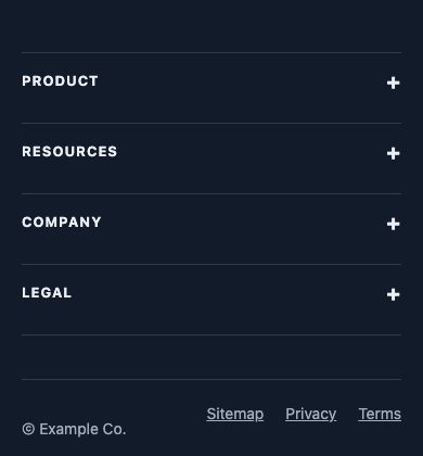
Four stacked link lists are tedious to scroll on a phone, so collapse them. <details> gives you the toggle, keyboard support and state for free, with no JavaScript for the toggling itself. Every group carries the open attribute in the HTML, so with no JavaScript all links are visible and clickable on every screen. The small script below closes the groups on phones and keeps them open at desktop width.
summary { list-style: none; cursor: pointer; }
summary::-webkit-details-marker { display: none; }

@media (max-width: 47.99rem) {
  .footer-nav { display: block; border-top: 1px solid var(--line); }
  details { border-bottom: 1px solid var(--line); }
  summary h2 { margin: 0; padding: 1rem 0; display: flex; justify-content: space-between; }
  summary h2::after { content: "+"; }
  details[open] summary h2::after { content: "\2212"; }
  details ul { padding-bottom: 1rem; }
}

/* only once JS has run (it adds .js to ) */
@media (min-width: 48rem) {
  .js summary { pointer-events: none; }
}
document.documentElement.classList.add('js');
const mq = matchMedia('(min-width: 48rem)');
const groups = document.querySelectorAll('.footer-nav details');
const sync = () => groups.forEach((d) => {
d.open = mq.matches;
// on desktop the toggle is inert, so take it out of the tab order
d.querySelector('summary').tabIndex = mq.matches ? -1 : 0;
});
sync();
mq.addEventListener('change', sync);
// safety net: if something still closes a group on desktop, re-open it
groups.forEach((d) => d.addEventListener('toggle', () => { if (mq.matches) d.open = true; }));Without JavaScript, the groups stay open and nothing is hidden, which is the safe default. The trade-off of this pattern is that on desktop each heading is still a <summary>, so some screen readers announce it as an expandable disclosure even though it no longer toggles. If that matters for your audience, a plain heading on desktop is cleaner: render the groups as ordinary <section> elements and let the script swap in <details> only below 48rem.
Accessibility checklist
- Use
:focus-visibleoutlines with enough contrast against the footer background. - Keep link text descriptive. “Pricing” is fine; “Click here” is not.
- Aim for body-text contrast of at least 4.5:1. Muted grey on dark backgrounds is the usual failure.
- Make touch targets comfortable on phones, with vertical padding on links in the collapsed layout.
- Check how the desktop headings are announced: a
<summary>that cannot toggle is still read as a disclosure, so test with a screen reader or use plain headings above the breakpoint. - Do not hide the only route to a page inside a hover-only interaction.
Keep building
If you want ready-made starting points, the WDW snippet library has several footers: a mega footer with newsletter, a responsive footer with link columns, a dark footer, and a multi-column footer. For the collapse behaviour on small screens, see the accordion with plus and minus icons and our guide to mobile-friendly responsive menus.


Great Article and I think it is a good idea for the larger type of site.
But the more I think about it every website could make very good use of this because you do indeed create a better user experience. I might try it on my own site as well with my main sections and my twitter feed.
One thing I have noticed is that some websites have huge footers with sitemaps that seem totally unnecessary, because there just isn’t enough content on the website to justify having one. If your website is small enough to be totally accessible from the top links then what is the point in having one?
I agree with Patrick; There is only need for a sitemap when the site is complicated. A normal portfolio-site should work without it, otherwise the basic structure of your site is messed up.
A regular “work, blog, contact” should do the trick for those. Everybody knows this system, so why fill your page with extra info?
When you’re experimenting with structure,… well, that’s an other cup of tea…
I agree, if the structure of the site is complicated then we do need a sitemap, otherwise for a simple brochure site if we dont have it also, it will work!
A footer sitemap is an excellent idea. Do you think this would be good for SEO too?
Good post! I’m happy to read your site!
2 Amelia Vargo: for SEO would be good an XML sitemap ;)
Nice Article, thanks.
Note: I like the skinning job you did for the Thickbox jQuery plugin, may be a good idea for a future tutorial? Cheers
It´s amazing what we can get from this articles… My skills rose up a lot after reading many of these ones…
And this article was well put here, many sites had been negating the footer strength, this is a simple and elegante way to rise show it up.
Greeting, from Brazil ;D
Another good example, if a little basic is the Redweb. The site structure is narrative and as you read through the site the footer ticks of the sections as you go.
Bravo! Great post with show and tell.
Very refreshing to see designer that champions usability…and don’t forget to include XML site map for Google and to leverage sitemap and footers to support SEO!
I noticed this was the ‘in’ thing to do and I think it is very user friendly. =)
I forgot about using them that way on front end. I have been, lately, using them only for the search engine
trollsI mean robots :-)Personally, I’ve always questioned why we have a footer. If it’s just being used as a navigation safety net, as it is in most of these examples, then the navigation isn’t working hard enough.
Contact details: ok, but these should primarily appear in close proximity to the content that prompts the CTA.
Legal: does the appearance of legal info in a footer carry any enforceable legal weight, over its appearance on a dedicated page?
What we’re effectively doing here is adding yet another block of navigation to be processed by screen-readers and compete for attention during the all important, yet brief scan-time that websites enjoy when visitors first arrive.
would love to hear your thoughts…
-tom
A few years back the footer was frequently used for keyword stuffing. During the evolution of Search, at one time Google and Yahoo actually favored sites that used on-page keyword stuffing and under the hood stuffing in the meta keywords tag. Now that Google has a real good handle on the stuff masters, it opened up the possibility for using the footer for intelligent design. I’ve heard the phrase “Phat Footer” or “Phat Foot” used for the latest incarnation where the footer is used for navigation and sort of a “below the fold” block. I really like a beautifully designed footer – it can look great AND it gives SEO people a chance to send the pagerank earned on the homepage directly to interior core pages that you want to pump up for more rankings. Interior links pass juice just like exterior links.
I noticed this was the popular thing to do and I think it is extremely user friendly.
You’re a genius… A sitemap in the footer is a better and more usefull way to catch the users atention.
hmmm, but i think in the same time it should be on the top part of the page too, a lot of people just look at the top part only, they does not know even that sometimes they have to scrool down. it sound funny but it is a fact.
You have done a nice analysis of web sites. Yes, that’s very true. It’s better not to have a separate page for sitemap because usually a visitor has got 0.1 chance out of a 100 possibilities of visiting the sitemap. Thus, better utilize the footer space. I guess that’s what it is meant for.
Great Post!!! I really love the functional footer stuff out there now. I have also seen some really nice footer stuff with jquery sliding hidden divs for the sitemap to be revealed on click… just to make it so there is less Text… if that suits the site design anyway.
YourChurch.com does this too–combined with a drop-down alphabetical listing of ministries at the top of every page–to create what is possibly the most usable church website I’ve seen.
I love the footer site map for last sites, doesn’t really seem to work for the smaller site though
yeah, that’s really useful. save the click.
but why you dont use it at this site ?
http://www.birminghampost.net has a smart looking sitemap footer but also has a separate sitemap page too.
Good post I had noticed this on site and hadn’t really put much thought into in I could see it even enhancing your ranking in SEO. Will definitely consider using site map as footer on future designs, and redesigns.
I’m curious, Nick (author), you don’t use a footer sitemap… how would you in this wildly fun layout YOU use, do this? All of the examples are very clean site, not really expressive though, show us your example of how you would implement this concept.
Another advantage of placing the sitemap in the footer: Improved site-wide accessibility! (You actually hint at this in the benefit labeled “Save readers’ time,” but what I’m pointing out is specific to people who use assistive technologies)
As screen readers like JAWS and Window Eyes scan page content, the last thing they “see” is the footer. Placing the sitemap there positions the person using a screen reader to choose whatever is next, to navigate from that point rather than returning to a typical navigation menu near the top of the page. For the same reason, I’ve placed navigation menus in the right column of three-column layouts (with main content in the center of the page, the right column falls next in the usual order, and the footer is last).
Lets not overlook the added SEO benefits – site wide interlinking.
We tend to use dynamic sitemaps in our footers, use one list to link the most relevant pages in that section, then the other 2/3 columns to link the rest of the sections.
As a web designer I can see the benefits of using an entire sitemap in the footer from a usability point of view, However this should not detract designers from creating a clear and easy to use navigation for theiir website.
I really like the white house web site, and i like the fact that Obama isnt afraid to venture and use the digital world to reach the public.
Nice design and user friendly.
Yeah, just follow the crowd…
Come on people, find out for yourself how to best design a sitemap page.
I kind of dislike these top 100 sites that all use the same design, just because the there are 99 other websites that use this technique.
This makes you think less about design principles and why footers like these work. Just because they work doesn’t mean you should use them.
It’s ok to invent another wheel.
We’ve tried to take a more evidence based approach to designing the footer, and here’s what we’ve found:
1) footer links seem to typically outperform the same link in the top nav
2) a “fat footer” isn’t that great for SEO
3) in some sites, a thin footer will outperform a fat footer
You can see more on post here: footer design results
@Thijs – totally agree – consider why you should add a sitemap in there rather than just follow the smashing magazine etc “top 100” list
I think Jason Santa Maria’s example is a good one- extending the content and making it useful, rather than trying to stick everything plus the kitchen sink down there.
yes, it should be easy to navigate and user friendly,.. not for seo puropses.
Let’s take this to a different level. Anyone have a site that uses a footer such as the one’s described that would be willing to show the google analytics click-throughs? Would be nice to some rough percentages of usage. Personally, I can’t remember 1 single moment in all my web surfing where I clicked on a footer link.
Thanks.
I really like the idea of having a more comprehensive sitemap in the page footer. I think this is a technique that is definately catching on all around the Web. As a designer, I would have to say that the page could get a little clunky when listing a large number of links. I do, however, like the idea of only listing the pages with the most significant content. Currently, when designing websites, our company lists only the main navigation in the footer. It might be helpful to include some additional links for the purpose of user convenience. It’s definately a topic that’s worth bringing up at the next staff meeting. Thanks for the insight.
@Robin – I’ve outlined uplift that we found here:
large footer design testing results
Keep in mind that we found significant improvements to this approach (as in, like for like clicks typically increased), but there were also several significant negatives. One was a negative SEO impact. The other was that our users achieved goals *much* better with a thin footer.
Our key learning was that it really suits some sites, and is quite detrimental on others.
Great article! I had done some r&d on sitemaps a little while back. I found that HP had a really awesome set-up but I havent been to their site recently.
Great SEO idea, but not always fitting for every design.. perhaps if you hide the data like the comment guidelines and have it expand on click.. problem is search engines ignore anything that’s hidden I believe.
As a designer, I would have to say that the page could get a little clunky when listing a large number of links.
I recommend you to consider some things before building any e-commerce website for your purpose —>
-There should be a consistent theme and design running
throughout your site ie same header image and/or logo, slogan,
navigation, copyright and colors.
Check here >>> Website Design Company
Good suggestions. The expanded footer is great for usability and SEO. I like the fact that from any given page I can jump deep within another section of the site yet by putting it in the footer it doesn’t clutter the page I’m currently viewing.
Not sure why you included Digg, Firefox, and Apple, but the rest are great examples for your post. Thanks a lot for the share.
This is AMAZINGLY helpful, as are all the design resources here. I’ve been out of the game for a while, and it shows in my designs. Thank you for this site.
Hi,
Thanks for the information. I am in the middle of overhauling my web site so this info is greatly appreciated. Indeed I will be speaking to my web designer tomorrow about it.
Wow! I’m about to redesign the footer on the company website, this has been really helpful. Now I just have to think of a way to organize all of the footer mess.
Thanks for this post. You gave me some good resources, because I’m planing to design my own template so this is good inspiration.
Thanks once again :)
I’d never realised that this was a site map – I’d often see it and thought “what a good idea” but never really thought much more about it…
I’m definitely going to think about incrporating this into my client’s sites from now on.
Thank you!
A footer is also very helpful for retail websites like the dutch website of hema.nl. The footer can be used to put all the categories and sub-categories in list view. This is also very SEO.
http://www.hema won twice the Dutch Online webshop Award
(check the tagcloud at the homepage too!)
Wooo, I like it. I’d noticed it before on Chris Coyier’s website, css-tricks which I really like.
Great article, sourced quite a few designs there too! I’ve used this method in a couple of recent designs i have done, and in some cases it does work very nicely not only from a navigation point of view but from a content filler also if the pages of a website are a bit sparce on content.
Is the traditional nav bar under threat from the footer mini-sitemap??
Whats the impact on seo of creating such a sitemap at the foot of the page that is hidden but expands on mouseover?
I do like the layout on some of these site maps. I think I will rearrange mine. Thanks for the list you provided.
I really enjoyed this post and infact I have used some of the sites as inspiration for a new site we are working on.
I do have a question tho……..how do you find all these sites for examples?
Our church has a great sitemap in their footer as well: Church on 99. I think footers in sitemaps helps make a site a lot easier to navigate, especially when the primary navigation doesn’t have dropdown menus.
Great list to get inspiration.
I like the breadcrumb navigation use in apple site’s footer.
I like the “maximize the hover use” ;) of mozilla site’s footer. But it seems consistency is missing. Though most of the out going links (only) have arrow (on hover), some are missing.
GoodBarry attempts to get subscription finally @ footer. Good Idea!, perhaps they can add a site search too. I know they have one right at the top, but visitors may give it a last try @ footer.
Clearspring has nice footer design and clever use of top of page link. :)
Also, microsoft’s site have a site map on the footer.
If you are looking for psd templates check out http://www.venuswebdesign.com
I generally examine footers as long as headers. very important part.
Thank you. This is exactly what I’m going to do with a project at work. Especially for long stretching pages these kind of ‘sitemap’ footers become very useful!
Thanks What’s the problem here? Google could bury the meager profit number from even the biggest media conglomerates.
Thanks Thanks What’s the problem here? Google could bury the meager profit number from even the biggest media conglomerates.
Thank =)=)=) you http://www.cennet.gen.tr webdesignerwall Thanks
I like the large footer myself, however i am trying to get a large footer to work with a large CSS background photo. The photo can not be infinitely long so I have a small problem. Oh well, I’ll figure it out.
As the saying goes,learn as you work and work as you learn.Websites are getting more and more easy and snazzier to use and go through.
What really attracts a new visitor to a site is the appearance,layout and the “feel”.As important as maintaining your physical business location.Effective layout means you are a no nonsense person and like to place things where they are most accessible from.
Practicality and originality,if these two yardsticks are met then the site is worth looking into.Imperative to comment that the header footer is like the head and toes of any site.If you have them you have “your” site otherwise it is just “another” site.I liked this one.
The fact is that this new sitemap relay, hugely participates to re-design the bottom of websites, becoming essential part of general design on the page…
I’m in the process of doing this too, but I’m wondering about the SEO implications for large websites. I’ve heard that Google crawls only the first 25 or so links on a page, so if the page already has a lot of links (internal and/or external), I wonder if the footer sitemap idea might backfire a bit. Do you have any information about the SEO side of this? Thanks, and by the way I really love your site design!!
how would thought that larger vertical lists will sneak into footers. But it is def. easy way to fill the whitespace.
The fact is that this new sitemap relay, hugely participates to re-design the bottom of websites
I’ve seen a LOT of portfolio websites use this technique. Maybe a little too often sometimes, to the point that portfolios look the same…
Nice tips, it all makes sense, and every day more and more sites implement site map in footer. But i have some doubts about too many links in home page, because that is not seo friendly, and sitemaps often have too many links, not sure google likes that.
great thanks a lot i am going to try this on my site i hope it will work
These are definitely great examples of site maps in the footer!
It can definitely offer some benefits as mentioned by engaging the user and duration that they visit your site, it makes it easily and accessible to view the site map, the footer can be used to promote links and obviously it can enhance the design of your website. When designing your site; you always have to think of the visitors who are viewing your site and what they can benefit from your site; whether its fast loading time; easy access and clarity of content or just scanning through an attractive/appealing web design concept.. I am actually part of a web programming company that specializes n a variety of things including website design take a look at our website above! :)
I was in search of the best practice to make the sitemap for my website this post really helped me a lot but what I was thinking that the site maps made to solve two purpose one for the user ease and the other that the crawlers visit the site but in this footer version of the site map I think only the user point of view will be served not the crawler. As it can;t be that mush details that we use to make while it was on the dedicated page, but still I need to move on with the latest trend , Please guide me if I am wrong
Nice round up – I’m not sure I totaly agree with the bullet-points in the post intro though… If users are engaging through your footer, then I kinda feel you’ve not done a good enough job further up the page.
I definitely see the benefit of sitemap footers if you have long pages however, where your users might become ‘stranded’ from the main site navigation (assuming this is at the top of the site). Also, I’ve always assumed that it’s great for SEO.
I use sitemaps in the footer of my WordPress-themed sites. This does create its own dynamic page that will get crawled by search engines well. Those that want to look at a sitemap would view it too, but i question whether this is needed for any site other than the most over complicated sites.
Thanks for the article though.
San Diego Mobile Notary
Good Post !!! that Answers why most websites are utilizing the footer space.
Keep Up the Good Work!!!!
I was reading something else about this on another blog. Interesting. Your position on it is diametrically contradicted to what I read earlier. I am still contemplating over the opposite points of view, but I’m tipped heavily toward yours. And no matter, that’s what is so great about modernized democracy and the marketplace of thoughts on-line.
Congratulation for your site. Very well written too !
would you plan to make a post on a graphical sitemap ?
When you do article marketing, your intention is to increase the number of visitors to your website. It is not our abilities that show what we truly are, it is our choices. I have look for such a article for a long time
It relies heavily on touch because the pages I have a user acting on, are usually a collection of child records. uggs outlet Caching is a big help in this respect.Thanks
These are so incredibly well thought out, I’m having such a hard time redesigning ours right now… I want to use all the ideas of inspiration, but that would mean I’d have the worlds longest footer!
No wonder, with white iphone 4 in your hand will make you be the focus of the crowd! You won’t miss it!
I just heard the gossip that since there’s some technic problems on white iphone 4, iphone 4b is going to release. It that true?
These are so incredibly well thought out, I’m having such a hard time redesigning ours right now… I want to use all the ideas of inspiration, but that would mean I’d have the worlds longest footer!
These are so incredibly well thought out, I’m having such a hard time redesigning ours right now… I want to use all the ideas of inspiration, but that would mean I’d have the worlds longest footer
Splendid work. Thank you so much for this post. Interesting content.
Thank you. Very good Article. This was exactly what I searched for. I love this modern footers. I think I am going to subscribe to your rss feed. Regards from Germany.
Thanks, very good article. It would be nice if you could point out some WordPress plugins to create, or themes that have this modern footer sitemap already incorporated. Thanks
Best structure is defined by Mozilla. I want to develop best HTML sitemap on website. I read entire post & assume that: HTML sitemap and footer section both are too important for users.
i think that it looks more professional to have private policy, sitemap, etc in the footer. However, how do you create this in wordpress? I am missing it on your site. This is a very usefull site.
This is such a great blog post! I was searching for “How to create best HTML sitemap?” on Google and land on this such a great blog post. This blog post have quite different subject from my requirement but, I suppose to indicate that suggestions will help me to design great footer with my eCommerce website.
BTW: I am searching for best blog post or solution which help me to design such a great HTML sitemap and improve my indexing over Google. Can any one help me in same direction?
Excellent post. I was checking constantly this blog and I’m impressed! Extremely useful information specially the last part :) I care for such information much. I was looking for this certain information for a very long time. Thank you and good luck.
Yes I really liked the footer design of FiveRuns , I found this page through Google search when I was searching for inspiration for Footer Designs. Thanks for posting such an informative article and website collection to Inspire web designers like me .
Thanks for this post. I’m just learning about sitemaps and the actual function they can play in website optimization.
Would it have the same effect from an SEO perspective if I just placed a link in the footer to a page which has a sitemap?
Very Very interesting post. There are some other good ones I found on
Yahoo
Today I revised some of those websites, and all them changed the footer style.
What is the best footer for users and SEO in 2012 and why? I think this would be a nice read
Thank you for the auspicious writeup. It in fact was a amusement account it.
Look advanced to far added agreeable from you! However, how could we communicate?
well, this is very good post. I have personal experience of this stuff. When I started my site at that time I did not put all links at footer section after then I read somewhere and put links at footer section then simply I good good traffic. .
Thanks for posting this kind of valuable post
Nice point ! improved user navigation experience, and you are a “small fish” website, it is always good to follow the “leaders” experiences… I did apply this strategy on -some- of my web pages (when needed)… btw, thanks for this cool webdesigner oriented blog… keep up the good work !
I have followed the 3 steps as mentioned by the author:
Categorize – organize your links in categories.
Use Headings – use headings or titles for each category.
Be Consistent – the order of the links should be consistent.
Now, how do i add these into the footer? I am stuck with it.. Can anyone help..?
THanks
I want to create a separate page for the HTML sitemap, does anyone have any good examples of those? They say it can give you a decent amount of internal SEO benefit by using the internal linking. I have also heard that you should place the sitemap in the upper left hand corner to ensure that the Google bot follows that link first, any thoughts?
Great collections of footer design!! Totally love your blog that offering some fantastic ideas…. keep up the good work!!
Every weekend i used to visit this website, for the
reason that i wish for enjoyment, for the reason that this this web page conations actually fastidious funny stuff too.